Wall Art Guide, Wall Art Tutoriels
Anthropologie Wall Art: Bohemian Collection & Reviews
Feb
Okay so I literally just spent three hours rearranging my client’s living room with like four different Anthropologie wall art pieces and here’s what actually matters when you’re looking at their bohemian collection because honestly their website makes everything look amazing but in real life it’s…different.
The Actual Size Thing Nobody Talks About
First thing – and I cannot stress this enough – their dimensions are WEIRD. I ordered this gorgeous “Desert Moon” print thinking it would fill the space above my client’s credenza and it arrived looking like a postcard. The measurements were technically correct but something about the mat-to-print ratio just reads smaller in person. Now I always add like 20% to whatever size I think I need. My cat knocked over my tape measure while I was checking this btw so I had to remeasure everything twice.
The sweet spot for their bohemian pieces is usually the 30×40 range if you want statement art. Anything smaller works better in a gallery wall situation which…we’ll get to that because I have thoughts.
Frame Quality Is All Over The Place
So this is gonna sound weird but I’ve noticed their frame quality depends entirely on which “collection” the piece comes from. The stuff that’s labeled “Rifle Paper Co.” or artist collaborations? Chef’s kiss, the frames are solid wood, real glass, proper backing. But some of their house brand bohemian prints come in these lightweight frames that feel almost plasticky and the glass isn’t even glass sometimes it’s acrylic which gets scratched if you look at it wrong.
I had one arrive last month where the frame corner was literally separating from the rest of the frame. Had to return it. Their return process is actually pretty painless though you just gotta keep the box which I never do because I have zero storage space.
The Ones Worth Your Money
- Anything from the “Justina Blakeney” collaboration – her stuff is pricey but the quality is consistently good and the boho vibe is authentic not trying-too-hard
- The pressed botanical series with the vintage-looking mats – these are GORGEOUS in person and the detail is insane
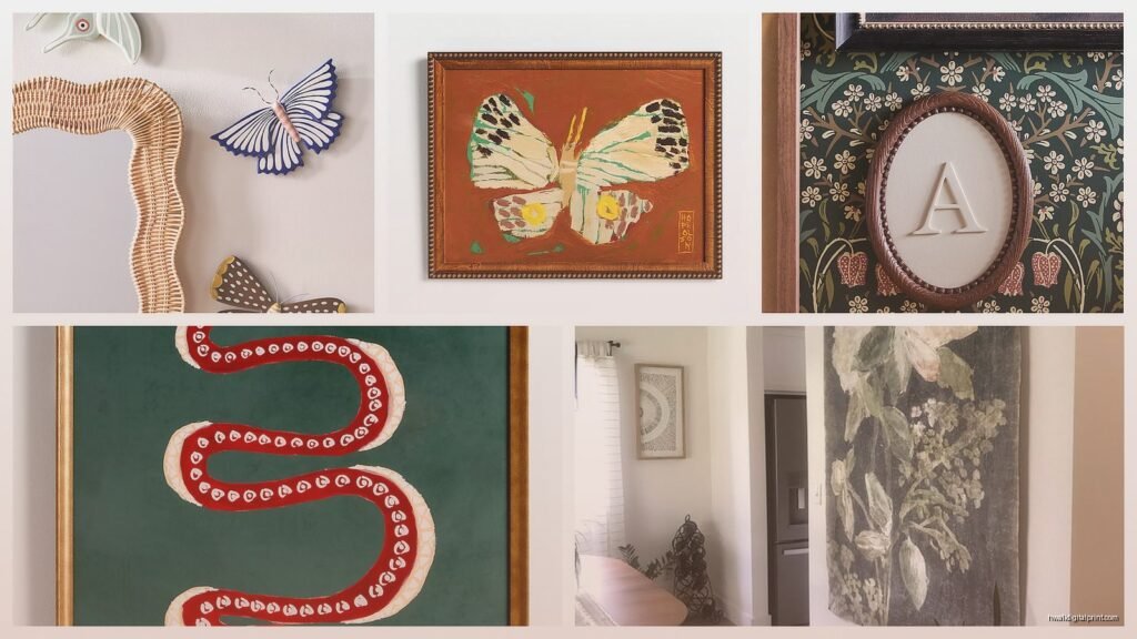
- Their macrame pieces which technically aren’t wall art but I’m counting them because they photograph beautifully
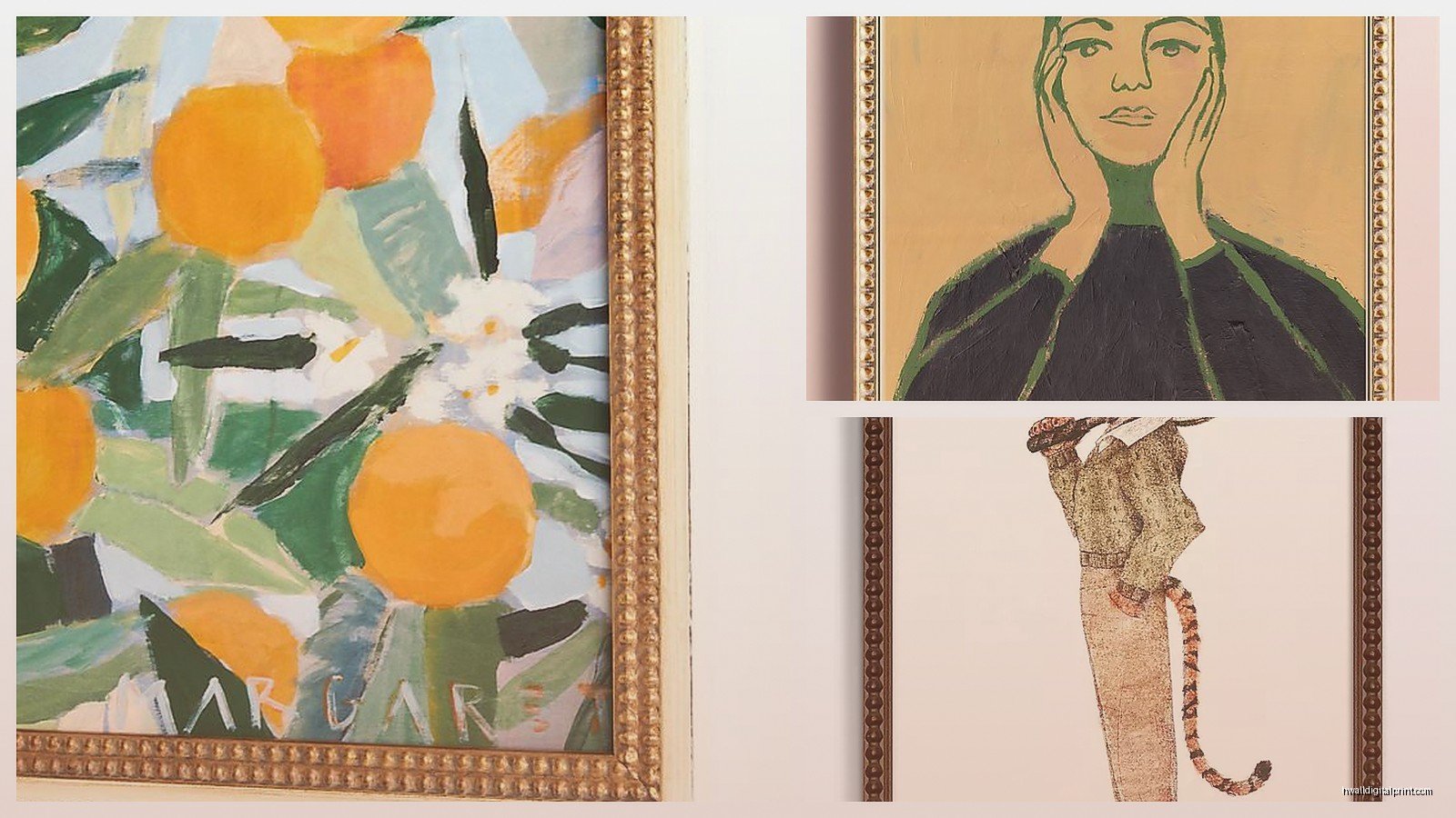
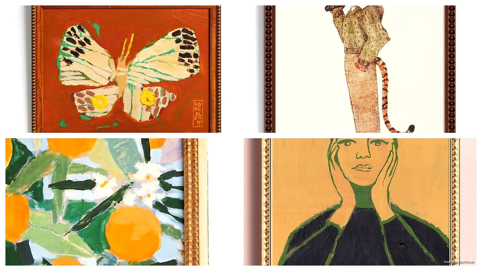
- The line drawings of women/figures – very minimalist boho, go with everything
Skip These Unless They’re On Sale
- The mass-produced “inspirational quote” prints – you can find better on Etsy for half the price
- Anything that says “printed on wood” because it chips SO easily
- The really trendy stuff like those rainbow prints from 2021 – dated already
Color Accuracy Is A Gamble
Okay so funny story – I ordered this print called “Terracotta Dreams” or something like that for a client who was doing this whole warm earth tone situation in her bedroom. The website showed this beautiful burnt orange and deep rust color palette. What arrived was…pink. Like dusty rose pink with hints of coral. Still pretty but absolutely not what we needed.
I’ve learned to read the reviews specifically for color comments and even then it’s risky. Their photography has this soft filtered quality that makes everything look more muted and sophisticated than reality. If you’re trying to match existing decor I’d honestly order two options and return one because the return shipping is free anyway.
Oh and another thing – their “neutral” boho pieces can read really cream/warm toned even when they look grey online. Something about their printing process I think.
The Gallery Wall Situation
Everyone wants to do a gallery wall with Anthropologie stuff because their aesthetic is so cohesive right? But here’s the deal…if you buy all matching frames from them it looks flat. Like weirdly corporate. The bohemian vibe needs some texture variation.
What actually works is mixing their framed prints with their baskets (yeah the decorative wall baskets) and maybe some vintage mirrors or your own thrifted frames. I did this in my breakfast nook area while watching that new season of The Bear and honestly got so distracted I hung one piece crooked and didn’t notice for three days.
My formula that works every time:
- Pick one large Anthropologie statement piece as your anchor – usually bottom center or off to one side
- Add 2-3 smaller Anthropologie prints in different frame styles from their collection
- Fill in with non-Anthropologie stuff – vintage plates, small mirrors, one weird sculptural thing
- Throw in at least one piece with serious texture like macrame or a woven basket
The key is odd numbers and asymmetry. Their bohemian stuff is already pretty maximalist in style so you need some breathing room.
What Actually Looks Good In Different Rooms
Living room – go big or go home honestly. Their large-scale botanical prints or the abstract landscapes work best. I just did a client’s space with their “Wild Garden” print which is like 40×50 and it completely transformed the room. Paired it with velvet pillows in similar tones and it was *that moment* you know?
Bedroom – the softer line drawings or anything with a sunset/celestial theme. They have this moon phase print that everyone and their mother has bought but it’s popular for a reason. Looks dreamy above a bed especially with those gauzy curtains they also sell but that’s getting off topic.
Bathroom – okay so this is tricky because humidity is real and their paper prints will warp eventually. I only use their framed stuff with glass in bathrooms never the canvas prints. The small botanical series works great here or vintage map reproductions if you’re going for that explorer bohemian vibe.
Kitchen/dining – this is where I go for their more colorful pieces or anything food-related but artistic not kitschy. They have some gorgeous vintage produce prints and some abstract stuff in warm tones that makes the space feel cozy without being too serious.
The Seasonal Collections Problem
Here’s something that drives me nuts – Anthropologie rotates their wall art SO fast. Like you’ll see something online, deliberate for two weeks, go back to order it and it’s gone. Discontinued. They do this thing where seasonal collections drop and then disappear forever.
If you see something you genuinely love just buy it because it probably won’t be there next month. I’ve learned this the hard way after losing out on this perfect abstract piece that had all the right colors for a client’s space. Ended up spending way more on a custom piece instead.
Their sale section is actually worth checking regularly though because discontinued items end up there and sometimes you can score something amazing for like 40% off.
Price Real Talk
Most of their bohemian wall art ranges from $98 to $450 depending on size and artist. The sweet spot for quality-to-price ratio is around $150-200. Below that and you’re often getting something you could find cheaper elsewhere. Above that and you should really be considering if it’s a investment piece or just pretty.
Wait I forgot to mention – they do this thing where items will show as full price then randomly go on sale then back to full price. If something’s not urgent I add it to my wishlist and wait for the sale email. Usually happens every 6-8 weeks.
Installation Tips Nobody Asked For But You Need
Their hanging hardware is…minimal. Most pieces come with basic sawtooth hangers or wire which is fine for lightweight stuff but anything over 20 pounds and you’re gonna want to upgrade to proper D-rings and picture hanging wire.
I always use proper wall anchors even when I hit a stud because their frames aren’t always weighted evenly. Had one tip forward and nearly knock over a lamp which would’ve been a disaster.
For the really large bohemian pieces consider using two hanging points instead of one centered wire. Distributes the weight better and keeps things level which matters more than you’d think when you’re staring at slightly crooked art every day.
Oh and if you’re hanging anything above a sofa leave at least 6-8 inches between the furniture and the bottom of the frame. I see people hang stuff way too high all the time and it just floats there awkwardly.
The Anthropologie Dupe Situation
Look I’m not gonna tell you not to look for dupes but honestly most of the Etsy “inspired by” versions are just…not the same quality. The paper is thinner, the printing is less crisp, and somehow the colors always look slightly off. That said, for trendy pieces you’re not sure about, a dupe makes sense to test the vibe before committing.
Society6 has some artists doing similar bohemian styles and their quality is actually comparable, sometimes better because you can choose your print size and framing options separately. Just a thought if you can’t find what you want at Anthropologie.
Target’s Opalhouse line also does boho wall art that’s obviously lower price point but decent if you’re doing a rental or kids room where you don’t wanna invest heavily.
My Current Favorites From Their Collection
As of right now because this will change next month probably – the “Sun Salutation” print which has this gorgeous warm gradient, anything from Lulie Wallace her style is perfectly boho without being cliche, and their pressed fern collection which works in literally any space I’ve tried it in.
There’s also this three-panel abstract landscape set that I keep coming back to but it’s expensive and I can’t justify it for my own house even though I think about it weekly. Classic.
The macrame wall hangings are having a moment still and theirs are actually handmade which you can tell when you see them in person. Way better than the mass-produced ones from Amazon that look kinda sad and limp.