Wall Art Guide, Wall Art Tutoriels
Aqua Wall Art: Turquoise Blue Water Color Designs
Mar
So I’ve been absolutely obsessed with aqua and turquoise wall art lately, like to the point where my studio apartment looks like an ocean threw up in the best way possible. A client asked me last month to help her choose pieces for her beach house and I went down this whole rabbit hole testing different types and honestly learned so much about what actually works versus what just looks good on Instagram.
First Thing About Choosing the Right Shade
Okay so turquoise and aqua aren’t the same thing and this matters more than you’d think. Aqua leans more green-blue, turquoise is more pure blue with that slight green hint. I spent like three hours one night holding paint swatches against different prints because my photographer friend was supposed to come over but canceled, and the difference is wild depending on your wall color. If you’ve got warm white or cream walls, go for true turquoise because aqua can look weirdly medical? Like that antiseptic blue-green. But if you’re working with cool grays or white-white, aqua actually pops better.
The Watercolor vs. Photography Debate
Here’s where I have thoughts. Watercolor designs give you that soft dreamy vibe but—and this is gonna sound weird but—they’re way harder to pull off in certain rooms. I bought this gorgeous watercolor print from this Etsy shop, all flowy turquoise washes, and it completely disappeared on my living room wall. The texture wasn’t enough. Watercolors work best when you either go HUGE like 40×60 inches minimum, or you do a gallery wall with multiple pieces so there’s enough visual weight.
Photography of actual water though? That’s your friend if you want immediate impact. I did a whole installation for a dental office (random but it paid well) and we used these massive turquoise ocean photography prints. The detail in the water, the waves, the light hitting it—photographs give you that depth that watercolor sometimes lacks. Plus they read better from a distance.
Paper Quality Actually Matters and Here’s Why
Oh and another thing, I spilled coffee on one of my test prints—it was this lighter aqua abstract piece—and discovered that cheap paper just disintegrates. Even behind glass, humidity affects prints. If you’re putting aqua art in a bathroom which honestly is such a good move for that spa vibe, you gotta get either acrylic prints or make sure it’s printed on heavy cotton rag paper. I learned this the hard way when a client’s framed print in her master bath started warping after like six months.
Museum-grade paper is worth it. Hahnemühle or Moab are brands I actually trust. They’re pricier but the color stays true. I had two identical turquoise prints, one on cheap paper and one on Hahnemühle Photo Rag, and after a year the cheap one faded to this sad gray-blue while the good one still looked fresh.
Size and Scale Nobody Talks About
This is where everyone messes up including me initially. Aqua and turquoise are light colors so they don’t anchor a wall the same way darker art does. You need to go bigger than you think or cluster pieces together. My rule now is: measure the wall space you want to fill, and the art should take up at least 60-75% of that width. Maybe even more.
I did a project last spring where we put a single 24×36 print on this massive wall behind a sofa and it looked like a postage stamp. We ended up doing three 30×40 pieces in varying turquoise tones and suddenly the whole room came together. Oh wait I forgot to mention—odd numbers work better for groupings. Three or five pieces. Something about visual balance that I learned in my art curation days.
Different Style Categories That Work
Let me break down what I’ve tested because I literally have samples all over my place right now and my cat keeps knocking the smaller ones off the bookshelf.
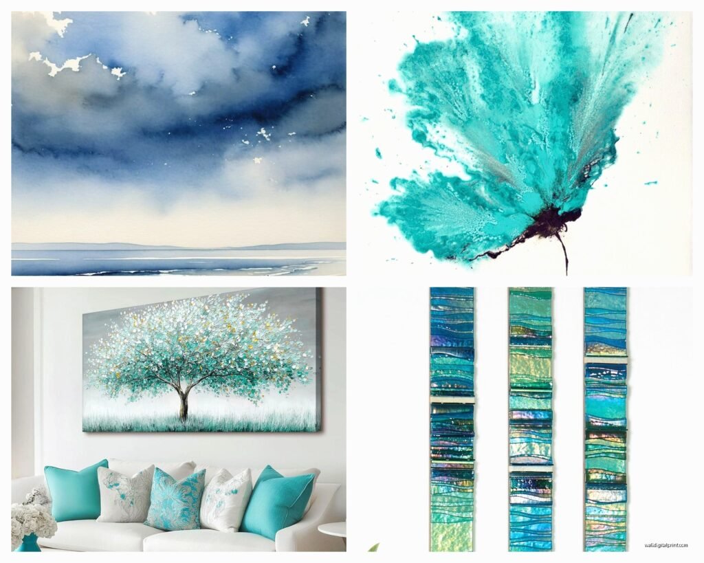
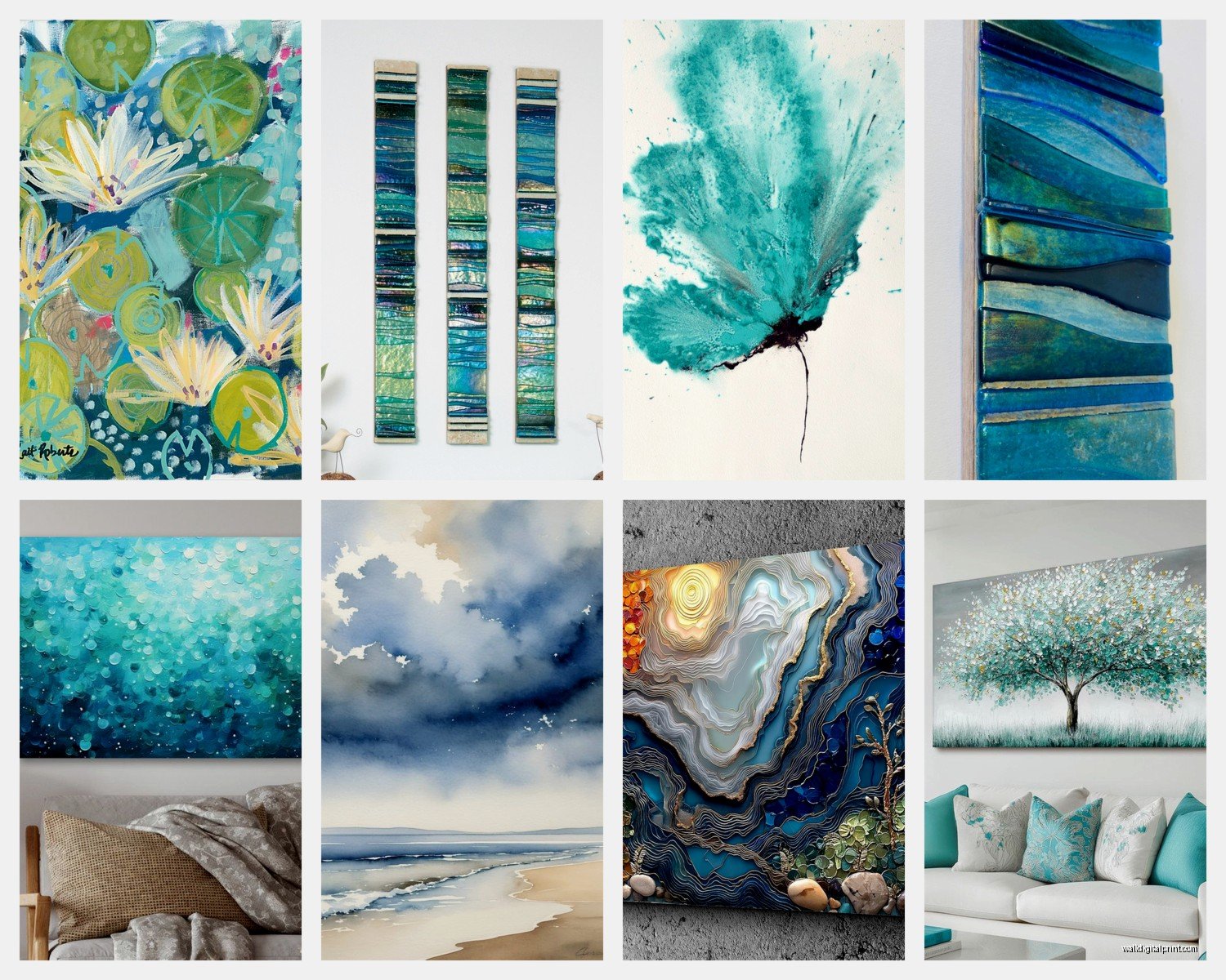
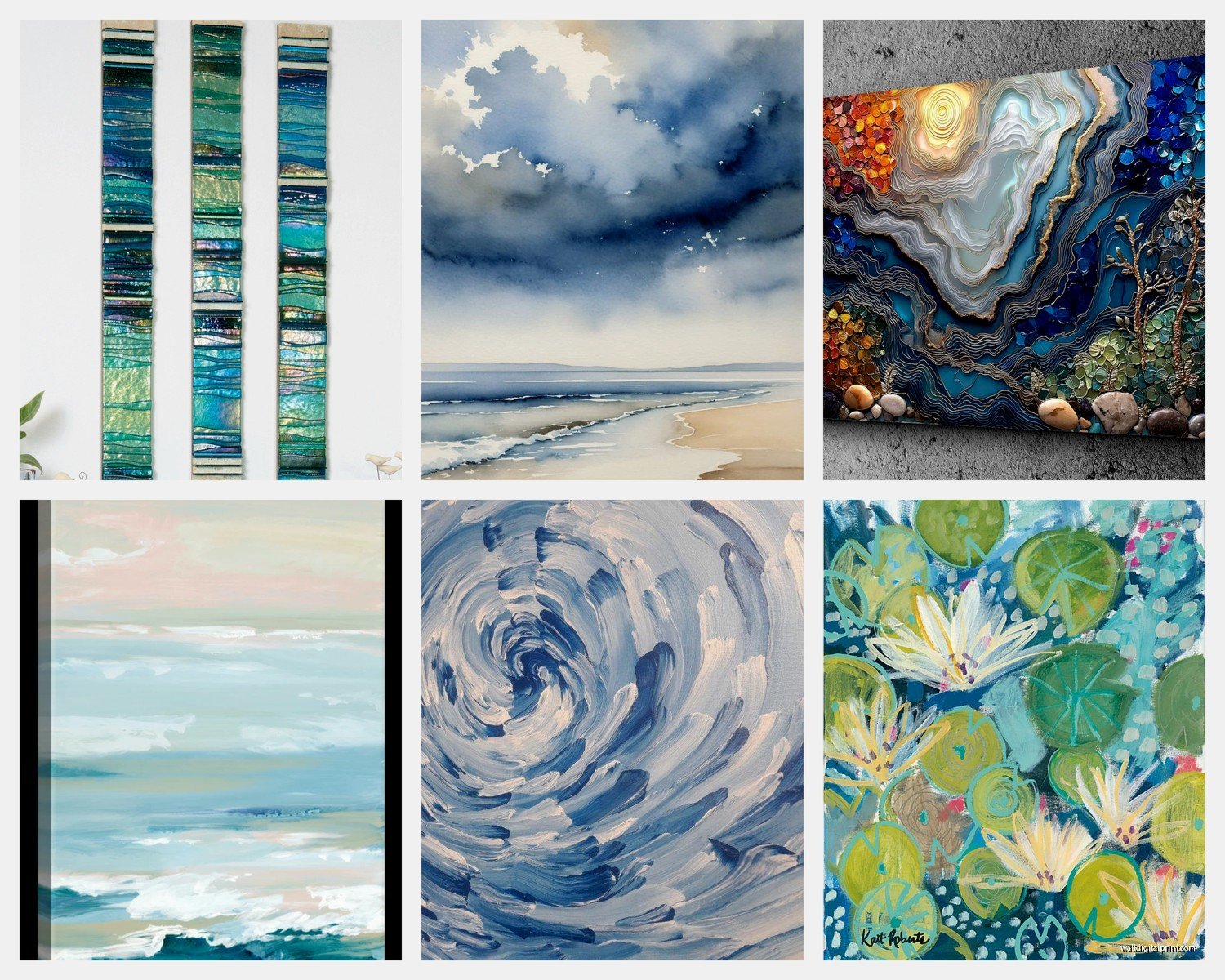
Abstract Watercolor Washes
These are the pretty flowy ones everyone pins on Pinterest. Best for bedrooms and spaces where you want calm energy. The trick is making sure there’s enough color variation—pure turquoise to deep teal to almost white aqua. Single-tone washes look unfinished unless they’re really expertly done. I found this artist who does turquoise alcohol ink pieces and they have this depth because the colors pool and separate naturally. Way better than digital watercolor effects which can look flat.
Ocean and Water Photography
Waves, tide pools, underwater shots, aerial beach photos. This is my go-to for coastal vibes obviously but also works in modern spaces. The key is resolution—you want to see individual water droplets or sand particles. I got burned buying a “high quality” print online that turned out to be like 72 DPI and looked blurry from three feet away. Always ask for 300 DPI minimum if you’re doing custom printing.
Geometric and Modern Takes
Turquoise circles, aqua hexagons, gradient designs. These work surprisingly well in offices and modern spaces. Less beachy, more sophisticated. I used a geometric turquoise piece in a lawyer’s office and it totally worked because it felt professional but still had personality. The shapes give structure that pure watercolor doesn’t have.
Minimalist Line Art
Simple line drawings in turquoise ink—think botanical prints, abstract faces, wave lines. Super trendy right now and honestly pretty versatile. They’re subtle enough to work with other art but still add that color pop. I’m weirdly into these lately because they don’t compete with furniture and textiles the way busier pieces do.
Framing Makes or Breaks Everything
Okay so funny story, I bought these beautiful turquoise watercolor prints and put them in black frames because I had them already, and they looked SO HEAVY. Aqua and turquoise are airy colors and dark frames weigh them down too much unless you’re specifically going for that contrast.
White frames keep things light and coastal. Natural wood—light oak or whitewashed—adds warmth while keeping the breezy vibe. I’m obsessed with floating frames right now, the kind where you can see the paper edge. They work great with deckled-edge watercolor paper and make the art feel more expensive.
For glass, I always recommend UV-protective if you’re spending real money on the art. Regular glass lets UV fade the turquoise tones over time and they shift more grayish. Museum glass is pricey but worth it for statement pieces. Anti-glare is good for rooms with lots of windows.
Where to Actually Place Them
Bathrooms are obvious but don’t overlook powder rooms—a single stunning turquoise piece in a small powder room is such a power move. Bedrooms above the bed, but also consider the wall opposite your bed so it’s the first thing you see waking up. That morning light hitting turquoise art is *chef’s kiss*.
Living rooms work best when you balance the aqua art with neutral furniture. If you’ve got a lot of color happening already, turquoise art can be too much. I learned this working with a client who had a yellow sofa and the turquoise just clashed. We ended up using teal instead which has more complexity.
Hallways are underrated for this. A series of small turquoise prints down a hallway creates this flow—literally like water moving through the space. I watched this weird home design show while arranging these once and they talked about visual rhythm which sounds pretentious but it’s real.
Mixing Different Shades
You can totally mix aqua and turquoise in the same space but include some overlap pieces that have both tones. Otherwise it looks accidental. I do light aqua, medium turquoise, and deep teal together a lot. The gradient effect tricks the eye into seeing them as a collection rather than random blues.
Also throw in some white or cream pieces if you’re doing a gallery wall. All aqua can be overwhelming. I usually do 60% turquoise/aqua, 30% neutral, 10% accent color like coral or gold.
DIY Watercolor Option If You’re Feeling It
I’m not gonna lie, I tried making my own turquoise watercolor art one weekend and it’s harder than it looks but also kinda fun? You need actual watercolor paper—140lb cold press minimum—and decent paints. Winsor & Newton makes good turquoise shades. The technique is basically wet-on-wet, you soak the paper first then drop in color and let it spread.
The thing nobody tells you is turquoise dries lighter than it looks wet. So you gotta go more saturated than seems right. I made like fifteen practice pieces before getting one worth framing. But there’s something cool about having totally custom art in the exact shade you need. Plus you can make it the perfect size for your space.
Mixing with Other Decor
Turquoise art works with way more than you’d think. Obviously coastal and beachy styles, but also mid-century modern because of that retro aqua color. Bohemian spaces love it mixed with terracotta and natural textures. Even modern farmhouse can work if you keep the frames natural wood.
For throw pillows and stuff, pull the lightest shade from your art and use that in textiles. Don’t try to match the exact turquoise or it looks too matchy. I use a lot of cream, white, natural linen, then bring in the aqua through the art as the statement.
Metallics work great with turquoise—brass especially has that warm contrast, and silver or chrome if you want cooler tones. I always add gold or brass frames somewhere in the room when using turquoise art. Just ties it together.
Lighting Considerations
This is huge and people forget it. Turquoise looks completely different in warm light versus cool light. If you have warm-toned bulbs, turquoise shifts more green. Cool white bulbs keep it true blue. I spent an entire afternoon switching between bulb temperatures in my client’s living room to get her aqua art to look right. We ended up with 4000K bulbs which is that neutral white.
Picture lights are worth it for bigger pieces. The direct lighting makes the colors glow, especially with watercolor pieces that have that translucent quality. Just make sure it’s LED so you’re not adding heat that could damage the art.
Natural light is tricky—too much direct sun and you’ll get fading even with UV glass. I always suggest rotating art seasonally if a wall gets harsh afternoon sun. Or use those solar shades that filter UV while keeping the view.
Anyway I could literally talk about this forever because I’m clearly obsessed, but those are the main things I’ve figured out through way too much testing and some expensive mistakes. The key is just going bigger and bolder than feels comfortable because aqua is such a light airy color that it needs that scale to really work.