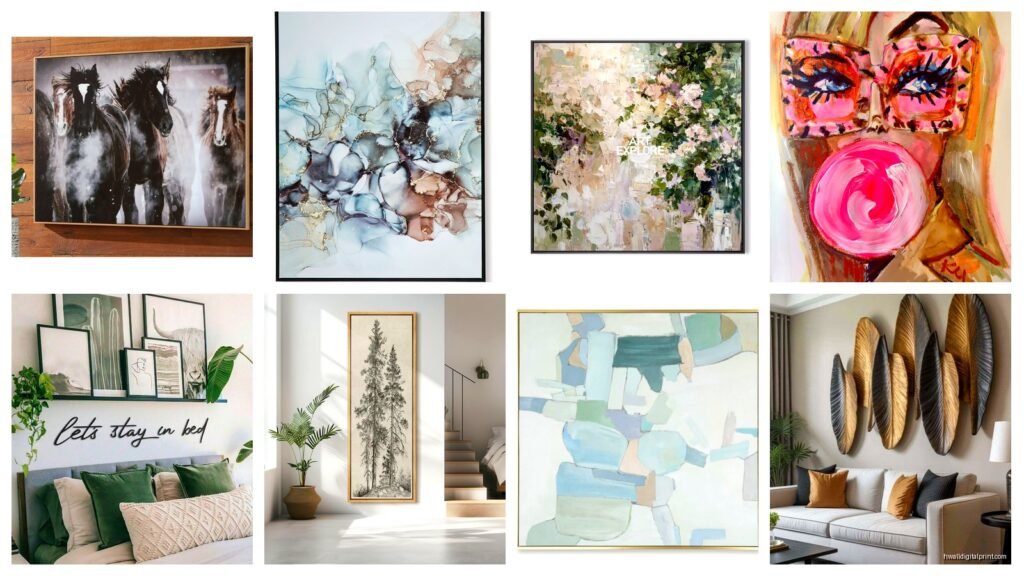
Wall Art Guide, Wall Art Tutoriels
Ashley Wall Art: Furniture Store HomeStore Collection
Feb
Okay so I literally just spent the last three weeks helping a client redo their entire living room and we went deep into Ashley’s wall art collection because she was tired of those generic HomeGoods prints everyone has. Here’s what I actually learned from hanging like 15 different pieces.
The Canvas Quality Thing Nobody Talks About
First off, Ashley’s canvas prints are actually way better than I expected? Like I’m used to furniture stores just slapping whatever cheap print they can find on particle board but these are legit stretched canvas. The Windsor Park collection especially – I hung three of those geometric pieces in my client’s dining room and the texture is really nice. You can see the actual canvas weave which makes them look less…Target clearance section if that makes sense.
The frames vary a lot though. Some come with those plastic molded frames that honestly look fine from far away but up close you’re gonna notice. The wood frames in their premium collections are actual wood which sounds obvious but you’d be surprised how many “wood” frames are just printed vinyl wrapped around foam.
Size Confusion Is Real
Their sizing is kinda all over the place and this drove me crazy last Tuesday when I was trying to plan a gallery wall. They’ll list something as a “3-piece set” but not tell you the total width until you really dig into the specs. I measured everything when it arrived and one set that said 60 inches wide was actually 68 inches when you space them properly. So like…always add 10-15% to whatever width they list if you’re doing multiple panels.
Oh and another thing – their “large” isn’t always that large? Some collections have a 40×30 as their biggest option which is actually pretty medium if you have tall ceilings. I learned this the hard way in a client’s entryway that has 12-foot ceilings and the “statement piece” looked like a postage stamp.
What’s Actually Worth Getting
The metal wall sculptures are surprisingly good. I was skeptical because metal art can go tacky real fast but their Signature Design pieces have some weight to them. Not like heavy enough to pull down drywall but substantial. There’s this one with overlapping circles that I put in a modern farmhouse kitchen and it actually elevated the whole space.
Their abstract collections rotate pretty frequently – I think every 6 months or so? Which means if you see something you love just get it because it might not be there next season. I had a client hemming and hawing over this blue and gold abstract set for two weeks and by the time she decided it was gone. We found something similar but it wasn’t the same vibe.
The Typography and Quote Art Situation
Look I’m gonna be honest the word art is hit or miss. Some of it is actually tasteful – there’s a “gather” piece in distressed wood that doesn’t make me cringe. But a lot of it is very…2015 Pinterest? You know what I mean. If you’re gonna do word art from Ashley get the ones that are more about the texture and material than the actual saying.
My dog knocked over one of the smaller framed quote prints while I was staging a bedroom and the glass didn’t shatter which was actually impressive. It’s that acrylic glazing stuff instead of real glass on most pieces under 24 inches.
Installation Tips Nobody Tells You
Okay so funny story – I’ve hung probably 200+ pieces of wall art in my career and Ashley’s hanging hardware is inconsistent. Some pieces come with those sawtooth hangers that I hate with a passion because they never hang level. Others have proper D-rings or wire which is way better for anything over 5 pounds.
Here’s what I do now: I just ignore whatever hanging method they include and add my own wire if it’s a bigger piece. Get some braided picture wire from the hardware store and attach it to D-rings about 1/3 down from the top of the frame. So much easier to level and adjust.
The multi-panel sets are the trickiest. They usually want you to space them 2-3 inches apart but I’ve found that 4 inches actually looks better in most rooms unless you have a really narrow wall. I use painters tape to map out the spacing before I commit to putting holes in the wall.
What To Skip Entirely
The really cheap printed “wood” signs that are like $29.99? Just no. I tested one in my own hallway thinking maybe I was being a snob but nope they look cheap. The print quality is fuzzy and the “distressing” is obviously fake. If you want that farmhouse sign look spend the extra $40 and get something from their better collections or honestly just go to HomeGoods.
Also their beveled mirror art can be beautiful but it shows every fingerprint and water spot. I put one in a powder room and had to windex it like every other day because you could see every single mark. Maybe fine for a bedroom but not high-traffic areas.
The Collections That Actually Work
The Uttermost stuff they carry is legitimately good quality. It’s pricier – like $200-400 per piece – but it’s actual gallery-quality art. I used three Uttermost abstracts in a luxury condo remodel and they held their own next to some expensive lighting and furniture.
Their nature photography prints are pretty solid too especially the black and white landscape ones. There’s less that can go wrong with a B&W photo print versus some of their more abstract stuff where the color reproduction matters more.
Wait I forgot to mention – the textured pieces with like hand-painted elements or dimensional details photograph terribly on their website. I almost skipped this amazing neutral abstract with gold leaf accents because it looked flat online but in person it has so much depth. If you’re near a store definitely see textured pieces in person before ordering.
Color Matching Reality Check
Their color representation online is…okay? Not great not terrible. Blues tend to photograph more teal than they actually are. I ordered what I thought was a navy abstract and it arrived definitely more on the cobalt side. Which worked out fine but could’ve been a problem.
This is gonna sound weird but I started using my phone to compare the online images to my client’s actual room colors using split screen and that’s helped a lot. It’s not perfect but better than just guessing.
The Actual Buying Strategy
Ashley runs sales constantly so like…never pay full price? I’ve been watching their wall art pricing for years and stuff goes on sale every 6-8 weeks. Usually 20-30% off. Around holidays it’s even better. I got a $300 three-panel set for $180 during a President’s Day sale which felt ridiculous but okay.
Their in-store inventory is different from online which is annoying. I’ve found pieces in the actual HomeStore that weren’t on the website and vice versa. If you have a store nearby call and ask them to check stock on specific items because their online inventory tracker isn’t always accurate.
Oh and shipping is weirdly expensive for smaller items but free over a certain amount – I think $199? So sometimes it makes sense to bundle a couple pieces together even if you don’t need them at the same time.
Mix and Match Without Looking Chaotic
You don’t have to buy matching sets even though that’s how they market everything. I pulled pieces from three different Ashley collections for one gallery wall and it worked because I stuck to a neutral color palette with black frames. The key is picking one unifying element – all warm metallics or all geometric shapes or all the same frame color.
I was watching The Great British Baking Show while planning this one gallery wall and had a breakthrough about composition being like…you need varying heights and textures but a consistent ingredient. Probably the exhaustion talking but it actually made sense as a framework.
The pre-arranged sets they sell are fine if you literally don’t want to think about it but you’re gonna pay more for the convenience and honestly most of them are boring? Like safe choices that won’t offend anyone but won’t excite anyone either.
Maintenance Stuff That Matters
Canvas prints need to be dusted regularly or they get that grimy buildup that’s impossible to remove without damaging the print. I use a microfiber cloth and very lightly go over them maybe once a month. Don’t use any cleaning products on canvas ever – I watched someone spray Windex on a canvas print once and it left permanent spots.
The metal pieces can be wiped down with a damp cloth which is nice for kitchens where grease builds up. Wood pieces really depend on the finish – some are sealed well and some absorb moisture so test in an inconspicuous spot first.
Framed prints under acrylic can be cleaned like regular glass but use something meant for acrylic because regular glass cleaner can cloud it over time. Learned that one the expensive way.