Wall Art Guide, Wall Art Tutoriels
Black and Beige Wall Art: Neutral Contrast Minimalism
Mar
So I’ve been working with black and beige wall art for like three years now and honestly it’s become my go-to when clients are terrified of color but still want their walls to not look completely dead. The contrast thing works because you’re getting drama without the commitment of actual bold colors, if that makes sense.
Why This Color Combo Actually Works in Real Spaces
Okay so here’s the thing about black and beige together – it sounds boring on paper but in practice it creates these layers that your eye actually wants to follow. I did this whole living room last spring where the client had beige walls (builder beige, the worst kind) and we added these massive black ink abstracts and suddenly the room had like… structure? The black anchors everything and the beige softens it so you don’t feel like you’re in a stark gallery.
The contrast ratio is what matters here. You want enough black to create weight but not so much that it feels heavy. I usually aim for pieces that are maybe 60% beige/cream tones and 40% black, or sometimes flip that depending on the room. My client Sarah had this tiny apartment and we went heavier on the beige with just black line work and it made the space feel bigger somehow.
Choosing the Right Pieces Without Overthinking It
You’re gonna want to start with the undertones of your beige. This is where everyone messes up including me when I first started. Not all beiges are the same – some pull pink, some pull yellow, some are gray-beige which is my personal favorite to work with. Hold your potential art piece next to your wall or furniture in natural light. If it looks off, it probably is.
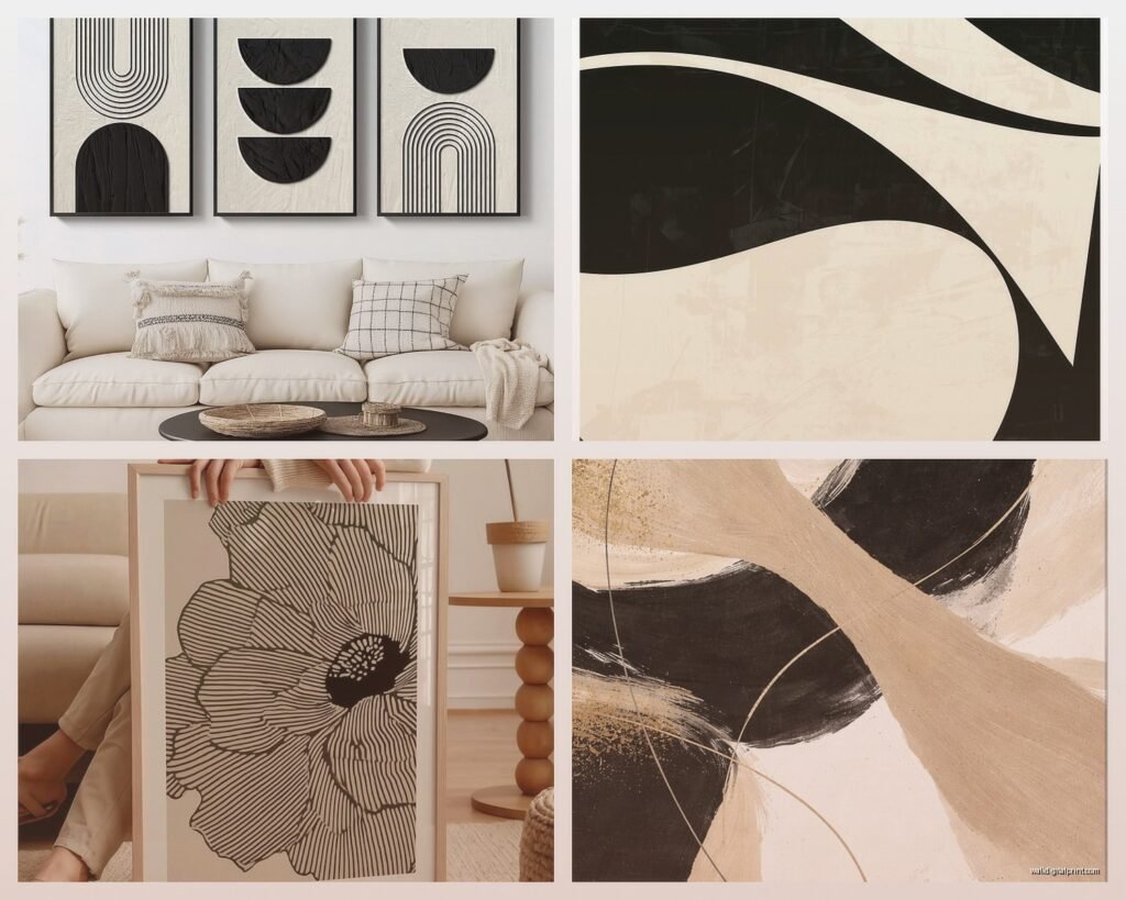
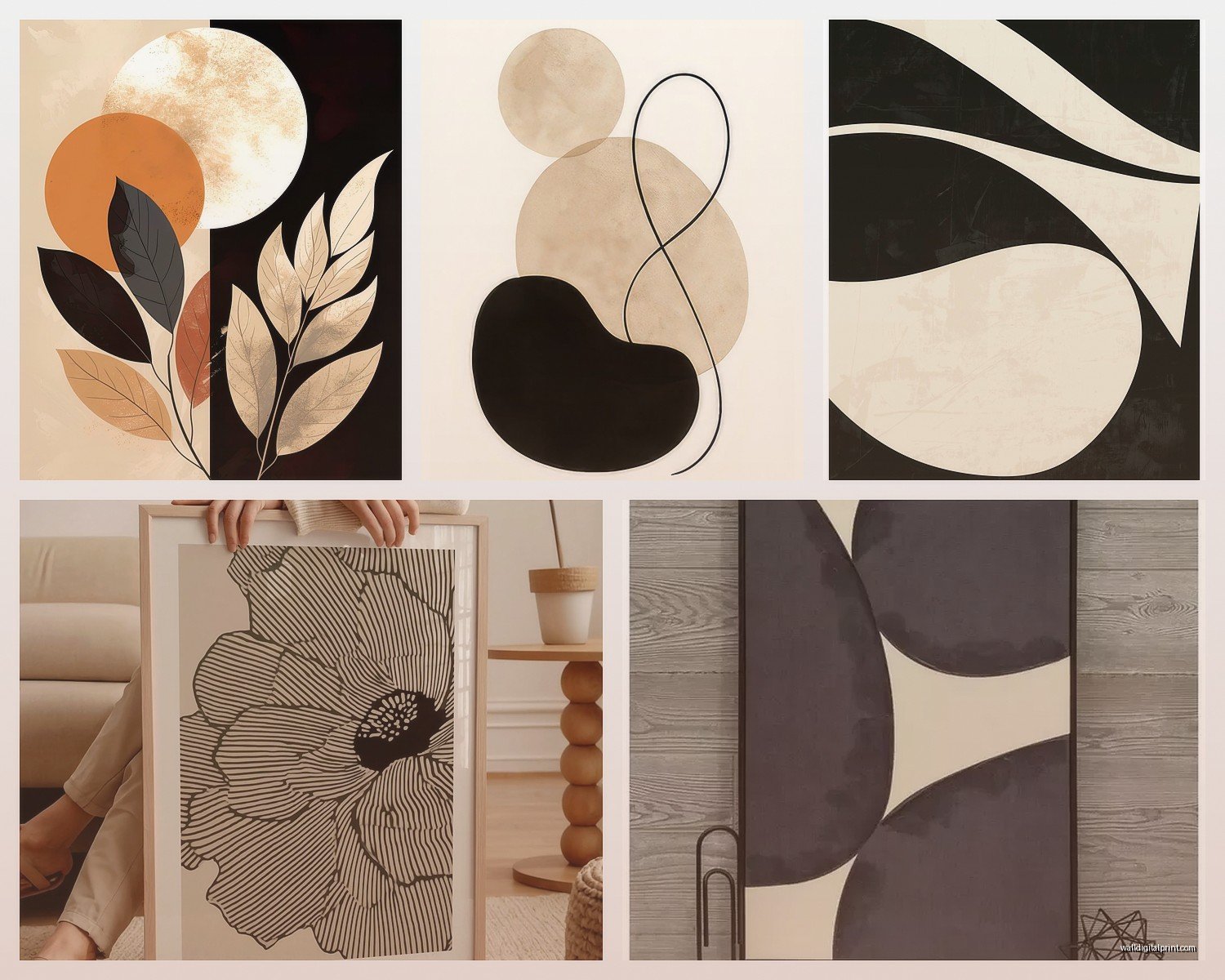
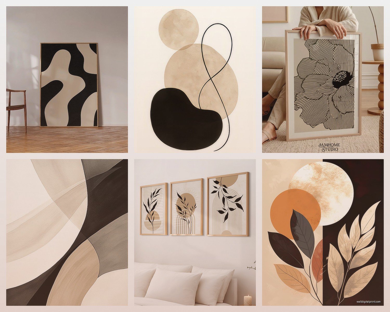
Abstract pieces are the easiest route honestly. Geometric patterns with black lines on beige backgrounds, organic shapes, those trendy arch designs everyone’s doing. I’m kinda over the arches but they do work well for this aesthetic. Line drawings work too – I found this amazing set of figure drawings last month that were just black ink on this creamy paper and they looked so much more expensive than they were.
What Actually Looks Good vs What Instagram Tells You
Instagram will show you those perfectly curated gallery walls where everything matches perfectly but lemme tell you, in real homes with real lighting that can look flat. You want variation in your blacks – some pieces with true black, some with more charcoal or dark brown tones. Same with beige – mix in some cream, some tan, maybe a piece with slight gray undertones.
I learned this the hard way when I ordered six prints that looked perfect online and when they arrived they were all the EXACT same shade of beige and it looked so matchy-matchy that my client thought I bought them as a set. We ended up keeping four and finding two different ones with warmer tones.
Texture Makes or Breaks This Whole Thing
This is gonna sound weird but the texture of your art matters almost more than the actual design. Flat prints on glossy paper read as cheap even if the design is good. You want matte finishes, canvas, textured paper, linen mounted prints. I’m obsessed with those prints on handmade paper that have the rough edges – they add so much dimension.
Oh and another thing, mixing mediums keeps it interesting. Don’t do all prints or all canvas. Throw in a framed textile piece, maybe some ink on watercolor paper, a charcoal drawing. I did a bedroom recently where we mixed a beige woven wall hanging with black abstract prints and a black and white photo and it felt collected not decorated.
Frame Choices That Don’t Ruin Everything
Black frames are the obvious choice but they can be too much sometimes. I usually do thin black frames for smaller pieces and then mix in some natural wood frames or even white frames depending on the space. My dining room actually has a mix of black and light oak frames with black and beige art and it looks intentional not confused.
No frame works too if the canvas or paper is nice enough. Those gallery-wrapped canvases or prints mounted on wood blocks are having a moment and they work perfectly for this aesthetic. Just make sure the edges are finished nicely.
Sizing and Placement Because That’s Where People Panic
The whole “art should be at eye level” thing is fine but not a hard rule. I hang things where they look right in relation to the furniture and the space. Big piece above a sofa? Yeah, center it about 6-8 inches above the sofa back. Gallery wall? I always lay it out on the floor first, take a picture, then make a paper template before putting any holes in the wall.
For black and beige specifically, you want some breathing room. These aren’t super colorful pieces that grab attention so if you crowd them they just disappear into the wall. I space gallery wall pieces about 2-3 inches apart usually. Bigger pieces can stand alone – don’t feel like you need to fill every wall.
The Big Piece vs Multiple Small Pieces Debate
One large statement piece is easier and honestly makes a bigger impact if you find the right one. I’m talking like 40×60 inches or bigger for a main living room wall. But those cost more and you’re committed to that one piece. Multiple smaller pieces (like 16×20 or 20×24) give you flexibility and you can rearrange them if you get bored.
I usually tell people to start with one medium-large piece (maybe 30×40) and then add smaller complementary pieces around it over time. You don’t have to do everything at once. My own living room took like eight months to finish because I kept finding new pieces I wanted to add.
Where to Actually Buy This Stuff
Etsy is still my go-to for downloadable prints that you can print yourself. Way cheaper and you can get exactly the size you need. I’ve found amazing black and beige abstract art from sellers who do instant downloads – you just take the file to a local print shop or use an online service. Quality varies though so check the reviews.
Wait I forgot to mention – when you’re buying prints to download, make sure they’re high resolution. You want at least 300 DPI for anything you’re printing larger than 8×10. I made the mistake once of printing a file that looked fine on screen and it came out pixelated and we had to reorder.
Local art fairs and estate sales are goldmines for original pieces. I found this incredible vintage charcoal drawing on beige paper at an estate sale for like $30 and it’s worth way more. Plus original art just has a different energy than prints, even if the prints are good designs.
Online Retailers That Don’t Suck
Minted has good quality prints and you can get them framed which saves the hassle. Society6 is hit or miss but when you find good stuff it ships fast. I’ve had good luck with Artfully Walls too, they do a lot of neutral abstract work. For budget-friendly stuff, honestly Target’s Project 62 line has some decent black and beige pieces that look more expensive than they are.
Oh and another thing – don’t sleep on custom art. I work with a few local artists who do commissioned abstract pieces and for like $200-400 you can get something unique in exactly the colors and size you need. Instagram is actually useful for finding local artists.
Styling Around Your Black and Beige Art
The art is gonna dictate your room’s vibe so everything else should support it not compete with it. I keep furniture and larger pieces neutral – beiges, tans, soft grays, natural wood. Then you can add small pops of color in pillows or plants or books but the wall art stays the focal point.
Lighting matters so much and nobody thinks about it until too late. If you have good natural light, matte finishes work great. If your room is darker, you might want pieces with some lighter beige areas to reflect light. I always add picture lights or track lighting to highlight the larger pieces – it makes them feel more important and adds ambiance at night.
What Not to Do
Don’t match your art too perfectly to your throw pillows or rug. It looks staged and boring. The art should complement the room but not blend in completely. I had a client who bought beige art to match her beige sofa and beige walls and it just disappeared. We added pieces with more black contrast and suddenly the room had depth.
Also don’t go too literal with subject matter. Abstract and minimal works better for this aesthetic than like, a black and beige photograph of a specific thing. Keep it interpretive so it works with different moods and seasons. My cat knocked over a plant onto one of my beach photos once which made me rearrange everything and I realized the abstract pieces were way more versatile anyway.
Mixing Black and Beige with Other Colors
This palette plays well with almost everything if you’re strategic. Warm terracotta or rust tones look amazing with black and beige – very earthy and organic. Deep greens work too, brings in that nature element. I did a bedroom with black and beige art and added emerald green velvet pillows and it was *chef’s kiss*.
Metallics are your friend here. Gold or brass frames, copper accents, even silver can work if your beige leans cooler. The metallics add just enough shine to keep things from feeling flat. I’m personally loving warm brass with this color scheme lately.
If you want more color, use the 80-20 rule. Keep 80% of the room in the black/beige/neutral zone and add 20% of a bolder color through accessories. Burnt orange, navy, deep red – they all work as accent colors without overwhelming the minimalist vibe you’ve got going with the wall art.
Switching Things Up Seasonally
The cool thing about keeping your main art neutral is you can change the room’s vibe with accessories. Fall comes and I swap in warmer textiles and maybe add some amber glass. Summer I lighten everything up with whites and natural textures. The black and beige art anchors it all but doesn’t lock you into one specific season or mood.
Okay so funny story – I was watching The White Lotus while arranging a client’s gallery wall last month and got so distracted I hung three pieces before realizing I hadn’t measured anything. Luckily they ended up looking fine but definitely measure and plan first unlike me.
The main thing with black and beige wall art is trusting that “neutral” doesn’t mean boring. The contrast creates interest, the minimalism feels intentional and calm, and you have so much flexibility with how you style around it. Start with one piece you really love and build from there. Don’t rush it and don’t overthink it – sometimes the best rooms come together over time as you find pieces that speak to you.