Wall Art Guide, Wall Art Tutoriels
Black and Cream Wall Art: Neutral Elegant Contrast
Mar
So I’ve been obsessing over black and cream wall art for like three months now because honestly, every beige room I walk into desperately needs something with actual contrast but clients get scared of bold color. This combo though? It’s the sweet spot.
Why This Color Combo Actually Works
Okay so the thing about black and cream is it gives you drama without committing to like, a whole burgundy accent wall situation. I had this client last month who kept saying she wanted “interest” but vetoed every colorful piece I showed her. Brought in three black and cream prints and suddenly she’s ready to buy five of them. The cream keeps it soft enough that it doesn’t feel stark or cold, but the black gives your eye somewhere to actually land instead of just floating around in beige soup.
And here’s what I’ve noticed after styling probably 30+ rooms with this palette—it photographs SO well. Like if you’re ever gonna post your living room on Instagram (no judgment, I do it constantly), black and cream art makes everything look more expensive and intentional.
Where to Actually Put These Pieces
Living rooms are the obvious choice but wait I forgot to mention—your bedroom is actually the best place to start. I tested this in my own space first because my bedroom was giving absolutely nothing, just gray walls and white bedding. Hung a large black and cream abstract piece above the headboard and suddenly the whole room felt like it belonged in a boutique hotel instead of looking like I just moved in (I’ve lived there four years lol).
Hallways need this treatment too. Long narrow hallways are where I always do a gallery wall of smaller black and cream pieces, maybe 4-6 prints in matching black frames. Creates this really cool rhythm as you walk through. Oh and another thing—above consoles or credenzas in your entryway. You want something that makes an impression when people walk in but doesn’t overwhelm, and this color scheme nails that balance.
The Kitchen Situation
This is gonna sound weird but black and cream art in kitchens is really having a moment. Not like directly over your stove obviously, but on that awkward wall next to the fridge? Or in a breakfast nook? I hung some vintage-style black and cream botanical prints in my own kitchen area and it ties together the black cabinet hardware with the cream subway tile in a way I didn’t even plan.
Choosing the Right Style for Your Space
So there’s basically a few categories I always work with, and honestly which one you pick depends more on your existing furniture than your personal taste (sorry but it’s true).
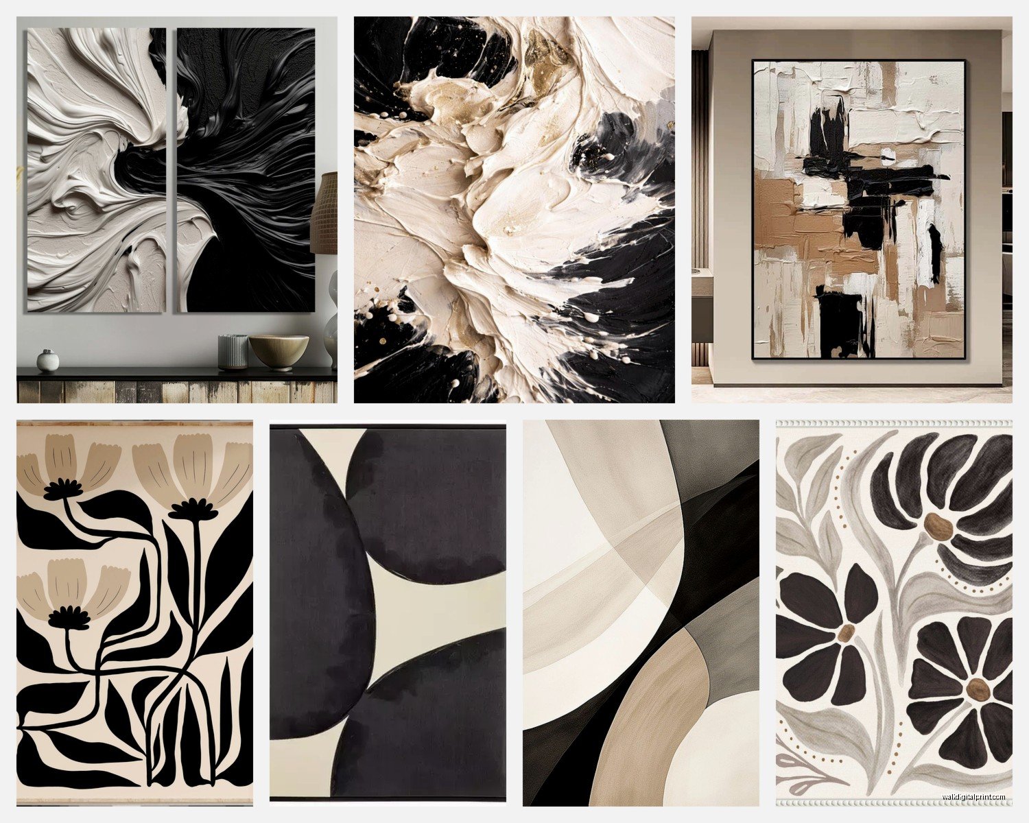
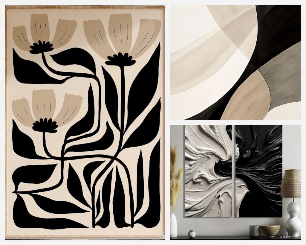
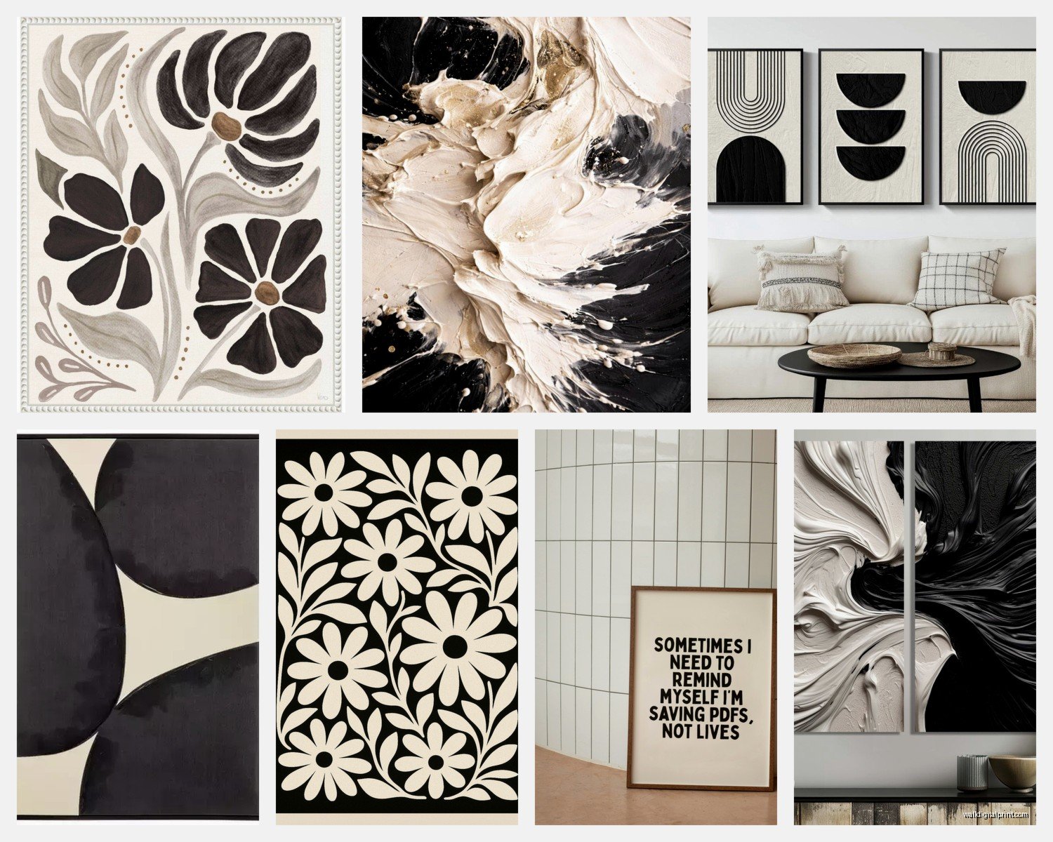
Abstract and Geometric
If you’ve got modern or contemporary furniture—clean lines, minimal details—you want abstract black and cream pieces. Think bold brushstrokes, geometric shapes, maybe some line drawings. I’m currently obsessed with those minimalist face line drawings in black on cream backgrounds. They’re everywhere right now but they actually work really well in spaces that might otherwise feel too cold.
The key is scale here. Don’t get a tiny 8×10 abstract print for a huge wall, it’ll just disappear. I learned this the hard way in a client’s loft where we had to return like three pieces before getting something large enough to hold the space.
Botanical and Natural Prints
For traditional or transitional spaces (you know, the style that’s like “I want it classic but not grandma”), botanical prints in black and cream are perfect. Vintage-style ferns, leaves, wildflowers rendered in black ink on cream paper. These have this timeless quality that makes them feel collected rather than just bought all at once from HomeGoods.
I actually found some of my favorite ones at estate sales and just had them professionally framed with cream matting and black frames. Cost more than buying new prints honestly but the paper quality is so much better.
Typography and Text-Based Art
Okay so funny story—I used to think text art was super cheesy, like “Live Laugh Love” vibes. But then I discovered vintage typography prints and manuscript-style pieces in black and cream and completely changed my mind. They work amazing in home offices or reading nooks. Just make sure the text is either actually meaningful or purely decorative/illegible, nothing in between. The in-between is where it gets tacky.
Frame Choices That Don’t Suck
You gotta match your frames to your hardware and light fixtures, this is non-negotiable. If you have brushed nickel or chrome finishes, black frames can sometimes feel too heavy. I’d actually go with a dark charcoal gray frame instead, or even a thin black frame with a metallic inner edge.
For spaces with black hardware, matte black frames all the way. And here’s a trick—use cream or off-white matting even if the artwork already has a cream background. That extra border makes such a difference in how finished it looks. My dog knocked over one of my framed pieces last week (long story, there was a squirrel involved) and when I was getting it reframed I switched from no mat to a cream mat and it’s like night and day.
Gallery Wall vs Single Statement Piece
I go back and forth on this constantly. Gallery walls give you more flexibility and you can mix in other neutral tones—taupe, gray, even a tiny bit of gold. But they’re also way more work to hang properly and honestly most people don’t get the spacing right.
Single large statement pieces are easier and often more impactful. I’m talking like 40×60 inches or larger for a big wall. Smaller walls can do 24×36. Just center it properly and you’re done. I spent an entire Saturday once hanging a gallery wall in my client’s dining room, spacing everything with painter’s tape first, and at the end she was like “I think I like the single large piece better.” We started over.
Mixing Textures and Mediums
So this is where it gets interesting—you don’t have to stick with just prints. I’ve been mixing in black and cream woven wall hangings, ceramic pieces, even black sculptural elements next to cream paintings. The variety in texture keeps it from feeling flat.
Canvas prints vs framed paper prints is another thing. Canvas gives you more casual relaxed energy, works better in family rooms and bedrooms. Framed prints under glass feel more formal and collected, better for dining rooms and entryways. I usually have both in the same house just in different rooms.
What Actually Makes It Look Expensive
Okay real talk—the difference between black and cream art that looks expensive vs cheap is usually the paper quality and the depth of the black. I ordered a bunch of prints from different online retailers to compare (my client canceled so I spent an hour comparing them all spread out on my living room floor while watching that new Netflix show), and the cheap ones have this grayish black that looks washed out. The good ones have rich, deep black that actually contrasts with the cream.
Also cream vs stark white backgrounds matter more than you’d think. True cream or ivory backgrounds feel warmer and more sophisticated. Bright white with black can veer into too graphic, almost corporate looking unless that’s specifically your vibe.
Lighting Makes or Breaks It
You need proper lighting on these pieces or the contrast doesn’t read properly. I always recommend picture lights for really important pieces, or at minimum make sure you have good ambient lighting in the room. Warm LED bulbs around 2700K show the cream tones better than cool white bulbs which can make everything look washed out.
Oh and another thing—avoid hanging black and cream art directly across from windows where it’ll get constant bright light. The blacks will fade over time and you’ll end up with black and cream and weird brown situation.
Rooms Where This Combo Struggles
Gonna be honest, there are some spaces where I don’t reach for black and cream. Really small powder rooms can feel too dramatic—sometimes you want those to be lighter and brighter. And if you already have a lot of black furniture, adding black art can make the whole space feel heavy. In those cases I’d do cream art with maybe just touches of black in the frame or subtle details.
Also kids’ rooms usually need more color and playfulness, though I did do a sophisticated nursery once with black and cream animal prints that turned out really beautiful. But that’s more the exception.
Budget-Friendly Sources That Don’t Look Cheap
Printable art on Etsy is honestly great if you get it printed properly. Don’t use your home printer, take the files to a professional print shop and get them printed on quality paper. Then frame them yourself with frames from Target or IKEA but upgrade the matting to museum-quality cream mat board. The mat is what people actually notice.
Estate sales and antique stores for vintage prints and drawings. Thrift stores sometimes have good pieces but you gotta dig. I found an amazing set of vintage botanical prints at an estate sale for like $20 total, spent $200 framing them properly, and they look like they cost $500.
For original art if you have more budget, local art fairs and student shows at art schools. Young artists working in black and cream are everywhere right now and their prices are actually reasonable. Plus you get an actual original piece which is cool to talk about when people ask about your art.