Wall Art Guide, Wall Art Tutoriels
Black and Gold Wall Art: Elegant Luxury Contrast Decor
Feb
So I’ve been obsessing over black and gold wall art lately because honestly it’s one of those combinations that can either look incredibly sophisticated or completely tacky and there’s like zero middle ground. Last month I redid my own living room with this theme and also just finished a client’s dining room where we went heavy on the metallic accents and I learned SO much about what actually works versus what just looks good in Instagram photos.
Why This Color Combo Is Trickier Than You Think
Okay so first thing – the gold tone matters way more than anyone tells you. I bought three different pieces from different sellers on Etsy and when they arrived the golds were completely different shades. One was like brassy yellow gold, another was rose gold (which wasn’t mentioned anywhere), and the third was this perfect champagne gold that actually worked. You gotta ask sellers specifically about the gold tone before buying because “gold” means literally nothing.
The black matters too but it’s more forgiving. Matte black, glossy black, charcoal – they all kinda work depending on your space. I personally love matte black with shiny gold because the contrast in texture is where the magic happens, not just the color contrast.
Where to Actually Place These Pieces
This is gonna sound weird but the worst place for black and gold art is actually where most people put it – right above a black leather couch. I did this in my first apartment and it just disappeared into the furniture. The whole point of this combo is contrast so you need it against lighter walls or at least in a spot where there’s enough breathing room.
I’ve had the most success with:
- White or cream walls (obviously the safest bet)
- Light gray walls – this is actually my favorite because it makes the gold look richer
- Blush pink or dusty rose walls if you’re going for that feminine luxe vibe
- Navy walls but ONLY if you have tons of natural light otherwise it’s too dark
My client last week had sage green walls and we tested a black and gold abstract piece and honestly it looked amazing? I wouldn’t have predicted it but the warm gold pulled out these undertones in the green that were really pretty.
Size and Scale – Don’t Be Timid
So here’s where I see people mess up all the time. They buy these tiny 16×20 pieces and wonder why their room doesn’t feel elevated or luxurious. Black and gold art needs to make a STATEMENT or it just looks like you bought something random at HomeGoods (no shade to HomeGoods, I buy plenty there).
For above a couch or bed you want minimum 40 inches wide. I actually prefer going bigger – like 48 to 60 inches. Or do a gallery wall but commit to at least 5-7 pieces so it feels intentional.
Oh and another thing – if you’re doing a single large piece, the ratio matters. Horizontal pieces work better in most spaces because they echo the lines of furniture. Vertical pieces can work in entryways or narrow walls but they’re trickier to style around.
My Living Room Test Results
I tried four different arrangements in my own space which is about 14×16 feet with 9 foot ceilings. Started with three 24×24 square pieces in a row – looked okay but felt choppy. Then tried one massive 60×40 horizontal abstract with gold leaf details and that was the winner. The third option was a gallery wall with mixed sizes and that actually worked too but required way more planning and nail holes.
Abstract vs Figurative vs Geometric
This depends so much on your existing decor but let me break down what I’ve noticed:
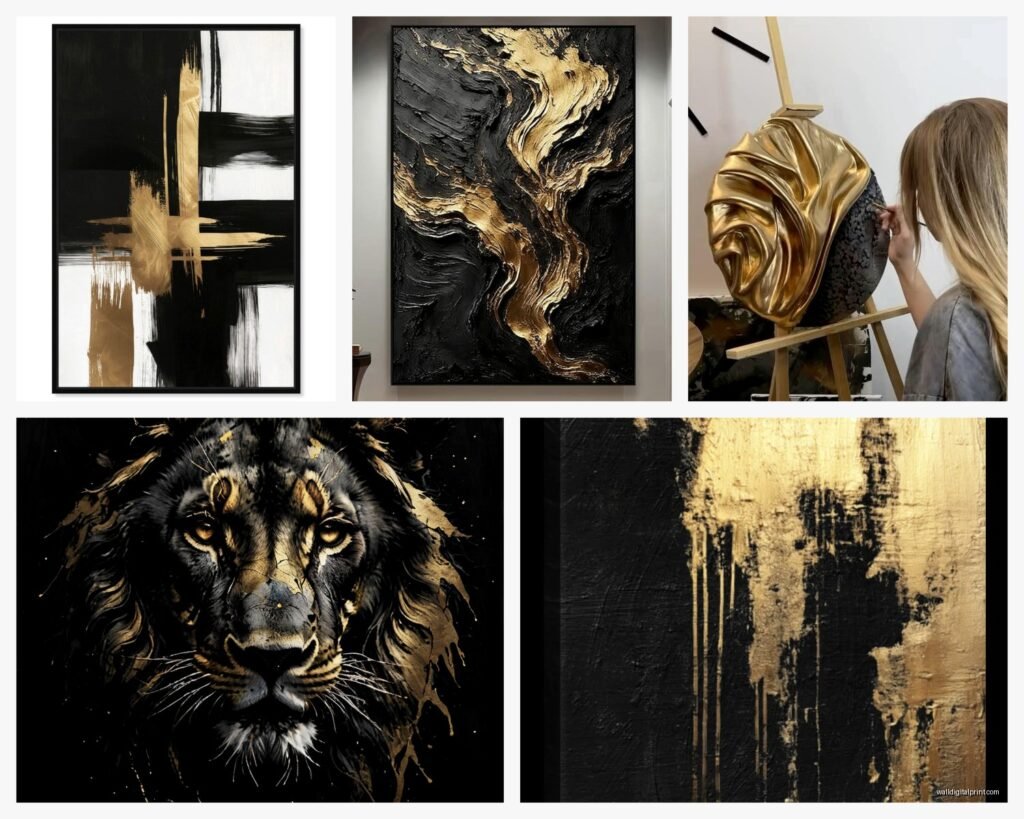
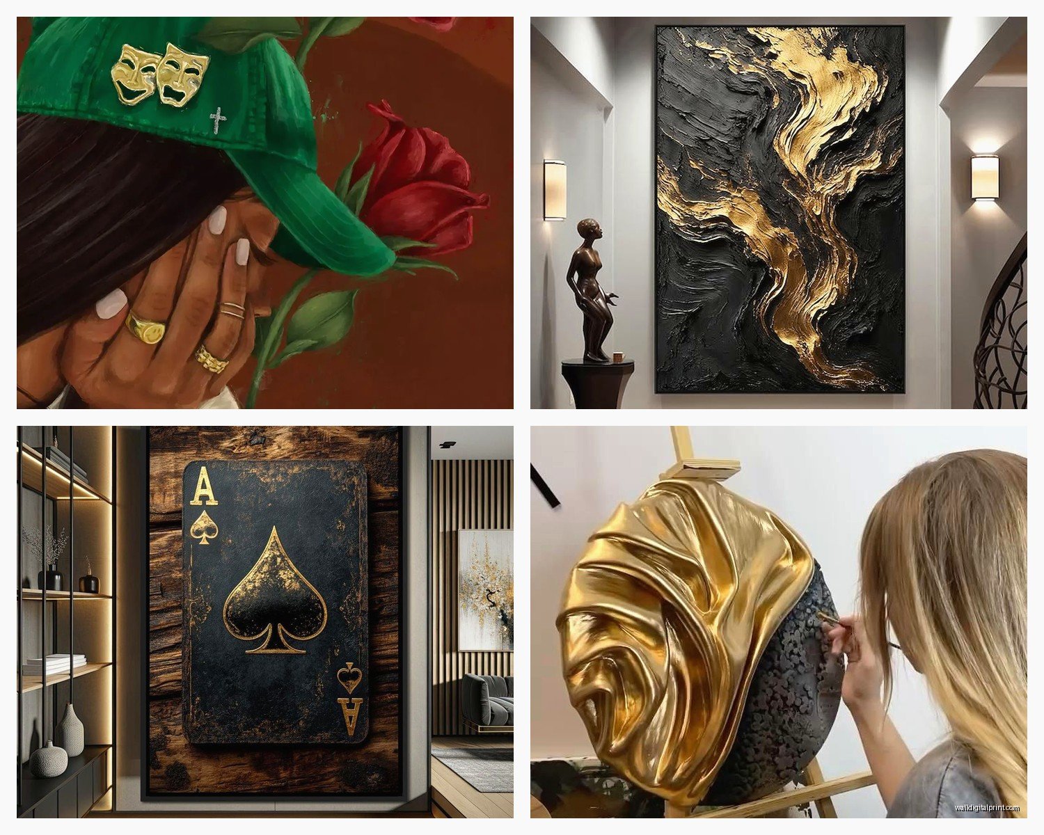
Abstract black and gold: This is your safest bet honestly. Swirls, brushstrokes, fluid art, gold leaf accents – all of this works in most spaces. It reads as expensive without being too specific style-wise. I have this one piece that’s mostly black with gold “veins” running through it like marble and everyone who comes over asks where I got it.
Geometric patterns: Think hexagons, art deco lines, circles, chevrons. These work amazing in modern or contemporary spaces. I used geometric black and gold pieces in a client’s home office and it felt sharp and professional. But if your space is more traditional or eclectic this might feel too rigid.
Figurative stuff: Like silhouettes, faces, animals, etc. This is where things get risky. I saw this gorgeous black silhouette of a woman with gold leaf hair and I almost bought it but then realized I’d probably get sick of looking at the same face every day? If you go figurative just make sure it’s something you genuinely connect with not just something that looks cool.
Framing Decisions That Actually Matter
Wait I forgot to mention earlier – the frame can completely change the vibe. Black frame keeps it cohesive and modern. Gold frame can look incredible but it’s easy to tip into gaudy territory. I usually recommend a thin gold frame if you’re gonna go that route, not those thick ornate ones unless your whole space is glam maximalist.
My favorite trick though? No frame at all. Canvas wraps where the art continues around the edges look so much more expensive and contemporary. Just make sure the sides are finished nicely – I bought one piece where the sides were just stapled canvas and it looked unfinished.
Floating frames are having a moment too and they work great with black and gold art because they add another layer of dimension. There’s this one in my hallway that has a 2-inch gap between the canvas and the frame and people always comment on it.
Mixing Metals and Not Looking Confused
Okay so funny story – I used to think you couldn’t mix gold and silver in the same room but that’s totally outdated. If you have black and gold art you can absolutely have silver picture frames or chrome lighting fixtures elsewhere. The key is that the black acts as a neutral that ties everything together.
I do recommend keeping your OTHER metallics to a minimum though. Like if you have black and gold art, maybe your throw pillows have some gold embroidery and your coffee table has gold legs but don’t also add copper and bronze and rose gold everywhere. Pick gold as your main metallic and let one other metal be an accent.
My Current Setup
In my living room I have the big black and gold abstract piece, gold curtain rods, one silver mercury glass vase (because I love it and refuse to get rid of it), and chrome cabinet hardware. It all works because the black in the art is repeated in my black window frames and black legs on my chairs. Everything connects.
Lighting Is Half the Battle
This is so important and nobody talks about it – gold only looks luxe when it catches light properly. I installed picture lights above two of my black and gold pieces and the difference is incredible. The gold literally shimmers when it’s lit correctly.
If you can’t do picture lights (renters I see you), try positioning your art across from windows so natural light hits it during the day. Or use track lighting or even a well-placed floor lamp that angles toward the wall.
My client had this beautiful gold leaf piece that looked kinda flat until we added an LED picture light and suddenly it looked like a gallery piece. Worth the extra $40 honestly.
DIY Options If You’re On a Budget
Look I’m gonna be real – black and gold art can be expensive especially if you want something original or high quality. But there are workarounds.
I made my own piece last year using a canvas from Michael’s, black acrylic paint, and gold leaf sheets. Took me maybe 3 hours including drying time and cost under $50. You literally just paint the canvas black, let it dry completely (don’t rush this or the gold won’t stick right), then use adhesive and apply gold leaf in whatever pattern you want. I did random torn pieces for a modern abstract look.
You can also buy printable art on Etsy for like $5-10, download it, and get it printed at FedEx or a local print shop on nice cardstock or photo paper. Then frame it yourself. I’ve done this multiple times for clients who need to fill a lot of wall space without spending thousands.
Oh and thrift stores sometimes have great frames that you can spray paint gold and put your own art in. Just use primer first so the paint actually sticks.
What to Avoid – Lessons From My Mistakes
Don’t buy anything that says “glitter” unless you want glitter falling off for the next decade. I learned this the hard way with a piece I bought for my entryway – looked amazing for like two weeks then started shedding gold glitter everywhere. My dog tracked it through the whole house.
Avoid super trendy phrases or words in gold lettering on black backgrounds. I see these everywhere – “But first, champagne” or “Live Laugh Love” in gold script. They date your space immediately and you’ll get tired of reading the same phrase every day.
Don’t match your black and gold art too perfectly to your other black and gold decor. Like if you have a black and gold geometric pillow, don’t get black and gold geometric art. Mix the patterns and styles so it feels collected not matchy-matchy.
Seasonal Flexibility
One thing I love about this color combo is you can style it differently throughout the year. In winter I add white and cream accents around my black and gold art – white vases, cream throws, maybe some silver. In summer I’ll add greenery and natural wood tones to keep it from feeling heavy.
Actually right now I have this fiddle leaf fig next to my main piece and the green against the black and gold is *chef’s kiss*. Plants are your friend with this color scheme because they add life to what could otherwise feel cold.
Where to Shop – My Actual Sources
West Elm has some great options but they’re pricey. I only buy there during sales. Their abstract black and gold pieces are usually good quality though and the gold is typically a nice warm tone not brassy.
Etsy is hit or miss – you can find amazing original pieces and also total garbage. Always read reviews and look at customer photos not just the listing photos. I’ve found some of my favorite pieces on Etsy from small artists who do custom sizes.
Wayfair has budget options but the quality is variable. Good for if you need something temporarily or if you’re just testing out the style.
HomeGoods and TJ Maxx are actually solid for this if you’re patient and check regularly. I’ve scored some beautiful black and gold pieces there for under $50. You just gotta go often because inventory changes constantly.
For prints – minted.com has gorgeous options and they often have sales. The quality is consistently good and they have tons of size options.
Styling the Rest of the Wall/Room
Don’t just hang the art and call it done. I like to layer in other elements – maybe a black console table underneath with gold hardware, or floating shelves with a mix of black and gold objects.
Mirrors with gold frames near black and gold art = always a good move. They reflect light and make the space feel bigger plus they echo the metallic without being repetitive.
If you’re doing a gallery wall, mix in some black and white photography with your black and gold pieces. The variety keeps it interesting and the black and white acts as a visual rest for your eyes.
Texture texture texture – this is key. If your art is smooth and glossy, add something matte nearby. If it’s all flat, add something dimensional like a woven wall hanging or a sculptural object.
I’m watching The Bear while I write this and just remembered – my client last month wanted black and gold art in her kitchen and we found this perfect abstract piece that had both but also hints of white. The white helped it feel less formal and more livable for a kitchen space. So yeah if you’re putting this in a casual room consider pieces that incorporate a third neutral color.
Maintenance and Long-Term Care
Dust your art regularly especially if it has any texture or dimension. I use a microfiber cloth or a duster with a long handle. Don’t use any cleaning products on gold leaf – it’ll damage it.
Keep black and gold art out of direct harsh sunlight because the black can actually fade to a weird charcoal gray over time. I learned this from a piece I had in my old apartment – it was next to a west-facing window and after two years one side was noticeably lighter.
If you have canvas pieces, don’t hang them in humid rooms like bathrooms. The canvas can warp or develop mold. Learned that one the hard way too – had a small black and gold piece in my powder room and it started getting wavy around the edges.
Actually another random tip – take photos of your wall art setup from different angles and at different times of day. Sometimes what looks perfect at noon looks totally different at night with artificial lighting and you might need to adjust your lighting or even the placement. I do this with every client install now because I got burned once when a client texted me a week later saying the art looked completely different at night than when I styled it during the day.