Wall Art Guide, Wall Art Tutoriels
Black and Silver Wall Art: Dark Metallic Elegant Contrast
Mar
So I’ve been working with black and silver wall art for like three years now and honestly it’s one of those color combos that looks SO easy until you actually try to hang it in a room and realize you’ve created either a gorgeous sophisticated space or accidentally made everything look like a goth teenager’s bedroom from 2006.
Why This Combo Works (When It Works)
The thing about black and silver is that you’re essentially working with neutrals BUT they’re dramatic neutrals which sounds like an oxymoron but just go with me here. Silver reflects light in this really specific way that makes black look richer instead of just… dark and depressing. I had this client last month who bought this massive black and silver abstract piece and stuck it in her basement office with terrible lighting and it just looked like a black hole on the wall. We moved it upstairs near a window and suddenly it was this whole elegant focal point situation.
Black absorbs light, silver bounces it around. That’s literally the entire secret to making this work. You need BOTH things happening in the same space or it falls flat.
The Lighting Thing Nobody Tells You
Okay so this is gonna sound weirdly specific but the type of lightbulbs you have will make or break black and silver art. I learned this the hard way when I hung this gorgeous silver leaf piece in my own dining room and it looked completely different at night because I had warm Edison bulbs that made the silver look like…gold? brass? something definitely not silver.
Here’s what actually works:
- Daylight bulbs (5000K-6500K) make silver look crisp and actually silver
- Cool white (4000K-5000K) works if you want slightly softer but still shows the contrast
- Warm white (2700K-3000K) is gonna muddy everything unless that’s specifically the vibe you want
- Natural light is obviously ideal but position matters – direct harsh sunlight can wash out silver completely
I actually keep a few different bulbs in my storage closet now because I got tired of doing test hangs only to realize the lighting was sabotaging everything. My dog knocked over my lamp during one of these tests and I just left it because honestly the floor lighting was showing me problems I hadn’t noticed before.
Wall Colors That Don’t Fight With Black and Silver
This is where people mess up constantly. They think black and silver are neutral so they’ll go with ANY wall color and then wonder why it looks off.
Best backgrounds I’ve tested:
- White walls – classic, clean, lets the contrast do its thing
- Light gray (especially blue-grays) – sophisticated without competing
- Deep charcoal – sounds counterintuitive but the silver POPS against dark walls
- Navy blue – weirdly works better than you’d think, very masculine elegant vibe
- Pale blush or beige – if you need warmth but still want the drama
Colors that made me want to cry and start over:
- Bright white with cool undertones – makes everything look sterile like a dentist office
- Yellow-based beiges – fight with the silver, makes black look brownish
- Sage green – I really wanted this to work for a client but it just looked muddy
- Red walls – just no unless you’re going for a very specific maximalist thing
Finishes and Textures Matter More Than You Think
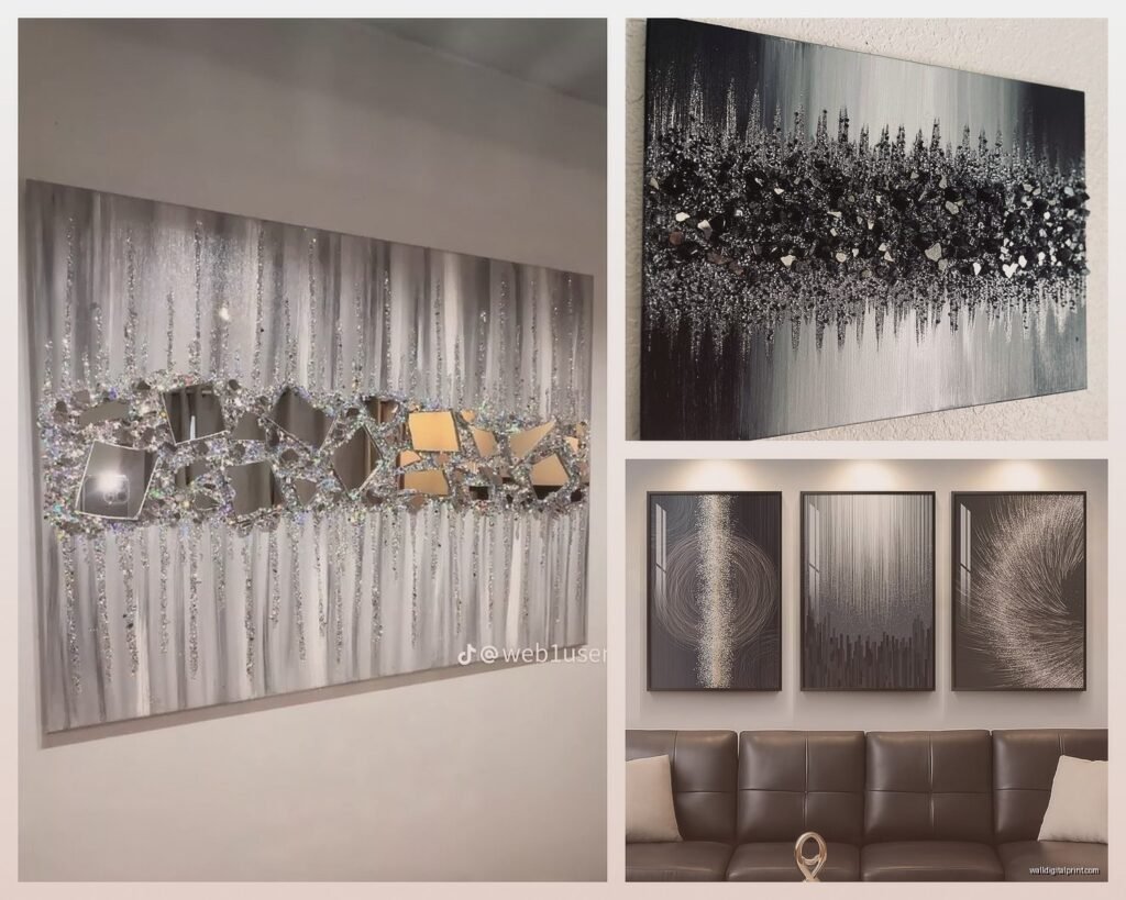
Not all silver is created equal and this is something I didn’t understand until I had like eight different “silver” pieces in my studio and realized they all looked completely different.
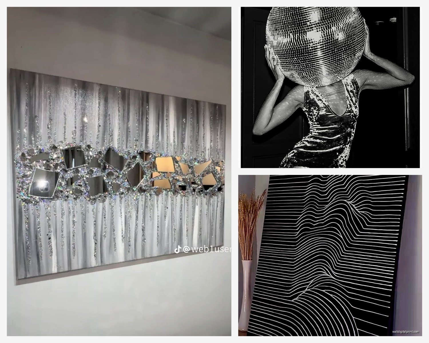
Glossy silver is super reflective, almost mirror-like. It’s dramatic but can be overwhelming in small spaces or if you have a lot of windows. I used a high-gloss silver abstract in a client’s entryway and it literally reflected the door opening which was cool but also kinda disorienting?
Brushed or satin silver is more subtle, gives you that metallic vibe without the intense reflection. This is usually my go-to recommendation because it works in more situations. Less finicky about lighting and wall colors.
Antiqued or tarnished silver adds warmth and works better with traditional decor. If you’re trying to mix black and silver art into a space that has warmer metals like brass or gold, this finish bridges the gap better.
oh and another thing – matte black versus glossy black in the art itself changes everything. Matte black is sophisticated and modern, absorbs light completely. Glossy black has subtle reflections that can add depth but also shows every fingerprint if it’s behind glass.
Size and Scale Guidelines
So I’ve hung probably 200+ pieces of black and silver art at this point and here’s what I’ve figured out about sizing…
Small pieces (under 20 inches) work best in groupings. A single small black and silver piece on a big wall just looks lonely and lost. I did a gallery wall last week with seven small pieces – mix of photographs, small abstracts, one silver leaf print – and the collective impact was way better than trying to make one piece work.
Medium pieces (20-40 inches) are the sweet spot for most residential spaces. Big enough to make a statement, not so big that they overwhelm. These work over furniture, in hallways, basically anywhere you need a focal point without going dramatic.
Large pieces (40+ inches) need space to breathe. I had this huge black and silver geometric piece that a client bought before calling me and she’d hung it in a narrow hallway and it was just…too much. We moved it to her living room with like 8 feet of viewing distance and suddenly it made sense.
The old rule about art being 2/3 the width of furniture below it? Still applies but with black and silver I actually go slightly bigger because the high contrast makes pieces feel a bit smaller than they are visually. Like your eye gets drawn to the contrast so aggressively that it compresses the perceived size? I dunno if that makes sense but it’s what I’ve observed.
Mixing Metals Without Looking Confused
Okay so this is where it gets tricky because silver is a metal and if you have other metals in the room you need a strategy or it looks like you just bought random stuff from different stores and called it a day.
Silver plays nicely with:
- Chrome and stainless steel – obviously, they’re basically the same family
- Crystal and glass – adds to that reflective elegant vibe
- White or black metals – keeps everything in the cool-toned neutral family
- Mirrors with silver frames – doubles down on the reflective quality in a good way
Silver gets weird with:
- Warm brass – too much temperature contrast unless you’re really intentional
- Copper – they just fight, I’ve tried so many times
- Gold – CAN work if you use brushed silver and brushed gold, but shiny versions together look like you couldn’t decide
My trick is to pick one dominant metal (silver from the art) and let other metals be accent pieces. Like if you have a gold lamp, fine, but don’t also add gold frames and gold hardware and gold accessories. The black and silver art should be the star.
Styles and Subjects That Work Best
I’ve tested this color combo across pretty much every art style and some definitely work better than others…
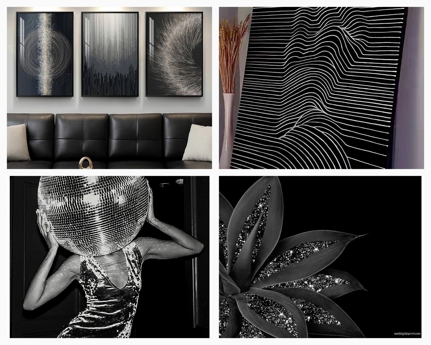
Abstract geometric – probably the most popular and for good reason. The clean lines of geometric art match the sleek modern vibe of black and silver. I’m watching this documentary about Bauhaus while writing this which is ironic timing but anyway geometric just WORKS with these colors.
Photography – especially architectural photography or nature shots with high contrast. Black and white photos with silver frames are kind of a cop-out but effective. I prefer actual silver elements IN the photograph though, like city skylines at night or water reflections.
Botanical prints – surprisingly good? I did a client’s bedroom with black and silver fern prints and it was this whole modern organic thing that shouldn’t have worked but totally did. The key is high contrast botanical silhouettes not soft watercolor florals.
Typography and quotes – can work if you’re into that but tends to skew more office/commercial than residential elegant. I have feelings about word art but that’s a whole other conversation.
Landscape art – harder to pull off because landscapes usually need color to feel impactful. Black and silver landscapes can feel a bit flat unless there’s really interesting texture or composition.
Figurative/portraits – hit or miss. Very dramatic when done well but can look unintentionally gothic if the subject matter is too serious. I had a client obsessed with black and silver portrait art and her whole house felt like a Tim Burton movie which was fine because that’s what she wanted but it’s not for everyone.
Texture Combinations in the Room
So here’s something I didn’t understand for way too long – black and silver art is already visually “hard” with the metal and the dark color, so you gotta balance it with softer textures in the room or everything feels cold and uninviting.
Add these textures to warm it up:
- Velvet or plush fabrics – pillows, throws, upholstery
- Wool rugs – the texture adds necessary warmth
- Linen curtains – softens the metallic without adding competing colors
- Wood elements – especially lighter woods or black wood, adds organic warmth
- Plants – always, but especially with black and silver because you need the life
I did a living room last year that was heavy on black and silver art and we added a cream boucle sofa and suddenly it went from “cold modern” to “sophisticated modern” and the only difference was that one texture element.
Common Mistakes I See Constantly
Too much pattern mixing. Black and silver art is already high contrast which reads as visual pattern even if it’s abstract. If you then add patterned pillows and patterned rugs and patterned curtains it’s just chaos. Keep surrounding patterns minimal.
Hanging it too high. I don’t know why but people see dramatic art and think it needs to be up high? Art should be at eye level which is like 57-60 inches to the center of the piece. Black and silver art doesn’t get special height privileges.
Not considering the backing/matting. If your black and silver art is framed, the mat color matters SO much. White mats can work but sometimes they’re too stark. I usually go with light gray or even black mats depending on the piece. My client last week had silver mats custom cut and honestly it was gorgeous but expensive.
Forgetting about glare. Glass-covered black and silver art can have serious glare issues because of the reflective silver elements. I’ve started recommending museum glass for pieces that are going in spots with tricky lighting. Regular glass just bounces light everywhere.
Trying to make it work in traditionally decorated spaces without transition pieces. If your whole house is farmhouse rustic with warm woods and soft colors, one piece of black and silver abstract art is gonna look like it fell through a portal from another dimension. You need bridge elements – maybe start with black frames on existing art, add some metal accessories, then introduce the black and silver piece.
Room-Specific Tips That Actually Work
Living Rooms
This is where most people want to put their statement black and silver pieces and honestly it usually works. Living rooms typically have the best lighting and the most space to create a full design story.
I always put the art on the wall you see when you first walk in – that immediate impact is what black and silver does best. Over the sofa is classic but make sure you have enough space above the furniture. I like at least 6-8 inches between the sofa back and the bottom of the frame.
If you’re doing a gallery wall of black and silver pieces in the living room, keep spacing consistent – I use 2-3 inches between frames. Uneven spacing with high-contrast art looks sloppy instead of curated.
Bedrooms
People get nervous about black and silver in bedrooms because they think it’ll be too cold or harsh but actually it can be super sophisticated and calming. The trick is balancing it with soft textiles and warm lighting.
I prefer black and silver art above the bed or on the wall opposite the bed so you see it but it’s not the last thing you look at before sleep. Some people find high contrast art stimulating in a bad way for sleep so test your own reaction.
Smaller black and silver pieces on nightstands or dressers work well – adds elegance without overwhelming. I found these small black and silver botanical prints at this artist market last month and used them in my own bedroom on floating shelves and it’s just enough visual interest.
Dining Rooms
Okay this is maybe my favorite place for black and silver art because dining rooms are inherently formal-ish spaces and black and silver leans elegant. Plus you usually have good overhead lighting from a chandelier which helps with the whole light-reflection situation.
Large scale pieces work great here because you typically have at least one full wall without furniture. I did a client’s dining room with a massive black and silver abstract (like 60 inches) and it became the whole vibe of the space. We pulled the silver into the table setting with silver candlesticks and it felt very intentional.
Oh and another thing – black and silver art looks amazing with both traditional dark wood dining furniture AND modern light wood or white furniture. It’s weirdly versatile for dining rooms specifically.
Bathrooms
Small black and silver pieces in bathrooms can be really chic, especially powder rooms where you’re going for impact in a small space. The trick is avoiding anything that looks too heavy or