Wall Art Guide, Wall Art Tutoriels
Black White Wall Art: High Contrast Monochrome Designs
Mar
So I’ve been working with black and white wall art for like seven years now and honestly it’s still my go-to when a client is completely stuck on what to put on their walls. The high contrast monochrome thing just WORKS in ways that confuse even me sometimes.
Why This Stuff Actually Matters More Than You Think
Okay so here’s the thing about black and white pieces – they’re not boring, they’re anchoring. I had this client last month who had this gorgeous emerald green sofa and she kept trying to match art to it and everything looked like a hotel lobby. We threw up this massive black and white abstract piece behind it and suddenly the green actually looked expensive instead of just… green. The contrast lets your actual color pieces in the room breathe.
High contrast specifically means you’re dealing with pure blacks and pure whites with not a ton of grey middle ground. It’s graphic. It’s got punch. My cat knocked over a framed botanical print last week (the black and white one thank god not the expensive colorful one) and when I went to replace it I realized how much that stark contrast was doing for my entryway.
Where to Actually Start Looking
You’re gonna want to figure out your style category first because black and white covers SO much ground. Like I spent three hours yesterday just scrolling through different shops and the range is wild.
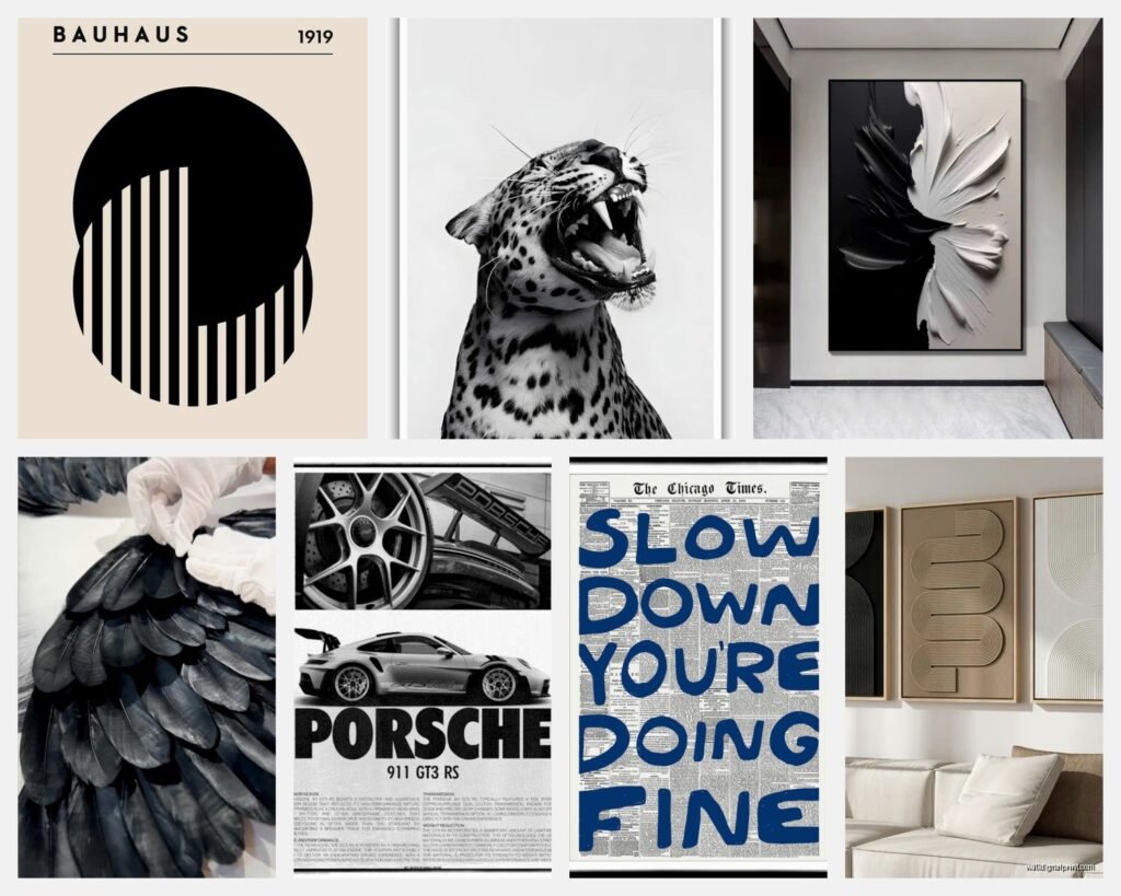
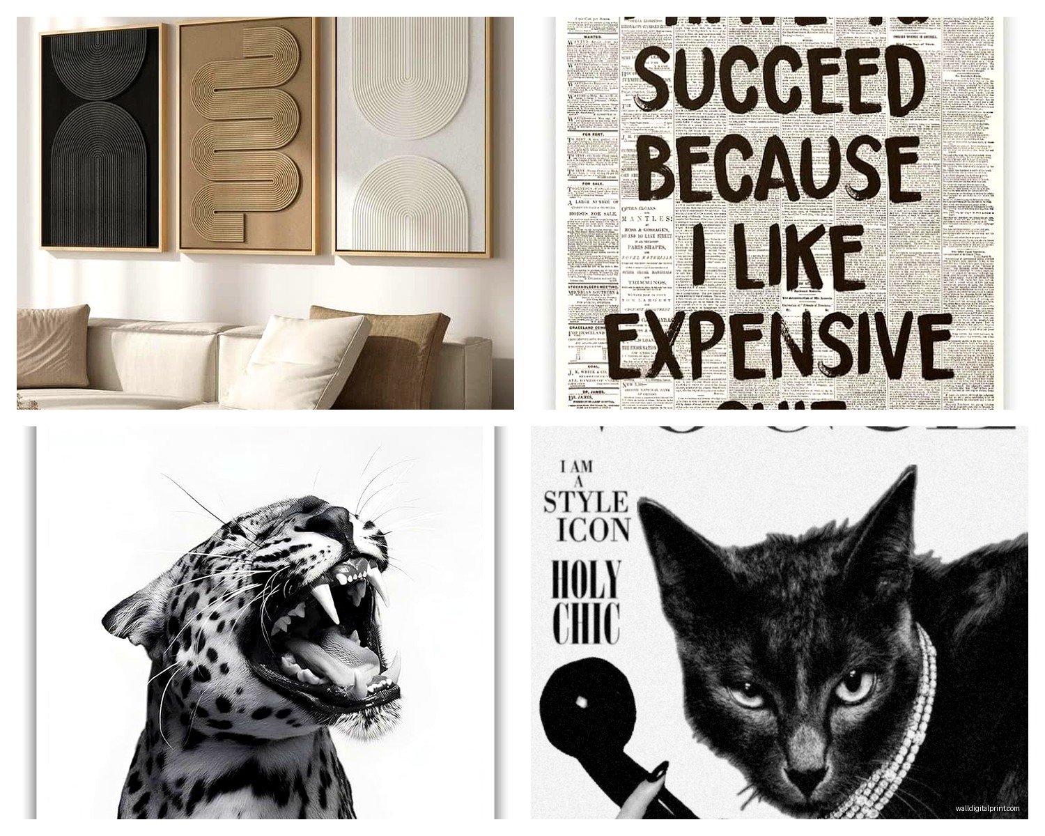
Abstract Geometric Stuff
This is your circles, lines, shapes, that whole Scandinavian minimal vibe. I use these constantly in modern spaces. The thing about geometric black and white is it reads as sophisticated without trying too hard. You want thick black lines on white backgrounds or inverted – white shapes on black.
Look for pieces where the shapes have actual weight to them. Not those thin spindly line drawings that disappear from across the room. I made that mistake in a client’s dining room in 2019 and we had to redo it because you literally couldn’t see the art from the table.
Photography Prints
Architecture photography in black and white is *chef’s kiss* for offices and hallways. I’m talking dramatic building facades, staircases, urban scenes. The high contrast makes architectural details pop in ways color photography just doesn’t.
Nature photography works too but you gotta be careful – a lot of black and white nature photos read as sad? Like there’s this whole category of misty forest photos that just make rooms feel depressing. Go for dramatic landscapes, close-ups of textures, anything with strong light and shadow play.
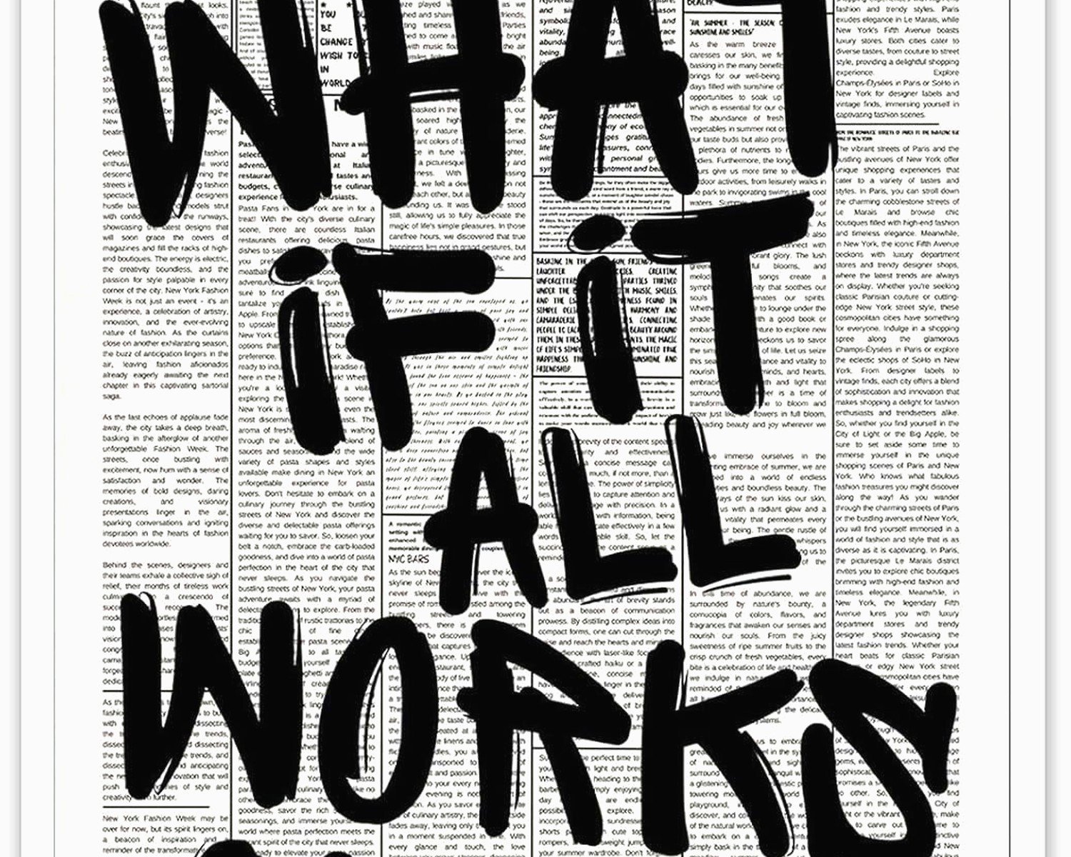
Typography and Text Art
Okay this is gonna sound weird but typography prints are having a whole moment again and I’m kinda here for it. Not the “Live Laugh Love” stuff obviously, but actual interesting text compositions. I used a massive black and white typography piece in my own bedroom that’s just fragments of poetry and it’s… it works?
The key is finding pieces where the text itself creates visual interest through layout and scale, not just what it says.
Line Art and Illustrations
Single-line drawings, bold graphic illustrations, that whole minimalist figure drawing thing. These are everywhere right now. Some of it’s really good, a lot of it is generic. The difference is in the line quality – you want confident strokes, not shaky uncertain lines.
I tested like fifteen different “female figure” line drawings for a client’s bedroom and the cheaper ones all had this weird tentative quality to the lines. Spent the extra $40 and got one where the artist actually knew what they were doing.
Sizing This Stuff Out (Nobody Talks About This Enough)
So here’s where people mess up constantly – they buy art that’s too small. With high contrast black and white pieces, you can actually go BIGGER than you think because the simplicity keeps it from overwhelming.
For over a sofa or bed, you want the art to be roughly 2/3 to 3/4 the width of the furniture. I know everyone says this but I’m telling you because I still get clients who buy 16×20 prints for above king beds and then we’re both standing there like well… this is awkward.
High contrast pieces can handle being oversized. I put a 48×60 black and white abstract in a medium-sized living room last year and it became the whole vibe of the space. You couldn’t do that as easily with a busy colorful piece.
The Gallery Wall Situation
If you’re doing multiple pieces together, odd numbers work better (3, 5, 7). And with black and white, you can mix styles more freely than with color art. I’ve got a hallway gallery in my place that mixes photography, abstract, and line art all in black and white and it’s cohesive just because of that shared palette.
Wait I forgot to mention – when you’re mixing frame styles in a black and white gallery, stick to all black frames or all white frames or all natural wood. Don’t mix the frame colors even though the art is monochrome. I learned this the hard way and had to return like $200 worth of frames.
Framing Choices That Actually Matter
Okay so the frame makes or breaks this stuff. Black and white art is basically naked – there’s nowhere to hide a cheap frame job.
Black frames on black and white art is classic and makes the contrast even stronger. It boxes in all that visual energy. White frames soften the whole thing and make it feel more gallery-like. Natural wood frames (light oak or walnut) warm up the stark contrast.
I usually do black frames in modern spaces, white in traditional or light/airy rooms, and wood when there’s already warmth in the space that needs echoing.
Mat or no mat? High contrast pieces can handle both but here’s my rule – if the piece has a white background, skip the mat or use a black mat. If it has a black background, white mat or no mat. You want contrast between the art and frame, not art and mat and frame all fighting each other.
Glass Situation
Non-glare glass is worth it for black and white pieces because regular glass glare is SO much more obvious against stark black and white. Regular glass creates these white reflections that compete with the art itself.
I did a whole living room last month with four large black and white photographs and the client cheaped out on the glass for two of them and splurged on non-glare for the other two. Guess which ones you actually look at versus which ones just reflect the window? Yeah.
Where to Actually Buy This Stuff
I’m gonna be honest about where I source things because that’s what you’re actually asking right?
The Budget Route
Printable art on Etsy is huge for black and white because you’re basically buying a digital file and printing it yourself. Quality varies WILDLY. Look for shops with hundreds of sales and reviews. I’ve found some genuinely good pieces for $6 that I’ve used in client homes.
You’ll need to get them printed though – I use a local print shop that does photo printing because places like FedEx Office have been hit or miss. The blacks need to be actually black, not grey-ish.
For pre-framed stuff, Target and West Elm have gotten way better with their black and white collections. I grabbed three pieces from Target’s Project 62 line for my home office and honestly they’re fine? Not groundbreaking but solid.
Mid-Range Options
Minted, Juniper Print Shop, The Poster Club – these are my go-to shops. Prices usually run $40-150 for prints. The paper quality is noticeably better and the designs are more curated.
Society6 and Redbubble let artists sell their work and the black and white selection is massive. Quality control is decent. I’ve ordered probably 30 pieces from Society6 over the years and only had issues with two.
Oh and another thing – Desenio is a European shop that ships to the US and their black and white photography is really strong. Shipping takes forever but the price point is good.
Investment Pieces
When I’m working with clients who have budget, I go to actual galleries or buy from artists directly on Instagram. Original black and white photography or paintings run $500-5000+ but there’s something about an original piece that just reads differently.
Local art fairs are underrated for finding black and white work. I found this incredible abstract artist at a street fair last summer who does black and white paintings that look almost graphic printed but they’re actual paint and the texture is insane in person.
Mixing Textures Because Flat Gets Boring
This is something I didn’t figure out until like three years into my styling work – black and white art needs texture variation or rooms feel flat even with the contrast.
If you’re doing multiple pieces in a room, mix glossy photography prints with matte abstract paintings with textured paper prints. The visual interest comes from how light hits different surfaces.
I did this bedroom last fall where we used three large black and white pieces – one was a glossy photograph, one was a charcoal drawing with visible texture, one was a matte ink print. All black and white, totally different feeling when you walked in because your eye moved between the different textures.
Canvas prints versus paper prints is another texture thing. Canvas gives you that wrapped gallery edge and works great frameless for a more casual vibe. Paper prints need frames but feel more refined.
The Actual Hanging Part Nobody Wants to Do
Use a level. I know, revolutionary advice. But the stark lines in black and white art make wonky hanging SO obvious. Color art kinda hides slight tilts. Black and white art is like HERE I AM CROOKED.
For heavy pieces, use two hanging points instead of one centered hook. The piece stays more stable and doesn’t shift when you walk by or when doors close or whatever.
My dog ran into a wall last week (long story involving a squirrel outside the window) and knocked a black and white print askew and because it’s just black lines on white it looked SO noticeably crooked. A colorful piece probably would’ve been less obvious.
Height Stuff
Center of the art at 57-60 inches from the floor. This is the gallery standard and it actually works. I see so many people hang art way too high, like up near the ceiling, and then it’s just decorating the crown molding.
Exception is if you’re hanging a horizontal piece over furniture – then you want the bottom of the frame 6-8 inches above the furniture top. This goes for sofas, beds, console tables, whatever.
Styling Around These Pieces
Okay so you’ve got your high contrast black and white art up, now what? The room needs to support it.
Black and white art lets you go bold with color in your furniture and accessories. Like I said before with the green sofa thing – the monochrome art acts as a visual break. I’ve paired black and white abstracts with jewel-tone furniture, pastels, even other patterns, and it works because the art provides a resting place for your eye.
You can also go full monochrome in the room which feels very editorial and dramatic. Black furniture, white walls, black and white art, maybe some grey tones. It’s a whole mood. I did this in my living room during 2020 when I was watching too much Netflix and needed a project and honestly it still looks good.
Lighting These Pieces
This is gonna sound extra but lighting actually matters more with high contrast art than with other types. The blacks need to stay black and not get washed out, but you also need enough light to see the detail.
Picture lights are one option if you’re feeling fancy. I prefer adjustable wall sconces flanking larger pieces or track lighting aimed at the art. Regular room lighting works fine too if you’re not trying to spotlight things.
Natural light is tricky – direct sunlight will fade even black and white prints over time. If you’ve got a wall with harsh sun, either use UV-protective glass or pick a different wall.
Common Mistakes I See Constantly
Matching the art too closely to one specific thing in the room. Like buying a black and white piece because you have black chairs. Then you change the chairs and the art feels random. Black and white should complement the overall space, not match individual items.
Going too literal with subject matter. A kitchen doesn’t need black and white food photography. A bedroom doesn’t need black and white photos of beds. Let the art be something interesting that you actually want to look at.
Buying art that’s trendy right now without considering if you’ll still like it in two years. The line art trend is everywhere currently and some of it’s great but a lot of it’s gonna feel dated. Classic photography and abstract geometric stuff tends to have more staying power.
Hanging everything in the same size and creating a grid. Unless you’re specifically going for that look, vary your sizes. A large focal piece with smaller pieces around it creates more visual interest than six 16×20 prints in a grid.
The “Too Matchy” Problem
I had a client last year who bought all her black and white art from the same collection, same artist, same sizes, same frames. It looked like a hotel. We kept three pieces and swapped the others for different styles and suddenly the room had personality.
Even though it’s all monochrome, you want variety in style, subject, and scale. Mix abstract with photography, mix bold graphics with delicate line work, mix large with small.