Wall Art Guide, Wall Art Tutoriels
Blue and Gold Wall Art for Living Room: Luxury Color Combo
Apr
So I’ve been going down this rabbit hole with blue and gold wall art lately because honestly, three different clients asked about it in the same week and I figured the universe was telling me something. Let me tell you what I’ve actually learned from hanging probably too many pieces at this point.
The Materials That Actually Work
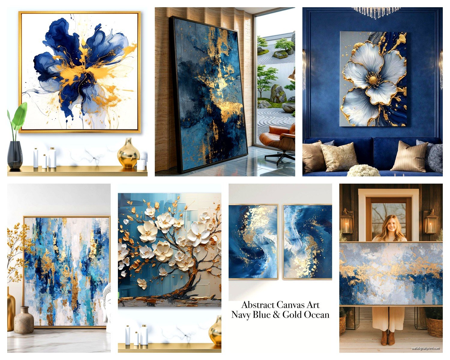
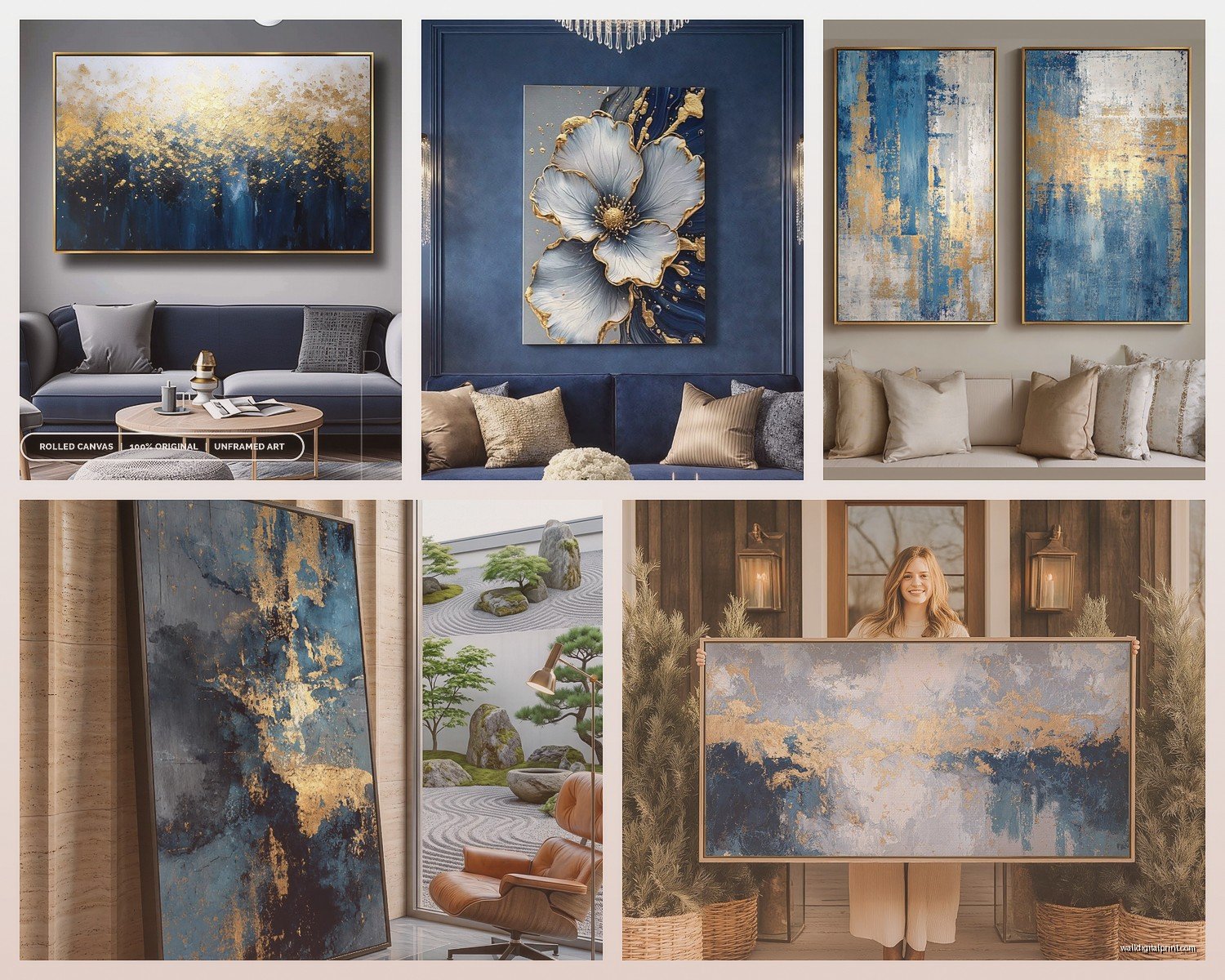
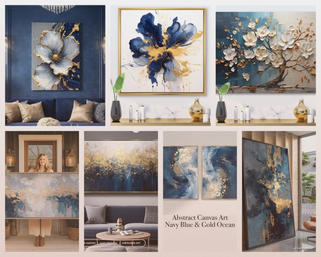
Okay so first thing—canvas prints are gonna be your easiest route. I used to think they looked cheap but the quality has gotten so much better in like the past two years. You want to look for gallery-wrapped edges, which just means the image wraps around the sides so you don’t see that weird white border when you look at it from an angle. The thickness matters too, go for at least 1.5 inches deep because anything thinner looks kinda flimsy on the wall.
Framed prints though, that’s where the luxury really comes through. I did this whole living room last month with blue and gold abstract pieces in gold leaf frames and it was *chef’s kiss*. But here’s the thing nobody tells you—the frame color matters more than the actual art sometimes. A warm gold frame will make your blues look completely different than a cool champagne gold. I learned this the hard way when I ordered five pieces online and they all looked wrong together because the gold tones didn’t match.
Metal prints are having a moment right now and they’re actually perfect for this color combo. The way light hits metallic surfaces makes both the blue and gold shimmer differently throughout the day. My cat knocked one off the credenza last week (long story, she’s chaotic) and it didn’t even dent, so there’s that durability factor too.
Textured Options That Add Dimension
Okay wait I forgot to mention—textured pieces are where you can really make this color scheme pop. Resin art with gold leaf embedded in blue? Unreal. I watched an artist make one at a studio visit and the process is actually insane, they pour layers of resin and add the gold leaf between layers so it has this depth you just can’t get with flat prints.
Oil paintings if you’ve got the budget. Real ones, not prints. The texture of actual paint, especially with metallic gold mixed in, catches light in a way that makes your living room feel expensive even if the couch is from IKEA. I’ve seen original pieces range from like $300 to several thousand, but you can find emerging artists on Instagram who are crazy talented and way more affordable.
Acrylic paintings are similar but they dry faster so artists can build up texture differently. The gold metallic acrylics have gotten really good—some of them have this almost holographic quality that shifts between gold, copper, and rose gold depending on the angle.
Getting the Blue-Gold Ratio Right
This is gonna sound weird but I have a whole formula for this now. If your living room has warm undertones (beige, cream, warm grays), you want about 60% blue and 40% gold in your art. If it’s cool-toned (true gray, white, cool beige), flip it to 60% gold and 40% blue.
I tested this theory accidentally when I bought matching pieces for two different condos and they looked completely different in each space. Same art, totally different vibe based on the room’s existing color temp.
Navy blue with gold is the classic luxury combo—think old money vibes, traditional elegance, all that. But don’t sleep on lighter blues. Powder blue with gold is having this weird renaissance right now and it’s less stuffy. Teal with gold reads more bohemian-luxury which might be what you’re going for if your style is more eclectic.
Size and Placement Strategy
Oh and another thing—size is where people mess up constantly. I see so many living rooms with art that’s way too small for the wall space. Your main piece should take up roughly two-thirds to three-quarters of your sofa width if it’s hanging above it. I know that sounds huge but trust me, go bigger than you think.
For a gallery wall situation with multiple blue and gold pieces, I layout everything on the floor first. Take a photo, live with it for a day, see if you still like the arrangement. I’ve rearranged the same six pieces four different ways before finding the right balance.
The center of your art should be at eye level, which is usually around 57-60 inches from the floor. But if you have vaulted ceilings or you’re tall (I’m 5’9″ so my eye level is different than my 5’4″ assistant), adjust accordingly.
Mixing Different Art Styles
You can absolutely mix abstract blue and gold pieces with more representational stuff. I did a living room where we had an abstract navy and gold painting next to a vintage-style gold-framed print of peacock feathers (which are naturally blue and gold, nature’s perfect color combo honestly). It worked because the colors tied them together even though the styles were different.
Geometric patterns in blue and gold feel modern and clean. Organic, flowing designs feel more traditional or artistic. Marbled effects with blue and gold swirls are very trendy right now—I’m seeing them everywhere on Etsy and in home goods stores.
My client canceled yesterday so I spent an hour comparing different marbled prints and honestly they’re hit or miss. Some look luxurious, some look like someone spilled their drink on blue paper and called it art. Look for ones where the gold actually has metallic sheen in the print, not just yellow color.
The Finish Makes a Difference
Glossy finishes reflect more light and make colors more vibrant. Matte finishes absorb light and look more sophisticated and subtle. I usually go matte for bedrooms and living rooms because they’re easier to photograph (less glare) and they feel more expensive somehow.
Semi-gloss is the middle ground and it’s actually my go-to for blue and gold pieces. You get some of that light reflection that makes the gold shimmer without the glare problem.
Glass-fronted frames add another layer of protection but they can create reflections depending on your window placement. If you have a big window directly across from where you’re hanging art, skip the glass or get museum-grade non-reflective glass which is pricey but worth it.
Where to Actually Buy This Stuff
Okay so real talk—Etsy has been my secret weapon. You can find independent artists selling original blue and gold pieces and prints for way less than galleries. Filter by “ships from your country” to avoid insane shipping costs and long wait times. Read reviews obsessively, look at customer photos not just the listing photos.
Society6 and Redbubble let you choose your format—same design as a framed print, canvas, metal print, whatever. The quality is pretty consistent and they have tons of blue and gold options. The downside is everyone and their mother has access to the same designs so it’s not unique.
HomeGoods and TJ Maxx are hit or miss but when you hit, it’s gold. Literally. I’ve found incredible blue and gold pieces there for under $50 that look like they should cost $300. You just have to go regularly because inventory changes constantly.
Wayfair for affordable options in every style imaginable. Their photos are usually pretty accurate. Free returns on most stuff which is clutch when you’re not sure how colors will look in your actual space.
Local art fairs and studio tours if you want original work. I discovered my favorite local artist at a random street fair—she does these blue resin pieces with real gold leaf and they’re stunning. Supporting local artists is cool and you can often negotiate on price if you’re buying multiple pieces.
Online Shopping Tips Nobody Tells You
Always check the actual dimensions, not just how it looks in the room mockup. I ordered what looked like a huge statement piece once and it arrived the size of a dinner plate. Read the specs carefully.
Look at reviews with photos uploaded by actual customers. The professional listing photos always look perfect—customer photos show you what it really looks like in someone’s regular living room with normal lighting.
Color accuracy is tricky online. Your monitor settings affect how blues look—they might appear more teal or more navy depending on your screen. If you’re ordering something expensive, some sites will send you a swatch or sample for like $10 which is worth it.
Arranging Multiple Pieces
Odd numbers look better than even numbers for some psychological reason I don’t totally understand but it’s true. Three pieces, five pieces, seven if you’re doing a big gallery wall.
Symmetry feels formal and traditional. Asymmetry feels more casual and collected-over-time. I usually do asymmetrical arrangements because they’re more forgiving—if spacing isn’t perfect it still looks intentional.
Keep spacing consistent between frames—usually 2-3 inches works well. Use painter’s tape on the wall to map out where everything goes before you start hammering nails. Trust me on this one, I’ve created so many unnecessary holes learning this lesson.
Balancing Blue and Gold Throughout the Room
Your wall art shouldn’t be the only place these colors appear. Echo the blue and gold in throw pillows, a vase, maybe a gold-framed mirror or blue ceramic lamp. But don’t go overboard—you want it to feel cohesive not themed.
I usually aim for the colors to appear in at least three different places in the room (the art plus two other items minimum). This creates visual rhythm and makes the design feel intentional rather than like you just hung random art.
If your walls are already painted a bold color, your blue and gold art needs to work with that. Navy walls with gold art looks incredible but might be too much with blue in the art too. Gray or white walls are the safest bet for letting the art colors really stand out.
Lighting Your Blue and Gold Art
This is gonna sound extra but lighting changes everything. Picture lights mounted above frames make art look museum-quality. They’re not that expensive—you can get battery-operated LED ones for like $30-40 that just stick on the wall.
Track lighting or adjustable can lights pointed at your art create drama, especially at night. The gold elements will literally glow when lit properly.
Natural light is free but inconsistent. North-facing windows give the most consistent light throughout the day. South-facing light is stronger and warmer which makes golds look more intense but can wash out lighter blues.
Avoid hanging art in direct sunlight if it’s a print or photograph—they’ll fade over time. Original paintings with lightfast pigments can usually handle it better but it’s still not ideal.
Maintaining Your Collection
Dust happens, especially on textured pieces. Microfiber cloths work for smooth surfaces. For textured oil or acrylic paintings, use a super soft brush (like a makeup brush honestly) to gently dust without damaging the surface.
Canvas prints can warp in humid environments. If you live somewhere humid, make sure you have decent air circulation or consider framed prints under glass instead.
Metal prints are basically indestructible and you can clean them with glass cleaner which is nice. They’re good for high-traffic areas or if you have kids who touch everything.
Keep receipts and certificates of authenticity if you’re buying original art. Not just for insurance purposes but also for resale value if you decide to sell later. I keep digital copies of everything in a folder on my phone because I lose paper receipts constantly.
Okay so that’s basically everything I’ve figured out through trial and error with this whole blue and gold situation. The combination really does create that luxury vibe without being too flashy if you balance it right, and there are options for literally every budget from like $30 prints to investment pieces. Just remember the gold tone matters as much as the shade of blue, go bigger than you think on sizing, and don’t stress about making it perfect because you can always rearrange or add more pieces later.