Wall Art Guide, Wall Art Tutoriels
Blue and Silver Wall Art: Cool Metallic Ocean Combo
Mar
So I’ve been obsessing over blue and silver wall art lately because honestly, this combo hits different than any other metallic pairing. Like I had this client last month who wanted “coastal but make it sophisticated” and that’s when I fell down the rabbit hole of metallic ocean pieces.
Why This Combo Actually Works When Others Fall Flat
The thing about blue and silver is they share the same cool undertones, which sounds boring but trust me it’s the secret. I’ve tried gold with blue and it always looks like a beach gift shop threw up on the wall. Silver though? It amplifies the coolness of blue without fighting it. The metallic acts almost like moonlight on water, which is gonna sound cheesy but it’s literally what happens visually.
I tested this theory in my own living room first because I’m not about to experiment on paying clients. Bought like six different pieces from various Etsy shops and Amazon and a few local artists. My boyfriend thought I’d lost it when packages kept arriving for two weeks straight.
The Different Types You’ll Actually Find
Okay so there’s basically four categories of blue and silver wall art and they all hit differently depending on your space:
Resin Ocean Pieces
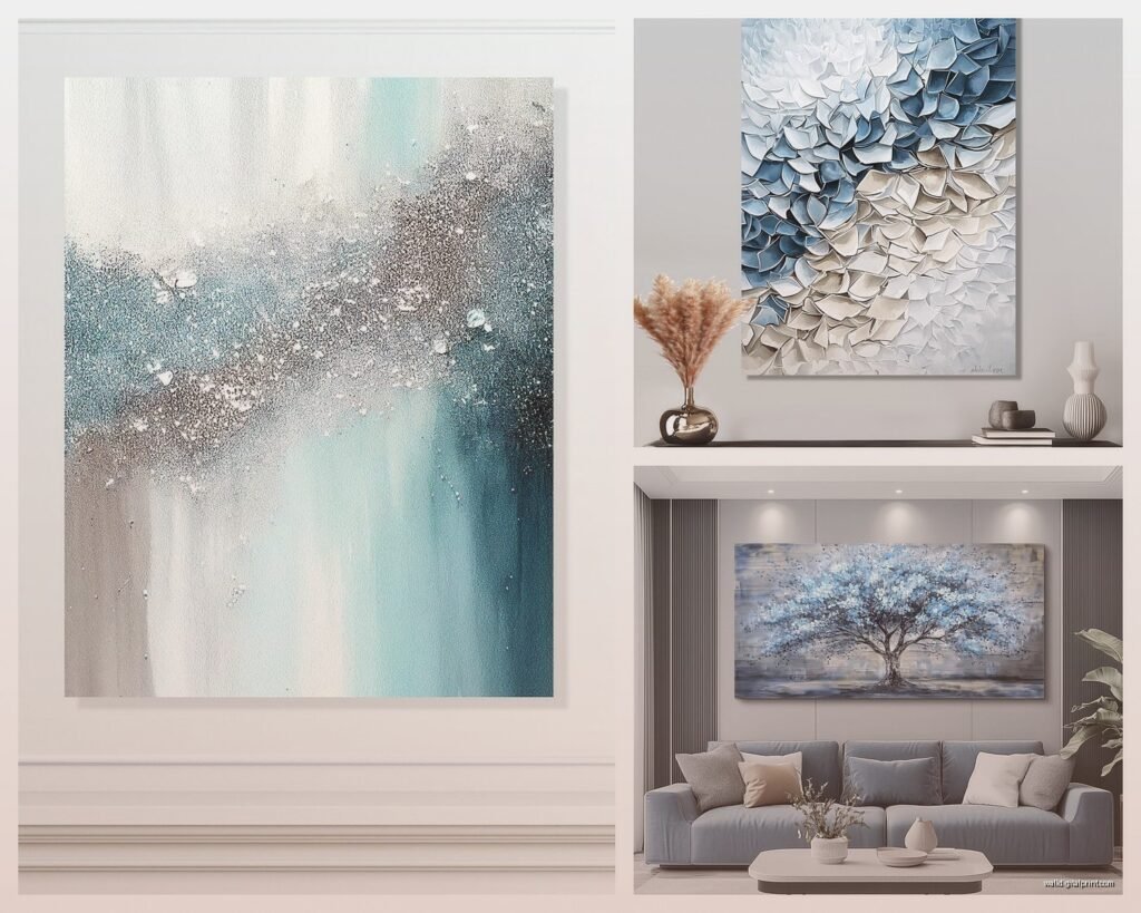
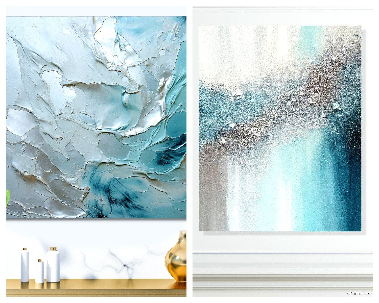
These are the ones you see all over Instagram with the swirly metallic effects. I gotta say, the quality varies WILDLY. The cheap ones from certain Amazon sellers look plasticky and the silver is more gray than metallic. But when you find a good one… oh man. I have this piece above my entryway console that’s navy and silver resin with actual depth, like you can see layers when light hits it different ways.
What to look for: make sure the listing shows close-up shots. If they only have far-away styled photos, that’s usually hiding something. The resin should look glossy and clear, not cloudy. Silver leaf or metallic powder mixed into resin creates way better effects than silver paint on top.
I spent probably three hours one night comparing resin artists on Etsy while watching The Bear (so good btw, totally distracted me). The price range is insane, from like $45 to $800 for similar sizes. The difference comes down to materials and technique. Cheaper pieces use acrylic paint and mica powder, fancier ones use actual silver leaf and alcohol inks.
Metal Wall Sculptures
These are having a moment and I’m here for it. We’re talking actual metal cut into wave shapes, fish, abstract ocean forms. The silver is usually brushed aluminum or steel, with blue elements either painted or powder-coated.
Here’s what nobody tells you: these are HEAVY. Like I ordered this gorgeous wave sculpture for a client’s dining room, didn’t check the weight, and it was 40 pounds. We had to use special anchors and hit studs. So before you fall in love with one, check if your wall can handle it.
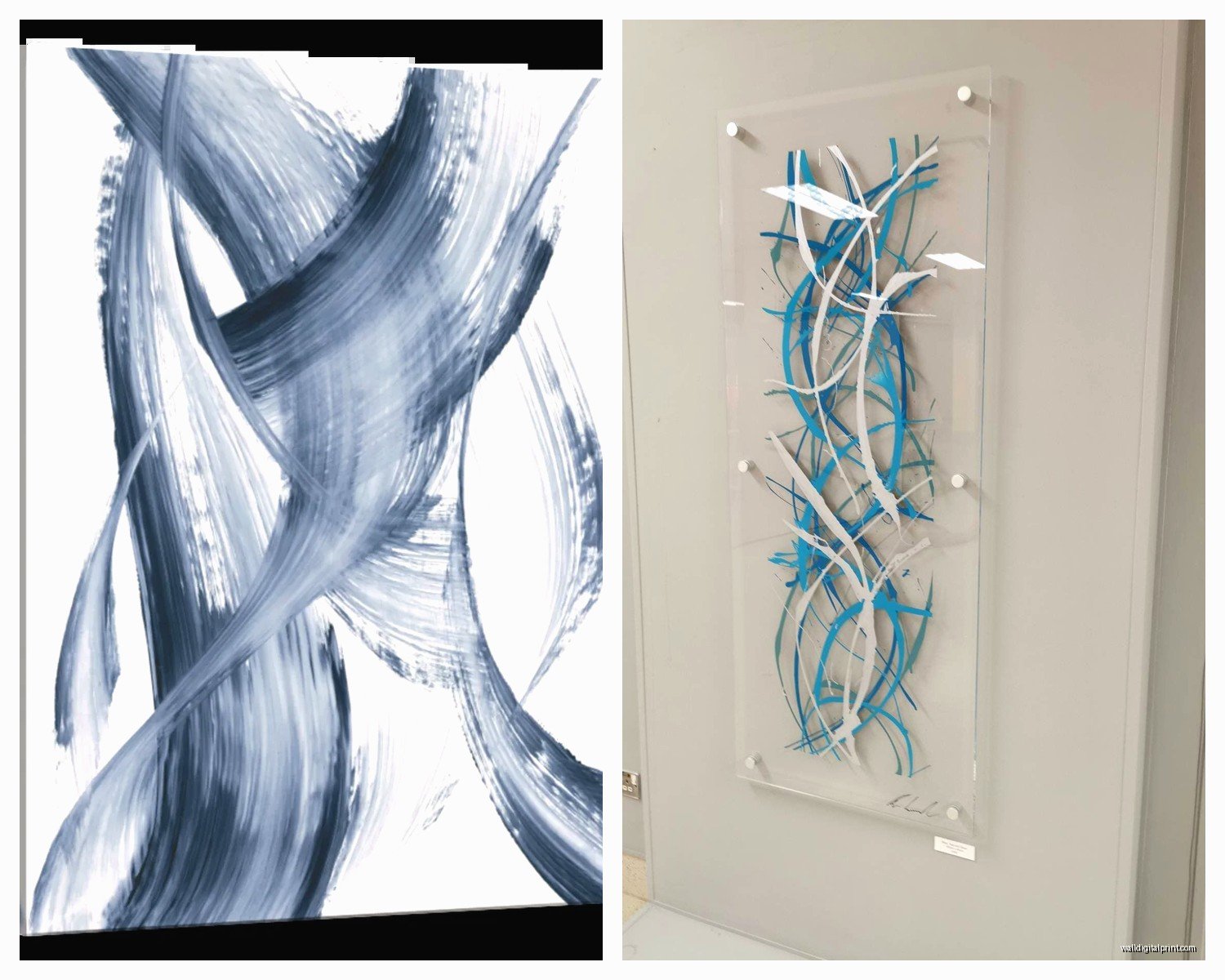
The good news is they photograph amazingly because the dimensional aspect catches light all day long. Natural light, lamp light, whatever. It’s constantly changing which is cool but also means you gotta think about placement more carefully.
Printed Art with Metallic Accents
This is probably the most accessible option. Regular prints (canvas or paper) with silver foil details or metallic ink. I was skeptical about these at first because I’ve been burned by “metallic” prints that just looked like flat gray ink.
But oh and another thing, the printing technique matters SO much here. Digital prints with UV metallic ink are pretty good. Hand-embellished prints where an artist adds silver leaf after printing are obviously better but pricier. Screen prints with metallic ink can be gorgeous if done well.
I spilled coffee on one of the test prints I got (it was sitting on my desk, don’t ask) which actually tested the paper quality accidentally. The good ones are on thick paper or real canvas that can handle a gentle wipe-down. Cheap ones basically disintegrated when I tried to clean it.
Mixed Media Textured Pieces
These combine painting with silver leaf, resin details, sometimes even real shells or sand. Very tactile, very statement-making. Not for every space but when they work, they WORK.
I have one in my office that’s abstract ocean vibes, layers of blue paint with torn silver leaf and resin drips. Everyone who comes over touches it without asking which is annoying but also proves how magnetic these pieces are.
Picking the Right Blues for Your Silver
So here’s where people mess up. They think any blue goes with silver and then wonder why it looks off. The undertones gotta match, and silver is a cool metal so you need cool blues.
Navy blue is probably the easiest to work with. Deep, sophisticated, reads as intentional rather than beachy. I use navy and silver in commercial spaces all the time because it feels expensive without trying too hard.
Cobalt and royal blue are trickier. They’re so saturated that silver can get lost next to them unless there’s enough metallic to hold its own. I learned this the hard way with a piece I bought for above my bed… the blue just ate the silver accents alive. Had to move it to a smaller wall where it didn’t need to compete with anything else.
Powder blue and sky blue with silver is very beachy. Not bad, just know what you’re getting into. It reads much more casual and coastal than darker blues. Great for bathrooms, bedrooms, covered porches. Less great for a formal living room unless that’s specifically your vibe.
Teal and turquoise technically have green undertones but the cooler-leaning versions work beautifully with silver. Warmer teals that lean yellow-green? Nope. Looks confused. I tested this extensively because my client canceled one day (they were sick, not mad) so I spent like three hours comparing different teal samples against silver leaf sheets I had from a framing project.
Size and Scale Stuff That Actually Matters
Everyone asks about sizing and honestly it’s more about proportion than following rules. But here’s what I’ve noticed works:
Above a sofa, you want roughly two-thirds to three-quarters the width of the furniture. But with metallic art, you can go slightly smaller because the reflective quality makes it feel bigger. I have a client with a 90-inch sofa who has a 48-inch blue and silver piece centered above it, and it totally works because the silver catches so much light.
Gallery walls with blue and silver pieces are having a moment but they’re finicky. The silver needs to be distributed evenly or your eye just goes to one spot and ignores everything else. I usually do three pieces with metallic elements in a triangle layout, then fill in with matte blue pieces.
Wait I forgot to mention, in bedrooms over the bed, metallic art can be too stimulating for some people. The light reflection might bother you if you’re sensitive to that stuff while trying to sleep. I moved a really shimmery piece out of my bedroom after a week because every time a car went by outside, the headlights would make it flash. Looked cool but not at 2am.
Small Spaces
Blue and silver actually makes small spaces feel bigger because of the reflective quality and cool tones receding visually. I put a silver-heavy abstract ocean piece in my tiny powder room and people always say it feels more spacious than it is.
Just don’t go too dark with the blue if your space is already dim. Navy in a dark room with one small window is gonna feel like a cave. Go for lighter blues or pieces where silver is the dominant element.
Styling Around the Art
Okay so you’ve got your blue and silver piece, now what? This is where I see people freeze up.
The easiest approach is treating it as your color story anchor. Pull out the exact blue shade for pillows, a throw, maybe a vase. Then bring in the silver through lamp bases, picture frames, decorative objects.
But here’s the thing… you don’t want to match everything exactly. That looks costume-y. If your art has navy and silver, maybe your pillows are a shade lighter navy, and you add in some white or cream to break it up. The silver in the room should reference the art without copying it exactly.
I’m gonna be honest, I struggled with this in my own place at first. Had the blue and silver art, bought blue pillows, silver frames, silver candlesticks… looked like a themed restaurant. Had to edit way back and let the art be the star.
What Colors to Add
White and cream are your friends. They let blue and silver breathe without competing. All three together is very coastal contemporary.
Gray in the right shade can be gorgeous. Cool grays, not warm greige tones. The gray should feel like it comes from the same family as the silver.
Black adds drama and grounds the coolness. I love navy, silver, and black together for a moody sophisticated vibe. Did this in a home office recently and it feels like a luxury hotel.
Blush pink sounds weird but trust me. Cool-toned blush with blue and silver is very modern and less expected than the obvious choices. The pink needs to be dusty rose, not coral or peachy.
Wood tones work but they gotta be the right ones. Weathered driftwood-y finishes, yes. Dark espresso, also yes. Medium oak or pine? Usually fights with the coolness.
Lighting Considerations Nobody Talks About
This is gonna sound weird but metallic art is basically a lighting decision as much as a decor one. The silver reflects whatever light hits it, which means the type of bulbs in your space changes how it looks.
Warm bulbs (2700K) make silver look more golden or champagne. Not necessarily bad but not what you bought. If you want true silver tones, go for 3000K or higher. I have 3500K throughout my main living spaces and the blue and silver art reads exactly as intended.
Natural light is the dream scenario. North-facing light is cool and even, perfect for these pieces. South-facing can be too warm depending on your location. East and west facing means the art will look different morning versus evening, which can be cool if you’re into that variability.
Picture lights or spotlights on metallic art are amazing but easy to overdo. You want a subtle wash of light, not a spotlight effect unless it’s a really large statement piece. I use LED picture lights that are dimmable so I can adjust based on time of day.
Where to Actually Buy Quality Pieces
I’ve ordered from basically everywhere at this point so here’s my honest take:
Etsy
Best for original art and unique pieces. Quality varies but you can message artists directly which is huge. I always ask about materials and process before buying. Look for shops with lots of reviews that mention shipping and quality specifically.
Search terms that work: “ocean resin art silver,” “blue silver leaf painting,” “metallic abstract blue.” You’ll get better results than just “blue and silver art.”
My go-to shops change but I look for artists who show process videos or photos. That usually means they’re proud of their technique and not drop shipping something.
Online Galleries and Art Sites
Saatchi Art, Artfinder, Minted. These are good for curated selections. Pricier than mass market but usually reliable quality. Return policies are decent which matters with metallic art because photos never capture it accurately.
I bought a piece from Saatchi Art for my living room after returning two other ones. Their packaging is really good which matters when you’re shipping something with metal leaf or resin.
Home Decor Retailers
West Elm, CB2, Anthropologie sometimes have blue and silver pieces. They’re mass-produced but quality controlled which means less risk. Won’t be one-of-a-kind but also won’t fall apart.
Wait for sales though. These places mark up like crazy and have sales constantly. I never pay full price.
Amazon
Okay so Amazon is hit or miss, mostly miss for metallic art. But occasionally you find something decent. Read reviews carefully and look for the ones with customer photos. If the photos show it looking good in real homes, might be worth trying.
The return process is easy at least, so less risk than some random website.
Local Artists and Art Fairs
My favorite option when possible. You see exactly what you’re getting, can inspect quality, ask questions. I’ve found some of my best blue and silver pieces at local art walks and studio tours.
Plus supporting local artists feels good and you usually get a story with the piece which clients love.
DIY Options If You’re Crafty
I’m not super crafty but I’ve done a few blue and silver pieces myself for staging purposes or when budget is tight. It’s actually more doable than you’d think.
Resin art is the most popular DIY. You need resin (I use ArtResin), blue alcohol inks or resin dyes, silver mica powder or silver leaf. There’s a learning curve for sure. My first attempt looked like a muddy puddle. But by the third try I had something actually decent.
The supplies cost maybe $80 to start, and you can make multiple pieces. Way cheaper than buying if you’re doing several rooms or gifting.
There’s tons of YouTube tutorials. I watched probably 20 before attempting my first one. Some artists gatekeep techniques but most are pretty generous with info.
Silver leaf on painted canvas is easier and more instant gratification. Paint your canvas whatever shades of blue you want (acrylic works fine), let it dry completely, then apply silver leaf to certain areas with adhesive. You can do abstract shapes, geometric patterns, whatever.
I made three pieces this way for my office gallery wall while binging Succession (so chaotic, loved it). Total cost was like $45 for all three and they look legit. People always ask where