Wall Art Guide, Wall Art Tutoriels
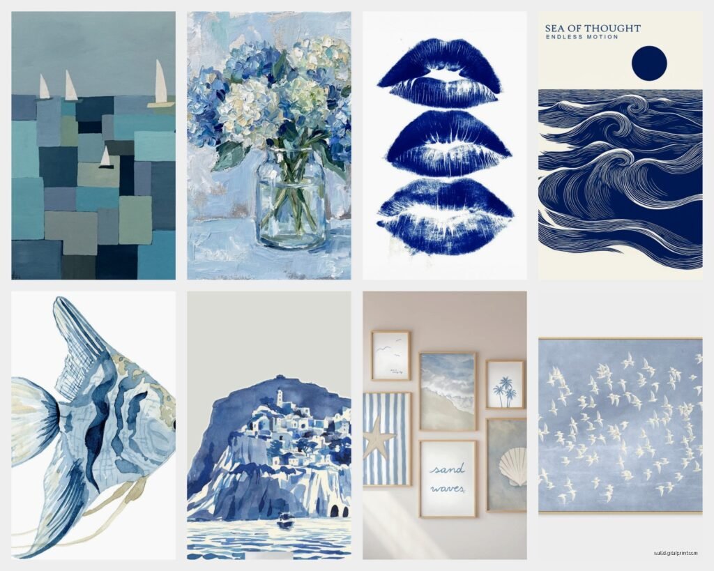
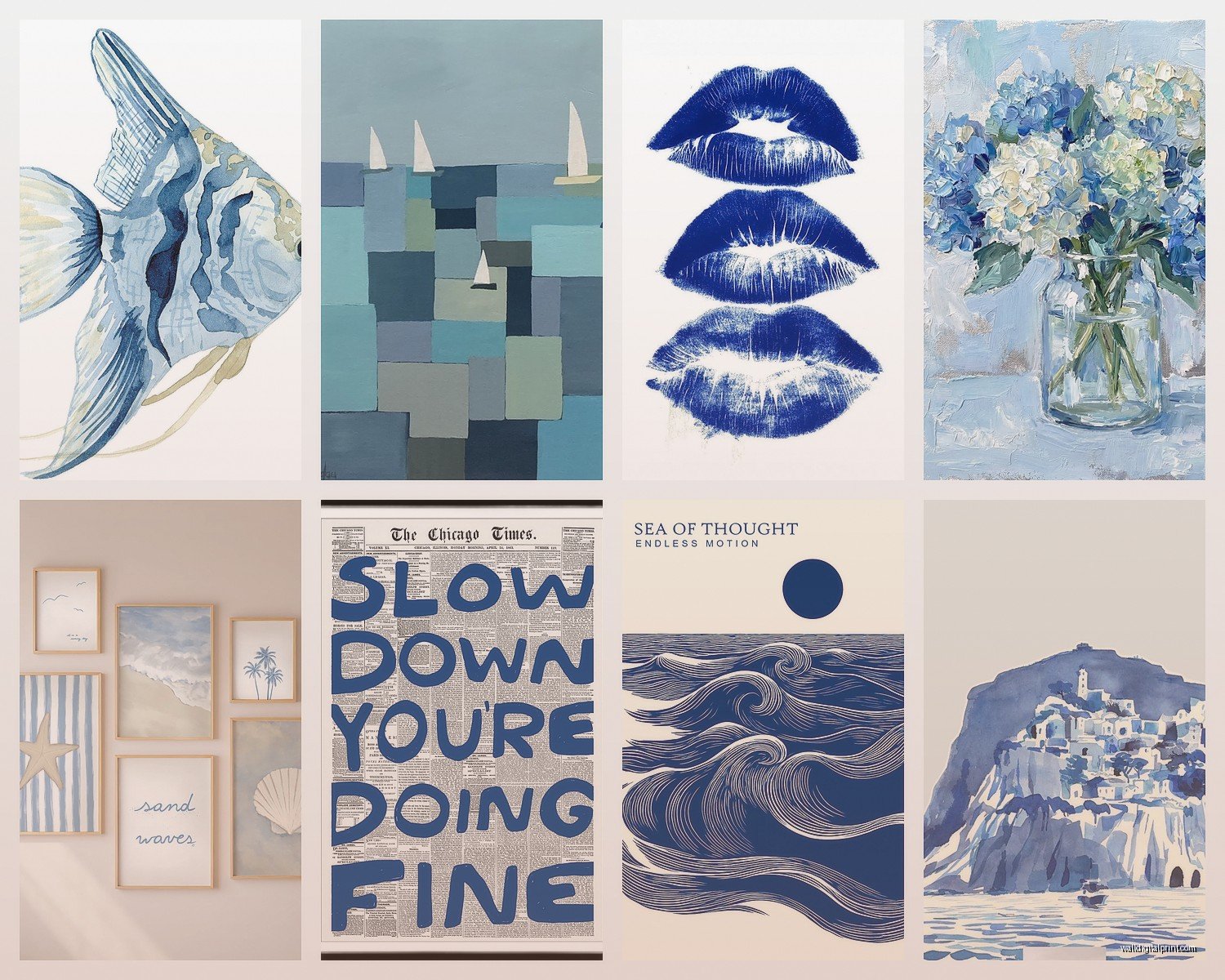
Blue Wall Art: Ocean Sky Navy to Turquoise Spectrum
Mar
So I’ve been working with blue wall art for like seven years now and honestly the whole ocean-to-sky spectrum thing used to stress me out because clients would say “I want blue” and I’d show up with navy samples and they’re thinking turquoise and… yeah. Let me just dump everything I know about actually picking blue art that works.
The Thing About Blue Nobody Tells You
Okay so first – blue changes more than any other color depending on your lighting. I learned this the hard way when I hung this gorgeous navy abstract piece in a client’s living room and in the morning light it looked practically black, but at 4pm it was this rich deep blue. We almost returned it before I was like wait, let’s just move it to the east wall. Totally different piece.
Natural light is gonna make your blues cooler. Warm bulbs (the yellowy ones) are gonna make them look slightly green or muddy, which sounds bad but actually sometimes that’s exactly what you want if you’re trying to tie in sage greens or earth tones. I keep forgetting to mention this to people and then they text me like “why does my turquoise look weird at night” and it’s always the bulbs.
Navy Blue Art Stuff
Navy is tricky because it reads as a neutral until it doesn’t. What I mean is – in small doses, like a 16×20 print, navy can look almost black and acts like a grounding element. But a huge navy canvas, like 40×60 or bigger, suddenly becomes a COLOR color and it’ll dominate the room.
I’ve been using a lot of navy in:
- Rooms with tons of white or cream where you need weight without going actual black
- Spaces with warm wood tones – navy plus oak or walnut is *chef’s kiss*
- Bedrooms where you want that cocooning vibe but grey feels too cold
- With brass or gold frames/fixtures because the contrast is just right
The mistake I see people make is pairing navy art with navy walls. I mean you CAN, but the art needs to have other colors in it or different textures otherwise it disappears. I did this in my own house actually – navy walls with this navy and cream abstract piece and you literally couldn’t see the art until you were like three feet away. Had to switch it out for something with white and rust tones.
Navy Art That Actually Works
So the navy pieces that perform best in my projects are ones that have:
- White or cream as a secondary color – gives it dimension
- Metallic accents – gold leaf, silver, bronze
- Texture – like thick paint, collage elements, anything that catches light differently
- Just a hint of another color – rust, blush, even yellow
I found this one artist on Etsy (gotta find the name, it’s saved on my other laptop) who does navy watercolor oceans with gold leaf and those sell SO fast for beach houses because they’re sophisticated navy, not that nautical bright blue situation.
The Middle Blues – Cobalt to Royal to Cerulean
Okay so this is where it gets fun because these blues have PERSONALITY. They’re not neutral, they’re not trying to be chill. My client last month wanted a “statement piece” and I was like okay we’re going cobalt.
Cobalt is that pure, intense blue. Think Yves Klein (sp? whatever, that artist who like trademarked a blue). It’s saturated, it’s bold, it needs space to breathe. You can’t crowd cobalt art with a bunch of other stuff or it’ll feel chaotic.
Royal blue is slightly more purple-leaning and honestly it’s having a moment right now. I’m seeing it everywhere in modern landscapes and abstracts. It plays really well with:
- Millennial pink (I know, I know, but the combo works)
- Emerald green
- Warm greys
- Natural wood
Cerulean is lighter, more sky-like, less intense. It’s what people usually mean when they say “blue but not too blue” which is my least favorite direction ever but I get it. Cerulean art works in spaces where you want color but you’re scared of color, if that makes sense.
How to Use These Blues Without It Looking Like a Kids Room
This is the question I get most. The middle blues can skew juvenile if you’re not careful, so:
- Go abstract instead of literal – a cobalt abstract reads sophisticated, a cobalt painting of cartoon waves… doesn’t
- Pair with mature colors – charcoal, chocolate brown, deep greens
- Use matte frames or no frame – glossy frames make it look like poster from a dorm
- Scale UP – bigger pieces look more intentional and grown up
- Mix with black and white photos or prints
I did a gallery wall last year with a big royal blue abstract as the center, surrounded by black and white architectural photos, and it looked so good. The blue was the star but the B&W kept it sophisticated.
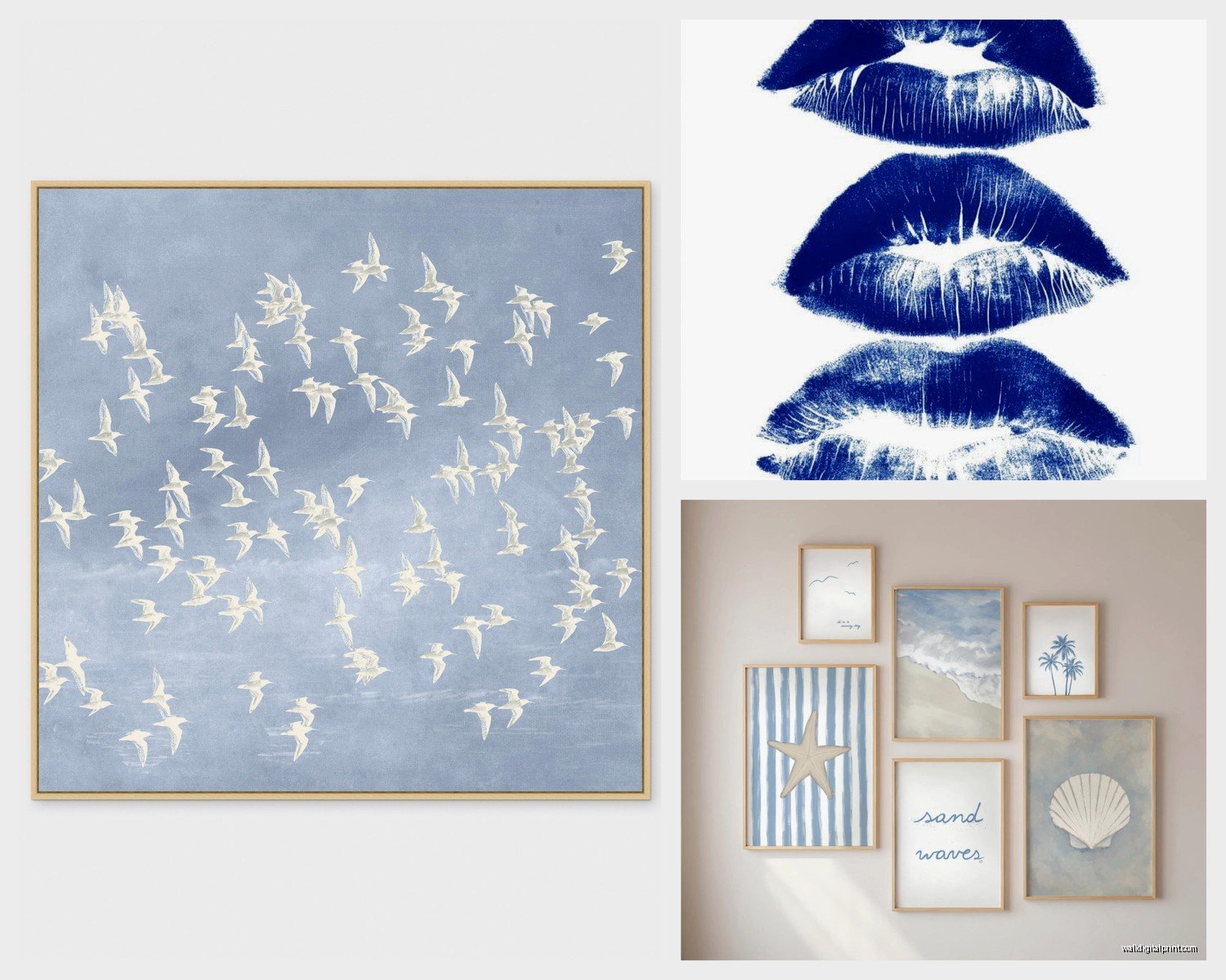
Sky Blues and Powder Blues
So these are technically in the light blue family but they lean more towards periwinkle or grey-blue. Sky blue art is everywhere right now, especially those “calming” pieces that are like… gradient skies or misty landscapes.
I use these in:
- Bathrooms (obviously)
- Bedrooms where people want calm but grey feels too sad
- Nurseries but in a non-gendered way
- Home offices surprisingly – it’s calming without being boring
The thing with sky blue art is you gotta watch your undertones. Some sky blues lean purple (powder blue territory), some lean green (gonna talk about that in a sec), and some are true blue. Hold them up against your wall paint or I promise you’ll get it wrong.
Oh and another thing – sky blue art can look washed out if your walls are too white. It needs a slightly warmer white or a very pale grey to show up properly. I learned this when I hung a beautiful pale blue seascape in a room with stark white walls and it looked like… nothing. Like it was barely there. We painted the walls in this warm white (I think it was Swiss Coffee by Benjamin Moore?) and suddenly the art had presence.
The Greyish Blues That Are Actually Perfect
Okay this is gonna sound weird but the best “blue” art I’ve used lately is actually grey-blue. That dusty, stonewashed, could-be-grey-could-be-blue situation. It’s insanely versatile because it:
- Works with both warm and cool color schemes
- Doesn’t compete with other colors
- Looks expensive somehow (I don’t make the rules)
- Photographs well if that matters for your space
I have a grey-blue abstract canvas in my bedroom that I bought four years ago thinking it was temporary and I still haven’t changed it because it works with everything. I’ve changed the bedding, the curtains, added plants, whatever – the art still works.
Turquoise and Teal Spectrum
Alright so we’re getting into the greener blues now. Turquoise art is so specific – it either works PERFECTLY or it looks totally wrong. There’s no in between with turquoise.
True turquoise (that bright blue-green gemstone color) needs:
- Other warm colors around it – coral, terracotta, warm wood
- Natural textures – rattan, jute, linen
- White space to breathe
- Good lighting because it can look cheap in dim lighting (sorry but it’s true)
I did a whole coastal house last year and we used turquoise art throughout but we paired it with so much natural wood and cream and terracotta that it felt organic, not themed. The second you add navy or red with turquoise it goes full nautical and sometimes that’s fine but usually that’s not what people actually want when they say they want “coastal”.
Teal vs Turquoise
Okay so people use these interchangeably but they’re different and it matters for art selection. Teal is darker, more sophisticated, leans more green. Turquoise is brighter, more blue, more saturated.
Teal art is honestly one of my favorite things to work with right now because it’s jewel-toned without being dark. It works in:
- Dining rooms – it’s vibrant without being too stimulating
- Accent walls (like a teal wall with teal art that has gold in it – so good)
- Bathrooms and powder rooms
- Bedrooms if you want color but navy feels too heavy
The best teal pieces I’ve found have metallic elements. There’s something about teal and gold or teal and copper that just elevates it from “pretty color” to “this person has TASTE”.
Actually Picking Art Based on Your Room
So here’s how I do this for clients, and this is gonna sound scattered but this is literally my process:
First I look at the biggest piece of furniture (usually sofa or bed) and I’m like okay what blue would make that look better? Not match – BETTER. If you have a grey couch, almost any blue works but navy or teal will make it look more expensive. If you have a beige couch, you want warmer blues – teal, turquoise, or navy with warm undertones.
Then I look at the light. Is it a bright room? You can go darker with your blues. Is it dim or north-facing? You need lighter blues with some warmth or they’ll make the room feel cold. I have a north-facing living room and I tried navy art in there and it was like a cave. Switched to a light turquoise piece with cream and it totally opened up the space.
The Frame Situation
Wait I forgot to mention frames and it actually matters so much. Navy art looks amazing in:
- Natural wood frames (oak, walnut)
- Gold or brass frames
- Black frames if the art has white in it
- No frame at all for modern spaces
Middle blues (cobalt, royal, cerulean):
- White frames for a crisp look
- Natural wood
- Black for drama
- Acrylic/lucite for a floating effect
Light blues and turquoise:
- White or cream frames
- Natural light wood
- Gold for a glam look
- Sometimes no frame if it’s a canvas
I basically never use silver frames with blue art anymore. I used to, but everything looks better with gold/brass or natural wood. Silver makes blue feel cold and office-like unless you’re specifically going for that corporate minimalist vibe.
Multiple Blue Pieces Together
Okay so gallery walls with multiple blue pieces or just multiple blue artworks in one space. This can look amazing or it can look like you panic-bought everything from HomeGoods blue section.
The rule I follow: vary your blues across at least three different shades on the spectrum. So like navy + powder blue + teal. Or cobalt + sky blue + turquoise. You need the contrast.
What doesn’t work: three different navy pieces. They’ll just look like you couldn’t commit to one. Unless they’re super different styles or textures, then maybe.
I did a stairway gallery wall with like nine pieces and four of them were blue (navy, teal, light blue, and one with just a hint of cobalt) and it worked because the blues were different enough AND they were mixed with creams and one rust-colored piece. The blues created a theme without being matchy.
My Actual Gallery Wall Formula
Since we’re here – when I do blue-heavy gallery walls:
- 60% blue artwork in varying shades
- 30% neutral (black and white, cream, beige)
- 10% accent color (rust, blush, green, whatever)
And I always include different mediums – so not all prints or all canvas. Maybe a print, a canvas, a textile piece, a small mirror, a 3D element. Variety makes it look curated instead of just “I bought five blue things”.
Where to Actually Find Good Blue Art
This is gonna sound like I’m promoting stuff but I’m not, these are just actually where I source things:
For affordable prints – honestly Etsy has gotten so good. I search for “abstract blue art print” or “navy watercolor art” and filter by reviews. Most of my clients don’t have huge art budgets so we’re getting digital downloads printed at a local print shop or ordering from sellers who ship prints.
The thing about Etsy is you gotta watch the quality. I always look for sellers who specify paper weight (at least 200gsm) and preferably archival quality if it’s gonna be in direct sunlight.
For original work – local art fairs and Instagram honestly. I’ve found amazing emerging artists on Instagram who do beautiful blue work for like $200-500 for original pieces.