Wall Art Guide, Wall Art Tutoriels
Blush Pink Wall Art: Soft Rose Feminine Designs
Mar
So I’ve been totally obsessed with blush pink wall art lately and honestly it started because a client wanted her bedroom to feel less…I don’t know, less like a hotel? And we went down this whole rabbit hole with soft rose tones and now I can’t stop recommending it to literally everyone who messages me.
Why Blush Pink Actually Works (And Why I Was Wrong About It)
Okay so I used to think blush pink was gonna make spaces look too feminine or too millennial-girly, but here’s the thing—it’s actually incredibly versatile if you know what undertones to look for. The key is finding pieces that lean either peachy-blush or mauve-blush depending on your existing wall color. I tested this theory in my own living room which has greige walls and the peachy-blush stuff just looked muddy and weird. Switched to cooler mauve-toned blush art and suddenly everything clicked.
You gotta consider your lighting too. Natural light makes blush pink look softer and more sophisticated, but if you’ve got warm yellow bulbs like I had in my office, it can skew too coral. I actually replaced all my bulbs to daylight LEDs just for this reason and yeah, expensive, but worth it.
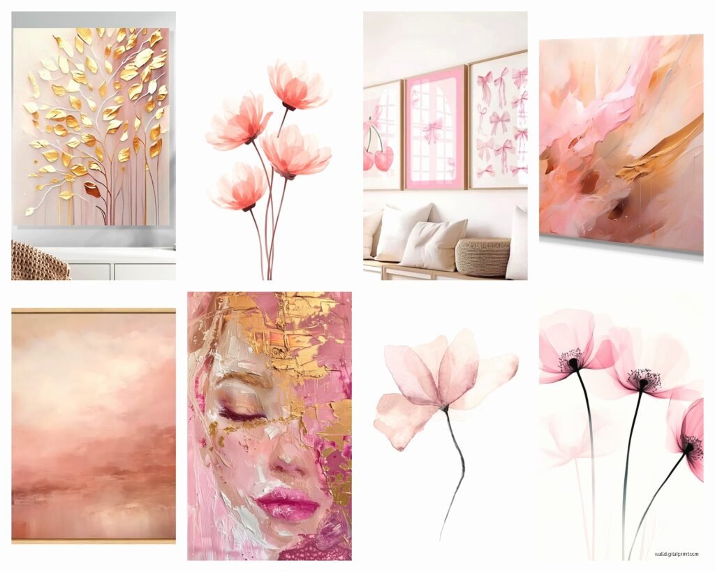
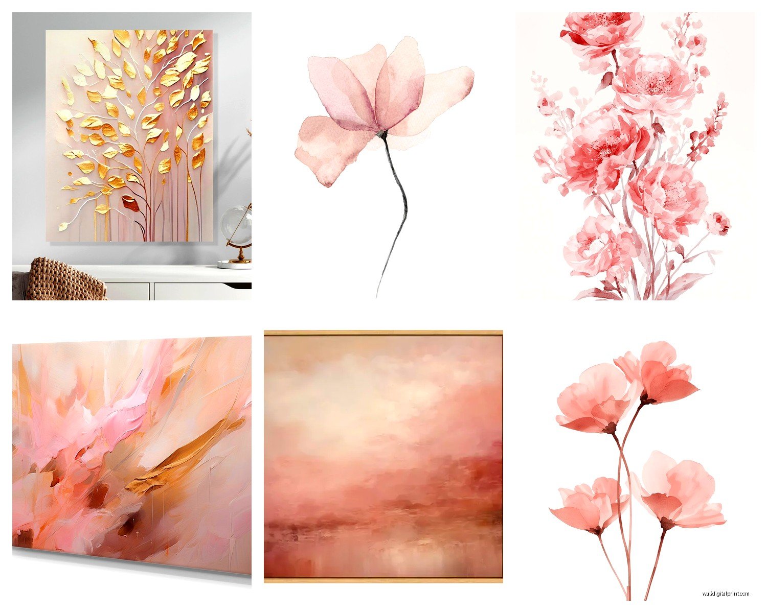
Types of Blush Pink Art That Actually Look Good
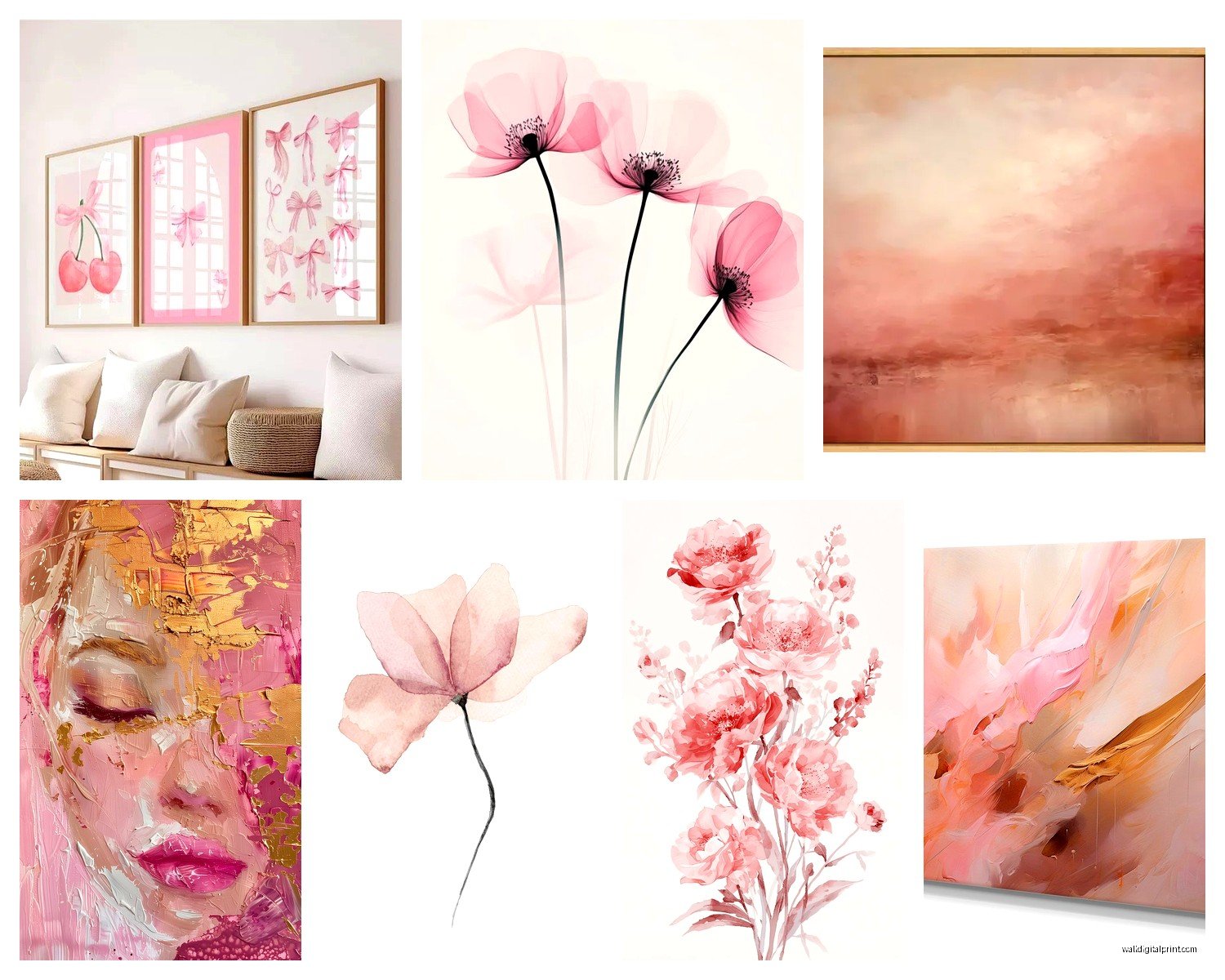
Abstract watercolor prints are probably the easiest starting point. I’ve been collecting these from various artists on Etsy and some print-on-demand sites, and the ones that work best have multiple shades of blush mixed with cream or soft gray. There’s this one print I found that has blush with gold leaf accents and I put it above a client’s bed—she texts me photos of it like once a month because she’s still obsessed.
Line art in blush is having a moment too. You know those minimalist female figure drawings? Those work surprisingly well in blush ink instead of black. Less harsh, more sophisticated. I hung three of them in a vertical arrangement in my hallway and my neighbor asked if they were from a gallery.
Botanical Prints in Rose Tones
Wait I forgot to mention botanical stuff. Pressed flower prints or watercolor florals in blush pink shades are pretty foolproof. I like peonies and roses obviously, but there’s also these really cool eucalyptus prints that have been painted in dusty rose tones. Found one at HomeGoods of all places for like $30 and it looks way more expensive than it was.
The trick with botanicals is not going too literal. Like, a super realistic photo of pink roses can look kinda dated? But an artistic interpretation or a vintage botanical illustration printed in soft rose tones feels current and elevated.
Sizing and Placement Because This Is Where Everyone Messes Up
Okay so funny story, I ordered this gorgeous blush abstract piece for above my couch and didn’t measure properly because I was watching The Crown and got distracted, and when it arrived it was literally the size of a postcard. So. Measure your wall space and aim for art that takes up about two-thirds to three-quarters of your furniture width if you’re hanging it above something.
For a gallery wall—which I’m gonna be honest, takes forever to get right—you want an odd number of pieces. Three or five works best. I did a set of five blush and cream abstract prints in my dining room, spent like two hours arranging them on the floor first before I committed to putting holes in the wall. My dog kept walking through them which was helpful actually because it forced me to try different configurations.
The Height Thing Nobody Talks About
Hang your art so the center is at eye level, which is supposedly 57 inches from the floor but like…whose eye level? I’m 5’6″ and my husband is 6’1″ and we definitely don’t agree on what looks right. I usually aim for around 58-60 inches to the center of the piece and it seems to work for most spaces.
In bedrooms though, you can go a bit lower, especially if you’re hanging art above the bed. You want to see it when you’re lying down, not just when you’re standing. I learned this the hard way when I hung a beautiful blush and gold abstract above my bed and realized I literally never saw it except when I was making the bed.
Mixing Blush Pink With Other Colors and Styles
This is where it gets fun. Blush pink plays really well with:
- Navy blue (this combo is *chef’s kiss* and way less predictable than blush and gold)
- Sage green (very calming, great for bedrooms)
- Warm grays and taupes
- Brass and copper metallics
- Cream and ivory (safe but pretty)
I did a whole living room last month with blush pink abstract art, navy velvet pillows, and brass accents and it looked so much cooler than I expected. The client was worried it would be too trendy but the color combo actually feels kind of timeless? Or at least as timeless as interior design trends can be.
What Doesn’t Work (Lessons From My Failures)
Don’t mix blush pink art with orange-toned woods. I tried this in my own home office with my vintage oak desk and the colors just fought each other. Blush needs cooler wood tones—think walnut or even painted white furniture.
Also avoid mixing too many different styles of blush art in one space. Like, if you have abstract blush prints, don’t also add floral blush art and geometric blush art all in the same room. Pick one vibe and stick with it. I broke this rule in my guest room and it looked like a TJ Maxx exploded.
Where to Actually Buy Blush Pink Wall Art
Etsy is my go-to for unique pieces and digital downloads you can print yourself. The digital download route is honestly super affordable—you can get high-res files for like $5-15 and then print them at a local print shop or even FedEx Office. Just make sure you’re getting files that are at least 300 DPI for good quality.
Society6 and Minted have good options too, though they’re pricier. The quality is consistently good though, which matters if you’re buying for a client and don’t wanna deal with returns. I’ve ordered probably 20+ prints from Society6 and only had one issue with color matching.
Print Quality Stuff You Gotta Know
Always order samples if you can. Colors look SO different on screen versus printed. I learned this when I ordered what looked like a perfect dusty rose print online and it arrived looking almost purple. Now I either order samples first or I make sure there’s a good return policy.
Paper quality matters more than you’d think. I spilled coffee on one of my cheaper prints accidentally (was styling a photoshoot and got distracted) and the paper basically disintegrated. Meanwhile the museum-quality paper prints I have? They can handle some abuse. Look for terms like “archival paper” or “giclée printing.”
Framing Options That Don’t Cost a Fortune
Oh and another thing—framing can cost more than the actual art which is insane. I use a mix of IKEA frames (the RIBBA and KNOPPÄNG lines are surprisingly good) and custom frames for special pieces. For blush pink art specifically, I love:
- Thin gold or brass frames (classic and elevates the art)
- Natural light wood frames (keeps things casual and modern)
- White or cream frames (safe choice that always works)
- No frame at all if it’s a canvas print (the floating look can be really cool)
Black frames with blush art can work but it’s tricky. The contrast has to be intentional and the art needs to be bold enough to hold up against the black. I did this once with a large-scale blush and black abstract and it looked amazing, but I’ve also seen it look really harsh.
DIY Blush Pink Art If You’re Feeling Crafty
This is gonna sound weird but making your own blush pink abstract art is actually pretty easy. I did this when my budget was tight for a client project and we needed like 6 pieces for a gallery wall. Got some canvases from Michael’s during a 50% off sale, some acrylic paints in various shades of blush, cream, and gold, and just went for it.
The technique I use is super simple: water down the acrylics so they’re more translucent, layer different shades, and add some metallic accents. You literally cannot mess this up because abstract art is subjective anyway. My client still doesn’t know I made those pieces myself and honestly they’re some of my favorite work I’ve done.
Styling Blush Art in Different Rooms
In bedrooms, I usually go for larger statement pieces or a calming triptych above the bed. Blush pink is inherently soothing so it works perfectly in sleep spaces. Just avoid anything too busy or bright—you want soft, dreamy, subtle.
Living rooms can handle bolder blush art. I like mixing a large blush piece with smaller complementary prints in a gallery wall. The large piece anchors everything and the smaller ones add interest without overwhelming.
Bathrooms are underrated spaces for blush art. I hung a small blush botanical print in my powder room and it completely transformed the space. Just make sure it’s in a frame with glass to protect it from humidity.
Home offices need careful consideration with blush pink because you don’t want it to feel too soft if you’re trying to work and be productive. I like using blush art with geometric elements or mixed with stronger colors like navy or charcoal gray in office spaces.
Seasonal Rotation and Long-Term Styling
Something I started doing last year is rotating my art seasonally. Sounds extra but it keeps spaces feeling fresh. Blush pink art works year-round honestly, but I tend to lean into it more in spring and summer. In fall and winter I sometimes swap in deeper rose or mauve tones.
If you’re worried about blush pink feeling too trendy, stick with pieces that have classic composition or timeless subjects. A blush-toned landscape or a subtle abstract in rose shades isn’t gonna look dated in five years the way some trend-heavy pieces might.
Also pay attention to how colors shift throughout the day in your space. That blush print that looks perfect in morning light might look completely different at sunset. I always try to view art at different times of day before committing, especially for larger expensive pieces.