Wall Art Guide, Wall Art Tutoriels
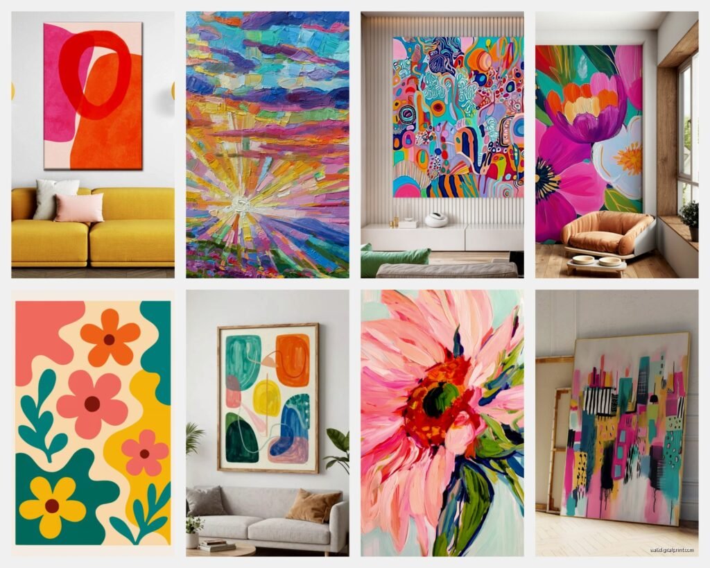
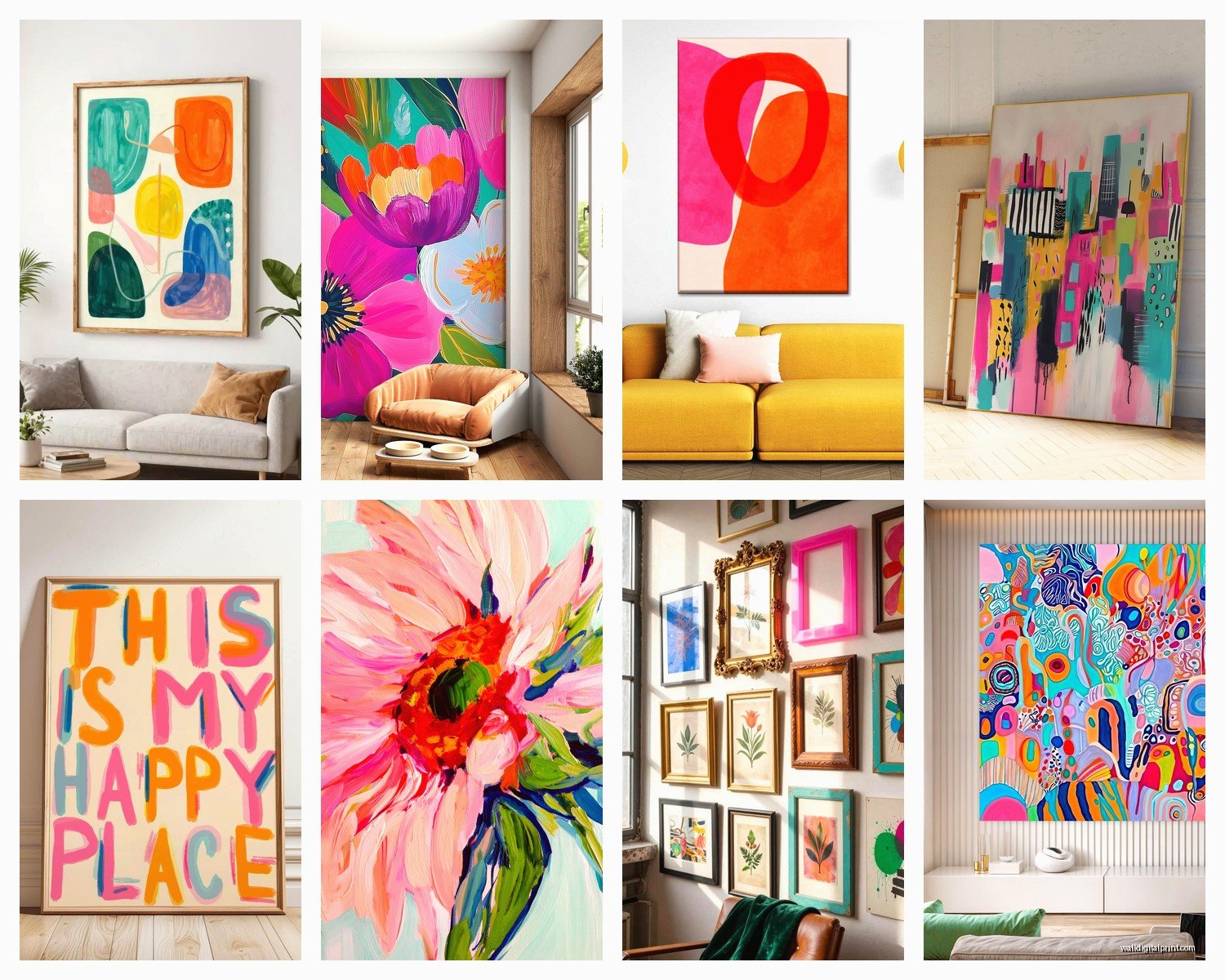
Bright Wall Art: Colorful Vibrant Bold Cheerful Designs
Mar
So I’ve been working with bright wall art for like the past fifteen years and honestly it’s one of those things where I had to learn through some pretty spectacular failures before figuring out what actually works. Let me just dump everything I know because you’re probably standing in a store right now or have like seventeen browser tabs open trying to figure this out.
The Color Temperature Thing Nobody Tells You
Okay so first thing – and I cannot stress this enough – you gotta understand warm versus cool brights. Not all vibrant colors are created equal and this is where most people mess up their entire room. I had this client last year who bought this gorgeous bright yellow piece, super cheerful, looked amazing in the gallery, but in her north-facing living room it just looked… sickly? Like the room had the flu or something.
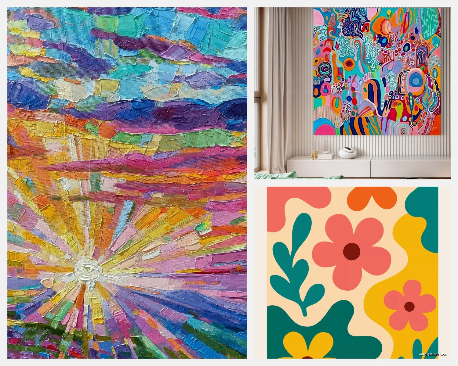
Warm brights are your oranges, warm yellows, hot pinks, coral reds. These work insanely well in rooms with cool natural light or north-facing spaces because they literally add warmth. I’m talking about colors that have red or orange undertones even if they’re technically a different color. That “blue” that’s actually got some red in it making it more violet.
Cool brights are your true blues, bright greens with blue undertones, purples, cyan, those electric lime greens. These are perfect for south-facing rooms or spaces that get really warm afternoon light because they balance it out. My own studio faces south and I’ve got this incredible bright turquoise piece that just… it calms down all that hot light streaming in.
Testing Light At Different Times
Here’s what I actually do and what I tell everyone – take photos of your wall at 9am, noon, 3pm, and like 7pm if you have the piece already or paint samples. The color shift is gonna blow your mind. That bright coral that looks perfect at noon might look washed out in evening light or weirdly intense in morning light. I learned this the hard way when I curated a collection for this cafe and the owner called me freaking out because the art looked completely different during breakfast service versus lunch.
Size and Scale With Bright Colors
So this is where it gets tricky and where I see people backing away from colors they’d actually love. Bright colors in large scale can be intimidating but like… they’re also more sophisticated? Which sounds backwards but stay with me.
A small bright piece (anything under 24×36 inches) needs to be REALLY bright to make an impact. We’re talking saturated, bold, almost aggressive. Because bright colors in small doses can read as decorative or even cheap if they’re not intense enough. I’ve got this tiny 8×10 hot pink abstract in my bathroom and it works because it’s practically neon – anything less saturated would just look like a regular pink painting.
But a large bright piece (over 40 inches in any direction) can actually be slightly less saturated and still feel vibrant. The sheer size does some of the work for you. I just installed this 60×48 inch piece that’s bright yellow and orange for a client and we went with colors that were like… 80% saturation instead of 100% and it’s perfect. At 100% it would’ve been overwhelming, like living inside a highlighter.
The Multiple Small Pieces Trap
Oh and another thing – people love doing gallery walls with multiple bright pieces and this can work but you gotta be really careful. I see this fail more often than it succeeds honestly. If you’re doing multiple bright pieces together, they need a unifying element. Either:
- They share one main color that appears in each piece
- They’re all the same color temperature (all warm or all cool)
- They have the same style/technique so the brightness feels intentional
- You’re spacing them with enough white/neutral wall space that they read as individual moments
I tried doing a gallery wall in my hallway with just random bright pieces I loved individually and it looked like a kindergarten classroom. Not the vibe I was going for. Ended up starting over with pieces that all had this deep teal as a grounding color and suddenly it worked.
Colors That Actually Make Spaces Feel Cheerful
Let’s talk about which bright colors genuinely create that cheerful feeling versus colors that are just… loud. Because there’s a difference and it matters.
Yellow is the obvious one but it’s so finicky. Bright lemon yellow can actually cause anxiety – there are studies on this and I’ve seen it play out in real life. Had a client who insisted on this super bright primary yellow piece for her kitchen and she ended up moving it within a month because she felt stressed cooking dinner. But golden yellows, yellow-oranges, those buttery yellows that lean slightly warm? Those are genuinely mood-boosting.
Coral and peachy brights are like universally cheerful. I’ve never seen these fail. They’re warm, they’re energetic but not aggressive, they work with basically every skin tone which matters more than people think when you’re living with art. You see yourself reflected in glass, you walk past it, you want colors that make you look alive not washed out.
The Surprising Power of Bright Pink
Okay so funny story – I used to hate bright pink in interiors. Thought it was too feminine, too much, whatever. Then I was stuck at this art fair because my friend who was supposed to pick me up was late and I spent like an hour in this one booth that had all these bright pink abstract pieces. The artist used these incredible ranges of pink from hot magenta to lighter bright pinks with bits of orange and purple and I just… got it suddenly.
Bright pink is actually incredibly sophisticated when it’s done right. It needs to be either really saturated (almost magenta) or mixed with unexpected colors. Bright pink with bright green is absolutely stunning. Bright pink with navy or charcoal gray is chef’s kiss. What doesn’t work is bright pink with other pastels or bright pink trying to be “pretty” – it needs to be bold about being pink.
I’ve used bright pink art in masculine spaces, in offices, in modern farmhouse kitchens (I know, sounds weird but trust me), and it brings this energy that’s hard to describe. It’s optimistic without being naive? My boyfriend initially vetoed pink anything in our place and now his favorite piece is this bright pink and orange abstract in the bedroom.
Combining Multiple Bright Colors
This is where people get really nervous and honestly? Valid. Multi-colored bright art can either look amazing or like a test pattern. Here’s what I’ve figured out through way too much trial and error.
The Three Color Rule
If you want art with multiple bright colors, stick to three main colors max. You can have little pops of other colors but three dominant ones. This creates enough variety to be interesting but enough cohesion to not feel chaotic. I’m working on a piece for my living room right now – bright turquoise, coral, and golden yellow. Those three colors in varying proportions and saturations but not adding in like… bright purple and lime green and hot pink too.
The exception is if you’re going for intentional rainbow vibes, in which case you need ALL the colors in relatively equal amounts. Partial rainbow never works. Either commit to the full spectrum or limit your palette.
Proportion Matters So Much
When you have multiple bright colors in one piece, they shouldn’t be equal amounts unless it’s a really specific design like stripes or color blocking. Usually you want one dominant bright color (maybe 50-60% of the piece), one secondary bright color (30-40%), and one accent bright (10-20%). This creates hierarchy and lets your eye rest.
I made the mistake of buying this piece where bright yellow, bright blue, and bright red were all fighting for dominance in equal thirds and I literally got a headache looking at it. Returned it within the week. Now I look at the proportion before anything else.
Background Colors and Negative Space
Wait I forgot to mention this and it’s actually super important – what’s happening in the non-bright parts of the art matters just as much as the bright colors themselves.
White backgrounds make bright colors pop like crazy. They feel modern, clean, energetic. But they also make the bright colors feel more intense, so if you’re nervous about going bold, white backgrounds might actually make it harder. I use bright art with white backgrounds in spaces where I want maximum energy – entryways, home offices, workout spaces.
Cream or off-white backgrounds soften bright colors just enough to make them approachable while still keeping them vibrant. This is my go-to recommendation for people who want cheerful but are worried about overwhelming. The slightly warmer background tone makes everything feel more cohesive.
Gray backgrounds make bright colors look sophisticated and intentional. Like you’re serious about color theory. This works really well in modern or contemporary spaces. I’ve got this piece with bright yellow and coral on a charcoal gray background and people always comment on it – it reads as designer-y in a way that bright colors on white sometimes don’t.
Black backgrounds make bright colors absolutely electric. This is dramatic and gorgeous but definitely not for everyone. The contrast is maximum. I use this in dining rooms a lot actually – there’s something about bright colors on black that feels celebratory and special.
Negative Space Amount
How much of the art is bright color versus background? This ratio changes everything. If it’s like 80% bright color and only 20% background, that piece is gonna dominate the room. It becomes the focal point, the whole vibe, everything else needs to defer to it. These work great on otherwise neutral walls where you want one statement moment.
If it’s more like 40% bright color and 60% background, the piece feels more balanced and easier to integrate. You can put other stuff on the same wall, you can have colorful furniture nearby, it plays well with others. I use these ratios in rooms where there’s already stuff going on visually.
Room By Room Real Talk
Okay so let me break down what actually works in different spaces because bright art doesn’t function the same way everywhere.
Living Rooms
Living rooms can handle big bright art but you gotta consider sight lines. Where do you sit most often? What are you looking at? I made this mistake in my old apartment where I put this gorgeous bright orange and pink piece directly across from the TV and I literally never watched TV anymore because the art was more interesting and also kind of distracting.
Best placement is usually on the wall your sofa faces if your TV is elsewhere, or above the sofa if your seating is arranged differently. Scale it to be about 2/3 the width of your sofa or main furniture piece below it. Bright colors in living rooms work best when the room has at least one other colorful element – a rug, throw pillows, something that ties it in.
My cat keeps trying to scratch the corner of my living room piece which is how I discovered that textured bright art is a bad idea in pet households. Smooth surfaces only unless you want paw-shaped modifications.
Bedrooms Are Tricky
Everyone assumes bright art is too energizing for bedrooms and like… yes and no? It depends on the colors and what wall it’s on. Bright blues and greens are actually fine in bedrooms – they’re vibrant but not stimulating in that keep-you-awake way. I have a bright teal and navy piece in my bedroom and sleep great.
What doesn’t work is bright warm colors (yellow, orange, red, coral) directly across from the bed where you’re looking right at it. Those are energizing and your brain doesn’t wind down as easily. But on the wall behind your bed or on a side wall? Totally fine. You’re not staring at them when you’re trying to sleep.
Also consider how much natural light the bedroom gets. If it’s a dark bedroom, bright art can actually make it feel more awake and pleasant during the day. If it’s already flooded with light, maybe skip the super bright stuff or go with cooler tones.
Kitchens and Dining Rooms
These spaces are perfect for bright art because they’re social, they’re active, they’re meant to feel alive. I go bolder in kitchens and dining rooms than almost anywhere else. Bright yellows, oranges, reds – all the warm tones that are too much for bedrooms work beautifully here.
One thing though – make sure your bright art doesn’t clash with your food. Sounds ridiculous but it’s real. My friend had this bright purple and green piece in her dining room and she said certain foods just looked unappetizing next to it. Blues and purples can be weird with food. Reds, oranges, yellows, and even pinks work better in eating spaces.
Kitchen art needs to be easily cleanable because grease and splatter happen. Glass or acrylic fronts are your friend. I learned this when I had to clean spaghetti sauce off a canvas piece and the texture never fully recovered.
Home Offices Need Strategic Brightness
So I work from home obviously and I’ve experimented a lot with this. Bright art in your direct sight line while you work can be either really motivating or really distracting depending on the type of brightness.
Organized bright art – geometric patterns, color blocking, clean lines – is great in your sight line. It’s stimulating but not distracting. Abstract bright art with lots of movement or detailed bright art is better placed to the side or behind you where you can see it when you turn away from your screen.
I had this incredibly beautiful bright mixed-media piece with so much texture and detail directly across from my desk and I would just zone out looking at it instead of working. Moved it to the side wall, put up something with clean bright stripes instead, productivity improved immediately.
Dealing With Existing Colors in Your Space
This is gonna sound weird but the biggest mistake I see is people trying to match their bright art to existing colors perfectly. Like they have navy sofa and they’re searching for bright art with the exact same navy and it just… that’s not how it works.
Instead, look for bright art that includes colors in the same family or temperature as what you already have. If you have warm-toned furniture and decor, get bright