Wall Art Guide, Wall Art Tutoriels
Burnt Orange Wall Art: Terracotta Rust Fall Warm Tones
Mar
So I’ve been working with burnt orange wall art for like three years now and honestly it’s one of those colors that everyone thinks they understand until they actually try to hang it in their space and realize terracotta from one brand looks completely different from rust from another brand and suddenly your “cohesive fall palette” looks like a Pinterest fail.
The Actually Important Difference Between Burnt Orange, Terracotta, and Rust
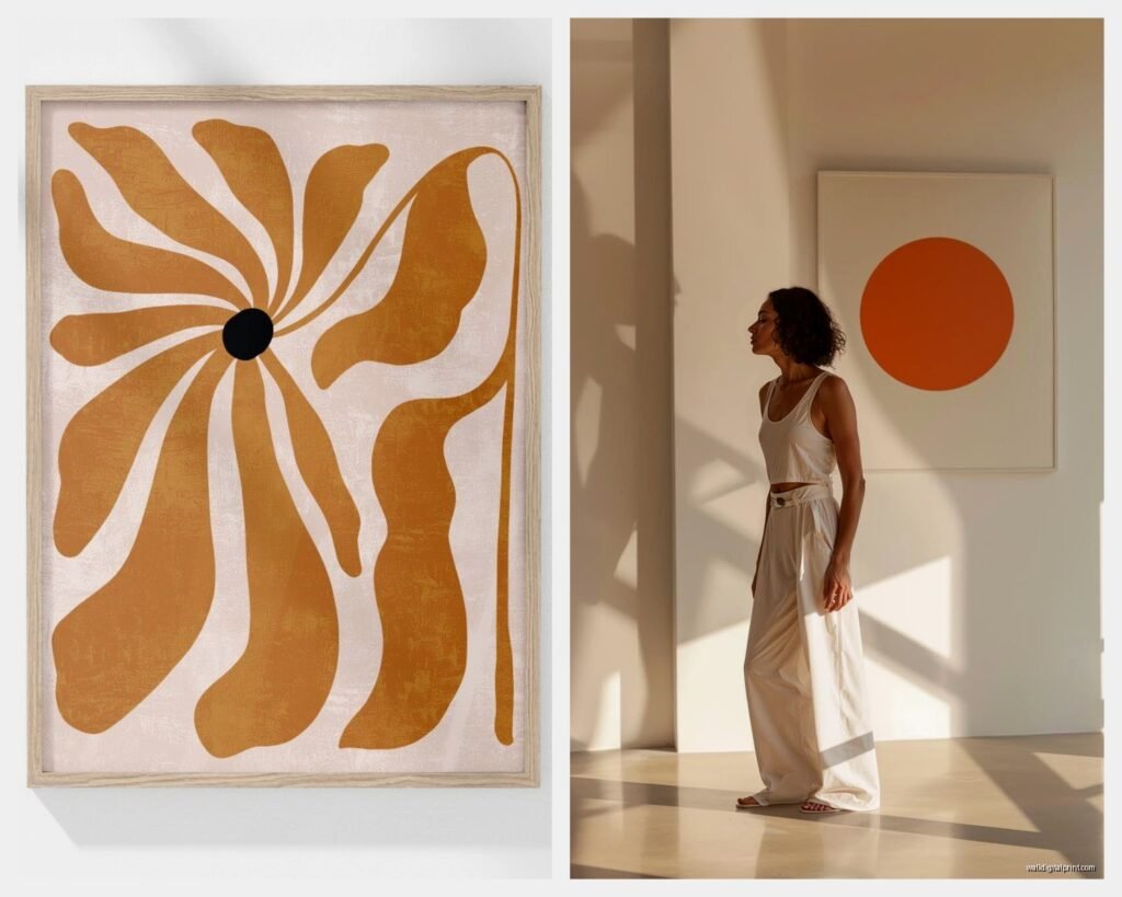
Okay so this is gonna sound nitpicky but I promise it matters. Burnt orange has more red in it, like a true orange that got deeper. Terracotta leans brown – think actual clay pots, that earthier vibe. Rust is basically orange that went through some stuff and came out more muted with gray or brown undertones.
I learned this the hard way when a client asked for “warm terracotta art” and I ordered three pieces that all claimed to be terracotta online and they arrived looking like three completely different color families. One was basically brown with a hint of orange, one was peachy, and one was that perfect clay pot color she actually wanted.
The Undertone Thing Nobody Talks About
Your burnt orange art is either gonna have:
- Red undertones (warmer, more energetic, kinda reminds me of those 70s conversation pits)
- Brown undertones (earthier, more grounded, easier to work with honestly)
- Pink undertones (yes really, some terracottas do this and it’s either gorgeous or completely wrong depending on your space)
- Gray undertones (this is your rust territory, more industrial vibes)
Here’s what I do now – and my cat knocked over my coffee while I was doing this last week so there’s a stain on one of my sample cards – I literally order paint swatches in the burnt orange family and hold them up next to my laptop screen when I’m shopping for art online. Sherwin Williams Cavern Clay, Behr Rustic Orange, Benjamin Moore Audubon Russet. You don’t have to paint your walls these colors but the physical swatches are like three dollars and they’ll save you so many returns.
What Actually Works With Burnt Orange Art
Okay so you‘ve got your burnt orange piece or you’re about to buy one, and now you’re panicking about what goes with it because everything you read online says something different.
The Neutral Situation
Warm whites are your friend. Not stark white, not cool gray-white. Think cream, ivory, that slightly peachy white that Farrow & Ball calls Pointing or whatever. Cool whites make burnt orange look muddy and sad. I watched this happen in real-time in my own living room before I repainted, it was like the art was actively being drained of life.
Beiges and tans work but they gotta have warm undertones too. If your beige looks grayish, it’s gonna fight with your burnt orange. If your beige looks slightly peachy or yellow, you’re good.
Black is actually really good with burnt orange? Like surprisingly good. It makes the orange feel more sophisticated instead of just autumnal.
Colors That Sound Wrong But Actually Work
Navy blue. I know, I know. But a deep navy with burnt orange is *chef’s kiss*. It’s that complementary color theory thing but in a less obvious way than straight blue and orange.
Sage green or olive green. Not mint, not kelly green, not forest green. Those muted greenish tones that look kinda grayish. This is like the entire fall aesthetic right here.
Mustard yellow. But you gotta be careful because too much warm yellow plus burnt orange can read very… 1970s kitchen. Not in the cool vintage way.
Dusty pink or mauve. This sounds insane but if your terracotta has those pink undertones I mentioned, bringing in an actual dusty pink makes everything feel intentional instead of accidental.
Colors That Definitely Don’t Work (I’ve Tried)
Bright white – already said this but seriously don’t
Cool gray – they just cancel each other out energetically, everything looks flat
Bright red – too much, looks chaotic unless you’re going for a maximalist thing and even then it’s hard
Purple – I thought this would work because warm tones but nope, they just sit there awkwardly next to each other
Choosing Burnt Orange Art For Your Actual Wall Color
Wait I forgot to mention this earlier but it really matters what’s already on your walls.
White or Cream Walls
You have the most flexibility here. Any shade of burnt orange through rust is gonna pop. The art becomes the statement. I’d go more saturated with your orange choices because you have that neutral backdrop.
Gray Walls
If it’s a warm gray, you can work with rustier, more muted oranges. If it’s a cool gray… honestly I’d either repaint or choose different art because you’re gonna be fighting that coolness constantly. My client tried this in her bedroom and we ended up adding so many warm wood elements to compensate that it would’ve been easier to just paint.
Beige or Tan Walls
This is actually really pretty but you need contrast. Go darker with your burnt orange, more terracotta than peachy-orange. Light peachy art on beige walls disappears.
Colored Walls (Bold Choice, I Respect It)
Navy walls with burnt orange art – incredible, already mentioned this but it’s worth repeating
Sage or olive walls – chef’s kiss again, very fall, very cozy
Cream or warm white – you want this to look intentional so go for larger-scale art, make it a statement
The Art Styles That Work Best
Okay so funny story, I was curating a show last fall and realized that burnt orange doesn’t work the same in every art style.
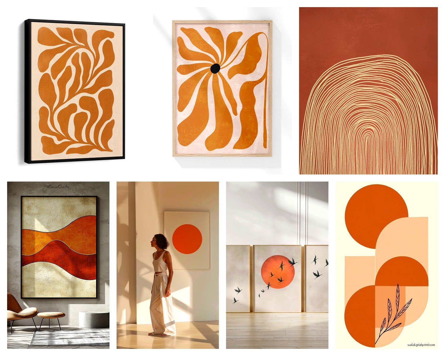
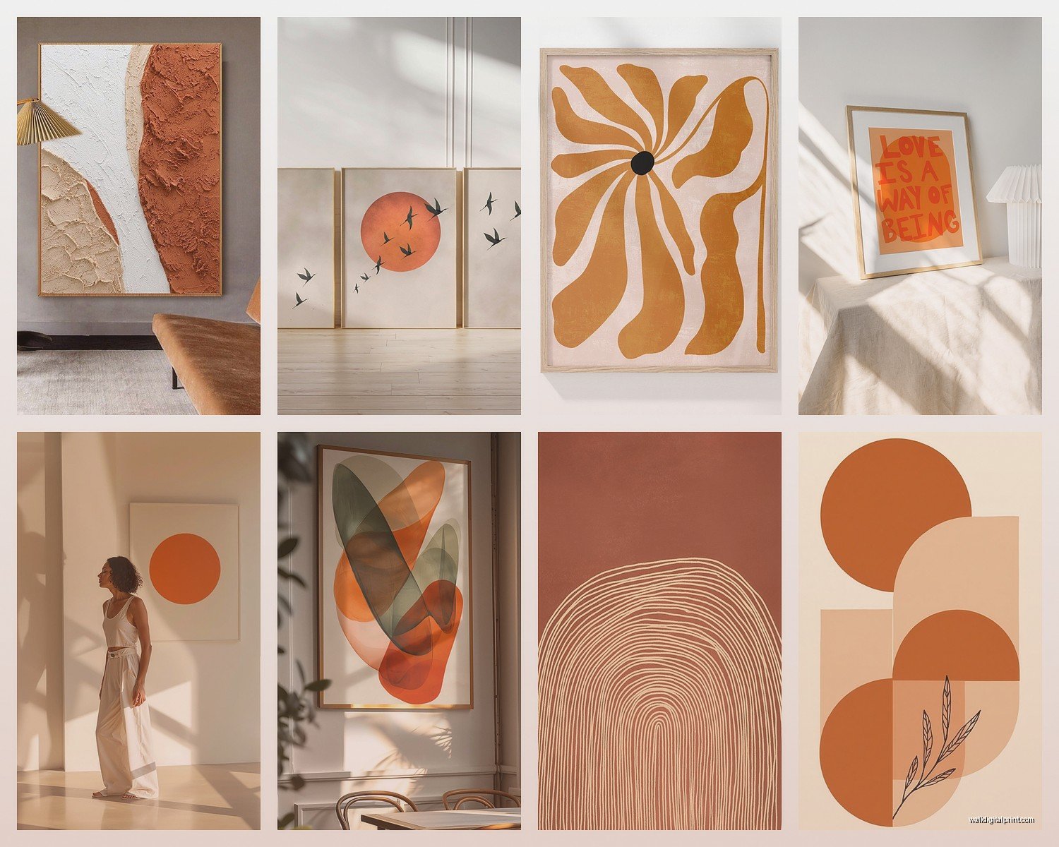
Abstract Art
This is probably your safest bet. Burnt orange in abstract pieces can be layered with all those colors I mentioned – navy, sage, cream, mustard. Look for pieces where the orange isn’t the only color but it’s a main player. The brushstrokes or texture give it dimension so it doesn’t read flat.
Oh and another thing – watercolor abstracts in burnt orange tones are having a moment and they’re actually really versatile because the color is usually more translucent, less intense.
Botanical Prints
Terracotta is especially good for botanical stuff. Line drawings on terracotta backgrounds, or actual botanical illustrations that feature those warm tones. It feels organic in a way that makes sense? Like the color is connected to earth and plants.
Geometric Art
This can go really modern or really mid-century depending on how you do it. Burnt orange in geometric patterns with cream and navy is very 2024 in the best way. Rust with black geometric shapes is more industrial.
Photography
Sunset photos, desert landscapes, architecture – these work because the burnt orange is contextual. It’s not just orange for orange’s sake, it’s actually in the scene. I find these easier to work with than like, a solid burnt orange canvas.
What Doesn’t Really Work
Portraits in burnt orange tones can be tricky unless it’s very stylized. The orange can make skin tones look weird if you’re going for realism.
Text-based art in burnt orange… I mean it can work but it often reads too crafty? Like it wants to say “Gather” or “Blessed” and live in a farmhouse.
Size and Placement Strategy
This is where I see people mess up constantly. They get the color right but the scale is wrong.
Large Statement Pieces
If you’re doing one big burnt orange piece, it should be at least 30×40 inches for a standard living room wall. Smaller than that and it’s not making the statement you think it’s making, it just looks like you couldn’t find anything bigger.
Hang it at eye level, which is like 57-60 inches from the floor to the center of the piece. I measured this in my own place because I was tired of eyeballing it and getting it wrong.
Gallery Walls
Okay so with gallery walls, you can mix burnt orange art with other warm tones but don’t do all burnt orange. Too much. I usually do like 30-40% burnt orange pieces, the rest in complementary colors and neutrals.
Layout wise – and my friend canceled our lunch plans so I actually spent two hours testing gallery wall layouts on my floor before hanging them – start with your largest piece slightly off-center and build around it. Don’t do the symmetrical grid thing with these warm colors, it feels too formal.
Series or Diptych
Two or three pieces that work together is really nice with burnt orange. You can show a color progression from true orange to rust, or mix burnt orange with complementary colors across the pieces. Space them 2-4 inches apart.
Texture Matters More Than You’d Think
This is gonna sound weird but the texture of your burnt orange art changes how the color reads in your space.
Matte finishes make the color look more muted, earthier, more terracotta vibes. Glossy finishes make it pop more, feel more energetic. Canvas has that slight texture that catches light differently throughout the day – I notice this in my hallway where the art looks more rust-toned in morning light and more orange at sunset.
Paper prints under glass give you that smooth look, more gallery-like. Metal prints (yes burnt orange on metal is a thing) look more industrial, the color stays really saturated.
If you’re going for a boho vibe, textured art like macrame or woven pieces in burnt orange tones add dimension. There’s this fiber artist on Etsy – wait I can’t remember her name – but she does these incredible rust-colored woven wall hangings that have actual depth to them.
Lighting Will Make or Break This
Okay so I learned this when I was staging a condo that had terrible lighting. Your burnt orange art is gonna look totally different depending on your light sources.
Natural Light
If you have lots of natural light, burnt orange art is gonna shift throughout the day. Morning light (cooler) makes it look more muted and rusty. Afternoon and sunset light (warmer) makes it glow. This is actually beautiful if you’re into that changing mood thing.
North-facing rooms get cooler light all day so your burnt orange might look more brown. South-facing rooms are warmer so the orange stays vibrant.
Artificial Light
Warm white bulbs (2700-3000K) make burnt orange look richer and more saturated. Cool white bulbs (4000K+) make it look muddy. Please don’t use cool bulbs if you’re committing to warm-toned art.
I replaced all the bulbs in my living room with 2700K after I hung a terracotta abstract piece and it looked completely wrong under the old 4000K bulbs. Cost me like forty bucks but totally worth it.
Picture Lights
If you really wanna get fancy, a picture light above your burnt orange art makes it feel like a gallery. But make sure the light itself is warm-toned, not cool LED.
Mixing Different Shades of Burnt Orange
You can totally have multiple burnt orange pieces in the same room but you gotta be strategic about it.
Rule I follow: vary the saturation and value. So like one piece that’s deep rust, one that’s brighter burnt orange, maybe one that’s peachy terracotta. They all live in the same color family but they’re not competing.
Distance matters too. Don’t put two very similar burnt orange pieces right next to each other. Spread them out so your eye moves around the room.
Oh and another thing – mix your art styles if you’re doing multiple burnt orange pieces. One abstract, one botanical, one geometric. Keeps it interesting.
Seasonal Considerations (Yeah Really)
Here’s something weird I’ve noticed – burnt orange art hits different in different seasons.
Fall through winter? Perfect. It feels cozy and intentional and seasonal in the best way. My clients always comment on how the art feels more present during these months.
Spring and summer? You gotta support it with your styling. Add fresh greenery, lighter textiles, maybe some brass or gold accents. Otherwise it can feel heavy. I swap out throw pillows seasonally to keep my burnt orange art feeling fresh year-round.
Some people rotate their art seasonally but honestly if you style it right, burnt orange can work all year. Just don’t go full fall vibes with pumpkins and then wonder why it feels weird in June.
What to Put Around It (Styling the Space)
Your art doesn’t exist in a vacuum and honestly this is where people mess up even when they got the art choice right.
Furniture
Warm wood tones – walnut, oak, teak – all look incredible with burnt orange art. Cool dark woods like espresso can work but they’re trickier.
Leather furniture in cognac or tan shades is basically made for burnt orange art. It’s that whole warm-on-warm thing.
Cream or beige upholstery is safe and good. Navy upholstery is bold and really good if you’re confident.