Wall Art Guide, Wall Art Tutoriels
Coffee Bar Wall Art: Home Cafe Station Decor
Apr
So I’ve been setting up coffee bar areas for like three years now and honestly the wall art is what makes or breaks the whole vibe. My client last week had this gorgeous espresso machine but the wall behind it looked so sad and I just… let me tell me what actually works.
Canvas Prints vs Metal Signs vs Wood
Okay so first thing, you gotta think about moisture. Coffee bars get steamy, especially if you’re using a proper machine. I learned this the hard way when I hung this beautiful watercolor print above my own setup and within like two months it was warping around the edges. Not cute.
Metal signs are honestly my go-to now. Those vintage-style coffee shop signs? They hold up SO well. I found this one on Etsy that says “But First Coffee” in this retro font and it’s been hanging near my french press for over a year with zero issues. The powder-coated ones are best because they don’t get water spots if you splash them accidentally.
Wood signs can work but you want sealed wood. Like properly sealed. I made the mistake of buying this cute farmhouse-style piece from HomeGoods that wasn’t sealed well enough and it got all weird and swollen looking after a few months. If you’re going wood, ask about the finish or just plan to seal it yourself with polyurethane.
Canvas can work if you keep it far enough from the actual coffee-making zone. Like if your wall art is a foot or more away from where steam happens, you’re probably fine. I have a canvas coffee bean print that’s been okay because it’s off to the side.
Size Matters More Than You Think
This is gonna sound weird but I see people mess this up constantly. They buy these tiny 8×10 prints for a wall that’s like three feet wide and it just looks lost.
For a standard coffee bar setup where you’ve got maybe 24-30 inches of wall space, you want something in the 16×20 range minimum. I usually go bigger. Like if you have a 36-inch wide area, I’d do a 24×36 piece or do a gallery wall situation with multiple smaller pieces.
Oh and another thing – consider the height of your coffee maker and stuff. You don’t want your wall art sitting directly on top of your equipment with like one inch of space. Leave at least 4-6 inches between the top of your tallest item and the bottom of your art. It needs breathing room or it looks cluttered.
I was watching The Bear the other day (have you seen it? so good) and noticed how they do signage in that kitchen and it made me realize that negative space is your friend. Don’t fill every inch.
What Actually Looks Good Theme-Wise
Okay so you can go a few directions here:
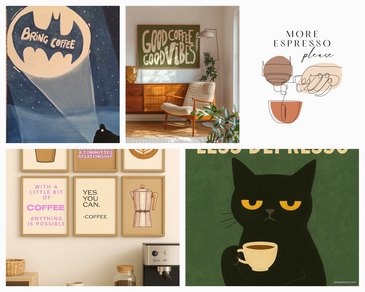
Vintage coffee advertising – This is classic. Think old Folgers ads, Italian espresso posters, those French cafe scenes. Works really well if your kitchen has any traditional or farmhouse elements. I just finished a client’s space with three vintage-style Italian coffee ads in black frames and it looked like a legit cafe.
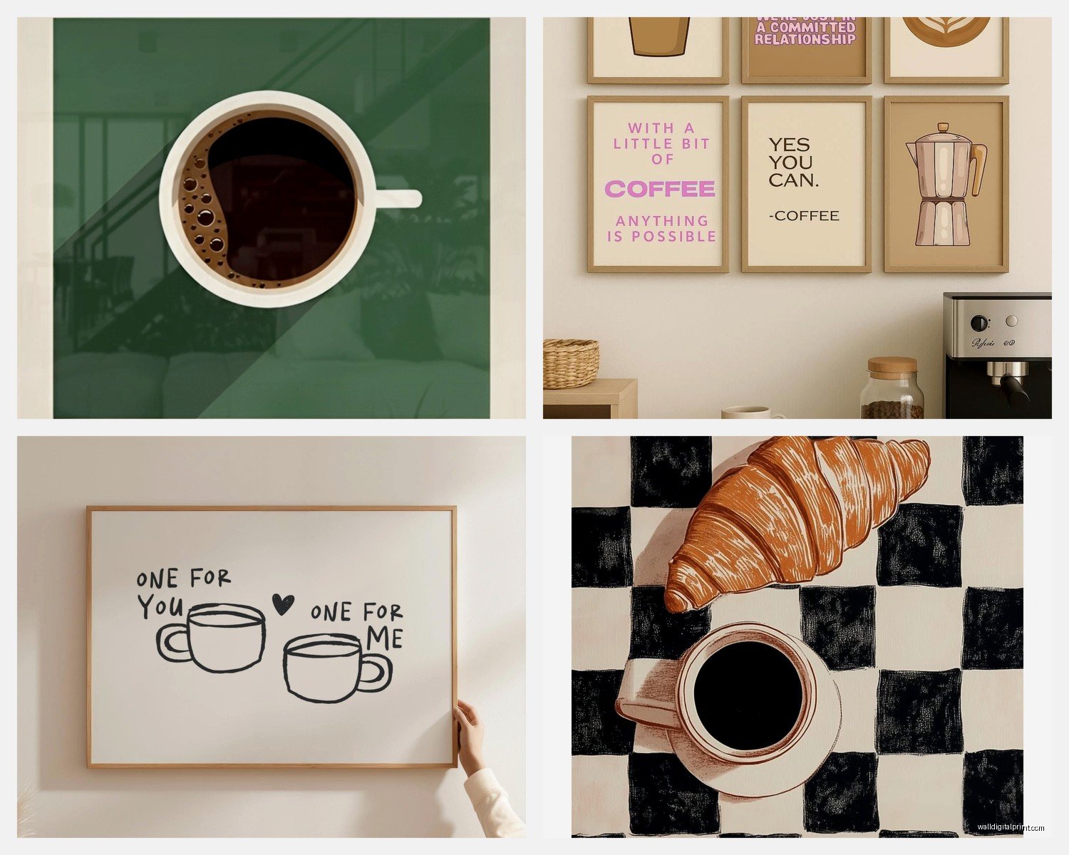
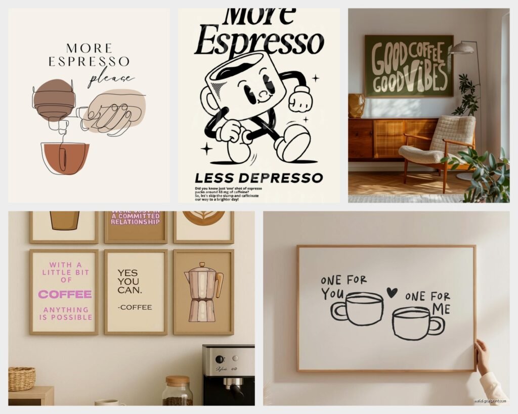
Minimalist typography – If your kitchen is modern, those simple black and white prints with coffee quotes or just the word “coffee” in nice fonts. Less is more here. I have one that just says “espresso” in this gorgeous serif font and that’s it. Clean.
Botanical coffee plant prints – This is having a moment right now. Actual coffee plant illustrations or photos. It’s unexpected? Like people don’t immediately think “coffee” when they see it but then they get it. More sophisticated than the cutesy stuff.
Abstract or geometric – Honestly if you’re sick of obvious coffee imagery, just do art you like that happens to work with your color scheme. I did a whole coffee bar with abstract prints in cream and terracotta and it was gorgeous. Nobody needs to know it’s a “coffee bar” from the art.
Skip the really cutesy stuff unless that’s genuinely your style. Like the signs that say “Life happens, coffee helps” with cartoon coffee cups… they can read a bit Target clearance section if you’re not careful.
Frames Are Actually Important
I used to just slap any frame on things and call it done but frames really do change the whole look.
Black frames – super versatile, work with literally everything, make colors pop. This is my default. You can get decent ones at Michael’s when they’re doing their 50% off sales which is like every other week.
Natural wood frames – great for warmer, cozier spaces. I use these when there’s already wood elements in the kitchen. They soften things.
White frames – good for bright, airy spaces but they can wash out if your walls are also white. Need some contrast somewhere.
No frame at all – canvas wraps or metal prints don’t need frames. Actually looks cleaner sometimes. Less fussy.
One trick I learned from my friend who’s a gallery curator – if you’re doing multiple pieces, keep the frames consistent. Same color, same style. It looks intentional instead of like you just grabbed random stuff.
The Gallery Wall Approach
If you can’t find one perfect piece, do a gallery wall. This actually gives you more flexibility and you can mix different types of art.
I usually do odd numbers – 3 or 5 pieces works better than 2 or 4 for some reason. Something about visual balance.
Here’s my formula that works every time:
- One larger anchor piece (like 16×20)
- Two medium pieces (11×14 or 12×16)
- Two small pieces (8×10) or some 3D elements like a small shelf with a coffee cup
Lay it out on the floor first. Seriously, don’t wing it on the wall. I learned this after putting like 15 nail holes in my kitchen wall trying to get things right. Measure, use painters tape to mark where things go, then hang.
The center of your arrangement should be roughly at eye level, which is usually around 57-60 inches from the floor. But if you’re tall or short adjust accordingly.
Where to Actually Buy This Stuff
Okay so I’ve ordered from everywhere at this point. Here’s what’s worth it:
Etsy – Best for unique prints and custom stuff. I found this seller who does personalized coffee bar signs with your family name and it’s such a nice touch. Quality varies though so read reviews. Shipping can take forever if it’s coming from overseas.
Society6 – Good for artistic prints, lots of independent artists. You can get the same design as a canvas, framed print, metal print, whatever. I like that flexibility. Prices are medium-range.
Amazon – Don’t sleep on Amazon. They have tons of metal coffee signs that are actually decent quality and they arrive in like two days. Search “vintage coffee metal sign” and you’ll find hundreds. Read reviews about the actual metal thickness though because some are flimsy.
HomeGoods/TJ Maxx – Hit or miss but when you find something good it’s a great deal. I check every time I’m there. Found a gorgeous coffee botanical print for $25 that would’ve been $80+ elsewhere.
Minted – If you want something really nice and don’t mind spending more. Their quality is consistently good. I use them for client projects where budget isn’t as tight.
Wait I forgot to mention – if you’re crafty at all, you can print your own. I’ve done this with vintage coffee ads that are in public domain. Download a high-res image, take it to a print shop or even print at home if you have a decent printer, frame it. Costs like $15 total.
Practical Installation Tips
Use proper wall anchors if you’re not hitting a stud. Drywall anchors are your friend. I like the self-drilling ones because you don’t need to pre-drill a hole.
For renters or if you don’t wanna make holes, Command strips actually work for lighter pieces. I’ve had a metal sign up with Command strips for over a year with no issues. Just follow the weight limits they list.
Level everything. Please. I know it seems obvious but I can’t tell you how many times I’ve seen slightly crooked art and once you notice it you can’t unsee it. Get a small level, they’re like $5.
If you’re hanging multiple pieces, the spacing between them should be consistent. I usually do 2-3 inches between pieces. Measure it.
Lighting Considerations
Oh man this is something people forget. If your coffee bar is in a darker corner of your kitchen, consider adding a small picture light or even some LED strips. Art looks way better with proper lighting.
I installed these battery-operated LED puck lights above a client’s coffee bar gallery wall and it completely transformed it. You can get them for like $20 on Amazon and they stick on, no wiring needed.
Natural light can be tricky though. Direct sunlight will fade prints over time, especially if they’re not UV-protected. If your coffee bar gets a lot of sun, consider UV-protective glass in your frames or go with metal signs that won’t fade.
Color Coordination Without Being Matchy-Matchy
Your wall art should work with your overall kitchen colors but it doesn’t need to match exactly. Actually it’s better if it doesn’t.
I usually pull one or two colors from the art that appear elsewhere in the space. Like if you have a print with teal accents, maybe you have teal kitchen towels or a teal container. That’s enough to tie things together.
Black and white art works with literally any color scheme. This is why I use it so much. It’s foolproof.
If your kitchen is all neutrals, this is your chance to add a pop of color through the art. I did a whole white kitchen with this vibrant teal and orange abstract coffee print and it became the focal point of the whole room.
My dog just knocked over my coffee cup while I’m writing this which is ironic but anyway…
Mixing Art with Functional Decor
You don’t have to do JUST art. Mix in some functional stuff that also looks good:
- Floating shelves with coffee mugs displayed
- A small chalkboard for writing daily coffee specials or quotes
- Hooks with cute coffee scoops or pour-over equipment hanging
- A small succulent or coffee plant in a wall-mounted planter
I did this one setup where we had two framed prints flanking a floating shelf with pretty coffee mugs and a small plant. It looked like something from Pinterest but was actually super functional because those mugs were the ones they used daily.
The key is keeping it from looking cluttered. If you add shelves and hooks, keep them organized. Nothing ruins a nice coffee bar faster than messy, overcrowded shelves.
Seasonal Switching
This might be extra but I have a few clients who swap their coffee bar art seasonally. Like warmer, cozier prints in fall and winter, brighter stuff in spring and summer.
If you’re into that, keep the frames and just swap the prints. Way easier than rehanging everything. You can find printable coffee art online, print it yourself, and have a whole rotation for minimal cost.
I don’t personally do this at home because I’m lazy but it’s a cute idea if you like changing things up.
What Doesn’t Work
Real quick, things I’ve tried that flopped:
Anything too busy or colorful if your countertop already has a lot going on. It just becomes visual chaos.
Really large pieces in small spaces. Sounds obvious but I’ve seen people try to cram a 30×40 print above a tiny coffee station and it overwhelms everything.
Unrelated art just because you like it. Like if you have beach scenes above your coffee bar it’s just confusing? Unless your whole kitchen is coastal themed I guess.
Paper prints without glass protection in high-moisture areas. They will warp, I promise you.
Super trendy stuff that you’ll hate in six months. The “but first coffee” trend is kinda dying out honestly. Go with something that’ll age better.
Budget Breakdown
If you’re wondering what this actually costs:
Budget option: $30-50 total. Print your own art or get Amazon metal sign, cheap frame or no frame. Totally doable and can still look good.
Mid-range: $100-150. Decent quality prints from Etsy or Society6, proper frames, maybe a small gallery wall.
Splurge: $200+. Custom pieces, high-quality framing, maybe some original art from local artists, professional installation if you’re not confident with the hanging.
I usually tell people to spend about 10% of what they spent on their coffee equipment. Like if you dropped $500 on an espresso machine, a $50 art piece makes sense. But honestly just spend what feels right for your space.
Anyway that’s basically everything I know about coffee bar wall art from doing this for years. The main thing is just pick something you actually like looking at every morning because that’s the whole point right? It should make you happy when you’re making your coffee, not just look good in photos.