Wall Art Guide, Wall Art Tutoriels
Colorful Wall Art: Vibrant Rainbow Multi-Hue Designs
Mar
So I’ve been absolutely obsessed with colorful wall art lately and honestly it started because a client wanted to “rainbow-fy” their living room and I thought they were joking but they weren’t and now I can’t stop thinking about vibrant multi-hue designs everywhere I look.
Understanding What Actually Works With Rainbow Art
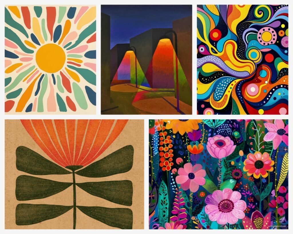
Okay so first thing – and I cannot stress this enough – not all rainbow art is created equal. You’ve got your literal rainbows, your abstract color blocking, your gradient situations, and then these wild multi-hue pieces that don’t follow any color wheel rules but somehow work? I spent like three weeks testing different styles in my own space and then in client homes and here’s what I figured out.
The key is understanding undertones. This is gonna sound weird but I literally held up like 40 different “colorful” prints next to each other and realized some lean warm (reds, oranges, yellows dominating even when blues are present) and some lean cool (blues, purples, greens taking over). Your room’s existing undertones matter SO much here. My kitchen has warm oak cabinets and when I tried a cool-toned rainbow abstract it looked absolutely terrible, like it was from a different house.
Warm Rainbow Palettes
These are your reds, oranges, yellows, warm pinks, coral tones. Maybe some teal or turquoise thrown in but the overall vibe is sunset-y. Works amazing in:
- Kitchens with wood cabinets
- Living rooms with warm hardwood floors
- Spaces with a lot of natural terracotta or rust tones
- Rooms that get golden afternoon light
I have this one piece above my dining table that’s mostly orange and pink with shots of yellow and a tiny bit of purple and it makes the whole room feel energized but not chaotic. Got it from an Etsy seller who does custom sizing which – wait I’ll get to sizing in a minute because that’s its own thing.
Cool Rainbow Palettes
Blues, purples, greens, cool pinks (the ones that lean lavender not coral). These work better in:
- Bedrooms where you want calm energy
- Bathrooms especially with white or gray tile
- Modern spaces with lots of metal and glass
- North-facing rooms that get cooler light
My client with the original rainbow request actually needed cool tones because her whole apartment faces north and we did this incredible gradient piece that goes from deep navy through purple and into mint green. She was worried it would be too much but it actually makes the space feel bigger somehow?
Size and Scale Which Everyone Gets Wrong
Okay so funny story – I ordered what I thought was a 24×36 print for above a sofa and it arrived and it was 24×36 CENTIMETERS and I felt like an idiot but also it taught me to really pay attention to measurements because some sellers use inches, some use cm, some are super unclear.
Here’s my actual sizing guide based on wall space:
Above a Sofa or Bed
You want the art to take up about 2/3 to 3/4 the width of your furniture. So if your sofa is 84 inches wide, you’re looking at around 56-63 inches of art width. This can be one large piece or a gallery wall situation but the total width should hit that range. I see people hang tiny little pieces above massive sofas all the time and it looks like the art is floating away.
For colorful multi-hue stuff specifically, I actually think going BIGGER is better because the colors need space to breathe and make their impact. A tiny rainbow print just looks like…a tiny colorful rectangle. A 40×60 inch vibrant abstract makes people stop and actually look.
Gallery Walls With Multiple Hues
This is where things get fun but also complicated. I spent an entire Saturday laying out different configurations on my studio floor (my dog thought it was a game and kept walking through them) and figured out some formulas.
If you’re doing multiple colorful pieces:
- Pick one dominant color that appears in at least 60% of the pieces
- Vary the sizes but keep similar frame styles or it gets too chaotic
- Leave 2-3 inches between frames – more space than you think you need
- Start with your largest/most colorful piece as the anchor
I did a gallery wall in my hallway with 9 different prints that all have different rainbow elements but they all have navy blue appearing somewhere and that common thread makes it feel cohesive instead of like a kindergarten classroom (no offense to kindergarten classrooms but you know what I mean).
Framing Options That Don’t Cost Your Whole Paycheck
Oh and another thing – framing colorful art is different than framing black and white photos. The frame either needs to be super simple so it doesn’t compete OR it needs to pick up one of the accent colors in the piece.
Budget-Friendly Options
I’m gonna be real with you – custom framing is insanely expensive. I priced out frames for a client project last month and almost fell over. Here’s what actually works:
Poster frames from big box stores: IKEA, Target, those places. Get black, white, or natural wood. For vibrant rainbow art, black frames create the most contrast and make colors pop. White frames make everything feel lighter and more casual. Natural wood works if your art has warm tones.
Frame TV approach: This is gonna sound weird but bear with me. If you have a larger budget, getting a Frame TV and rotating through digital rainbow art gives you flexibility to change with seasons or moods. I was skeptical but a client did this and loads different vibrant pieces for different occasions.
Floating frames: These are the ones where the art appears to float between two pieces of acrylic or glass. They’re pricier but for really special rainbow pieces, the effect is incredible. The colors look more saturated and vibrant. I use these for abstract multi-hue paintings where you want maximum color impact.
When to Skip the Frame
Canvas prints with gallery-wrapped edges don’t need frames. Make sure the artwork continues around the sides though – nothing worse than beautiful rainbow art on the front and white edges showing. I learned this the hard way with a print I ordered where the sides were blank and it looked unfinished.
Different Types of Rainbow Multi-Hue Art Styles
So there’s like a million different approaches to colorful wall art and I’ve tested most of them at this point. Some in my own space, some for clients, some I literally just bought to experiment with because I have a problem.
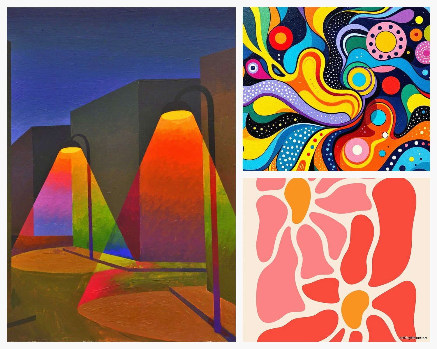
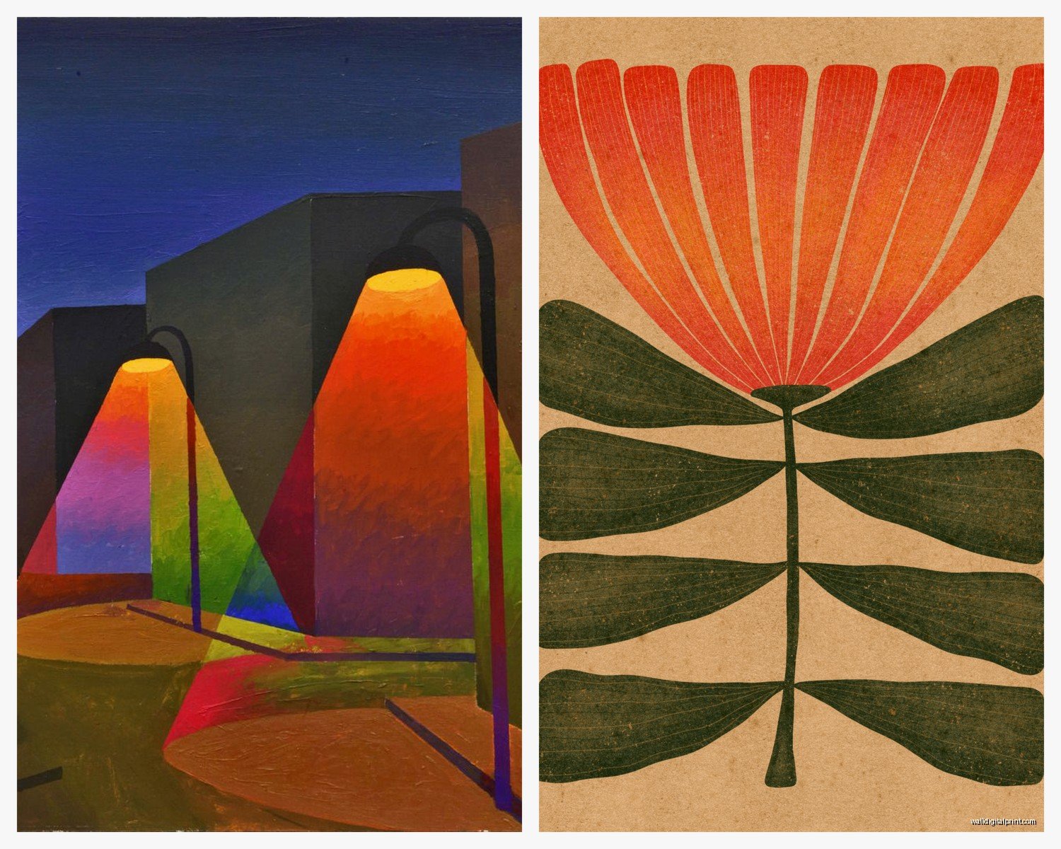
Abstract Color Field Paintings
These are the ones that are basically blocks or washes of color. Think Rothko but rainbow. They’re usually pretty large and make a huge statement. I have one in my bedroom that’s 48×60 inches with horizontal bands of pink, orange, yellow, green, blue, and purple and it’s literally the first thing you see when you walk in.
Best for: Modern or contemporary spaces, rooms where you want the art to be THE focal point, spaces with minimal furniture
Where they don’t work: Small rooms where a huge block of color will overwhelm everything, traditional or vintage-heavy spaces
Gradient Ombre Designs
These transition smoothly from one color to another – could be two colors or the full rainbow spectrum. Way more subtle than color blocking. I used one in a client’s nursery that went from pale pink to deeper purple and it was perfect because colorful but not overstimulating.
The trick with gradients is lighting. They look completely different in bright light versus dim light. I actually take photos of gradient pieces at different times of day now before committing because I got burned once with a piece that looked gorgeous in afternoon light but washed out in morning light.
Maximalist Pattern-Based Rainbow Art
This is your florals, geometric patterns, mandalas, whatever – but in full rainbow colors. These are BOLD. Like really bold. I did a client’s powder room with a massive rainbow floral print and people either love it or hate it, there’s no in between.
You gotta have confidence to pull these off. They work best in small spaces where you can go full maximalist (powder rooms, entryways, reading nooks) or in really large spaces with high ceilings where the pattern can breathe.
Line Art With Rainbow Elements
Simple line drawings – faces, bodies, landscapes, whatever – but the lines are in rainbow colors. More subtle than full rainbow pieces. I have one in my home office that’s a simple face outline but the lines go through the color spectrum and it adds personality without being overwhelming.
These are great starter pieces if you’re nervous about colorful art. They read as artistic and interesting but aren’t as bold as full abstract rainbow pieces.
Photographic Rainbow Art
This could be actual photos of rainbows (kinda literal but can be stunning), prism effects, light refraction photos, or colorful architectural/nature photography. I’m currently obsessed with this photographer who shoots buildings but uses long exposures and colored lights so everything has rainbow streaks.
These work well if your style is more realistic or if abstract art isn’t your thing. They bring color but in a way that feels grounded in reality.
Placement Strategies Room By Room
Okay so where you actually PUT rainbow art matters as much as what you choose. I learned this when I hung a gorgeous multi-hue abstract in a client’s living room and it was right next to a window and the sun completely washed it out half the day.
Living Rooms
Above the sofa is obvious but here are less obvious spots that work amazing:
- Behind/above the TV if you have a console setup – this actually makes the TV less dominant visually
- On the wall opposite your windows so natural light hits it but doesn’t wash it out
- In corners that feel dead – a tall vertical rainbow piece can activate empty corners
- Above a bar cart or bookshelf to create a vignette
I have a client who hung a huge horizontal rainbow abstract above their fireplace instead of a TV and it’s the best decision they ever made. The colors reflect on the ceiling when the fire’s going and it’s kinda magical.
Bedrooms
People get nervous about colorful art in bedrooms thinking it’ll be too stimulating but honestly? It depends on the colors and style. Cool-toned rainbow gradients are actually super calming. I have a blue-purple-green gradient piece above my bed and it doesn’t interfere with sleep at all.
What DOESN’T work: Super bright hot pink/orange/red rainbow pieces. I tried this once and literally couldn’t relax in that room. Moved it to my living room and it’s perfect there.
Best bedroom placements:
- Above the bed (obviously)
- On the wall facing the bed so it’s what you see when you wake up
- In a reading nook area if you have one
- Above a dresser to create a focal point
Dining Rooms and Kitchens
These spaces can handle BOLD rainbow art. Like really bold. Something about eating and gathering makes vibrant colors feel appropriate and energizing. Plus if your kitchen is mostly white cabinets and stainless steel (like 90% of kitchens now), rainbow art adds so much needed personality.
I hung a massive rainbow geometric piece in my breakfast nook area and my morning coffee routine got like 10x more enjoyable because I’m just sitting there looking at gorgeous colors.
Kitchen-specific tips: Keep art away from the stove area because grease and splatters are real. I learned this when I had to clean a print that got splattered with tomato sauce and the paper absorbed it and…yeah. Not above the stove.
Bathrooms
Okay controversial take – bathrooms are PERFECT for rainbow art. Small spaces can handle bold choices. Your bathroom is probably mostly white or neutral tile so colorful art makes it feel designed instead of builder-grade.
Just make sure if it’s a bathroom with a shower, the art isn’t directly in the splash zone and consider using acrylic prints or framed pieces with glass to protect from humidity. I have a rainbow abstract in my bathroom and it makes taking a shower more fun somehow? Is that weird?
Home Offices
This is where I have the most rainbow art personally. Something about working from home means I’m staring at these walls 8+ hours a day so they better be interesting. Multi-hue art keeps your brain engaged and creative.
I rotate pieces in my office seasonally – warmer rainbow tones in winter, cooler in summer. Might be overkill but it genuinely affects my mood and productivity.
Color Psychology Stuff That Actually Matters
I’m not gonna get super woo-woo here but color does affect mood and energy and when you’re dealing with MULTIPLE bright colors all together, these effects intensify.
Energizing Color Combinations
Red-orange-yellow heavy rainbow pieces create energy and excitement. These are your warm spectrum pieces. I use these in:
- Workout spaces or home gyms
- Creative studios where you need inspiration
- Social spaces like dining rooms or living rooms where you entertain
- Home offices when you need motivation