Wall Art Guide, Wall Art Tutoriels
Cream Wall Art: Neutral Ivory Off-White Decor
Mar
So I’ve been working with cream wall art for like three years now and honestly it’s become my go-to recommendation when clients text me panicked about their spaces looking too cold or too boring. The thing with cream, ivory, off-white pieces is they’re way more complex than people think.
Why Cream Actually Works When White Doesn’t
Okay so first thing – cream isn’t just “dirty white” or whatever. It has undertones, and this is gonna sound weird but I literally hold paint swatches up to art prints now because I learned this the hard way. Warm creams have yellow or peachy undertones, cool creams lean gray or blue. I had this whole situation last month where a client bought what looked like a perfect cream abstract piece online and it arrived looking straight up pink against her gray walls because the undertones clashed.
You gotta figure out if your space is warm or cool first. Like actually look at your walls at different times of day. I usually take photos on my phone in morning light and evening light because our eyes lie to us. If your whites look blue-ish or gray-ish in natural light, you’ve got cool-toned walls. Yellow-ish or cream-ish means warm.
Types of Cream Art That Actually Make Sense
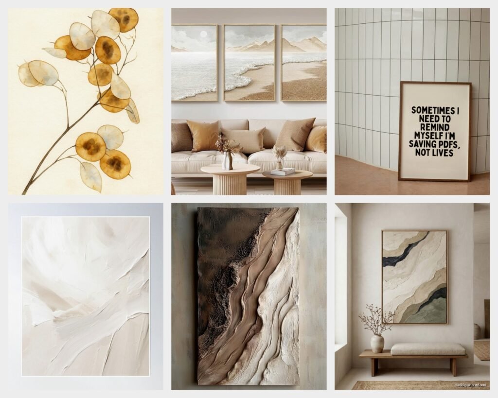
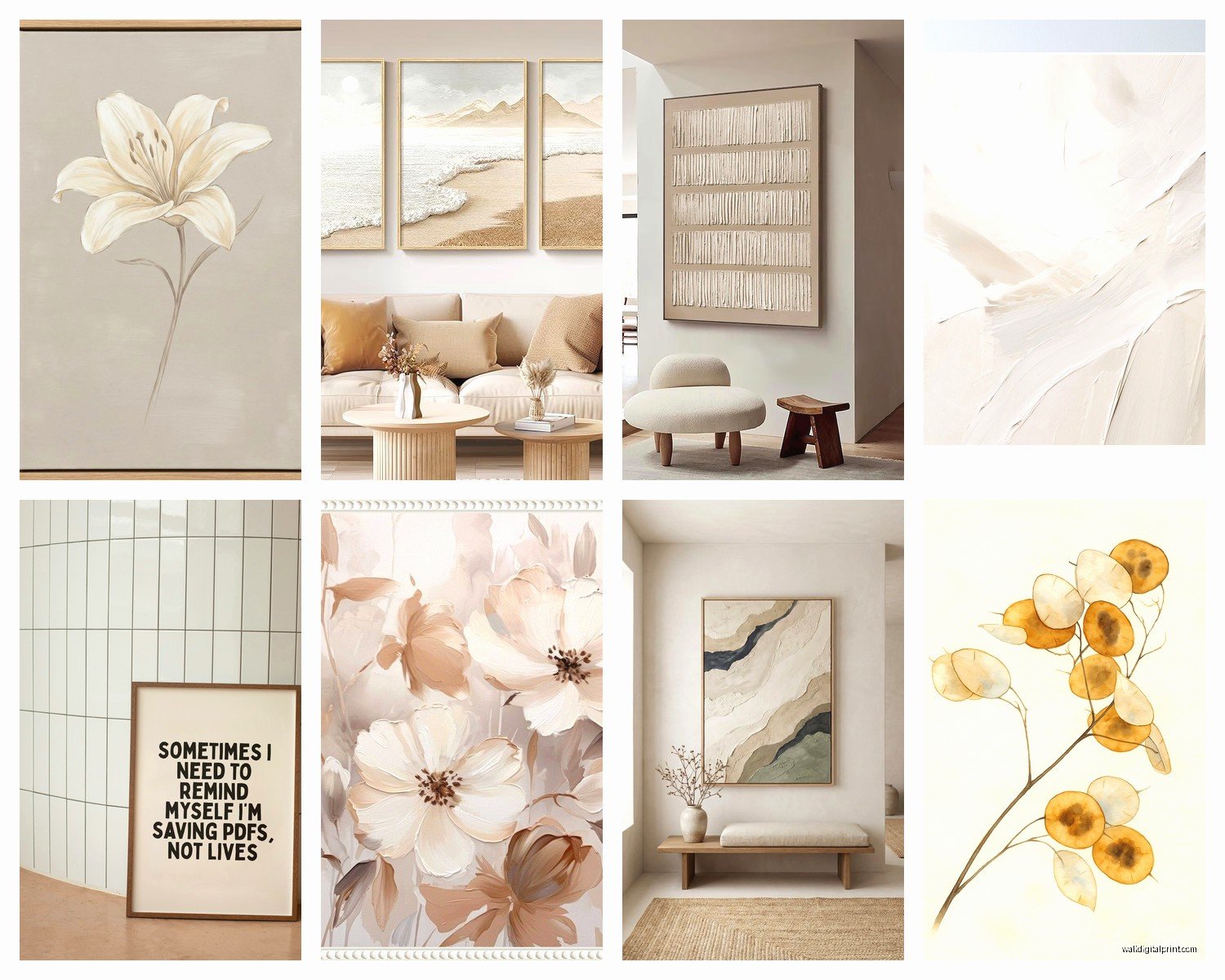
Abstract pieces in cream work because they add texture without competing. I’m obsessed with finding ones that have layers – like when artists build up paint or use mixed media. There’s this one piece I featured on my blog last fall that had cream, ivory, and beige all layered with some tan undertones and it literally made three different clients message me asking where to find it.
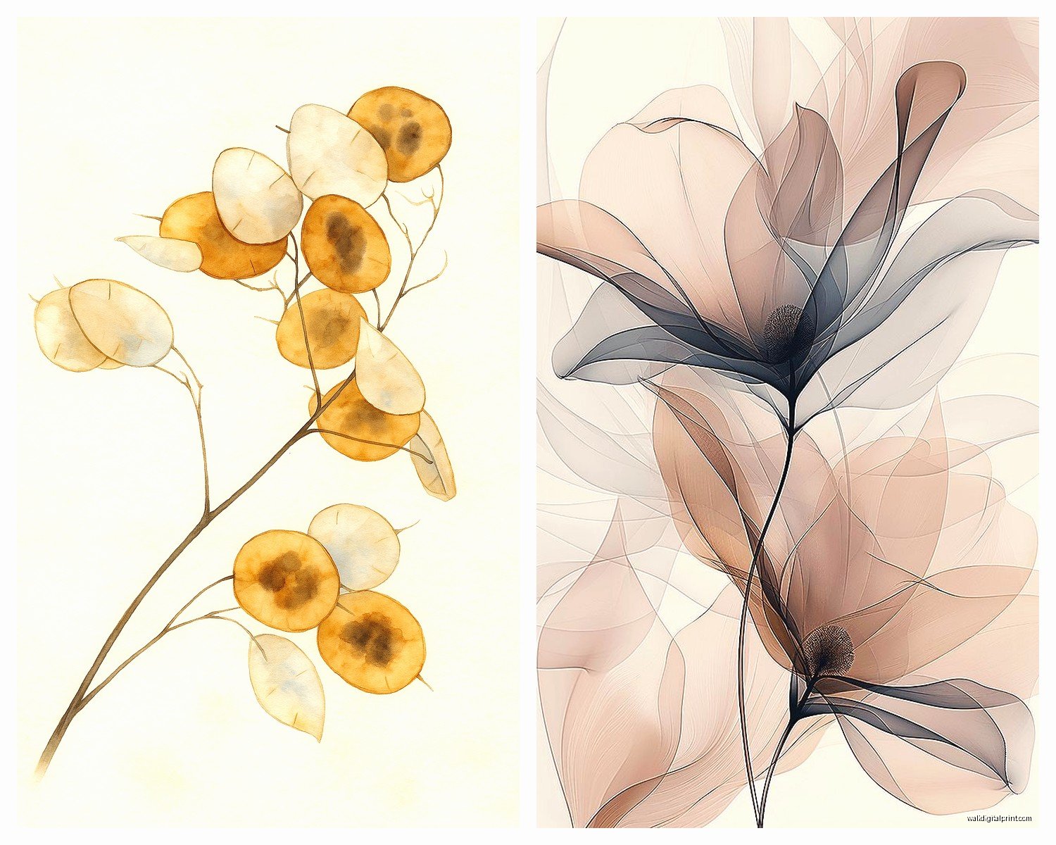
Botanical prints in cream tones are having a moment but pick ones with actual detail. Those super minimal line drawings? They disappear on cream or off-white walls. You want something with shading, depth. I found this vintage-style fern print that was cream background with sepia-toned details and it’s been my best seller recommendation.
Oh and another thing – textured cream art like woven pieces or canvas with heavy paint application. These work because they catch light differently throughout the day. My dog knocked over a lamp once and I noticed how the shadows changed on this cream textured piece and it’s actually what sells it.
Size Matters More Than You Think
Small cream art gets lost. Just trust me on this. I see people buying these tiny 8×10 cream prints thinking they’ll be subtle and elegant and then they’re basically invisible. Go bigger than you think you need. Like if you think you need 16×20, get 24×36.
For a standard living room wall, I usually do:
- Single statement piece: minimum 30×40 or larger
- Diptych or triptych: each panel at least 20×30
- Gallery wall: mix sizes but largest piece should be 24x36ish
Where to Actually Use This Stuff
Bedrooms are like the perfect place for cream art because it keeps things calm but not sterile. I just finished a client’s primary bedroom with three cream and ivory abstract pieces above the bed and she texts me photos of it like every week because apparently it photographs really well which matters to people now I guess.
Living rooms need cream art with more contrast though. All cream everything makes a space feel flat. I layer cream pieces with darker frames or mat them with warm gray or taupe. Actually scratch that – I did an all-cream living room last year for a client in Brooklyn and it worked because the furniture was darker wood and there were black accents throughout.
Hallways and entryways are where cream art really shines because you’re usually trying to brighten these spaces without making them feel stark. Long horizontal cream pieces work great in hallways. I have this one narrow hallway in my own place where I put four cream botanical prints in a row and it actually makes the space feel wider.
Mixing Cream with Other Colors
This is where people mess up the most. Cream plays nice with:
- Warm grays and greiges – they’re basically cousins
- Terracotta and rust tones – creates this earthy vibe
- Sage and muted greens – very 2023 but it works
- Navy and deep blues – the contrast is chef’s kiss
- Blush and dusty rose – if you’re into that
What doesn’t work as well: bright whites (makes the cream look dirty), neon anything obviously, and weirdly enough sometimes black. Like stark black against cream can look harsh unless you have other transition colors.
Frame Choices That Don’t Suck
Natural wood frames in oak or maple tones are my default with cream art. The warmth complements cream undertones. I keep like five different wood frame samples in my car because I’m constantly showing clients what I mean.
Gold frames can work but go for brushed or muted gold, not shiny brass unless your space is super traditional. My client last month ignored this advice and got shiny gold frames for cream botanical prints and it looked like a hotel lobby from 1987.
Black frames create drama but make sure your cream art has enough contrast within the piece itself or it’ll just look washed out. White frames disappear which can be good or bad depending on what you want.
The Lighting Thing Nobody Talks About
Cream art needs good lighting or it becomes beige wallpaper energy. Picture lights are expensive but worth it for statement pieces. I installed them in my dining room and the cream abstract piece I have literally looks like different art at night versus day.
Warm bulbs (2700-3000K) make cream art glow. Cool bulbs (5000K+) make it look dingy. I learned this while watching some home renovation show and testing it out at like 10pm with different bulbs from Home Depot spread out on my floor.
Natural light is obviously ideal. If you have a north-facing room (cooler light), warmer cream tones help balance it. South-facing (warmer light), you can go with cooler creams.
Shopping Tips From Someone Who’s Ordered Too Much
Online shopping for cream art is tricky because every screen shows color differently. I always check return policies first now. Learned that one the hard way spending $200 on a piece that looked ivory online and arrived looking straight tan.
Read reviews that mention color accuracy specifically. If multiple people say “lighter than expected” or “more yellow than shown,” believe them.
Etsy has amazing cream art from independent artists but communicate with sellers about undertones. I message them like “hey my walls are Benjamin Moore Revere Pewter, will this look too warm?” and good sellers know their stuff.
Print Quality Matters
Giclée prints are worth the extra money for cream art because the color gradients actually show up. Regular prints can look flat. I spilled tea on a giclée print once (don’t ask) and even slightly damaged the quality was noticeably better than cheaper prints I’ve worked with.
Canvas prints in cream tones should have some texture. That super smooth canvas looks cheap. Look for descriptions mentioning “textured canvas” or “artist-grade canvas.”
Styling Around Cream Art
Layer textures in the same color family. Cream art with cream chunky knit throw with ivory pillows with beige rug – sounds boring but it’s actually really sophisticated when you mix textures.
Add plants for contrast. The green against cream is chef’s kiss and brings life to neutral schemes. I have this massive fiddle leaf fig next to a cream abstract piece and people always comment on that corner of my living room.
Metallic accents help cream art pop. Brass candlesticks, copper bowls, gold mirror frames – these catch light and create visual interest without adding color.
Common Mistakes I See All The Time
Matting cream art with bright white mats makes the art look yellow and dirty. Use cream or off-white mats instead. I literally keep mat samples in my bag now because explaining this over text doesn’t work.
Hanging cream art too high. The center should be at eye level which is around 57-60 inches from the floor. I see so many photos where people hang stuff way too high and it throws off the whole room.
Not considering the room’s purpose. Super abstract cream art in a kid’s playroom? Probably gonna get ignored. Save that for adult spaces. Kids’ rooms need more visual interest and color.
Forgetting about humidity. Bathrooms and kitchens need sealed or protected art. Regular paper prints in cream will yellow faster in humid environments. Go for canvas or sealed prints in those spaces.
Budget Friendly Options That Don’t Look Cheap
Printable art from Etsy – you download and print at your local print shop. Just make sure you’re printing on good quality paper. I use a local printer that does cardstock or art paper and it’s like $15-30 for large prints.
Thrift store frames with new art. I’ve found so many good wood frames at thrift stores, spray paint them if needed, add downloaded cream art, and boom. Looks expensive.
DIY cream art is actually doable if you’re not artistic. Get a canvas, use cream acrylic paint in a few shades, layer it with a palette knife. It’s very forgiving because abstract cream art is trendy right now anyway.
Oh wait I forgot to mention – older art prints from estate sales sometimes have this natural cream patina that’s actually perfect for this aesthetic. I found three botanical prints from the 70s that had aged to this perfect cream tone and framed them together. Cost me maybe $40 total and they look like expensive vintage finds.
The key thing with cream art is it should feel intentional not accidental. It’s not “I couldn’t decide on a color so I went neutral” energy. It’s “I specifically chose this to create a calm sophisticated layered space” energy. That shift in mindset changes how you select and style everything else in the room.