Wall Art Guide, Wall Art Tutoriels
Custom Photo Wall Art: Personalized Picture Print Options
Apr
So I’ve been down this custom photo wall art rabbit hole for like three months now and honestly it started because my sister wanted to turn her wedding photos into something that didn’t look like every other canvas print at HomeGoods, you know?
First thing – and I wish someone had told me this – the material you choose matters SO much more than the actual photo quality sometimes. Like I had this gorgeous shot from a trip to Iceland, super high res, looked amazing on my phone. Printed it on the wrong material and it just looked flat and weird. The colors were off, the whole vibe was wrong.
Canvas Prints Are Not All Created Equal
Okay so canvas is probably what you’re thinking about first because everyone does canvas. But here’s the thing – there’s gallery wrap canvas and there’s museum wrap canvas and there’s this cheaper stuff that’s basically fabric stretched over cardboard. You want either gallery or museum wrap. Gallery wrap means the image continues around the sides of the frame, museum wrap usually has white or black edges.
I tested like five different companies last year when my client canceled on me and I had an afternoon free. Shutterfly’s canvas is fine for casual stuff, nothing wrong with it, but the texture is pretty pronounced. If you’ve got a photo with lots of detail or faces, that heavy texture can be distracting. Nations Photo Lab does this smoother canvas that I actually prefer for portraits. Cost difference is maybe $20-30 more but you can actually see the detail in people’s eyes.
The thickness matters too – you want at least 1.5 inches deep. Those thin half-inch canvases look cheap when you hang them. They just do. Learned that one the hard way with my own living room.
Canvas Coating Options
Most places offer matte or glossy coating. I’m team matte like 90% of the time. Glossy can create glare and honestly looks a bit dated now? But if you’re printing something with really vibrant colors – like tropical vacation photos or sunset shots – a satin finish (which is between matte and glossy) can make those colors pop without the weird shine.
Oh and another thing – ask about the stretcher bars. Some companies use finger-jointed pine which is fine, but solid wood bars are better if you’re doing anything larger than 16×20. They won’t warp over time.
Metal Prints Are Actually Incredible
Wait I forgot to mention metal prints earlier and they’re honestly my favorite discovery from this whole obsession. The photo gets infused directly onto aluminum and the colors are INSANE. Like almost too vibrant at first glance but then you get used to it and everything else looks dull.
Best for: modern spaces, photos with bold colors, architectural shots, anything graphic. Not great for: vintage-looking photos, soft romantic stuff, traditional decor.
I did a metal print of this abstract art piece I curated last year and hung it in my bathroom – sounds weird but the moisture doesn’t affect it at all unlike canvas or paper. That’s actually a huge benefit. You can put metal prints in kitchens and bathrooms without worrying.
Bay Photo and Fracture are the two I’ve used most. Fracture does this thing where they mount the print directly to the aluminum so it’s frameless and sits slightly off the wall. Really clean look. Bay Photo gives you more size options and the colors are maybe 5% more accurate if you’re being picky about it.
The main downside is glare. You gotta think about where light hits your wall. I made that mistake with a metal print near a window and depending on the time of day you literally couldn’t see the image.
Acrylic Prints For That High-End Gallery Look
These are pricey but wow. The photo is printed on paper or directly onto acrylic, then mounted behind a thick sheet of clear acrylic glass. The depth is incredible – it literally looks like you’re looking into the image rather than at it.
I used an acrylic print for a client’s entryway last month and every single person who comes over comments on it. It’s a simple black and white portrait but the acrylic makes it look like a $5000 gallery piece.
They’re heavy though. Like really heavy. You need proper wall anchors, not just nails. And they show every single fingerprint, so you’re gonna be wiping them down constantly if you have kids or if you’re like me and touch everything.
Cost-wise you’re looking at probably $150-400 depending on size. Worth it for statement pieces, maybe not worth it for a gallery wall where you need like eight prints.
Face Mount vs Back Mount
This is gonna sound confusing but there’s face-mount acrylic where the photo is mounted to the front of the acrylic, and back-mount where it’s behind. Face-mount has more depth and dimension. Back-mount is more durable and slightly cheaper. I prefer face-mount for the visual impact but I’ve got a dog who has knocked into wall art more than once, so back-mount is smarter for my actual life.
Wood Prints Have This Rustic Thing Going On
The image gets printed directly onto planks of wood and the grain shows through. Super trendy right now, very Instagram-friendly. I’m kinda over them personally but my sister loves hers.
Best companies: Simply Color Lab and Posterjack both do good wood prints. The wood grain adds texture which can be cool for landscape photos or anything nature-related. Terrible for portraits unless you want your grandmother’s face to have literal wood grain across it (learned this at Thanksgiving, it was awkward).
The colors are more muted than other options because you’re printing on wood instead of white. That vintage, faded look works for some photos. For others it just looks like a failed print job.
Photo Paper Prints With Proper Framing
Okay so funny story – after testing all these fancy options I actually came back around to just really good photo paper prints with nice framing. Sometimes simple is better?
But not all photo paper is the same. You’ve got glossy, matte, lustre, metallic, and fine art papers.
Glossy is what you probably think of as standard photo paper. Shiny, colors pop, shows fingerprints and glare like crazy. I barely use it anymore.
Lustre is glossy’s better-behaved sibling. Slight sheen but way less glare. This is my go-to for most color photos. The colors still look vibrant but you can actually see the image from different angles.
Matte is flat, no shine at all. Perfect for black and white photos or anything you want to look artistic and moody. Fingerprint-resistant which is clutch.
Metallic paper has these tiny metallic particles in it and the effect is wild. Colors are super saturated and there’s this subtle shimmer. Great for photos with water, skies, anything reflective. Can look cheap if you use it for the wrong image though.
Fine art papers are textured – like watercolor paper or canvas texture but it’s actually thick cotton paper. These are expensive but if you want your photo to look like actual art, this is the move. I use Hahnemühle papers mostly. Museum-quality stuff.
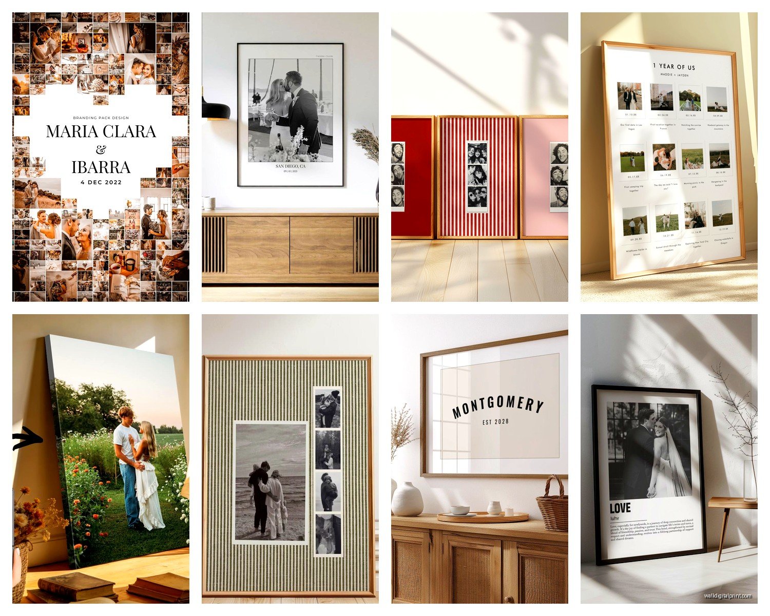
Framing Makes Or Breaks Everything
You can get a perfect print and ruin it with a cheap frame. I use Framebridge for most client projects because they make it stupid easy – you upload the photo, pick the frame and mat, they print and frame it and ship it ready to hang. More expensive than DIY but the quality is consistent.
For DIY framing, IKEA’s RIBBA frames are actually decent for the price. The HOVSTA frames are even better – real wood, proper glass. I’ve probably bought 30 of them at this point.
Mat boards matter too. Always use acid-free mats or your photo will yellow over time. White mats are classic and safe, but I’ve been using natural linen mats lately and they add this subtle texture that’s really nice. Warmer than stark white.
Size And Placement Strategy
This is where people mess up constantly. You need to think about viewing distance. A tiny 8×10 print on a huge wall just looks lost. A massive 40×60 canvas in a small room is overwhelming.
General rule: the width of your art should be about 60-75% of the furniture width below it. So if you’ve got a 6-foot couch, you want roughly 3.5 to 4.5 feet of art width above it. That could be one large piece or multiple pieces grouped together.
For hanging height, the center of your art should be at eye level, which is usually around 57-60 inches from the floor. But I cheat this rule all the time depending on the space. High ceilings can handle art hung a bit higher. Low ceilings look better with art hung slightly lower.
File Quality And Image Selection
Oh wait I should’ve mentioned this first probably. Your photo needs to be high enough resolution for whatever size you’re printing. The DPI (dots per inch) needs to be at least 150, preferably 300.
Most phone photos are fine up to about 11×14. Maybe 16×20 if the photo is sharp and well-lit. Beyond that you need a real camera or a really good phone camera in perfect conditions.
There are online calculators where you can upload your image and it’ll tell you the maximum print size. I use one from Pixsy but there are tons of them.
Images with lots of contrast and clear subjects work better for large prints. Busy photos with tons of detail can look chaotic when blown up big. I learned this when I tried to print a photo from a crowded market – it was cool on my laptop but at 30×40 it just looked like visual noise.
Black and white photos are more forgiving with quality issues. Converting a slightly blurry color photo to black and white can actually save it sometimes.
Companies I Actually Use And Trust
I’ve tried probably 20 different printing companies at this point and here’s who I come back to:
Nations Photo Lab – Professional quality, tons of options, great customer service. More expensive but worth it for important projects.
Bay Photo – Their metal prints are chef’s kiss. Also great for fine art papers.
Mpix – Consumer-friendly version of Millers Professional Imaging. Good quality, reasonable prices, fast shipping.
Fracture – Specifically for their frameless glass prints. One-trick pony but they do that one trick really well.
Framebridge – For framed prints when I don’t wanna deal with framing myself or when a client needs something foolproof.
I don’t love Shutterfly or Snapfish for anything important. They’re fine for casual stuff, photo books, whatever. But the color accuracy is inconsistent and I’ve gotten prints that looked nothing like the preview.
Color Management Is Annoying But Necessary
Your photo looks different on your phone than your laptop than the print. It’s just physics and color spaces and it’s annoying.
Most printing companies use the sRGB color space. If you’re editing photos, make sure you’re working in sRGB not Adobe RGB or ProPhoto RGB. Otherwise your colors will look dull when printed.
Also – and this is crucial – your monitor might be lying to you. If you’ve never calibrated your monitor, the brightness and colors are probably off. I use a Spyder calibrator thing that I bought three years ago and it’s made a huge difference. Before that I was editing photos on a screen that was way too bright, so all my prints came out dark.
If you don’t wanna buy a calibrator, at least turn your screen brightness down to maybe 50% when you’re selecting photos to print. That’ll get you closer to how it’ll actually look.
Proof Prints Are Your Friend
For anything important or expensive, order a small proof print first. Like if you’re planning a 30×40 canvas, order an 8×10 of the same image on the same material first. It costs maybe $15-20 but it’ll show you exactly how the colors will look and whether the image works at that crop.
I skipped this step once because I was in a hurry and ended up with a $300 canvas where the colors were way too orange. My fault for not proofing, but still painful.
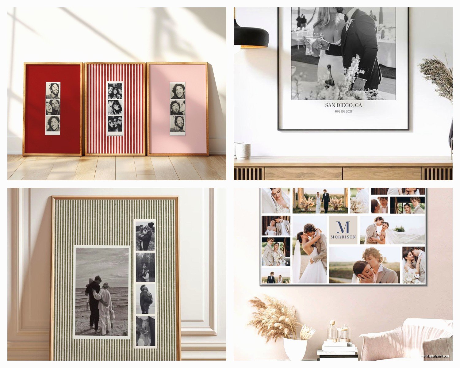
Gallery Walls Need Planning
If you’re doing multiple prints together, map it out first. I use painter’s tape on the wall to mark where each frame will go. Sounds tedious but it prevents the “why are these all crooked and uneven” situation.
You can mix materials – like combine canvas prints with framed photos with metal prints – but stick to a cohesive color palette or theme. Otherwise it just looks random.
For frame colors, either go all matching or all different. Mixing like two frame colors looks indecisive. All black frames, all wood frames, all white frames – clean and cohesive. Or go wild with all different frames but then you need the photos themselves to tie it together.
The spacing between frames should be consistent, usually 2-3 inches. Closer than that looks cramped, wider looks disconnected.
Anyway I’ve gotta stop because my cat is knocking things off my desk but honestly that’s most of what I’ve learned. Start with one print, see how you like the material, then go from there. Don’t do what I did and order like eight different prints all at once in different materials because then you’re stuck with a bunch of stuff that maybe doesn’t work together.