Wall Art Guide, Wall Art Tutoriels
Dark Green Wall Art: Forest Hunter Emerald Deep Designs
Mar
So I’ve been completely obsessed with dark green wall art lately and honestly it started because a client wanted this whole “forest hunter” vibe in their study but didn’t want it to look like a hunting lodge from the 1970s, you know? Like emerald and deep forest tones but make it modern and actually livable.
Why Dark Green Even Works (and when it doesn’t)
Okay so here’s the thing about dark green wall art that nobody tells you until you’ve already bought three pieces that don’t work – it’s incredibly dependent on your lighting. I learned this the hard way when I hung this gorgeous emerald abstract piece in my own hallway and it literally just looked black until like 2pm when the sun hit it right. My cat kept staring at it like it offended her personally.
Dark greens need either really good natural light OR you gotta commit to some quality picture lights or track lighting. The Forest Hunter aesthetic specifically – we’re talking those deep hunter greens, emeralds, almost-black-but-not-quite shades – they absorb light like crazy. Which can be stunning and moody but also can just be a dark blob on your wall if you’re not careful.
Best rooms I’ve found for dark green art:
- Living rooms with big windows (south-facing is chef’s kiss)
- Dining rooms where you can control the lighting with dimmers
- Home offices with good desk lamps that bounce light around
- Bedrooms if you’re going for that cocoony vibe
Worst places – bathrooms with no windows, those weird hallway corners, above a dark couch in a dim basement. Just trust me on this.
The Actual Shades That Matter
So “dark green” is basically meaningless when you’re shopping online which is SO frustrating. I’ve started keeping paint chips in my bag like a total weirdo to compare but it actually helps. Here’s what I mean when I say different dark greens:
Hunter Green: This is your classic deep green with slight brown undertones. Think old libraries and English country homes. It’s the most traditional of the dark greens and honestly the easiest to work with because it plays nice with browns, tans, cognac leather, all that stuff.
Emerald: More jewel-toned, leans slightly blue. This is trickier because it can read really formal and fancy if you’re not careful. I used emerald artwork in a client’s entryway last month and we had to add in some brass elements and warmer woods to keep it from feeling like a fancy hotel lobby.
Forest Green: Right in the middle – true green without being bright. This is probably the most versatile for the forest hunter look because it literally looks like…forests. Revolutionary, I know.
Deep Sage/Army Green: These have more gray in them, super sophisticated but can read a bit military if you overdo it. I mixed a deep sage print with some terra cotta pieces recently and it was *perfect* – oh and another thing, these grayed greens work really well with pink accents which sounds insane but try it.
How to Tell What You’re Actually Getting Online
This is gonna sound weird but I screenshot art I’m considering and put it in a photo editing app to check the actual color values. Because “emerald” on Etsy might mean 47 different shades depending on the seller’s monitor calibration and photography setup.
Also read the reviews specifically for comments about color accuracy. If someone says “darker than expected” that’s actually useful information, not just complaining.
Subject Matter That Actually Works
Okay so you want Forest Hunter vibes in emerald and deep greens. Here’s what I’ve tested in real rooms and what actually delivers:
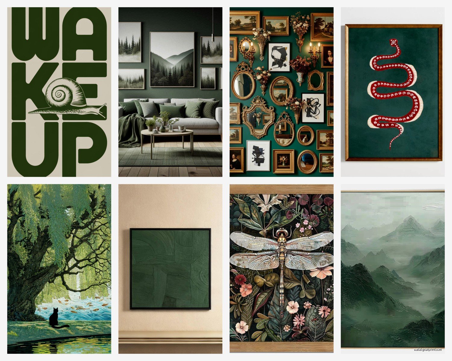
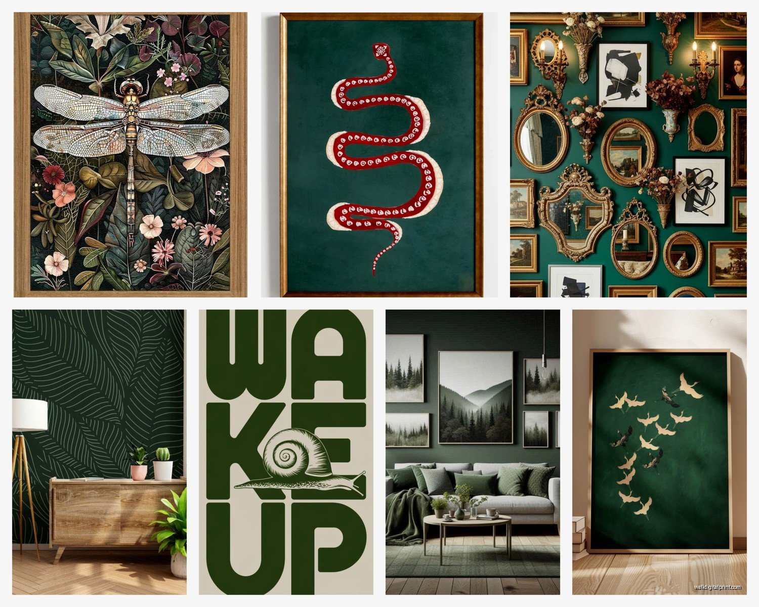
Abstract botanical: Not like cutesy watercolor leaves but more architectural plant studies. Think oversized fern prints, dramatic palm fronds, those vintage botanical illustration styles but in darker tones. I found this set on Etsy – wait I forgot to mention, Etsy is honestly where like 80% of good dark green art lives – that was tobacco plant illustrations in the darkest green and they looked incredible in a maximalist living room I staged.
Moody landscapes: Forests obviously but also mountains with heavy tree coverage, misty woodland scenes. The key is making sure there’s enough contrast in the piece itself. All dark green = boring. Dark green with some lighter highlights or fog or sky peeking through = interesting.
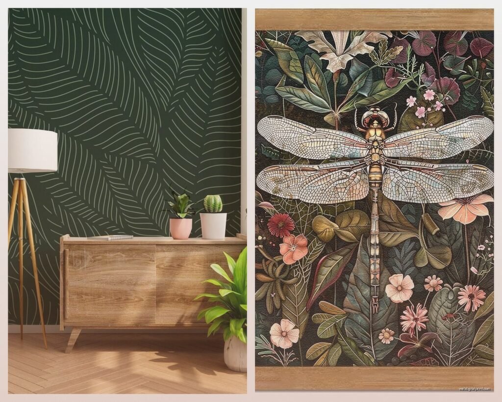
Animals in green tones: This is where the “hunter” aesthetic comes in without being literal dead animals on walls which, not everyone’s thing. I’m talking like a stag silhouette in emerald, bird studies in deep greens, even fish prints work surprisingly well. Had a client who was obsessed with trout fishing and we did these vintage trout illustration prints in hunter green and brown tones – his wife was skeptical but it actually looked really sophisticated.
Geometric and modern: Emerald green works SO well in mid-century modern geometric prints. Like those 1960s style overlapping circles or abstract shapes in varying shades of green. This is how you do dark green without the traditional hunting lodge thing.
Marble and agate: Okay this might be too trendy still but green marble or agate slice art in those deep forest and emerald tones? Stunning. The natural variation in the stone keeps it interesting even though it’s mostly dark.
What Doesn’t Work (learned this the hard way)
Tropical scenes in dark green usually just look muddy. Like you want that Palm Beach vibe but dark? It doesn’t translate well. Keep tropical bright.
Really detailed dark green art – you lose all the detail from more than 3 feet away. I bought this incredibly intricate forest scene that was gorgeous up close but from the couch it was just a dark rectangle. Ended up moving it to a reading nook where you actually sit close to it.
Size and Placement (this is where people mess up most)
Dark colors visually recede which means dark green art can disappear if it’s too small. I know everyone says “art should be X percentage of furniture width” but with dark greens specifically, I go bigger than I normally would.
Like over a sofa, where I might normally do 50-75% of the sofa width in art, with dark green I’m pushing 75-85%. You need that presence or it just gets lost.
Gallery walls with dark green: This actually works really well but you gotta mix in some lighter elements. I did a whole gallery wall last year that was probably 60% dark green pieces with 40% cream/tan/lighter botanical prints mixed in. The variation keeps your eye moving around instead of just seeing a dark mass.
My dog knocked into the gallery wall during installation which actually showed me how important proper hanging is – these heavier frames need good anchors obviously but also, I started using that 3M picture hanging tape for the lighter pieces and it’s so much easier to adjust the arrangement.
Framing Makes or Breaks Dark Green Art
Natural wood frames – walnut, oak, even lighter woods like maple – all work beautifully with dark greens. The wood warmth balances the cool depth of the green.
Black frames can work but it’s a LOT of darkness. I only use black frames with dark green art if the piece itself has some lighter elements or if we’re going for like a dramatic maximalist vibe.
Gold and brass frames are actually my favorite with emerald specifically. There’s something about that jewel-tone-plus-gold combo that just works. Silver and chrome read too cold usually.
White frames – honestly proceed with caution. The contrast can be too stark and make the art look darker than it is. I’ve made this work exactly once, in a very bright white room with lots of plants where we needed that crisp contrast.
Matting Decisions
Okay so funny story, I used to think matting was just about protection and looking fancy but with dark green art it’s actually really functional. A cream or light sage mat between dark green art and the frame creates this buffer that helps the art not feel so heavy.
Standard white mats work fine but can feel a bit gallery-like. I prefer cream, natural, or even a light sage/celadon mat with dark green pieces. It pulls out lighter tones in the artwork and feels more intentional.
Double matting with a thin inner mat in a metallic or darker green and an outer mat in cream is *gorgeous* with emerald art but also adds like $50+ to framing costs, so.
Where to Actually Buy This Stuff
I’ve bought from basically everywhere at this point testing stuff for clients and my own spaces so here’s the real breakdown:
Etsy: Best selection hands down, especially for prints. You can find vintage botanical prints, modern abstracts, photography – everything. Search terms that work: “dark botanical print,” “emerald green abstract,” “forest green wall art,” “hunter green print.” The algorithm responds better to specific color names than vague terms.
Quality varies wildly though. I always message sellers about paper quality and printing methods. Giclee prints on heavyweight paper are what you want – those cheap digital prints on regular paper look washed out in dark colors.
Minted: More expensive but really consistent quality. Their dark green abstract section is solid and they have good framing options. I use them when clients want everything handled – art, framing, shipping – and don’t wanna think about it.
Society6: Hit or miss but good for larger statement pieces. Their canvas prints in dark green tones hold up well. I’m watching House Hunters while writing this and literally just saw dark green art from Society6 in the featured home, so clearly the trend is everywhere now.
Vintage and Antique Shops: This is where the REALLY good stuff is if you have patience. Original dark green landscapes, old botanical illustrations, vintage hunting prints that are actually tasteful. You gotta frame them yourself usually but the patina and authenticity is worth it.
I found this incredible set of four forest prints from the 1940s at an estate sale for $60 total. Spent $300 framing them but they look like $1000+ pieces now.
Target and West Elm: Good for accessible price points and you can see stuff in person. Their selection rotates though so if you see something in dark green you like, grab it. It probably won’t be there in two weeks.
Custom and DIY Options
If you can’t find exactly what you want – and with specific color requirements like “forest hunter emerald deep” you might not – consider getting stuff custom made or DIYing.
I’ve worked with artists on Etsy who’ll do custom color ways of their existing prints. Like they have a botanical print in sage and bright green but they’ll recolor it in hunter and emerald for you. Usually costs a bit more but you get exactly what you want.
DIY option that works surprisingly well: buy high-res scans of vintage botanical illustrations (there are whole websites with copyright-free images), take them to a good print shop, have them printed large format on quality paper in the exact green tones you want. I did this with mushroom illustrations last month and the client was obsessed.
Making It Work With Your Existing Stuff
So you’ve got your dark green forest hunter art, now it needs to actually work in your room. Here’s what I’ve learned about pairing:
Wall colors that work: White and cream obviously, but also warm grays, greige, even darker walls can work. I hung deep emerald art on a charcoal gray wall recently and the slight contrast was really sophisticated. Light sage walls with darker green art is beautiful but might be too much green for some people.
Avoid: bright white walls can make dark green art look almost black, and cool gray walls can make green art look muddy.
Furniture and textiles: Dark green art loves warm wood tones, cognac and tan leathers, cream and ivory fabrics, rust and terra cotta accents. It’s not great with super cool modern grays or stark black furniture – everything just feels heavy.
I did a whole room around a large dark green abstract – camel leather sofa, walnut coffee table, cream rug, rust velvet pillows – and it was perfectly balanced. Then I tried to put a similar green piece in a room with gray sectional and black furniture and it was just…dark and cold.
Metals: Brass, copper, and warm gold all enhance dark greens. Silver and chrome can work if there’s enough warmth elsewhere in the room. I mixed brass lamps with a hunter green print and oak frames – really pulled together the forest hunter vibe without being literal about it.
Lighting Setup (this is crucial and people skip it)
I already mentioned this but it’s important enough to go deeper. You absolutely need adequate lighting for dark green art or you’re wasting your money.
Picture lights: I like the LED ones that mount above the frame. They’re low profile and actually show the art. The really ornate brass picture lights can compete visually with the art so I use simple modern ones usually.
Track lighting: If you’re doing a gallery wall or multiple pieces, track lighting gives you flexibility to spotlight multiple pieces. Just make sure the bulbs are warm temperature – cool LED bulbs make green look weird and yellowy.
Wait I forgot to mention – natural light direction matters. East and south facing walls get the best light for showing off dark art. North facing walls stay cooler and dimmer which can make dark greens feel flat. West facing gets harsh afternoon light which can actually be too much contrast.
I learned about light direction the hard way when I moved a emerald print from the south wall to the north wall in my client’s living room and she texted me like “did this print get darker?” Same print, just way less light.
Styling Around Dark Green Art
This isn’t just hanging it and walking away