Wall Art Guide, Wall Art Tutoriels
Dark Wall Art: Moody Gothic Black Deep Color Designs
Mar
So I’ve been living with dark wall art for like three years now and honestly it’s one of those things where everyone told me it would make my space feel smaller but they were completely wrong. Actually just helped a client last week who was terrified of putting anything darker than navy in her living room and now she won’t shut up about it.
Getting the Color Balance Right Without Making Everything Feel Like a Cave
Okay so the biggest mistake I see is people thinking dark wall art means you need dark walls. Actually the opposite works better most of the time. My favorite combo right now is charcoal and deep burgundy artwork on this really pale greige wall and it just… pops in a way that feels sophisticated instead of trying too hard.
The rule I use is the 60-30-10 thing but for darkness levels instead of colors. So like 60% of your wall should still be breathing room, 30% can be your dark moody piece, and 10% is whatever accent color you’re pulling from the art. I learned this the hard way when I covered an entire wall in black botanical prints and my sister walked in and asked if I was okay emotionally.
Deep Colors That Actually Work Together
Here’s what I’ve tested extensively because my apartment has basically been a lab for this:
- Charcoal black with deep forest green – this combo is *chef’s kiss* especially if you add brass frames
- Midnight blue with burgundy or wine red – very gothic but not costume-y if you balance it right
- Black with deep purple or plum – sounds intense but actually reads as really elegant
- Dark brown (almost black) with burnt orange accents – this one surprised me but it’s so good for fall vibes year-round
- True black with deep teal – modern gothic, less Victorian ghost
The thing about combining deep colors in wall art is you gotta have different textures or finishes. Like I have this matte black abstract piece next to a glossy deep green botanical print and the way light hits them differently keeps it from looking flat.
Lighting Makes or Breaks Everything
Oh and another thing – you absolutely cannot skip proper lighting with dark art. I mounted these gorgeous black and burgundy prints in my hallway and they literally disappeared until I added picture lights. Now they’re the first thing people comment on.
My go-to lighting setup:
– Warm white bulbs only, the cool white makes dark colors look muddy
– Picture lights mounted about 8 inches above the frame, angled at like 30 degrees
– If you can’t mount lights, use track lighting or even a well-placed floor lamp
– Avoid overhead lighting directly on dark art because it creates this weird flat effect
I spent way too much money on smart bulbs that let me adjust the warmth and honestly? Best investment for showcasing dark pieces. Sometimes I want them moodier at night, brighter during the day.
Frame Selection That Won’t Compete
So frames are where people get weird with dark art. They either go all black everything which can look too matchy, or they panic and choose light frames that create too much contrast.
What actually works:
– Deep walnut or espresso wood frames for warmth
– Matte black metal frames for modern spaces (but not with black matte prints, too much sameness)
– Antique gold or brass for that gothic romantic vibe
– Very dark green or burgundy frames if you can find them – game changer
My client last month insisted on white frames with her dark gothic florals and look… it worked but only because her walls were dark. If you’ve got light walls and dark art, skip white frames unless you’re going for that stark gallery look.
Frame Width Matters More Than You Think
Thin frames (like 1 inch or less) make dark art feel more contemporary and less heavy. Thick ornate frames lean Victorian gothic. I’ve got both in my place because apparently I can’t commit to one aesthetic, but they’re in different rooms so it works.
Sizing and Placement Without Overthinking It
Okay this is gonna sound weird but I measure everything with my forearm now because I got tired of carrying a tape measure around. Your forearm is roughly 18 inches, so you can eyeball spacing pretty accurately once you know that. Anyway.
For dark wall art specifically:
Large pieces (like 30×40 or bigger) work best as solo statements. Don’t try to gallery wall a massive dark piece with tiny ones around it, looks unbalanced.
Medium pieces (16×20 to 24×36) are your most versatile. You can do a pair of them, a trio, or solo.
Small dark pieces need to be grouped or they disappear. I learned this when I bought these tiny 8×10 black botanical prints thinking they’d be cute dotted around and they just… vanished. Grouped six of them together in two rows of three and suddenly they had presence.
The Height Thing Everyone Gets Wrong
Center of the artwork should be at 57-60 inches from the floor. This is actually museum standard and it works. But with dark pieces, I sometimes go slightly lower (like 55 inches) because they have more visual weight and can handle being a bit lower without looking like they’re falling.
Wait I forgot to mention – if you’re hanging dark art above furniture, 6-8 inches above the furniture is the sweet spot. More than that and they look disconnected, less and they feel crowded.
Picking Subjects That Enhance the Mood
Not all subjects work in dark moody colors. Like I tried to make dark wall art of a beach scene happen and it just looked confused. Some things are meant to be bright.
What works beautifully in dark gothic colors:
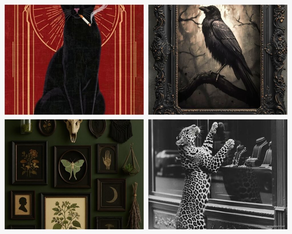
- Botanical prints – especially dried flowers, dramatic leaves, ferns in shadow
- Abstract expressionist stuff with deep colors bleeding into black
- Architectural drawings or etchings on dark backgrounds
- Moody landscapes – forests, mountains at dusk, stormy seas
- Renaissance-style portraits or figure studies
- Geometric patterns in deep colors
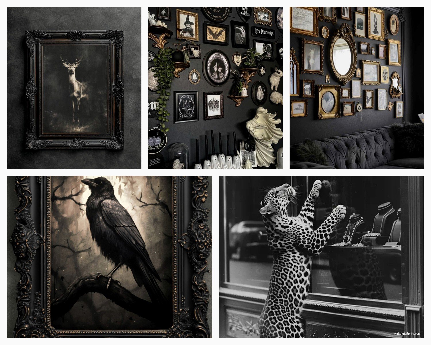
- Wildlife art, especially ravens, wolves, owls – very on brand
- Vintage anatomical drawings on aged dark paper
I’ve got this set of three dark forest prints in my bedroom that are basically black with hints of deep green and grey and they’re perfect because they’re calming but still interesting. My cat likes to stare at them which is either very atmospheric or slightly concerning.
Mixing Dark Art With Other Pieces
So you probably don’t want an entire house of only dark moody art unless you’re committed to a very specific aesthetic. Here’s how I balance it:
In gallery walls, use dark pieces as anchors. Put them in corners or as the largest piece, then build around them with lighter work. The ratio I use is like 2-3 dark pieces to every 5-7 lighter ones in a mixed gallery.
Oh and another thing – texture breaks up darkness really well. I have a dark velvet piece next to regular prints and the velvet catches light differently so it doesn’t feel monotonous.
Rooms Where Dark Art Works Best
Living rooms – yes absolutely, especially behind the sofa or on the wall opposite windows
Bedrooms – surprisingly great, creates a cozy cave feeling
Dining rooms – very dramatic and sophisticated
Hallways – perfect for dark art because you’re just passing through anyway
Bathrooms – if you’ve got good ventilation, dark botanical prints in bathrooms are *everything*
Kitchens – this is where I’d be more careful, usually too much activity for moody art
Avoiding the Obvious Gothic Clichés
Look, I love a good skull print or raven as much as the next person who wore too much black eyeliner in high school, but there’s a line between gothic elegance and Spirit Halloween.
Ways to keep it sophisticated:
– Choose abstract or subtle representations over literal skulls and crosses
– Mix in unexpected elements like dark florals or geometric patterns
– Vary your blacks – warm blacks, cool blacks, charcoal, they’re all different
– Add one piece that’s slightly lighter to break things up
– Quality matters more with dark art because you can see every printing flaw
I made the mistake of buying cheap dark prints from that one website everyone uses and the blacks were muddy and weird. Spent a bit more on proper giclée prints and the depth of color is completely different.
Color Psychology Stuff That’s Actually Useful
Deep burgundy and wine colors make spaces feel more intimate and luxurious. I use these in my dining area and people naturally speak quieter and more privately there.
Charcoal and black create drama and make other colors pop. Anything you place near dark wall art will seem more vibrant by contrast.
Deep greens bring in that moody nature vibe without being as heavy as pure black. Good for bedrooms because it’s still restful.
Navy and midnight blue are the gateway drug to darker wall art. Start here if you’re nervous about going full gothic.
Testing Before Committing
This is gonna sound extra but I always print test versions before buying large dark pieces. You can get 8×10 prints made pretty cheap and tape them up for a week. The thing about dark art is it really changes depending on natural light throughout the day.
My north-facing room needed warmer dark colors, my south-facing room could handle cooler blacks. Didn’t know this until I tested it and one set of prints just looked wrong in the wrong room.
Maintenance Nobody Talks About
Dark art shows dust like crazy. Especially matte black pieces. I’ve gotta dust mine like every two weeks or they get this grey film that kills the dramatic effect.
Use a microfiber cloth, barely damp if you need to actually clean them. Never use glass cleaner on dark prints under glass because it can seep and create watermarks that show up worse on dark backgrounds.
If you’re in a humid area, check your dark pieces regularly for any moisture issues. The deep colors can hide early signs of damage better than light prints.
Budget-Friendly Sources I Actually Use
Since I’m constantly sourcing art for clients and my own place, I’ve found some reliable spots:
Printable dark art on Etsy – you print it yourself, way cheaper, can test sizes
Thrift stores for vintage dark prints – surprisingly good finds if you’re patient
Society6 and similar for affordable artist prints in dark colorways
Frame your own black fabric or velvet in shadowboxes – very gothic, very cheap
Print your own photography in deep edited tones
Oh wait, I forgot to mention – sometimes I’ll take regular botanical prints and have them printed with dark backgrounds instead. Most print shops can do color inversions or dramatic editing. Turned a basic fern print into this gorgeous dark emerald and black piece for like $30.
Anyway that’s basically everything I’ve learned from trial and error with dark moody wall art. The main thing is just don’t be scared of it and make sure you have enough light to actually see what you bought because spending money on art that disappears into your walls is just sad.