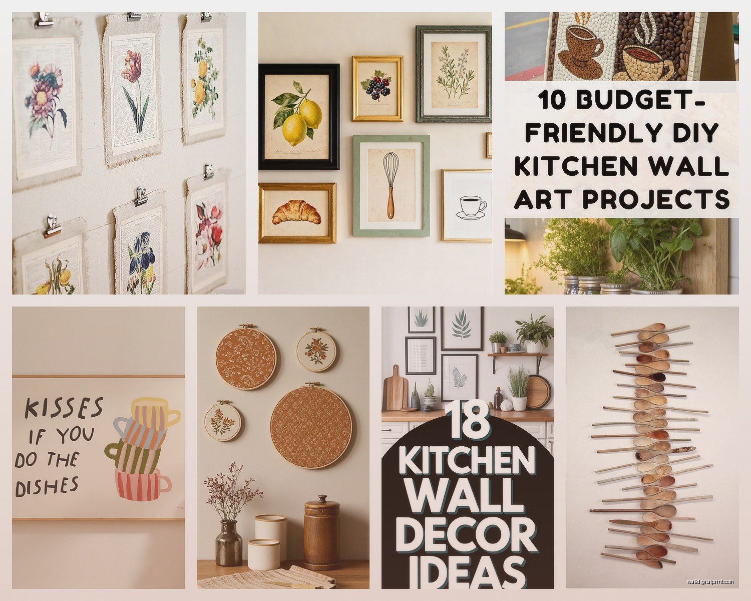
Wall Art Guide, Wall Art Tutoriels
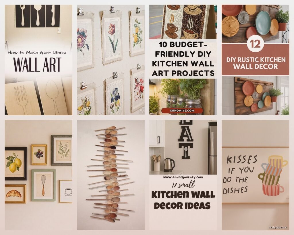
DIY Kitchen Wall Art: Handmade Cooking Space Projects
Mar
So I’ve been testing kitchen wall art projects for like three months now and honestly some of these DIYs are way easier than the Pinterest photos make them look, but the color part? That’s where everyone messes up.
Why Kitchen Colors Are Actually Different
Okay so here’s the thing about kitchen colors that nobody tells you. Your kitchen lighting is HARSH. Like way harsher than your living room because you’ve got those overhead lights, under-cabinet lights, plus whatever’s coming through the window. I learned this the hard way when I made this gorgeous terracotta piece that looked amazing in my studio but turned straight-up orange under my kitchen’s LED strips.
The colors that work best are either super saturated (so they hold up under bright light) or really muted neutrals. The middle ground? That’s where things get muddy and weird. My dog knocked over a whole tray of “dusty rose” paint samples last week and honestly they all looked the same under kitchen lighting anyway.
The Actual Color Families That Work
Warm Neutrals: Think cream, warm white, beige with yellow undertones. These bounce light around without looking dingy. I use Benjamin Moore’s “White Dove” as a base for probably 60% of my kitchen projects because it reads as actual white in kitchens but has enough warmth that it doesn’t look sterile.
Deep Greens: Like hunter green, forest green, that really dark sage that’s everywhere right now. These are having a moment but they actually work because they’re dark enough to create contrast against most kitchen cabinets. Just make sure your green leans either warm (yellow undertones) or cool (blue undertones) and stick with that throughout the piece.
Terracotta and Rust: But only if your lighting is warm. If you’ve got those blue-toned LEDs, skip this entirely or you’ll end up with something that looks like a bad fake tan.
Navy and Charcoal: These are your safe bets honestly. They work with almost everything, don’t show splatter marks if you hang them near the stove (learned that one the hard way), and they photograph well if you’re gonna post it somewhere.
Project One: Painted Cutting Board Display
Get those cheap bamboo cutting boards from Target. The medium sized ones, maybe 10×14 inches. You’re gonna paint abstract shapes on them.
Colors that actually work together: Pick THREE max. I usually do one neutral, one deep color, one accent. Like cream + forest green + burnt orange. Or white + navy + terracotta. The key is having different values – one light, one dark, one medium.
Sand the boards first with like 220 grit sandpaper. Doesn’t have to be perfect but acrylic paint needs something to grip. Then do a coat of white acrylic primer. The cheap stuff is fine.
For the actual design I’ve been doing these organic blob shapes? Just freehand with a small brush. Start with your darkest color, do a few irregular shapes scattered around. Let it dry (this is where everyone messes up – wait the FULL drying time, usually 2 hours). Then add your medium color overlapping slightly. Then your lightest color as little accent spots.
Oh and another thing – use matte acrylic paint, not glossy. Glossy looks cheap in kitchens because of all that light reflection. I use Apple Barrel paints from Walmart, they’re like $1 each and honestly work just as well as the fancy brands for this.
Seal it with matte Mod Podge. Two coats. These aren’t gonna be food-safe anymore obviously but they look expensive propped up on a shelf or hung with those plate hanger things.
The Herb Print Series That Everyone Asks About
This is gonna sound weird but the best way to do botanical prints for kitchens is actually screen printing with fabric paint on canvas. Hear me out.
Get pre-stretched canvases from Michael’s when they’re 50% off (which is basically always). Small ones, like 8×10 or 9×12. Buy actual herbs from the grocery store – rosemary, thyme, sage leaves, whatever.
The color trick here is to use ONE color per canvas but do a series of 3-4 canvases. I did a whole wall with different herbs, all printed in the same dark green. The repetition makes it look intentional instead of crafty.
You can also do them in black which is very classic French kitchen vibes, or this dusty mauve color that’s surprisingly neutral. The mauve one shocked me – it’s like a greyed-down purple-pink (I use Folk Art “Autumn Leaves” mixed with white) and it works with both warm and cool kitchens.
Press the herb into fabric paint (watered down slightly), press onto canvas. It’s literally that simple. The fabric paint stays flexible on canvas which is important because regular acrylic cracks over time with temperature changes and kitchens have a lot of temperature changes.
Color Combinations for Herb Series
- All black prints on cream canvas – classic, always works
- Dark green prints on white canvas – fresh, modern
- Terracotta prints on natural canvas – warm, Mediterranean
- Navy prints on light grey canvas – sophisticated, works with stainless steel
- Charcoal prints on warm white canvas – this is my go-to honestly
Abstract Geometric Stuff Using Tape
My client canceled last Thursday so I spent like three hours testing different tape methods for geometric art and okay so here’s what actually works.
Get artist tape (not painter’s tape, it bleeds). FrogTape makes a yellow one that’s specifically for delicate surfaces. Map out your design with pencil first – triangles, rectangles, whatever. Tape off sections.
Here’s the color strategy that looks professional: Use a gradient of one color family. So like if you’re doing blue, get three shades – light blue, medium blue, navy. Paint each taped section a different shade. The variation makes it look intentional.
OR do a two-color contrast thing. Warm + cool. Like mustard yellow and slate blue. Or terracotta and sage green. The contrast has to be strong enough that you can see it from across the room.
I’ve been obsessed with this combo lately: cream, terracotta, and olive green. It sounds like it shouldn’t work but it’s giving very California grandma kitchen in the best way.
Paint each section, let it dry completely (I usually wait overnight because I’m paranoid), then remove the tape verrrry slowly. Pull it back on itself at a 45-degree angle. If you just rip it off you’ll take paint with it.
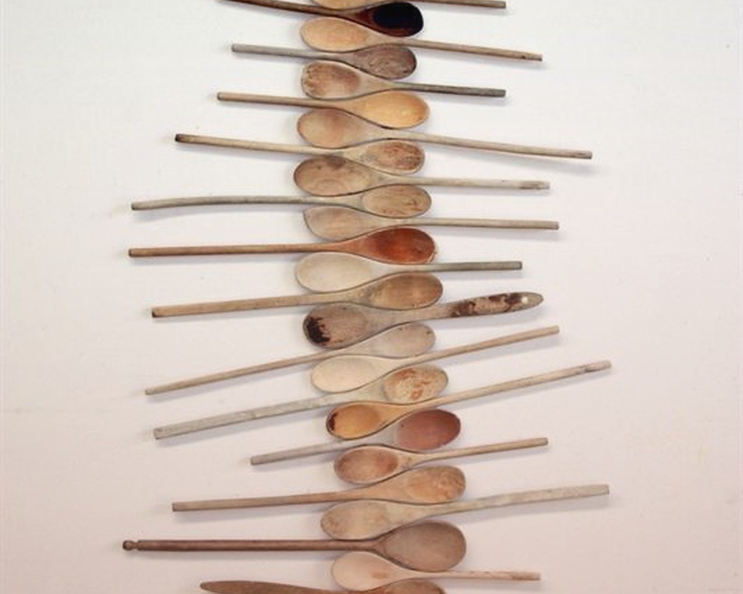
The Spoon Collection Wall
Okay this one’s not painting but it involves color choices so. Get wooden spoons from thrift stores, the bigger the better. You’re gonna dip-dye them.
Mix acrylic paint with water until it’s like the consistency of heavy cream. Dip the spoon bowl and part of the handle. Hang to dry (I literally use a coat hanger suspended between two chairs, whatever works).
Color palette that looks cohesive: Pick colors that are all the same saturation level. So all muted colors, or all bright colors. Don’t mix pastel pink with deep burgundy unless you’re going for a specific eclectic vibe.
My favorite combo right now is different shades of green – sage, olive, forest, hunter. All the greens. Looks like an intentional collection instead of random craft project.
Or go monochrome with different wood stains instead of paint. Walnut, golden oak, ebony. Still counts as color theory, just in browns.
Arrange them on the wall in a grid or that scattered organic layout everyone does. Use command strips, seriously, don’t overthink it.
Painted Plate Wall But Make It Not Tacky
White plates from Goodwill. The dinner plate size. You need like 5-7 for a good wall cluster.
Paint the BACKS of the plates (or the fronts if you’re never using them for food again). Here’s the color trick – use only two colors but vary the ratio. So like if you’re doing blue and white, some plates are mostly blue with white details, some are mostly white with blue details. Creates rhythm without being too matchy.
Color combos I’ve actually tested that don’t look craft-fair:
- Black and cream (very Scandi)
- Navy and white (coastal but not beach-themed if that makes sense)
- Terracotta and cream (warm and Mediterranean)
- Forest green and gold (use metallic gold paint sparingly)
- Grey and white (modern, works with everything)
Do abstract patterns – dots, lines, organic shapes. I use those foam pouncer things for dots, they’re like $2 for a pack. For lines just use a small brush and embrace the handmade look. Trying to make them perfect takes forever and honestly looks more homemade than just doing confident imperfect strokes.
wait I forgot to mention – seal these with spray acrylic sealer. The spray kind, not brush-on, because brush-on leaves streaks on smooth surfaces like plates.
Color Theory Stuff That Actually Matters
Okay so I’m not gonna give you a whole color wheel lecture but here’s what actually helps when you’re staring at paint samples at 10pm trying to figure out what goes together.
Temperature matching: If your kitchen has warm wood tones, brass fixtures, warm lighting – stick with warm colors. Cool grey cabinets, stainless steel, blue-toned light – go cool. Mixing temperatures CAN work but it’s advanced level and you gotta really commit to it.
The 60-30-10 rule: 60% main color, 30% secondary color, 10% accent. So if you’re making a canvas with three colors, the majority should be one color, less of another, just pops of the third.
Neutrals are your friend: When in doubt, add more neutral space. A painting that’s 70% cream with just 30% color reads as way more sophisticated than something that’s all color.
I was watching this design show the other night and they kept talking about “grounding” colors and honestly that’s the best advice. Every colorful kitchen art piece needs a grounding element – black, dark brown, charcoal, navy. Something that anchors all the other colors.
The Typography Poster Thing
Print out words in a nice font (I use Canva, it’s free). Tape the printout to a canvas. Trace with pencil. Paint in the letters.
Color choice here is crucial because typography reads best with HIGH contrast. Black on cream, navy on white, charcoal on light grey. Don’t do like… tan on beige. Nobody can read that from more than two feet away.
For multi-word designs, you can do each word in a different color but they need to be in the same family. Like different shades of blue, or different warm neutrals. I did one with “GATHER” where each letter was a different shade of green and it actually worked because they were all the same temperature and saturation level.
Words That Work in Kitchens
Not gonna lie, most kitchen quotes are corny. But these are short enough and vague enough to not be annoying:
- GATHER
- NOURISH
- SIMMER
- Just a single herb name in another language (BASILICO, ROMARIN)
- Your family name
- The year your house was built
Frame Color Matters More Than You Think
This is gonna sound basic but the frame color can make or break the whole thing. I’ve had pieces that looked terrible in one frame and amazing in another.
Natural wood frames – work with warm kitchens, warm art colors
White frames – work with literally everything, safest bet
Black frames – modern, crisp, make colors pop but can be harsh in traditional kitchens
Gold frames – only if you’re going full glam or vintage, otherwise skip
I buy all my frames from thrift stores and spray paint them if needed. Way cheaper than buying new and you can get weird sizes that add character.
The thing about DIY kitchen art is it doesn’t have to be perfect. Actually it looks better when it’s not perfect because then it’s obviously handmade instead of trying-to-look-store-bought-but-failing. Embrace the wonky lines and color variations. That’s literally the point.
Just make sure your colors work with your actual kitchen before you commit to a whole project. Take photos of your paint samples in your kitchen at different times of day. Morning light is totally different than evening light and if your art only looks good for two hours a day, that’s a problem.