Wall Art Guide, Wall Art Tutoriels
Free Printable Wall Art: 500+ Downloads for Every Room
Apr
So I’ve been downloading and printing free wall art for like three years now and honestly it’s kind of become this thing where clients text me at midnight asking where I found that botanical print in their guest room. Let me just dump everything I know because I literally just reorganized my entire digital collection last week when I should’ve been watching that new Netflix show everyone’s talking about.
Where to Actually Find Good Free Printables
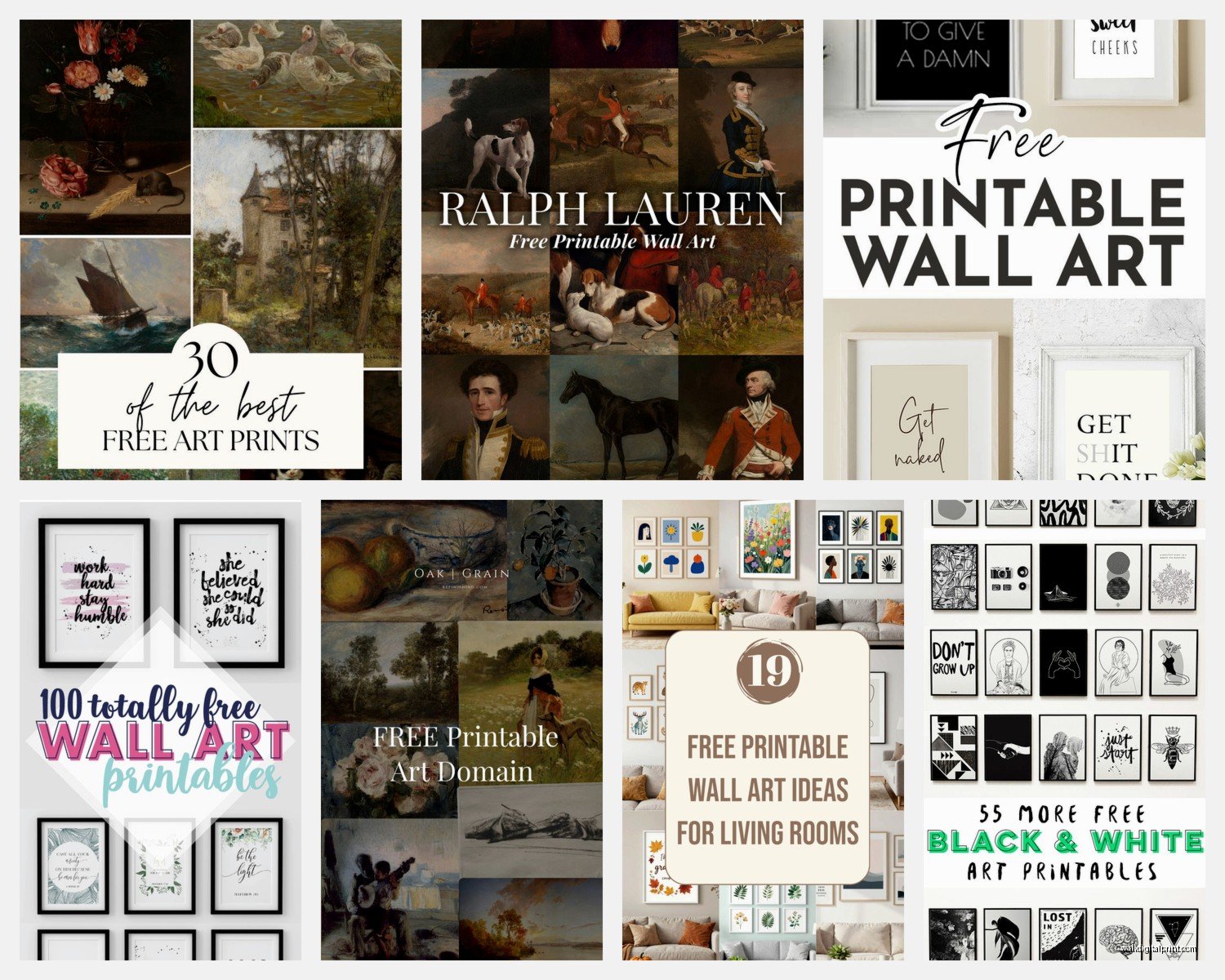
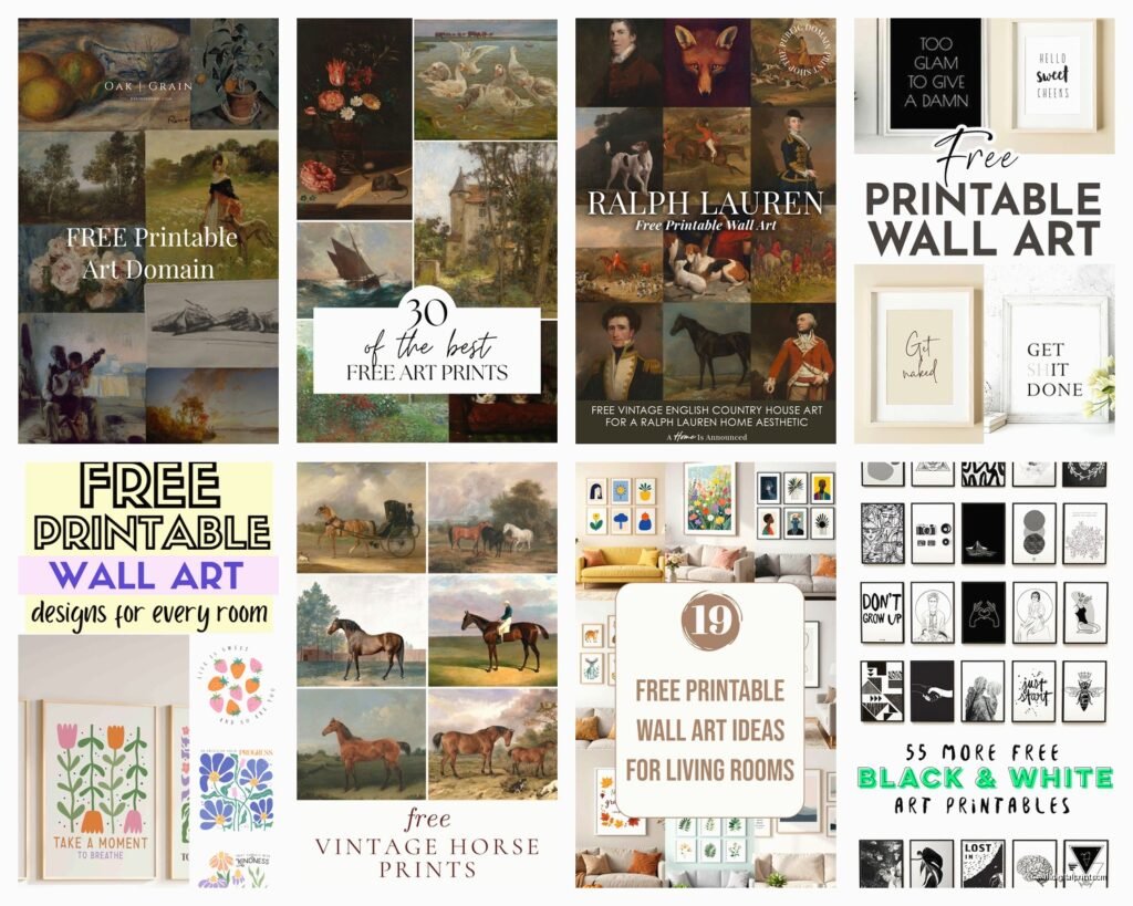
Okay so the obvious ones first. Unsplash and Pexels aren’t technically printable art sites but like… they are? I download high-res photos all the time and just print them as abstract art or landscapes. The quality is insane and it’s completely free for commercial use which means you can even use them for client projects.
The Print Emporium has maybe 200 free downloads if you sign up for their newsletter. I know, I know, another email list but they actually send decent stuff once a month and don’t spam you. Their minimal line art collection is *chef’s kiss* for modern spaces.
Printable Wall Art on Etsy sounds weird but stay with me. Filter by price (free) and you’ll find tons of shops that offer freebies to get you hooked on their paid stuff. It works on me every time but hey, free is free. I’ve downloaded probably 80 pieces this way.
The Graphics Fairy is this treasure trove of vintage public domain images. If you need that farmhouse-y antique botanical vibe or old maps or weird Victorian stuff, this is it. Everything’s free because it’s all old enough to be public domain. I used three of their bird illustrations in a client’s breakfast nook last month and she literally cried happy tears which was… a lot but also sweet.
The Printing Part That Everyone Messes Up
Here’s where people waste money. Don’t just download something and hit print at Staples without checking the specs first.
Resolution matters SO much. You need at least 300 DPI for anything you’re printing larger than 5×7. I learned this the hard way when I printed an 11×14 at 72 DPI and it looked like pixelated garbage. Now I always check the file info before I even download. If it doesn’t say the resolution, assume it’s too low for anything big.
Paper weight is the thing nobody tells you about. Regular printer paper looks cheap and flimsy on a wall. I use 32lb cardstock minimum, but honestly 65lb or 80lb cardstock is where it’s at for that professional gallery feel. Michael’s usually has sales and you can get 50 sheets for like twelve bucks.
Oh and another thing – matte versus glossy finishes change everything. Glossy shows every reflection and looks kinda cheap unless you’re going for a photo print vibe. Matte cardstock is more forgiving and looks intentional. I keep both in my supply closet but reach for matte probably 80% of the time.
Actual Printing Options
Your home printer works fine for 8×10 and smaller if you have a decent inkjet. I have an Epson EcoTank that I bought two years ago and it’s paid for itself like five times over. The ink bottles last forever.
For anything 11×14 or bigger, I go to a print shop. Staples is fine but their color calibration is hit or miss. FedEx Office is slightly better. My secret weapon though is this local print shop that does engineering prints – they can print up to 36 inches wide for like three dollars. The paper is thinner but if you’re framing it anyway, who cares?
Organizing Your Downloads Because You’ll Have Hundreds
I’ve got like 600 files right now and it was chaos until I created a system. On my laptop I have folders organized by: Room Type, Color Palette, and Style. So like “Kitchen – Warm Tones – Vintage” or “Bedroom – Neutrals – Abstract.” Sounds obsessive but when a client needs something specific I can find it in thirty seconds instead of scrolling through random files named “download_3847.jpg”
Renaming files immediately after downloading is gonna save you so much frustration. I spent an entire Saturday once trying to find this perfect sage green botanical print and finally gave up and re-downloaded it because I couldn’t remember what I’d named it.
The Best Free Collections by Room
Living Room Stuff
Large scale abstracts work amazing above sofas. I found a collection on Creative Market during their free goods week that had these huge watercolor backgrounds – they print beautifully at 24×36. Geometric line art is everywhere right now and honestly it’s not going away soon. Simple shapes in black and white never look dated.
Gallery walls are where free printables really shine because you need like 9-15 pieces and buying that much art is ridiculous. I mix different sources – some vintage botanicals from Graphics Fairy, some modern abstracts from Unsplash, maybe a quote print or two. The trick is keeping a consistent color story even if the styles vary.
Bedroom Options
Calming neutrals obviously. I download a ton of minimalist photography – sand dunes, misty forests, abstract textures. There’s this photographer on Unsplash named Pawel Czerwinski who does these insane abstract paint photos that look like expensive art when you print them large.
Typography prints work above beds but please don’t do “live laugh love” unless it’s ironic for like a guest room or something. I found better quotes on Canva – they have templates you can customize and download for free. Just change the colors to match your room.
Kitchen and Dining
Vintage fruit illustrations, herbs, botanical prints, old cookbook pages. The Graphics Fairy has hundreds of these. I printed a collection of antique herb drawings for my own kitchen and people ask about them constantly. Food photography from Unsplash works too – there’s something about a really good photo of figs or citrus that just works in a kitchen.
Coffee prints are cliche but if you own it and do like a whole coffee-themed gallery wall it becomes intentional instead of basic. I did this for a client who was obsessed with coffee and we found vintage coffee ads, coffee plant botanicals, and typography about coffee. It was very extra but she loved it.
Bathrooms
Keep it simple because bathrooms are usually small. Ocean photography, spa-like neutrals, simple line drawings. I’ve used a lot of single botanical stems – like one eucalyptus branch or a single palm frond. Prints beautifully at 8×10, frames easily, looks expensive.
Vintage soap ads and apothecary labels are having a moment. Public domain images of old medicine bottles and Victorian beauty product labels look surprisingly chic in modern bathrooms.
Kids Rooms
This is where I go a little wild with color. Alphabet prints, animal illustrations, space themes, underwater scenes. There’s a site called Creative Fabrica that has free downloads sometimes if you sign up – their kids illustration packs are adorable.
The key with kids rooms is printing on that heavier cardstock because it’ll get touched and moved around. Also maybe don’t frame everything in glass if they’re really young? I’ve learned this one the hard way.
Framing on a Budget
IKEA frames are fine. I said it. The RIBBA series is like seven dollars for 8×10 and they look perfectly acceptable. I buy them in bulk and spray paint the frames sometimes to customize them. Matte black, white, gold, whatever matches.
Thrift store frames are actually amazing if you’re patient. I check Goodwill maybe twice a month and find great wooden frames for two or three dollars. The existing art is usually terrible but the frames are solid. Sometimes the glass is dirty but like… you can clean glass.
Oh wait I forgot to mention – if you’re doing a gallery wall, don’t buy matching frames unless you want that super coordinated look. Mixing frame styles in the same color family looks more collected and interesting. All black frames in different sizes and styles, or all natural wood frames with varying tones.
My Current Favorite Sources With Actual Numbers
The Printable Wall Art category on Creative Fabrica has maybe 150+ freebies rotating monthly. You need an account but it’s free. Their boho collection is really strong right now.
Museum websites – okay this is gonna sound weird but so many museums have digitized their collections and you can download public domain artwork. The Met, Rijksmuseum, National Gallery of Art. I’ve printed everything from Van Gogh sketches to ancient Japanese prints. It’s all free and the resolution is professional quality because these are museum-grade scans.
Public Domain Review releases themed collections and they’re beautifully curated. Not massive quantities but high quality stuff you won’t find everywhere else.
Society6 has free downloads sometimes during promotions. Their artist community is huge so the variety is insane.
Color Correcting Before You Print
Your monitor shows colors differently than they’ll print. I always do a test print on regular paper first for anything I’m printing on expensive cardstock. Especially with whites and grays – they can look blue or yellow when printed depending on your printer settings.
Adjusting the brightness down by like 10-15% before printing usually helps. Things print darker than they appear on screen. I use the free version of Canva to make these adjustments even though I’m sure there’s better software out there.
The Stuff That Looks Expensive But Isn’t
Large scale black and white photography printed at engineering print size and mounted on foam board. Costs maybe five dollars total and looks like a gallery piece.
Diptychs or triptychs where you split one image across multiple frames. Download one large abstract image, crop it into sections, print each section. Instant expensive-looking art installation.
Vintage maps of places that matter to you. Print them large, frame them simply. Everyone assumes they’re custom and pricey but you downloaded them free from David Rumsey Map Collection.
Botanical prints in matching frames arranged in a grid. The repetition and organization makes even simple free prints look curated and intentional.
What Actually Doesn’t Work
Super trendy stuff dates fast. Those “good vibes only” prints were everywhere three years ago and now they look dated. Stick with more timeless options or accept that you’ll swap them out annually.
Printing too small for your wall space. That 8×10 above your king bed looks sad and lost. Go bigger than you think you need. I usually tell people to tape newspaper to the wall at different sizes before committing.
Low resolution files printed large. Just don’t. It’ll look terrible and you’ll waste money on printing and framing something pixelated.
Using too many different styles in one room unless you really know what you’re doing with eclectic design. It ends up looking chaotic instead of curated.
My cat just knocked over my water bottle so I gotta wrap this up anyway but honestly you could furnish every wall in your house with free printables if you’re strategic about it. I’ve done entire client projects using maybe 90% free downloads and nobody knew the difference. The framing and how you arrange things matters way more than whether you paid for the actual art file.