Wall Art Guide, Wall Art Tutoriels
Gold Metal Wall Art: Luxury Metallic Decor & Sculptures
Mar
So I’ve been working with gold metal wall art for like three years now and honestly the biggest mistake people make is thinking all gold finishes are the same. They’re really not and it’s gonna affect your whole room vibe.
Understanding Gold Finishes Before You Buy Anything
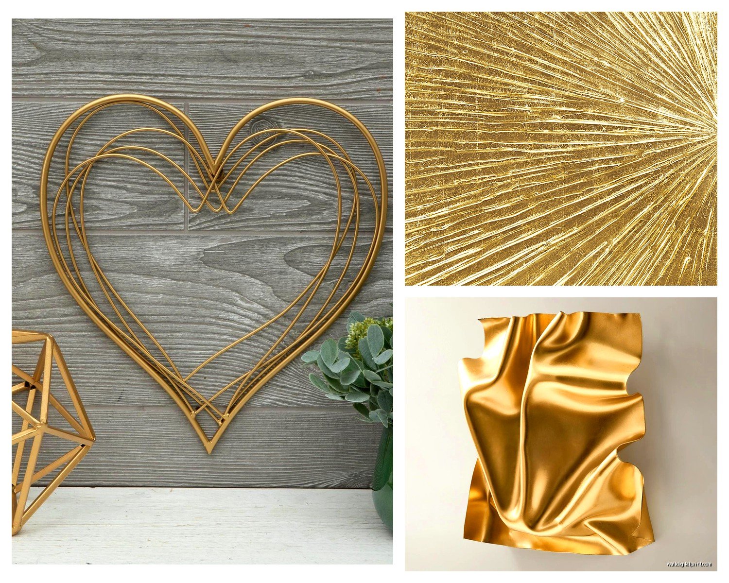
Okay so there’s basically four types you’ll see and this matters more than the actual design sometimes. Brushed gold has this matte thing going on, catches light softly, works in modern spaces without screaming “look at me.” Then there’s polished gold which is super shiny and reflective—I had a client return a $400 piece because she didn’t realize how mirror-like it would be. Antique gold has that aged patina look, sometimes with black or brown undertones, perfect if you’re going for that collected-over-time aesthetic. And champagne gold is lighter, almost pinkish, pairs really well with blush tones and white.
I usually tell people to get samples if possible because the lighting in your house will change everything. My living room faces north so I avoid polished finishes there completely.
Sizing is Where Everyone Screws Up
The formula I use is kinda loose but it works: your wall art should take up about 60-75% of the furniture width beneath it. So if you’ve got a 72-inch sofa, you’re looking at roughly 43-54 inches of art width. But here’s the thing—metal art often looks smaller in photos than it actually is because of the negative space in the design.
I once ordered this geometric gold piece that looked massive online and it was maybe 18 inches. My dog literally barked at the package because it was so small. Now I always check dimensions twice and visualize with painter’s tape on the wall first.
For statement pieces above a bed or sofa you want something at least 36 inches wide. Anything smaller just floats there looking lost. If you’re doing a gallery wall with multiple metal pieces, the entire arrangement should follow that 60-75% rule, not individual pieces.
Height Placement Actually Matters
Center point should be at eye level which is usually 57-60 inches from the floor. But if you’re hanging above furniture, leave 6-8 inches between the furniture top and the art bottom. I see people hang stuff way too high all the time and it disconnects from the space.
Oh and another thing—in rooms with tall ceilings (10 feet or more) you can go a bit higher to fill vertical space but don’t go crazy. I worked on a project last month where the homeowner had mounted this gorgeous sunburst piece at like 8 feet up and it just disappeared.
Weight and Installation Nobody Talks About
Metal wall art is HEAVY. Like heavier than you think. A 30-inch steel sculpture can easily be 15-20 pounds. Most pieces come with D-rings or sawtooth hangers but honestly those aren’t always sufficient.
For anything over 10 pounds I use heavy-duty picture hooks rated for the weight plus 50% more. So if it’s 15 pounds, I’m using hooks rated for at least 22 pounds. Better safe than having it crash down at 3am.
Drywall anchors are your friend if you can’t hit a stud. I prefer toggle bolts for heavy pieces—they distribute weight better than regular plastic anchors. This is gonna sound weird but I keep a stud finder in my car because I’ve been at client houses where we planned whole installations and then couldn’t find studs where we needed them.
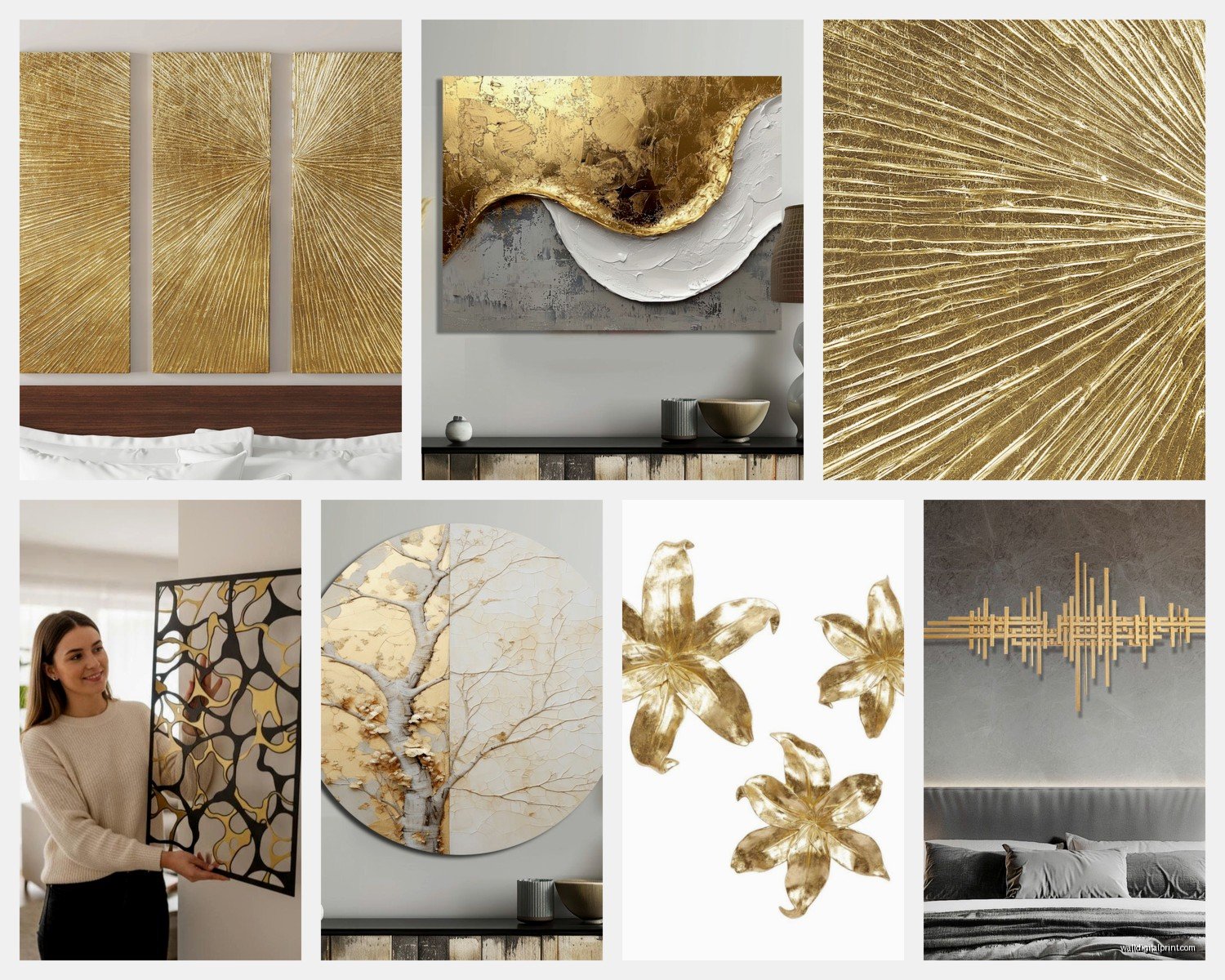
Mounting Multi-Panel Pieces
Those trendy three-panel or five-panel sets? Measure the total width INCLUDING the spacing between panels. Designers usually recommend 2-3 inches between panels but I’ve found 2.5 inches looks best for most compositions.
Use a level for the first panel then measure from that one to place the others. I mark all my spots with pencil first, step back, take a photo, look at the photo because somehow you see alignment issues better in photos than real life. Install the middle panel first if it’s an odd number, or start from the center and work outward for even numbers.
Mixing Gold Metal with Other Finishes
You can absolutely mix gold with other metals and anyone who says you can’t is stuck in 2005. I mix brass, gold, and copper all the time. The trick is repeating each metal at least twice in the room so nothing looks accidental.
Like if you’ve got a gold metal wall sculpture, bring in gold picture frames or gold hardware on furniture. Then maybe add brass candlesticks and a copper bowl. It looks intentional and collected rather than matchy-matchy.
Silver and gold together is trickier but doable if the gold leans warm and the silver is more pewter or aged. I wouldn’t do chrome and bright gold though—that’s a clash.
Style Categories That Actually Help When Shopping
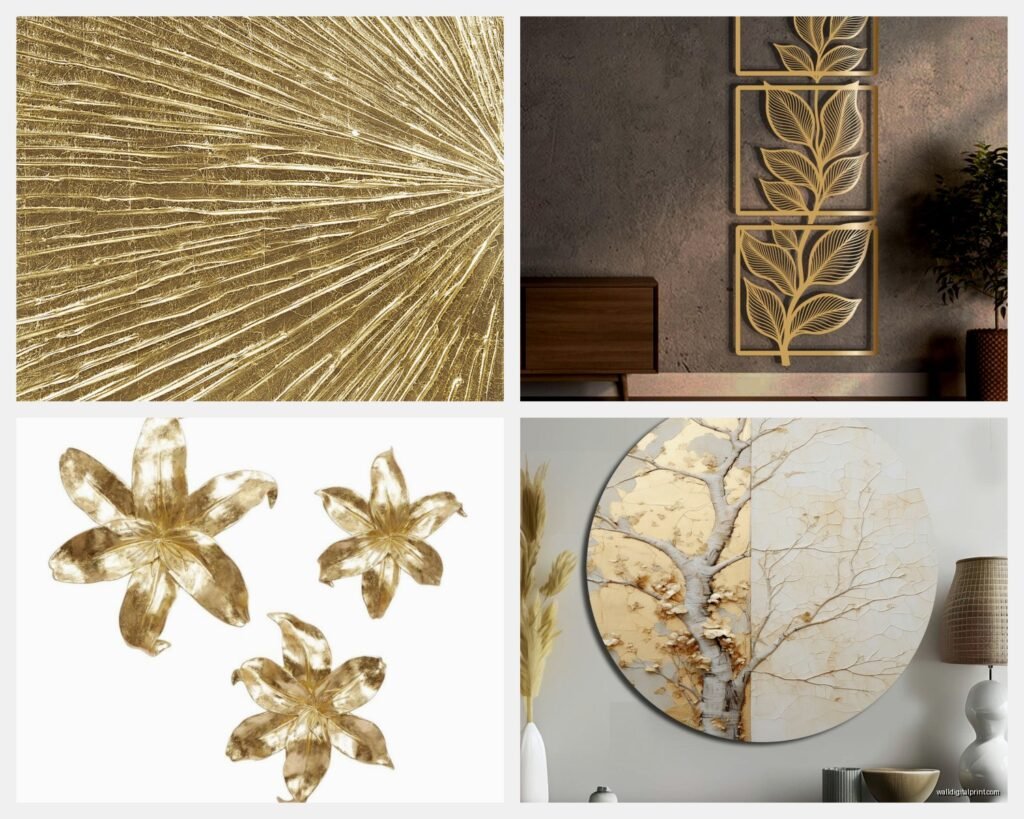
Abstract Geometric: circles, hexagons, angular shapes. These work in modern and contemporary spaces. Look for pieces with depth—layered metal creates shadows and dimension. Flat geometric stuff can look cheap.
Nature-Inspired: leaves, trees, branches, feathers. These soften modern spaces and work great in transitional designs. My friend has this gold eucalyptus branch piece in her bathroom and it’s been there four years still looks amazing.
Sunburst Designs: classic for a reason. They add drama without being too specific style-wise. Work in mid-century, glam, transitional, even some traditional spaces.
Typography and Words: honestly I’m picky about these. They can look Pinterest-y really fast. If you go this route choose something meaningful and make sure the font isn’t too trendy.
Sculptural 3D Pieces: these project off the wall, cast real shadows, super impactful. Need more clearance though—make sure you’ve got at least 6 inches from the wall to any furniture.
Where Gold Metal Art Works Best
Living rooms are obvious but I’ve had the most success with gold metal in dining rooms actually. Something about metallic catching candlelight or chandelier light makes dinner feel fancier without effort.
Bedrooms can handle gold but keep it behind the bed or on a side wall—you don’t want too much stimulation where you sleep. Brushed or antique finishes are better here than shiny polished.
Bathrooms are underrated for metal art IF you get properly sealed pieces. Moisture will tarnish unsealed metal. I learned this the hard way with a piece above my bathtub that developed spots within six months.
Entryways and hallways are perfect for statement gold pieces because they’re high-impact areas where guests pause. Just watch the scale—narrow hallways need narrower vertical pieces not wide horizontal ones.
Lighting Considerations
Gold metal needs light to work properly. In dim rooms it just looks dark and loses that luxe quality. If you’re putting it on a wall without natural light, add picture lights or wall sconces.
Direct overhead lighting can create harsh shadows on 3D pieces so I usually prefer angled lighting from sconces or track lights. Position lights at about 30 degrees from the wall for the best effect.
Wait I forgot to mention—avoid placing gold metal art directly opposite windows if it’s polished finish because the glare can be blinding at certain times of day. Found this out during a photoshoot where we literally couldn’t get a good shot for two hours because of sun reflection.
Maintenance is Easier Than You Think
Dust with a microfiber cloth every couple weeks. For brushed or matte finishes that’s basically it. Polished finishes might need occasional buffing with a soft cloth to maintain shine.
If you get fingerprints or smudges, use a tiny bit of glass cleaner on a cloth (not directly on the metal) and wipe gently. Test in an inconspicuous spot first though.
Antique or patina finishes shouldn’t be cleaned with anything harsh—you’ll strip the aging effect. Just dust those and maybe very lightly with a barely damp cloth if needed.
Don’t use abrasive cleaners or rough cloths ever. Scratches on gold metal are basically permanent and really obvious.
Budget Ranges and What You Actually Get
Under $50: probably thin metal, might be painted MDF, simple designs. These are fine for low-impact areas or if you’re renting and don’t wanna invest much. Quality varies wildly so read reviews.
$50-150: decent weight, actual metal (usually steel or iron), more intricate designs. This is my sweet spot for most projects honestly. You get good quality without the luxury price tag.
$150-400: heavier gauge metal, hand-finished details, unique designs, better hardware. Worth it for focal point pieces in main living areas.
Over $400: artist-made, custom work, really substantial weight, museum-quality finishes. I’ve worked with pieces up to $2000 and yeah the quality difference is noticeable but not always necessary unless you’re going for a really high-end look.
Buying Online vs In Person
Online gives you way more options obviously and usually better prices. But you can’t see the actual finish or feel the weight. I always check return policies—some places charge restocking fees for large items which is annoying.
Read reviews with photos from actual buyers not just the stock photos. Pay attention to comments about color accuracy and size perception.
In person lets you see exactly what you’re getting and usually stores have better lighting than your house so it might look different at home. I still take photos in the store and text them to myself to review later because store environments are deceiving.
Custom vs Ready-Made
Custom pieces let you get exact sizing and finishes but you’re waiting 4-8 weeks usually and paying premium prices. I only go custom when I’ve got a really specific space or the client wants something nobody else will have.
Ready-made is faster, cheaper, easier to return. The design options are actually pretty vast now—you’re not sacrificing much unless you need specific dimensions.
Common Design Mistakes I See Constantly
Hanging multiple small pieces when one large statement piece would work better. Small scattered metal art looks cluttered and cheap.
Choosing shiny gold in rooms with lots of other shiny surfaces—it becomes too much. You need some matte elements to balance.
Not considering the wall color. Gold on beige can disappear. Gold on dark walls pops but can feel heavy. Gold on white or gray is usually safest.
Ignoring the room’s existing metal tones. If all your hardware is silver and you add a gold statement piece with nothing else gold in the room, it looks random.
Going too themed—like all butterflies or all leaves. One nature piece is elegant, five is a garden center.
Quick Style Pairing Guide
Modern Minimalist: geometric shapes, brushed or matte finishes, clean lines, single large pieces rather than groupings
Glam/Hollywood Regency: polished gold, sunbursts, abstract shapes, pair with mirrors and crystal
Transitional: nature-inspired designs, mix of finishes, medium-sized pieces, layered with other art
Bohemian: antique gold, mixed with macrame and textiles, organic shapes, imperfect finishes
Industrial: raw metal with gold accents, geometric, mixed metals, sculptural pieces
Traditional: ornate designs, antique finishes, classic motifs like scrollwork, paired with wood tones
Okay so my cat just knocked over my coffee which is perfect timing I guess because I think that covers most of what you need to know about actually choosing and installing gold metal wall art without making the mistakes everyone makes first time around.