Wall Art Guide, Wall Art Tutoriels
Gold Wall Art for Living Room: Luxury Metallic Accents
Apr
So I’ve been basically obsessed with gold wall art lately because three of my clients asked for it in the same week and I was like, okay universe, I hear you. Plus my cat knocked over my coffee while I was researching this stuff at 2am so clearly it’s meant to be.
The thing about gold wall art is that everyone thinks it’s gonna look tacky or too much, but honestly if you pick the right type and finish, it’s actually super sophisticated. I tested like fifteen different pieces in my own living room before recommending anything and my partner was very patient about the constant rearranging.
Understanding Gold Finishes Because They’re Not All The Same
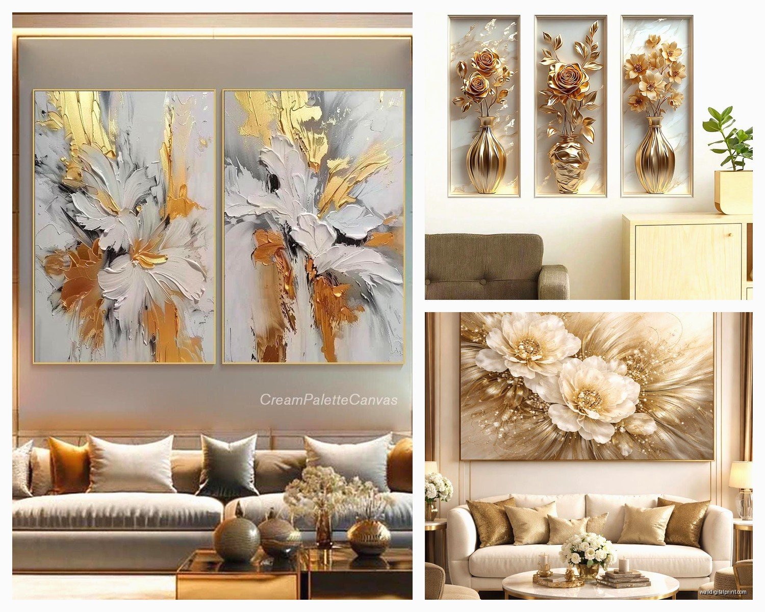
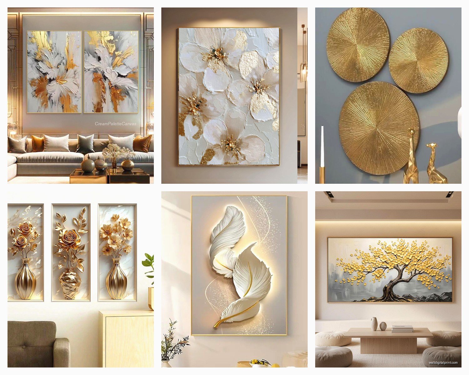
Okay so here’s where people mess up immediately. Gold wall art comes in different finishes and they give completely different vibes. Brushed gold is matte-ish and has this subtle texture that catches light without being shiny. I love this one for modern spaces because it doesn’t scream “look at me” but still has that luxury feel.
Then there’s polished gold which is super reflective and honestly can be a lot. I used a polished gold geometric piece in a client’s penthouse and it worked because the room had 12-foot ceilings and tons of natural light, but in my regular-height living room it felt like too much. You gotta have the space to pull this off.
Antique gold or aged gold is my secret weapon though. It has this patina effect that makes it look expensive but not new-expensive, you know? Like inherited-from-your-cool-aunt expensive. I found this amazing antique gold leaf piece at an estate sale and it’s still my favorite thing on my wall.
Gold leaf is actual gold applied in thin sheets and it’s gorgeous but also delicate. Don’t put it where people might touch it a lot because it can flake over time. I learned this the hard way when I installed one near a doorway and people kept brushing against it.
Material Options That Actually Matter
Metal is obviously the most common. Aluminum or iron with gold finish. The weight tells you a lot about quality – if it feels flimsy it’s gonna look cheap on your wall no matter what. I always do the shake test in stores which probably looks weird but whatever.
Canvas with gold leaf or gold paint can be really beautiful and it’s lighter so easier to hang. I have this abstract canvas piece with gold accents mixed with navy and it’s probably gotten more compliments than anything else in my apartment. The texture combo of matte canvas and metallic gold is just *chef’s kiss*.
Resin pieces are having a moment right now. They can embed gold leaf or metallic pigments in the resin and create this depth that’s really cool. I curated a show last month with a resin artist who does gold agate-style pieces and they sold out immediately. They’re more expensive but they look like actual art, not just decoration.
Wooden pieces with gold accents or gold-painted wood grain. This is great if you want metallic but not too much. The wood tones it down. I used gold-dipped eucalyptus branches in shadow boxes for a client and it brought in the gold element without overwhelming her traditional space.
Size and Scale Because This Is Where Everyone Panics
People always ask me “how big should it be” and I’m like… it depends on your wall but also here’s what I actually do. For a standard living room wall (let’s say 10-12 feet wide), you want your art or art grouping to take up about two-thirds to three-quarters of the sofa width if it’s above the sofa.
I measure this with painter’s tape before buying anything. Seriously just tape out the dimensions on your wall and live with it for a day. You’ll know if it feels right.
Gallery walls with multiple gold pieces can work but don’t make everything gold. I do like 40% gold pieces mixed with black and white photography or other neutrals. All gold looks like a department store display and not in a good way.
Oversized single pieces make a huge impact. I have a 48-inch circular gold sunburst mirror-art-hybrid thing and people always think my living room is bigger than it is because it draws the eye up and outward. Big pieces in small rooms can actually work if you keep everything else minimal.
Mixing Gold with Other Metals
Okay so funny story, I used to think you couldn’t mix metals and then I saw this designer’s apartment that had gold, brass, copper, and silver all together and it looked amazing. The rule is actually that you need at least three different metal finishes for it to look intentional rather than confused.
In my living room I have gold wall art, brass table lamps, and chrome picture frames. It works because there’s repetition – multiple pieces in each finish scattered around the room. If you just have one gold art piece and one silver lamp it looks like you couldn’t decide.
Warm metals together is the easiest combo. Gold, brass, copper, rose gold – they all play nice because they have similar undertones. I did a whole living room in warm metals for a client last year and it felt cohesive and expensive.
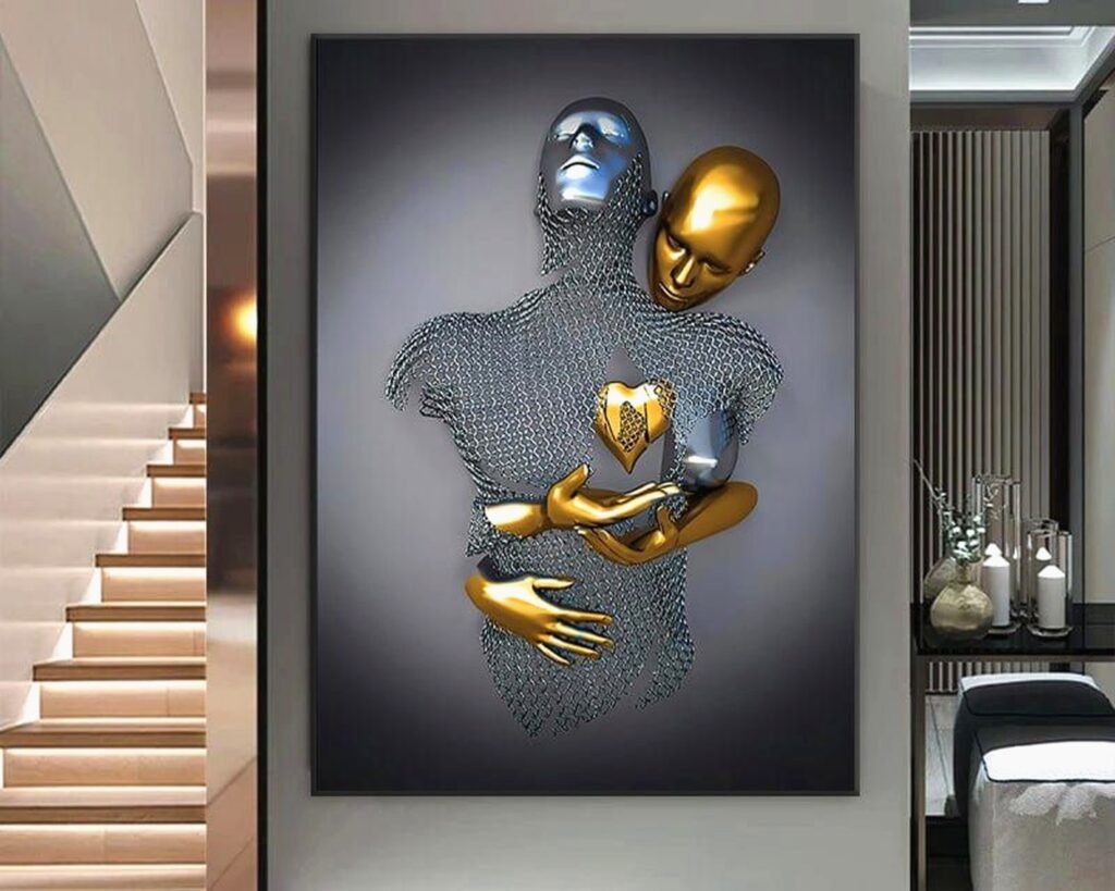
Mixing gold with cool metals like silver or chrome is trickier but totally doable. You need a bridge element. White or black furniture works, or you can use art that incorporates both metals. I found this abstract piece that has both gold and silver leaf and it ties my whole mismatched metal situation together.
Placement Strategies That Actually Work
Above the sofa is classic but make sure it’s centered and hung at the right height. Bottom of the frame should be 8-10 inches above the sofa back. I’ve seen so many people hang art way too high and it floats awkwardly.
On a large empty wall opposite the entrance – this is your statement moment. When someone walks into the room this is what they see first. I used a massive gold geometric piece here in my own place and it sets the tone for the whole space.
Flanking a fireplace with matching or complementary gold pieces is very traditional but still looks good. I did this with two vertical gold palm leaf sculptures and it made the fireplace feel more substantial.
In unexpected places like above a console table in a hallway or on a small wall between windows. Gold catches light so putting it where natural light hits during the day makes it come alive. I have a small gold piece in my entryway that gets afternoon sun and it glows.
Lighting Considerations Because This Changes Everything
Gold wall art needs good lighting or it just looks dark and muddy. This is gonna sound extra but I installed picture lights above my main gold piece and it was worth every penny. It highlights the texture and makes the gold actually look gold.
Natural light is amazing with gold but be careful of direct sunlight with certain finishes. Gold leaf can fade over time with too much UV exposure. I use UV-protective glass on valuable pieces.
Warm white LED bulbs make gold look richer. Cool white bulbs make it look brassy and cheap. I switched all my living room bulbs to 2700K warm white and it made such a difference. My gold art suddenly looked way more expensive.
Layered lighting is key. Overhead, table lamps, floor lamps – having multiple light sources at different heights makes gold art look dimensional throughout the day. When only my overhead is on the gold looks flat, but when I have lamps on too it has depth.
Style Combinations That Surprised Me
Modern minimalist with gold accents is probably the easiest. Clean lines, neutral colors, then BAM a gold geometric piece. It works because there’s contrast. I do this constantly and it never fails.
Traditional spaces with ornate gold frames or classical gold art is expected but you gotta be careful it doesn’t feel outdated. I balance it with modern furniture. Like an antique gold baroque frame but the sofa is contemporary with clean lines.
Bohemian spaces can handle lots of gold because boho is all about layering anyway. I mixed gold sunburst mirrors with macramé and plants and it felt collected not decorated. The key is varying the shades of gold – some antique, some bright, some brushed.
Industrial style with gold is unexpected but so good. The warmth of gold softens all that metal and concrete. I used a large gold abstract piece in a client’s loft with exposed brick and it made the space feel less cold. The juxtaposition of rough and refined just works.
Scandinavian minimalism with subtle gold touches. This is my personal style actually. Mostly white and wood, then small gold accents. A simple gold line drawing or a delicate gold mobile. It adds warmth without compromising the simplicity.
What to Avoid Because I’ve Made These Mistakes
Too much gold in one room makes it look like a jewelry store. I went overboard in my first apartment and it was a lot. Now I limit gold to 2-3 pieces max per room.
Cheap gold that looks orange or brassy. You can tell immediately. The color is off and it doesn’t reflect light properly. I’d rather have one good piece than five cheap ones.
Matching sets that look too coordinated. Like those three-piece canvas sets from big box stores. They’re fine but they don’t look curated. Mix different artists, different styles, different frames if you’re doing multiples.
Putting gold art in rooms with yellow or orange walls – it can get muddy. Gold looks best against white, gray, navy, emerald green, or black. I did a charcoal gray accent wall behind a gold piece and it popped like crazy.
Ignoring the rest of your decor. Gold wall art needs to connect to something else in the room. Maybe gold throw pillows or a gold-rimmed coffee table book or gold hardware on furniture. One connected element is enough.
Budget Options That Don’t Look Budget
DIY gold leaf projects are easier than you think. I bought gold leaf sheets and adhesive online and made my own abstract piece on canvas. It cost maybe $40 and looks like it could’ve been $400. There are tutorials on YouTube that are actually helpful.
Thrift stores and estate sales sometimes have gold frames that you can repaint or reuse. I found a ornate frame for $12, spray painted it matte black, and put gold paper inside for a modern look.
Printable gold art from Etsy is like $5-15 and you just need to frame it. I’ve used these as placeholders while saving for real pieces and honestly some of them are still up because they look fine.
Gold washi tape on canvas or paper to create geometric designs. This sounds crafty but I did it for a client’s teenager’s room and it turned out really cool and modern. Cost about $20 total.
wait I forgot to mention – second-hand luxury is a thing. I check Facebook Marketplace and estate sale sites constantly. Found a West Elm gold mirror piece for $60 that retails for $200+. People redecorate all the time and sell good stuff cheap.
Maintenance and Care
Dust with a microfiber cloth gently. Don’t use cleaning products on gold leaf – just dry dusting. I learned this after dulling a piece with glass cleaner.
Check the hanging hardware periodically especially with heavy metal pieces. I had a piece fall once because the wire weakened over time and it was not fun. Now I check every few months.
Keep gold art away from humid areas. Bathrooms are generally a no unless it’s sealed properly. Humidity can affect certain finishes and adhesives.
For valuable pieces consider professional cleaning every few years. I have an art conservator friend who says people neglect wall art maintenance and then wonder why it looks dull.
The thing about gold wall art is it’s an investment in your space that actually makes a difference. It catches light, adds warmth, feels luxurious without being over the top if you do it right. I’m literally looking at my gold abstract piece right now while writing this and it still makes me happy every time I see it, which is really what matters with any art you bring into your home.
Just start with one piece you really love and build from there. Don’t overthink it but also don’t just buy the first thing you see at HomeGoods even though I definitely have done that before.