Wall Art Guide, Wall Art Tutoriels
Gold Wall Art: Metallic Luxury Gilt Yellow Designs
Mar
So I’ve been working with gold wall art for the past few years and honestly it’s one of those things that can either look incredibly luxe or completely tacky depending on how you handle it, and I’m gonna walk you through what actually works because I’ve made basically every mistake possible.
Understanding Gold Tones Because They’re Not All The Same
Okay so first thing – when people say “gold” they usually mean like five different shades and this is where most people mess up right at the beginning. I was working on this penthouse project last year and the client kept saying she wanted gold accents, and I showed up with these gorgeous champagne gold pieces and she was like “no I meant GOLD gold” and we had to start over.
There’s yellow gold which is what most people picture – super warm, very traditional, the stuff your grandmother’s picture frames were probably made of. Then you’ve got rose gold which had that huge moment a few years ago and honestly I thought it would fade faster but it’s still going strong, especially in bedrooms. Champagne gold is more subtle, almost reads as a warm neutral sometimes. White gold is cooler toned, works better with grays and blues. And then there’s brass which technically isn’t gold but everyone lumps it in the same category anyway.
The champagne and white gold tones are way more forgiving if you’re nervous about going too bold. I use them probably 60% of the time because they play nice with other metals and you can mix them without looking like you raided a jewelry store.
Matching Gold to Your Wall Color Without Losing Your Mind
This is gonna sound weird but I keep paint swatches of my most common wall colors in my bag and I literally hold them up against gold samples in stores. My assistant thinks I’m crazy but it works.
White walls – you can do basically anything but cooler golds (champagne, white gold) look more modern while yellow gold reads more traditional. I did a whole gallery wall of mixed gold frames on white last month and used mostly champagne with a few yellow gold pieces and it looked intentional instead of “I couldn’t decide.”
Gray walls are tricky because if your gray leans cool, yellow gold can look weirdly orange against it. White gold or champagne is safer. I learned this the hard way in my own living room where I hung this beautiful gilt yellow piece and it just looked… wrong. Switched it to my bedroom which has warmer walls and suddenly it worked.
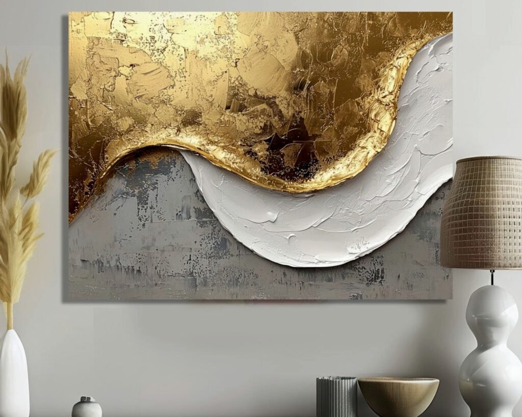
Navy or dark walls – oh man, this is where gold really shines, literally. Yellow gold and brass look incredible against navy, really dramatic. I did a client’s dining room with navy walls and these oversized gold leaf abstract pieces and people still send me photos of that room. The contrast is just *chef’s kiss*.
Beige, cream, warm neutrals – yellow gold all day. It’s like they were made for each other. Rose gold also works beautifully here, especially if you’ve got blush or terracotta accents happening.
The Undertone Thing Everyone Ignores
okay so funny story, I was watching this home renovation show while sorting through samples and they completely ignored undertones and I was yelling at the TV like a sports fan. Your wall color has an undertone (warm or cool usually) and your gold needs to match that vibe or at least not fight with it.
Cool undertones = cooler golds (white gold, platinum finishes, some champagnes)
Warm undertones = warmer golds (yellow gold, brass, rose gold)
I keep a gold tone chart on my phone now because trying to remember which specific piece works with which wall color was making me insane.
Finishes and Textures Because Flat Gold Is Boring
The finish on your gold art matters almost as much as the color. Flat metallic gold can look kinda cheap honestly, like spray paint. You want dimension.
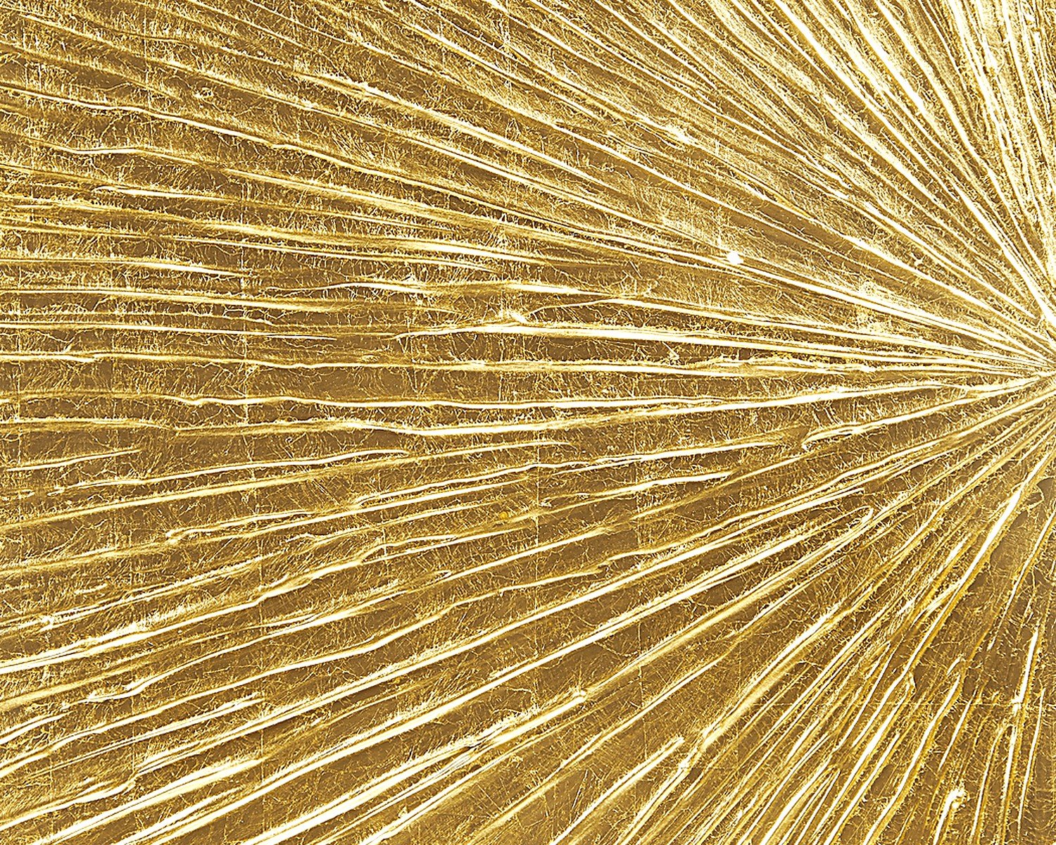
Leafing (actual metal leaf application) is the gold standard literally. It catches light differently depending on angle, has this gorgeous subtle texture, ages beautifully. It’s more expensive but worth it for statement pieces. I have a gold leaf abstract in my entryway that I bought three years ago and I still stop and look at it.
Brushed or matte gold is having a moment right now and it’s more subtle, works better in modern spaces. Less shiny means less chance of looking gaudy. I’m using this finish a lot lately for clients who want gold but are nervous about it.
Antiqued or distressed gold has that vintage vibe, shows darker tones in the recesses. Great for traditional spaces or if you’re doing that collected-over-time look. My dog knocked over one of these pieces once and the dent actually made it look MORE authentically aged so… silver lining?
High polish gold is very shiny, very glamorous, very “I know exactly what I’m doing with my decor.” Use sparingly unless you’re going full maximalist, which honestly can be amazing if you commit.
Mixing Finishes
You can totally mix finishes but keep the tone family consistent. Like, brushed brass with shiny brass works. Brushed brass with shiny rose gold… less so. I mixed matte gold frames with a leafed gold sculpture last week and it worked because they were both warm yellow golds, just different textures.
Size and Scale Because Bigger Isn’t Always Better
I see people buy these tiny gold pieces and scatter them around and wonder why they look insignificant. Gold art needs to be either big enough to make a statement OR grouped in a way that creates impact.
For a standard living room wall (like 10-12 feet), I usually go with either:
- One large piece (36×48 inches minimum)
- A gallery wall of 5-9 pieces with at least a few being substantial size
- A diptych or triptych where the total width is at least 60 inches
Small rooms can handle smaller gold pieces but you still need enough visual weight. I did a powder room last month with a single 18×24 gold geometric piece and it worked because the room was only like 6 feet wide.
wait I forgot to mention – gold reads as “heavier” visually than other colors, so a gold piece can actually be slightly smaller than you’d normally choose for a space and still hold its own. Like, a 30×40 gold abstract has more presence than a 30×40 watercolor.
Styles and Designs That Actually Work
Abstract gold art is probably the safest bet because it works with multiple decor styles. I keep coming back to abstract gold pieces for clients because they’re versatile. Geometric patterns, organic shapes, textured pieces – all good.
Gold leaf botanical prints are having SUCH a moment right now. I’m talking ferns, monstera leaves, ginkgo – rendered in gold on white or dark backgrounds. They bridge traditional and modern really well. I just installed three large fern prints in gold leaf for a client’s dining room and they look elegant without being stuffy.
Gilt yellow sunburst mirrors or sculptural pieces – these are classic for a reason. Work great as focal points. I have one over my console table and it’s probably the most-complimented thing in my house.
Gold calligraphy or text art can work but be careful it doesn’t read as DIY crafty. Needs to be sophisticated. I did a “home” piece in gold script for someone and we had to return it twice before finding one that looked high-end enough.
What Usually Looks Cheap (Sorry But Someone Has to Say It)
Gold mandala prints – they’re everywhere and they almost always look like you bought them at a college poster sale. Unless it’s a really well-executed version with dimension and good framing, skip it.
Overly literal gold metallic prints of like… lips or high heels or whatever – trying too hard. I mean if that’s your vibe go for it but they date quickly.
Those flat gold foil prints with inspirational quotes – just no. I’ve never seen one look expensive.
Anything where the gold looks uniformly spray painted – you want variation in tone and texture.
Framing Gold Art Without Overdoing It
This is tricky because gold art plus gold frame can be too much gold. Usually I do one or the other as the star.
If the art itself is very gold, go with a simple frame – thin black, natural wood, or even a float frame where the art appears to float in the frame without matting. White mats can work beautifully to give the gold breathing room.
If the gold in the art is more of an accent, you can do a gold frame but keep it simple. Ornate gold frames plus ornate gold art is a lot.
Black frames with gold art is like… my go-to combo probably 40% of the time. It grounds the gold, makes it look more intentional and less “I’m trying to make everything fancy.”
I’ve been experimenting with natural wood frames (walnut, oak) with gold art lately and it’s really working, especially for those botanical gold prints. Keeps things from feeling too glitzy.
Placement Strategies That Make Gold Art Look Intentional
okay so funny story, my client canceled last Thursday so I spent an hour just moving gold pieces around my showroom to test different arrangements and I figured some stuff out.
Gold art as a focal point above a sofa or bed – pretty standard but works. Hang it at eye level when standing (57-60 inches to the center typically). Make sure it’s wide enough for the furniture – like 2/3 the width of your sofa minimum.
Gallery walls with mixed metallics – you can mix gold with silver and brass but you need an odd number of gold pieces and they should be distributed in a triangle pattern so your eye moves around. I usually do like 60% gold, 30% other metallics, 10% maybe a non-metallic piece for balance.
Flanking gold pieces – two matching or complementary gold pieces on either side of something (fireplace, window, doorway) – very traditional but looks great if your space can handle symmetry.
Gold in unexpected places – I’m loving gold pieces in bathrooms lately (if they’re sealed properly), or a small gold piece in a bookshelf as part of a vignette. Breaks up the expected spots.
Lighting Considerations Nobody Talks About
Gold art needs the right lighting or it falls flat. I learned this when I hung a gorgeous gilt piece in a client’s hallway with terrible lighting and it just looked brown until we added a picture light.
Natural light is usually great but watch for direct sunlight which can wash out certain finishes. Indirect natural light is ideal – like north-facing windows.
Artificial lighting should be warm-toned (2700-3000K bulbs). Cool LED lights make gold look weird and greenish. I switched out all the bulbs in a client’s living room once just to make her gold art look right.
Picture lights or track lighting aimed at gold art makes it glow. Like you know those museums where everything looks amazing? It’s the lighting. I add picture lights to probably 30% of the gold pieces I install.
Mixing Gold with Other Metals Because Rules Are Flexible
The old rule was “never mix metals” and honestly that’s outdated. But you gotta do it thoughtfully.
Gold plus brass – basically cousins, always works. Different finishes of warm-toned metallics play nice together.
Gold plus silver – can absolutely work but you need enough of each that it looks intentional. Like if you have silver hardware and fixtures, add gold in substantial doses (art, mirror, accessories) so it reads as a choice not a mistake. I have silver faucets and gold art in my bathroom and it works because there’s enough of both.
Gold plus copper or rose gold – beautiful, especially in warmer spaces. Very on-trend right now for modern eclectic looks.
Gold plus black metal – chef’s kiss again. The black grounds everything and lets you use multiple gold tones without it feeling chaotic.
What doesn’t really work: gold with brushed nickel. I dunno why but they just fight with each other. One wants to be cool, one wants to be warm, nobody’s happy.
Budget Options That Don’t Look Budget
Real gold leaf art is expensive, like several hundred to several thousand dollars depending on size and artist. But you don’t always need the real thing.
High-quality gold foil prints can look great if they’re well done – look for ones with actual dimension and texture variation, not just flat printing. I found some on Etsy that I’ve used for client projects and nobody knew they weren’t original art.
Gold paint on canvas – you can get metallic gold paint that’s pretty convincing. I’ve done DIY gold abstract pieces with quality metallic paints and good brushes. The trick is layering and texture – don’t just paint flat gold.
Thrifted frames painted gold – I do this ALL the time. Buy interesting frames at thrift stores, spray paint them with good metallic spray paint (Rust-Oleum has some decent options), and frame regular prints. Instant gold art situation for like twenty bucks.
Mixed media with gold accents – instead of all-gold art, look for pieces that incorporate gold as an accent. Less expensive and often more interesting anyway.
Where to Actually Shop
Online: Etsy has tons of gold leaf art from independent artists, quality varies but you can find gems. Minted does good gold foil prints. Anthropologie usually has interesting gold pieces but they’re pricey. West Elm’s metallic art is hit or miss but when it hits it’s good. I check CB2 for modern gold pieces regularly.
In person: HomeGoods/TJ Maxx/Marshalls – no joke, I’ve found some of my favorite gold pieces here. You have to dig but it’s worth it. Local art galleries if you’ve got budget. Antique stores for gilt frames and vintage pieces. I found this