Wall Art Guide, Wall Art Tutoriels
Golden Wall Art: Metallic Yellow Gold Luxe Designs
Mar
So I’ve been working with golden wall art for about three years now and honestly it’s one of those things where the wrong shade will make your room look like a tacky hotel lobby but the right one is just *chef’s kiss*. Let me break down what actually works because I’ve made pretty much every mistake possible.
Understanding Gold Tones (Because They’re Not All The Same)
Okay so first thing – metallic yellow gold is not just one color and this is where most people mess up. You’ve got your warm golds that lean orange, your cool golds that have almost a greenish undertone, and then there’s champagne gold which is basically gold’s sophisticated cousin who studied abroad.
I was staging this client’s dining room last month and brought three different gold abstract pieces. Under her warm LED lights, one looked straight up orange. Like pumpkin orange. The same piece in my studio with natural north-facing light? Gorgeous rich gold. So lighting is gonna completely change what you’re seeing.
Warm Gold (24k-ish vibes)
This is your traditional gold. Rich, yellow, what you think of when someone says “gold.” Works amazing with:
- Deep jewel tones like emerald, sapphire blue, burgundy
- Warm whites and creams
- Chocolate browns
- Terracotta and rust colors
- Natural wood tones, especially walnut and cherry
Where it gets tricky – if your room has any cool gray or stark white, warm gold can look weirdly dated. Not vintage-cool dated, just… dated. I learned this the hard way in my own living room and had to repaint because the gold art I loved just looked wrong against my cool gray walls.
Cool Gold (Rose Gold’s Sibling)
This has more white or even silver mixed in. Sometimes people call it pale gold or Scandinavian gold which is kinda pretentious but whatever. It’s more subtle and works with:
- Cool grays and silvers
- Soft blues and blue-greens
- Blush pinks
- White on white schemes
- Marble and light stone textures
I use cool gold a lot in modern spaces because it doesn’t scream “LOOK AT ME” the way warm gold does. It’s more of a whisper.
Champagne Gold
Oh and this is my personal favorite even though it’s the most expensive usually. It’s got this almost peachy-beige thing happening. Super versatile because it reads as neutral but still has that metallic moment. Works with basically everything except maybe really warm orangey tones.
Finishes Matter More Than You Think
So the actual finish of the metallic is where things get interesting. I spent like two weeks testing different finishes for a hotel project and my cat knocked over one of the high-gloss pieces which left this huge scratch and taught me real quick that some finishes are NOT durable.
High Gloss/Mirror Finish
This is super reflective, almost mirror-like. Looks incredible in photos but in real life it’s tricky because:
- Shows every fingerprint and dust particle
- Can create weird reflections depending on what’s across from it
- In small rooms it can feel overwhelming
- Scratches easily if you’re not careful
But when it works? It makes a room feel twice as bright and expensive. I used a high-gloss gold geometric piece in a windowless hallway once and it basically acted like a light source. Just make sure you’re not putting it where it’ll reflect something ugly like your TV cables or whatever.
Brushed/Satin Finish
This is the workhorse finish. More forgiving, still looks luxe, doesn’t show every little thing. The texture catches light in this really beautiful way that changes throughout the day. I probably recommend this finish to 80% of my clients because it’s just easier to live with.
Wait I forgot to mention – brushed finishes can look really different depending on the direction of the brushing. Horizontal brushing makes things feel wider, vertical feels taller. Sounds like design BS but I swear it’s noticeable.
Antiqued/Distressed Gold
This has intentional darkening in the crevices or texture. It’s more traditional-leaning but can work in eclectic spaces. I’m personally kinda over the whole distressed thing unless it’s a genuinely vintage piece, but it does hide imperfections well which is nice if you have kids or dogs who might bump into things.
Leafing (Real or Faux)
Okay so gold leaf is when actual thin sheets of gold (or gold-colored metal) are applied to the surface. Real gold leaf is stupidly expensive and honestly unless you’re right up close you can’t tell the difference from good quality faux leaf, so don’t let anyone pressure you into real gold leaf for your house.
The thing about leafed pieces is they have this organic variation that’s really beautiful. No two spots are exactly the same. But they’re delicate – moisture and direct sunlight are enemies. I had a client who put a gold leaf abstract above her fireplace and the heat damaged it within a year.
Pairing Gold with Other Metals (The Rules Are Made Up)
Everyone asks if you can mix gold with silver or brass or copper and the old rule was no but honestly that rule is dead. I mix metals constantly. Here’s what actually matters:
If you’re mixing gold wall art with other metal finishes in the room, just make sure one is dominant. Like maybe 70% gold, 30% other metals. Otherwise it looks indecisive rather than intentional.
Gold + brass = usually works because they’re similar enough. Brass is just slightly more muted.
Gold + copper = gorgeous together especially in warm-toned rooms. Very autumnal which isn’t everyone’s thing but I love it.
Gold + silver = this is the controversial one but it totally works if you use them in clearly different ways. Like gold wall art with silver picture frames. Or gold art with chrome light fixtures. Just don’t put them right next to each other in similar amounts.
Gold + black = chef’s kiss every time. The contrast is *so good*. This is gonna sound weird but I think gold reads as more expensive when there’s black nearby.
Size and Placement (Where People Usually Mess Up)
So gold is reflective which means it draws the eye more than non-metallic art. You can actually go smaller with gold pieces than you’d think and they’ll still have presence. But people tend to go too small because they’re nervous about gold being “too much.”
The Two-Thirds Rule
Whatever furniture piece is below your gold art, the art should be about two-thirds the width of the furniture. So if you have a 60-inch console table, you want your gold art to be around 40 inches wide, or if you’re doing a gallery wall the whole arrangement should be about that.
I broke this rule in my bedroom with a massive gold abstract above a tiny nightstand and it actually looks amazing but that’s intentional imbalance which is different from accidentally going too small.
Height Matters
Center of the artwork should be at eye level which is usually 57-60 inches from the floor. But in rooms where you’re mostly sitting, like dining rooms, you can go lower. I hung gold art in my dining room at 54 inches because you see it while sitting and it feels more intimate that way.
Oh and another thing – if you’re putting gold art in a space with high ceilings, you can go bigger and higher than you think. The metallic helps it not disappear into the height.
Lighting Is Everything
This is where I see the most mistakes honestly. Gold needs light to activate that metallic quality but direct spotlight on high-gloss gold can be blinding. Soft ambient lighting or angled spotlights work better.
I installed picture lights on some gold pieces in a client’s library and it looks like a museum in the best way. The angled light catches the metallic without creating glare. But picture lights are pricey so if you’re on a budget, just make sure there’s some light source that hits the piece at an angle, not straight on.
Natural light is tricky because it changes so much. I have this gold abstract in my office and in morning light it’s bright and energizing but by late afternoon with the warm sunset coming through it’s almost peachy. Which I love but it’s something to consider – how does your room’s light change throughout the day?
Style Categories That Actually Work
Okay so there are like a million styles of gold wall art but let me break down what I actually use regularly and what’s just trendy nonsense.
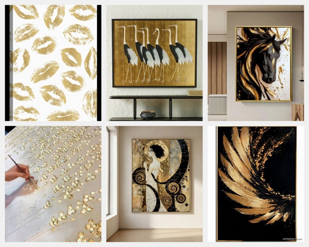
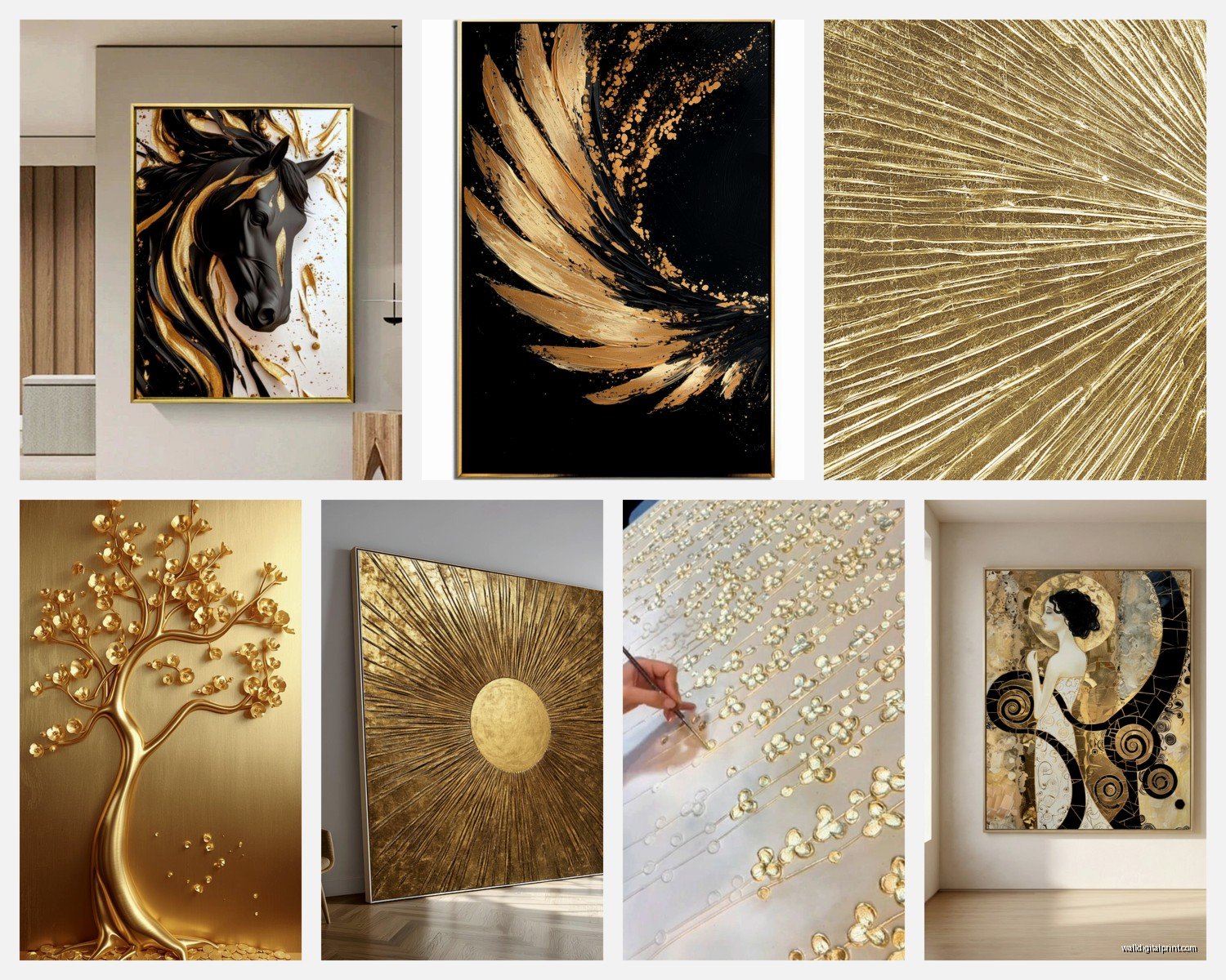
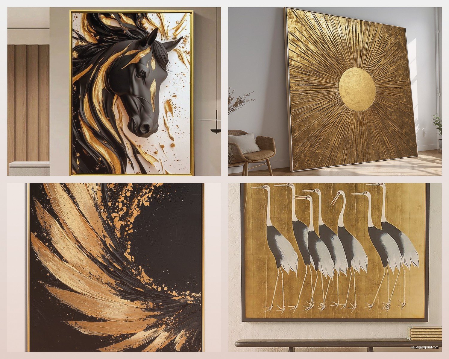
Abstract Gold (My Go-To)
Abstract pieces in gold are versatile because they don’t compete with other patterns in your room. Geometric abstracts work in modern spaces, fluid abstracts work in transitional spaces, and textured abstracts work in pretty much everything.
I keep coming back to pieces that mix gold with one or two other colors. All gold can be stunning but it’s also intense. Gold with navy, gold with blush, gold with black – these combo abstract pieces are easier to style around.
Wait so funny story, I bought this abstract gold piece that looked amazing on the website and when it arrived it was giving “corporate hotel conference room” in the worst way. Turns out it was a print not actual metallic paint, which the listing didn’t make clear. Make sure you’re getting actual metallic materials not just printed metallic colors because the light interaction is completely different.
Line Art in Gold
Super trendy right now and I actually think it’ll stick around because it’s so clean. Faces, bodies, botanical outlines, all in gold wire or gold foil. Works great in minimal spaces where you want just a touch of warmth.
These are usually smaller which makes them affordable but you gotta group them right. I do odd numbers – three or five pieces usually – in asymmetrical arrangements. The symmetrical thing can look too rigid with line art.
Textured Gold (For Maximum Luxe)
This is where you get dimensional pieces, not just flat. Could be actual sculpted metal, could be mixed media with gold elements that stick out from the canvas. These are statement pieces for sure.
I used a textured gold piece in an entryway where it’s the first thing you see when you walk in and multiple people have asked where it’s from which is always the sign of a good art choice. The texture makes it interesting from different angles as you walk past.
But real talk – textured pieces collect dust like crazy. You gotta dust them regularly or they start looking dingy.
Gold Frames (The Subtle Approach)
If full gold art feels like too much, gold frames are your friend. You can put literally anything in a gold frame and it elevates it. I’ve framed pressed flowers in gold frames, black and white photos, even fabric swatches for a textile-themed gallery wall.
Mixing different gold frame styles is actually easier than matching them perfectly. Like an ornate baroque frame next to a simple modern gold frame – the gold ties them together even though the styles are different.
What to Put Near Gold Art
So gold doesn’t exist in a vacuum, you’ve gotta think about what’s around it. I’m always considering the whole wall or whole room situation.
Wall Colors
Dark walls + gold = drama and sophistication. Navy, forest green, charcoal, even black. The contrast makes the gold pop without it feeling garish.
White walls + gold = classic and clean but can feel cold if you don’t bring in other warm elements. I always add warm wood tones or textiles to balance it out.
Gray walls + gold = this is where you need to be careful about your gold tone. Cool gray needs cooler gold or champagne. Warm gray (greige) can handle warmer gold tones.
Colored walls + gold = depends entirely on the color. Dusty pink and gold is gorgeous. Sage green and gold is having a moment. Terracotta and gold feels Southwestern in a good way.
I painted my powder room this deep teal color and added a small gold abstract piece and it’s legitimately my favorite room in my house now. Took me three tries to find the right gold piece though because the first was too orange-gold and the second was too pale.
Textiles and Textures
Gold art works really well with rich textures because they’re both about that sensory luxury thing. Velvet, linen, nubby wool, silk – all great near gold.
I’m personally obsessed with gold art above a velvet headboard or sofa. It’s almost too much luxury but not quite, it just rides that line perfectly.
Matte textures near shiny gold create good contrast. Like gold art on a limewashed wall or above a raw wood console. The gold feels more special when everything around it isn’t competing for shininess.
Other Art and Objects
You can absolutely put gold art in a gallery wall but I usually make it the anchor piece – the biggest or most central. Then surround it with non-metallic pieces so it stands out.
Plants near gold art = yes always. The organic shapes and green tones contrast beautifully with geometric gold or bring out warmth in abstract gold. I have a fiddle leaf fig next to my gold art in the living room and it’s the combo I get asked about most.
Books, ceramics, wood objects – all good near gold. Just think about balance. If everything on your shelf is visually heavy