Wall Art Guide, Wall Art Tutoriels
Green and Gold Wall Art: Nature Metallic Luxury Combo
Mar
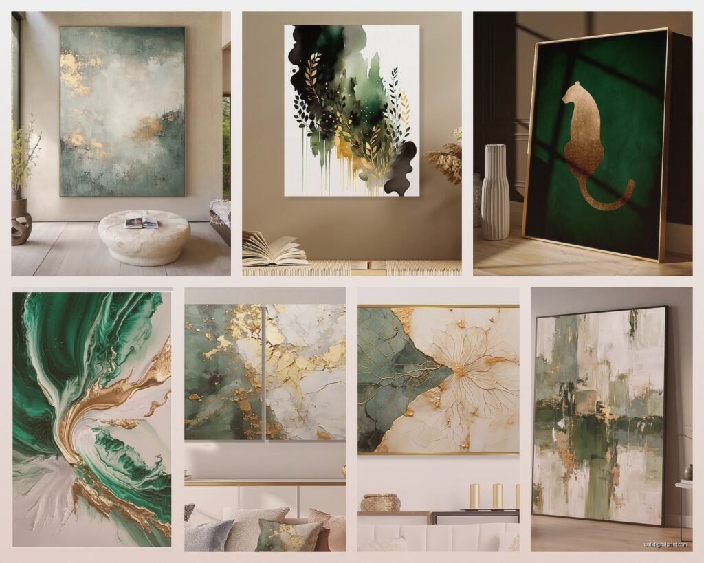
So I’ve been obsessing over green and gold wall art combinations for the past three months because a client wanted this whole “luxury nature” vibe in their downtown loft and honestly it sent me down such a rabbit hole. Like, I thought it would be straightforward but there are so many ways this can go wrong or look absolutely stunning.
The Shades That Actually Work Together
Okay so first thing – not all greens work with all golds and this is where people mess up constantly. I made a whole board of samples and my dog knocked half of them behind my desk and when I found them two weeks later I realized the ones that fell together actually looked better than my original pairings which was… annoying but helpful?
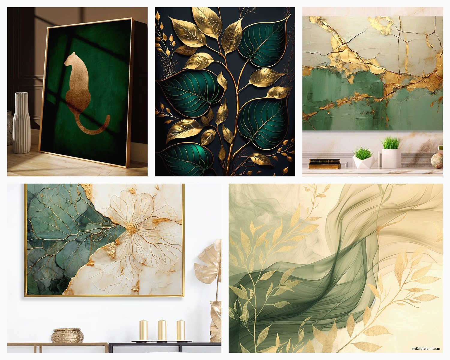
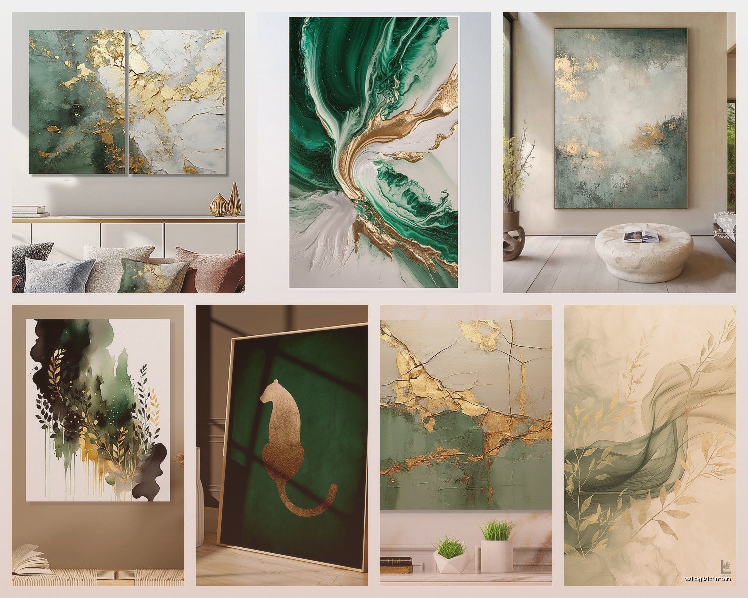
Sage green with brushed gold is probably the safest combo. It’s that soft muted green that doesn’t scream at you and when you pair it with a matte or brushed gold instead of shiny gold it reads as expensive without trying too hard. I used this in like four rooms last year and clients always ask where the art came from.
Emerald with bright polished gold is the dramatic option. This is for when you want people to notice the wall the second they walk in. But here’s the thing – you need good lighting or it just looks dark and muddy. I learned this the hard way in a north-facing room where the emerald pieces just disappeared until we added picture lights.
Forest green with rose gold is newer for me but it’s been working really well in spaces that lean more feminine or romantic. The warmth of the rose gold pulls out these undertones in forest green that you don’t normally notice. My friend Sarah did this in her bedroom and honestly I stole the idea for three client projects after.
Olive green with antique gold gives you that vintage collected-over-time feel. If you’re going for something that looks like you inherited it or found it at an estate sale this is your combination.
Shades to Avoid Unless You Really Know What You’re Doing
Lime green with any gold – just no. I mean unless you’re doing like a maximalist 70s throwback thing which could be cool but that’s so specific.
Neon or electric greens with shiny gold reads as costume jewelry. There’s a place for that in commercial spaces maybe but in homes it feels cheap even when the art itself is expensive.
Getting the Proportions Right
This is where I see the most mistakes honestly. The ratio of green to gold matters SO much and nobody talks about this enough.
If you’re doing abstract pieces my rule is roughly 60-70% green and 30-40% gold accents. When you flip that and have more gold than green it stops being a nature-inspired piece and starts being a gold piece with some green which hits different. Not necessarily bad but different intention.
For botanical or leaf prints I actually go more like 80% green 20% gold because you’re already getting the nature vibe from the literal plant imagery. The gold just needs to highlight and frame elements not compete with them.
Geometric designs can go either way depending on the mood. I did this whole gallery wall where we alternated – some pieces were mostly green with gold lines and others were mostly gold with green shapes. It created this rhythm that pulled your eye around the wall which is gonna sound weird but it made the small room feel bigger.
Scale Stuff That Took Me Forever to Figure Out
Large scale pieces (like 36×48 or bigger) should have bigger areas of solid color. If you get a huge canvas with tiny little gold details scattered on green they disappear from normal viewing distance. I ordered this massive piece for above a client’s sofa and when it arrived the gold leaf accents were so small you couldn’t see them unless you walked right up to it. We sent it back and got something with bolder gold sections.
Small pieces (8×10 to 16×20) can have more intricate detail because you’re usually viewing them closer anyway. These are good for shelves, small wall spaces, or gallery walls where you approach them.
Finishes and Textures That Change Everything
Oh and another thing – the finish on both the green and gold elements completely changes how the piece feels in person vs online. I’ve returned so many pieces that looked perfect on my screen.
Matte green with metallic gold leaf gives you the most contrast and depth. The flat green makes the reflective gold really pop. This works in almost any lighting situation which makes it reliable for rooms where you can’t control the light perfectly.
Glossy green with glossy gold is very high glamour but it’s also very dependent on lighting. In the right light it’s stunning, in wrong light it’s reflective and distracting. I only use this finish in rooms with consistent controlled lighting – never near windows with direct sun.
Textured green (like impasto or with visible brushstrokes) with smooth gold creates this interesting touchable quality. Even though you’re not supposed to touch art obviously but it gives that impression. This adds perceived value – people think it’s more expensive than flat printed pieces.
Watercolor greens with gold foil is having a moment right now. The soft blended quality of watercolor with the crisp metallic foil creates tension in a good way. I just got three pieces like this for my own place actually because I couldn’t stop thinking about them after using them in a client’s dining room.
What Actually Holds Up Over Time
Okay so funny story – I kept some samples in my south-facing office for like eight months just to see what would happen. The pieces with real gold leaf or actual metallic materials stayed vibrant. The ones with printed “gold” that was really just yellow ink faded and looked dingy after a few months. If you’re putting these anywhere with natural light spring for real metallic elements not printed.
Green pigments vary wildly in lightfastness. The pieces using quality pigments still looked the same. Cheaper prints faded to this sad yellowish color. You can usually tell by price point honestly – if it’s suspiciously cheap there’s a reason.
Different Art Types in This Color Combo
I’ve worked with pretty much every type of wall art in green and gold at this point so here’s what works best for each.
Abstract Art
This is probably the easiest category to work with because abstract gives you the most flexibility in placement and style mixing. You don’t have to worry about it being upside down or clashing with other imagery.
Look for pieces with movement – swirls, flows, gestural marks. Static geometric abstracts in green and gold can feel stiff unless that’s specifically the vibe you want. I have this one abstract piece that’s mostly sage green with these wild gold swooshes and it makes the whole room feel more energetic.
Layering and depth matters in abstracts. Multiple layers of paint or mixed media creates shadows and highlights that change as you move around the room. Flat single-layer abstracts don’t have that same life to them.
Botanical and Nature Prints
These are having such a moment but they can also look really dated really fast if you’re not careful. The vintage botanical illustration style with gold accents or frames feels more timeless than the trendy monstera leaf prints that are literally everywhere right now.
I did a whole wall of vintage-style fern prints with thin gold frames and gold Latin labels and it still looks current three years later. Meanwhile the tropical leaf prints I did in 2019 already feel kinda tired.
Pressed botanicals with gold leaf accents are beautiful but make sure they’re properly sealed. I had one that wasn’t sealed well and the botanical material started deteriorating and you could see it through the glass which was not cute.
Landscape and Nature Photography
Green landscape photography with gold frames or gold mat boards is an underrated combo. Everyone does black or white frames but a thin gold frame on a forest scene or garden photograph elevates it immediately.
Look for photos with natural gold tones already in them – autumn light, sunset filtering through leaves, golden hour shots. The gold frame then echoes what’s already happening in the image instead of feeling added on.
I’m gonna say something controversial maybe but… those forest photos with fake gold geometric lines photoshopped over them? They usually look tacky. Unless it’s done by an actual artist who understands composition it just looks like someone went crazy with the shape tool in editing software.
Line Art and Minimalist Pieces
Simple line drawings in gold on green backgrounds or green lines on gold backgrounds are very chic right now. These work great in modern or Scandinavian-influenced spaces where you want the nature reference without literal botanical imagery.
The key is line quality – the lines need to be confidently drawn not shaky or uncertain. Bad line art looks worse than bad abstract art in my opinion because there’s nowhere to hide mistakes.
Resin and Mixed Media
Resin pieces with green pigments and gold leaf or gold flakes are stunning but also expensive. The depth you get with resin is hard to replicate with other mediums. Light goes into the surface and bounces around and it’s just… chef’s kiss.
Make sure resin pieces are fully cured before hanging. I got one once that wasn’t totally cured and it was slightly tacky and attracted dust and was a whole thing. Reputable artists won’t ship until it’s fully cured but if you’re buying from random Etsy shops ask about cure time.
Styling and Placement Strategy
Okay so you’ve got your green and gold art now where does it actually go and what goes with it.
Gallery Walls
Green and gold pieces can anchor a gallery wall with other colors or you can go all green and gold which is bold but works. I did an all green and gold gallery wall in my hallway last year and people always comment on it.
Mix sizes and frame styles but keep the color story consistent. So varying shades of green and different gold tones but don’t suddenly throw in a red piece unless you’re intentionally doing a Christmas thing or whatever.
Odd numbers work better than even. Five or seven pieces looks more natural than four or six. I don’t know why this is a thing but it is.
Start with your largest piece slightly off-center and build around it. The temptation is to center everything but that can look too formal for green and gold which reads as organic.
Single Statement Pieces
If you’re doing one large piece over a sofa or bed or console the rule of thirds applies. The art should be roughly two-thirds to three-quarters the width of the furniture below it. Smaller looks floaty, bigger overwhelms.
Height matters more than people think. The center of the art should be at eye level which is usually around 57-60 inches from the floor. When it’s above furniture you adjust slightly higher but not way higher. I see art hung practically at ceiling level all the time and it’s just… no.
Give it breathing room. A big beautiful green and gold piece crammed between two windows or with furniture pushed right up under it can’t do its thing. Leave some blank wall space around it.
Room by Room Considerations
Living rooms can handle the most drama so this is where you can go bold with emerald and bright gold or large scale pieces. You have the wall space and people are spending enough time there to appreciate details.
Bedrooms should lean toward the calmer end of the spectrum – sage and brushed gold, forest green and rose gold. You want it to feel restful not energizing. I did emerald and shiny gold in a bedroom once and the client said it was too stimulating which… fair.
Bathrooms are tricky because of humidity. Make sure pieces are properly sealed or framed under glass. I love green and gold in bathrooms because it plays off marble or tile really well but I’ve seen pieces warp from moisture so protection is key.
Kitchens and dining rooms are great for botanical prints in green and gold specifically herb prints or vegetable illustrations. It ties into the function of the space without being too literal.
Home offices benefit from the balance of calming green and energizing gold. It’s supposed to help with focus and creativity which sounds like made up color psychology but genuinely multiple clients have said they feel more productive after we added green and gold art to their office so who knows.
What to Pair With Green and Gold Art
The art doesn’t exist in a vacuum obviously so here’s what I’ve learned about pairing it with other elements in the room.
Wall Colors
White or cream walls are the safe choice and they let the green and gold be the star. You can’t really go wrong here. I probably use white walls with green and gold art in 60% of projects.
Light gray walls add sophistication. The cool tone of gray makes the warm gold pop and creates more contrast with the green. This is my go-to for modern spaces.
Blush or dusty pink walls with green and gold art is chef’s kiss. The pink plays off the green in this complementary way while the gold ties them together. Very romantic and layered looking.
Navy walls with green and gold art is dramatic and jewel-toned. The dark background makes the gold really glow especially in evening lighting. Not for everyone but when it works it WORKS.
Green walls with green and gold art is possible but you need different values – so like a light sage wall with dark emerald art or vice versa. And you need enough gold in the art to break it up. This can look really sophisticated or really muddy depending on execution.
Furniture and Textiles
Wood tones – walnut and other dark woods are beautiful with green and gold. Light woods like oak or maple work too but create a different more casual Scandi vibe. I’m personally obsessed with walnut furniture and green and gold art together.
Metallics in the room should match your gold tone. If you have warm brass hardware don’t get art with cool champagne gold. Or I mean you can but it’ll look disjointed. I’ve mixed metals successfully by making sure there’s enough of both that it looks intentional but it’s harder to pull off.