Wall Art Guide, Wall Art Tutoriels
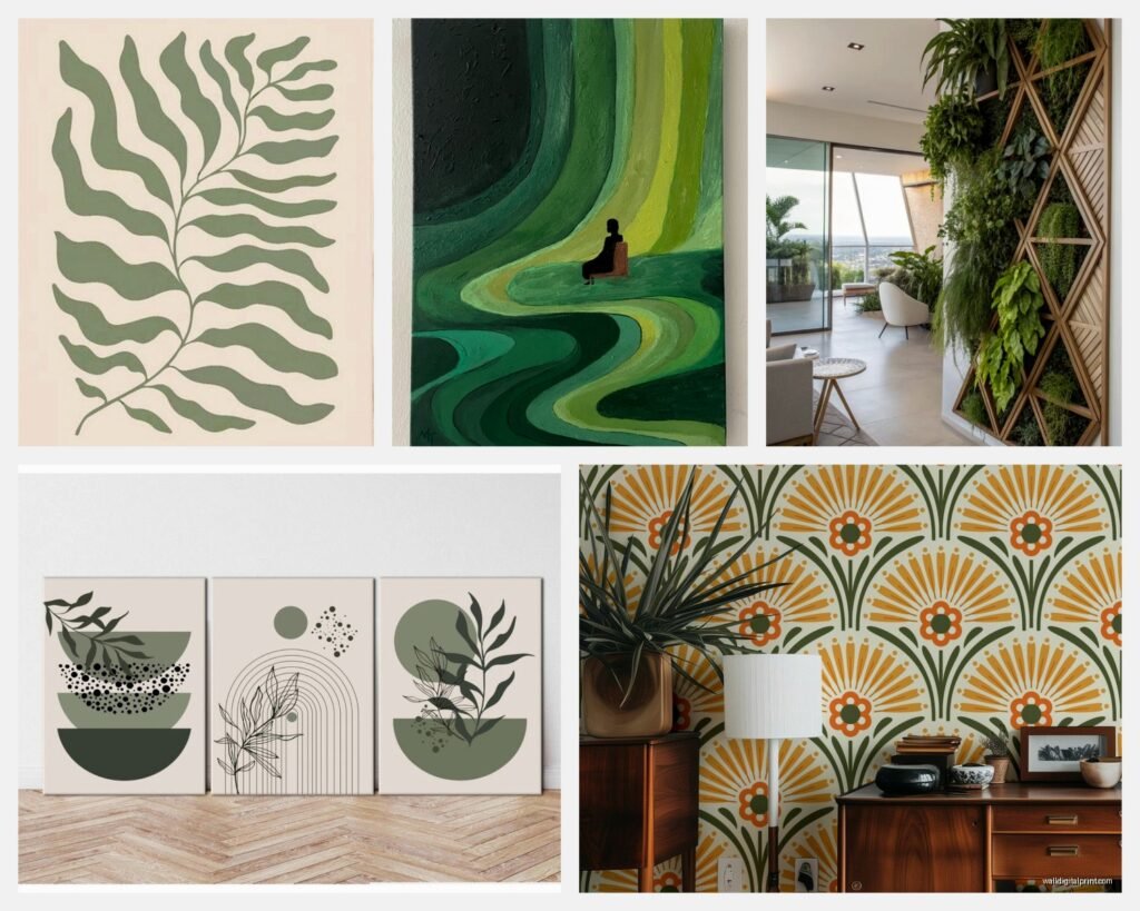
Green Wall Art: Emerald to Sage Nature Color Spectrum
Mar
So I’ve been basically living and breathing green wall art for the past like three months because this trend just won’t quit and honestly? I’m not mad about it. Started when a client asked me to redesign her living room and she wanted “nature vibes but make it sophisticated” and I went down this whole rabbit hole of green tones.
The Thing About Green Nobody Tells You
Okay so first thing – green is SO finicky with lighting and I cannot stress this enough. That emerald print that looks stunning in the store? Might look like straight up black in your north-facing room. I learned this the hard way when I ordered this gorgeous emerald botanical print from this Etsy shop (can’t remember the name, my cat was walking on my keyboard when I ordered it) and it arrived and looked completely different than the photo.
Here’s what actually matters with green wall art:
- Your room’s natural light direction changes everything
- The undertones in your green – is it blue-green, yellow-green, gray-green
- What’s already on your walls color-wise
- The finish of the print – matte versus glossy makes a huge difference
Breaking Down the Green Spectrum Actually Useful
So emerald to sage is like… a whole journey. I’ve been organizing it in my head as five main categories and this is gonna sound weird but I literally made a spreadsheet at 2am one night when I couldn’t sleep.
Deep Emerald and Forest Greens
These are your dramatic moody greens. Think really saturated, jewel-toned, the kind of green that makes a statement. I used a set of three emerald abstract pieces in a client’s dining room last month and the whole vibe just shifted.
What works with deep emeralds:
- Gold frames – sounds bougie but even cheap gold spray-painted frames from Target look expensive with emerald art
- Rooms with white or cream walls, the contrast is chef’s kiss
- Actually really good in rooms with minimal natural light because they create their own richness
- Pair them with brass fixtures or warm wood tones
What doesn’t work and I learned this by messing up – emerald green with cool gray walls. It just looks off. The undertones fight each other and not in a good way. Also emerald with a lot of other competing colors makes everything look muddy.
Oh and another thing about deep greens – size matters more than with lighter greens. A tiny 8×10 emerald print just looks like a dark rectangle from across the room. You want bigger pieces, like 16×20 minimum or do a gallery wall of smaller pieces clustered together.
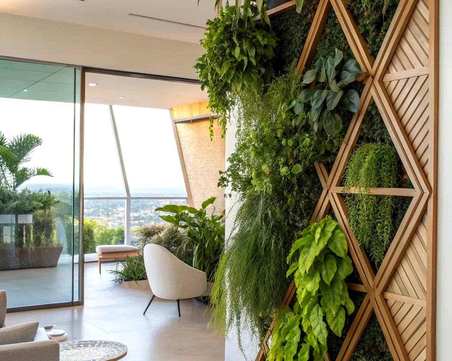
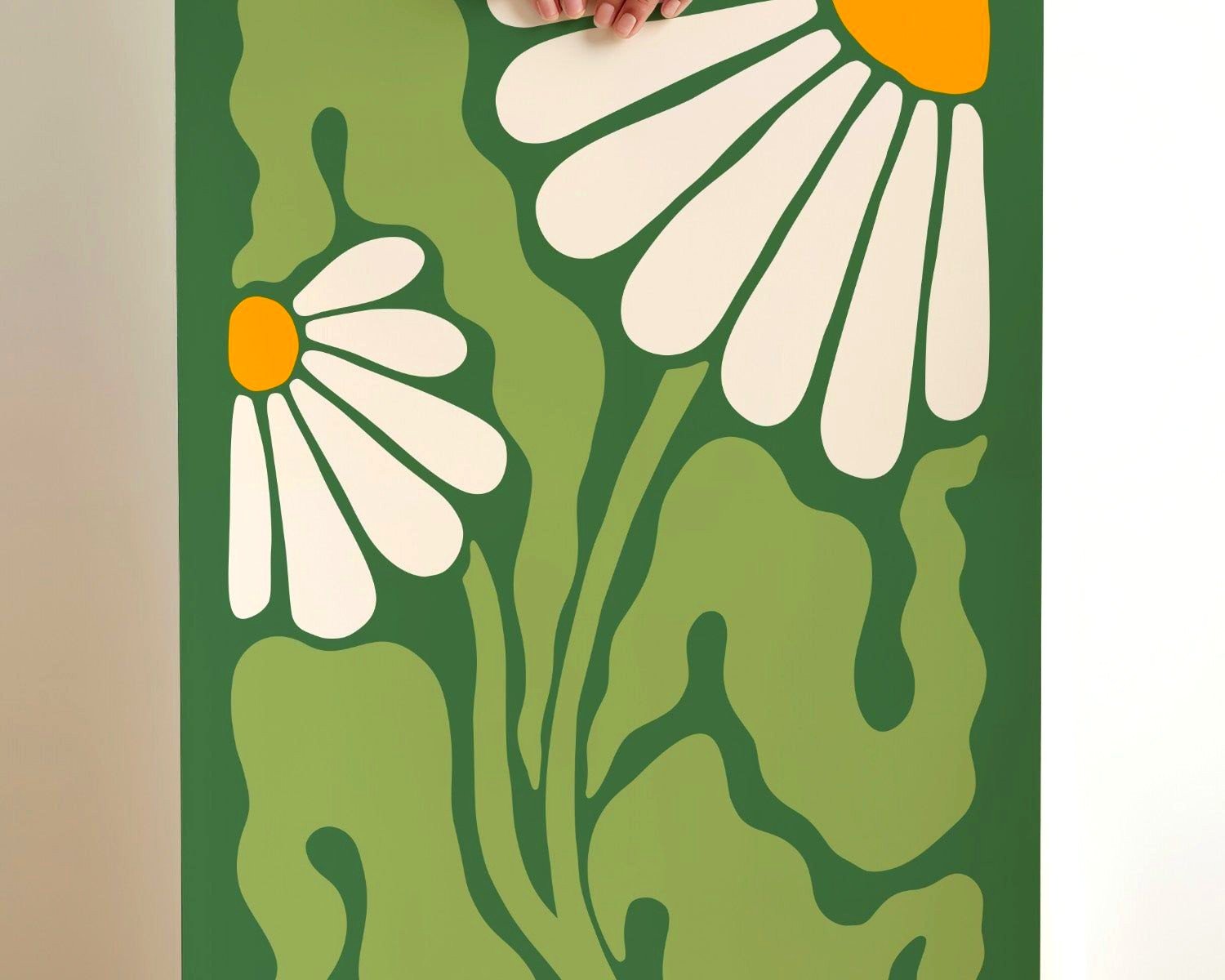
Tropical and Palm Greens
Okay so these are brighter, more yellow-undertoned greens. Monstera prints, palm fronds, that whole aesthetic. I was so over this look in like 2019 but it’s actually evolved and gotten way more sophisticated.
The key with tropical greens is not going full tiki bar unless that’s your vibe, no judgment. I’ve found the best tropical green art has:
- Clean white backgrounds or matting
- Simple frames – black or natural wood
- Mixed with other neutrals, not a million other colors
Wait I forgot to mention – I tested a bunch of printable palm art from different shops because a client had a tiny budget, and the paper quality is SO variable. There’s this one shop, oh god what was it called… they use this thick matte cardstock and it actually looks like real art. Versus the ones that are clearly just printer paper, those look cheap no matter how you frame them.
I spilled coffee on one of the cheaper prints which actually tested the paper quality accidentally and it basically disintegrated, so there’s your quality test I guess?
True Mid-Tone Greens
This is like your classic leaf green, grass green, that middle zone that’s not too dark or too light. Honestly the most versatile but also somehow the hardest to get right because it can go really boring really fast.
What I’ve figured out with mid-tone greens:
They need texture or interesting composition. A flat mid-tone green square is just… it’s nothing. But a mid-tone green with:
- Visible brushstrokes if it’s abstract
- Interesting botanical details if it’s nature-based
- Mixed with other shades of green
- Some kind of movement or flow in the composition
Then it actually works. I have this one piece in my own bedroom that’s this mid-tone green abstract with like cream and darker green mixed in, and people always ask about it because it’s interesting enough to look at but calm enough for a bedroom.
My client canceled last Tuesday so I spent an hour comparing different mid-tone green prints at this local art fair and the difference between amateur and professional work is so obvious in this tone range. The amateur stuff looks flat, the professional work has depth and layers.
Sage and Eucalyptus Tones
Okay THIS is where it’s at right now. Everyone wants sage green everything. Sage walls, sage art, sage throw pillows. I’m literally swimming in sage green projects.
The thing about sage that makes it tricky – it’s a chameleon color. Depending on your lighting it can look gray, green, blue, or even kind of beige. I’ve had sage prints that look completely different in the morning versus evening.
Best practices I’ve learned with sage art:
- Test it in your actual space before committing, like seriously take photos at different times of day
- Sage works beautifully with warm whites and creams
- Can handle both gold and silver frames depending on the undertone
- Layering different shades of sage creates really sophisticated depth
Oh and eucalyptus prints specifically – they’re having such a moment. The silvery-green leaves photograph so well and they work in literally any style from farmhouse to modern. I probably specify eucalyptus art in like 60% of my projects now. My partner is so sick of hearing about eucalyptus, he’s like “it’s a PLANT Sophia” but he doesn’t get it.
This is gonna sound weird but the best sage green art I’ve found has been from artists who actually work with botanicals, not graphic designers. There’s this subtle realism that makes it feel more authentic.
Mint and Pale Celadon
The lightest end of the spectrum. These are your whisper greens, barely-there greens. Really pretty but also really easy to mess up.
Pale greens need:
- Either a colored mat or frame to give them definition, otherwise they disappear into light walls
- Good natural light to bring out the color
- Larger scale usually works better – small pale prints just look washed out from a distance
I did a whole bedroom in pale celadon and white art last year and it was so serene, but we had to add darker green accent pieces because it was reading too bland. Sometimes you gotta layer your greens.
Mixing Greens and Not Looking Like A Paint Store Exploded
So here’s where people usually mess up – they pick greens from all over the spectrum and wonder why it looks chaotic. I’ve developed this system that actually works…
Pick a dominant green tone – let’s say sage. That’s your main character. Then you can add:
- One darker green (maybe forest or deep emerald) for depth
- One lighter green (pale celadon or mint) for brightness
- Keep them all in the same undertone family – either all warm-leaning or all cool-leaning
I tested this in my office with a gallery wall and it actually works. Three sage botanical prints as the foundation, one large emerald abstract piece, and two small pale green watercolor pieces. They all have blue undertones so they harmonize instead of fighting.
Wait okay another thing – white space matters SO MUCH when mixing greens. If you cluster a bunch of different green pieces right next to each other with no breathing room, it’s overwhelming. Space them out, add some white mats, let each piece have its moment.
Frame Colors That Actually Work With Green Art
Cannot tell you how many times I’ve seen perfect green art in the wrong frame just dying. Frames matter maybe more than the art itself sometimes?
Here’s what I’ve tested extensively:
Natural Wood Frames
Work with: literally all greens but especially tropical and mid-tones. The warm undertones in wood complement the yellow undertones in most greens.
My go-to is light oak or maple for sage and eucalyptus tones, darker walnut for emerald and forest greens.
Black Frames
Work with: everything except maybe the palest mint greens which can look too stark. Black frames make green art look more modern and graphic. I use black frames when I want the art to feel contemporary and bold.
Pro tip I figured out – matte black frames look more expensive than glossy black with green art. Something about the finish plays better with the organic nature of green tones.
Gold Frames
Work with: emerald, sage, forest greens. Gold frames instantly elevate green art and make it feel more luxe. But like… not shiny bright gold, that’s too much. Brushed gold or antique gold finishes work way better.
I found these affordable gold frames at HomeGoods last month and I literally went back and bought twelve of them because they were the perfect tone for green art. My storage closet is full of them now.
White Frames
Work with: tropical greens, sage, pale greens. White frames keep things light and fresh, very coastal or Scandinavian vibes. But they need to be the right white – cream or warm white works better than stark white which can look too clinical.
What Doesn’t Work
Okay so I’ve tried silver/chrome frames with green art multiple times thinking it would look modern and sleek and it just… doesn’t. The cool metal tone makes the green look sickly or off somehow. Also avoid colored frames unless you really know what you’re doing – a blue frame with green art rarely works, same with red or pink frames.
Where To Actually Buy Green Art That Doesn’t Suck
So you’re probably wondering where to find all this green art and I’ve got opinions because I’ve spent way too much money testing sources.
Original Art and Prints From Artists
Etsy obviously but you gotta know how to search. Don’t just type “green art” because you’ll get a million results and most are crap. Search specific terms like “eucalyptus watercolor” or “abstract emerald painting” and filter by shops that have good reviews and clear photos.
I’ve found my best pieces from artists who show the art in actual room settings, not just flat lays. That tells me they understand how it’s gonna be used.
Instagram is honestly really good for finding artists now. I follow the hashtag #greenart and #botanicalart and save pieces I like. Then I DM artists directly for commissions or prints. Got this amazing sage abstract piece that way last fall.
Print-on-Demand Sites
Minted, Juniper Print Shop, Desenio – these are solid for affordable art that still looks good. The quality is consistent which matters when you’re ordering online. I’ve probably ordered 50+ prints from these sites for various projects.
The trick is reading the paper descriptions. You want at least 200gsm paper, matte finish usually looks more expensive than glossy for green nature art.
Vintage and Thrifted
Okay so funny story – I found the most perfect vintage botanical prints at an estate sale and paid like $3 each and they’re worth probably $50-75 framed. Old botanical illustrations in green tones are having such a moment and you can find them at thrift stores, estate sales, antique shops.
The key is looking past the ugly frames. Most people see a dated frame and pass, but I just see cheap art. I literally travel with a tiny screwdriver in my purse to check if prints are attached to frames or if they’re separate.
Printable Downloads
Mixed feelings on these because quality varies SO MUCH. I’ve bought printable green art that looked amazing and stuff that pixelated when printed.
If you go this route:
- Make sure it’s at least 300 DPI
- Check the file dimensions match your frame size
- Print at a professional print shop, not your home printer unless you have a really good one
- Ask the seller for a sample crop if they don’t show print quality examples
I use printables for budget projects and honestly some turn out great. Just did a rental apartment with all printable green art and it looks really good for like $100 total including frames.
Styling Green Art In Different Rooms
Each room needs a different approach with green art and I’ve tested this extensively across probably 30+ client projects.
Living Rooms
This is where you can go bigger and bolder with your greens. I usually do either one large statement piece (like 30×40 or bigger) or a curated gallery wall.