Wall Art Guide, Wall Art Tutoriels
Half Bath Wall Art: Small Powder Room Design Ideas
Apr
So I’ve been obsessing over powder room art lately because honestly, these tiny spaces are like the perfect little gallery walls waiting to happen, and you can actually go kinda wild since people are only in there for what, two minutes max?
The thing about half bath art is you gotta think completely different than any other room. Like, I had this client who wanted to hang a massive abstract piece in her powder room and I was like… okay but you’re gonna be staring at it from literally 18 inches away while washing your hands. That changes everything.
Size Actually Matters Here (Unlike What They Tell You)
Okay so here’s what I’ve learned after way too many powder room projects. Your wall art should be between 16-24 inches wide for most half baths. I know everyone says go big or go home, but in a 5×3 foot space, a huge piece just feels aggressive? I tested this in my own powder room with like five different sizes and anything over 24 inches made me feel claustrophobic.
The sweet spot I keep coming back to is 20×24 inch prints or a gallery wall that spans about 30 inches total. My dog was literally judging me while I held up different frames against the wall for an hour last Tuesday but whatever, now I know what works.
The Three-Piece Rule
If you’re doing a gallery wall situation, stick to three pieces max. I tried seven once and it looked like a doctor’s waiting room from 1987. Three pieces in a vertical line or a tight cluster reads as intentional. Seven pieces reads as “I panic-bought at HomeGoods.”
What Actually Works Style-Wise
Botanical prints are like the safe choice everyone gravitates toward and yeah, they work. But I’m gonna be honest, I’m so tired of seeing the same Etsy fern prints in every powder room. If you want botanicals, go for vintage scientific illustrations instead. There’s this seller on Etsy (wait lemme find the name… okay I can’t remember but search “vintage botanical illustrations” and look for the ones that aren’t already in every Target catalog).
Stuff that actually looks good in powder rooms:
- Black and white photography – architectural shots work better than portraits because you don’t want someone’s face staring at you while you pee
- Abstract line drawings – the simple one-line kind, not the chaotic splatter paint situation
- Vintage maps or celestial charts
- Framed fabric or wallpaper samples (this is gonna sound weird but I framed a piece of this incredible William Morris wallpaper I couldn’t afford and it looks SO expensive)
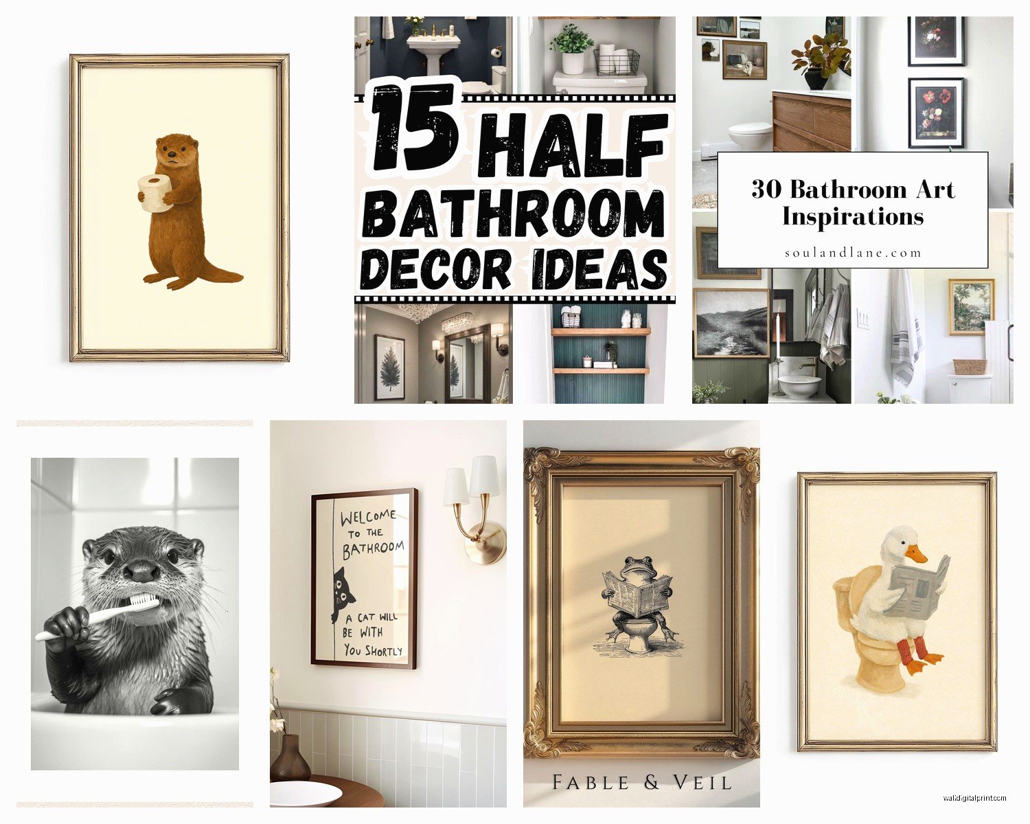
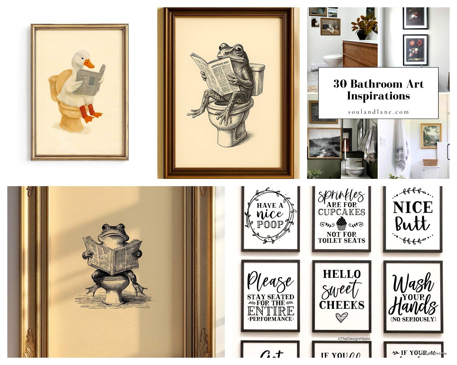
- Typography prints if they’re actually funny or meaningful, not the “wash your hands” stuff that’s trying too hard
What doesn’t work: anything too personal like family photos (weird), anything with too much red (makes people look flushed in the mirror reflection), or those “rules of the bathroom” signs. Just no.
The Humidity Problem Nobody Talks About
Oh and another thing – half baths get humid even without a shower. I learned this the hard way when a print I loved got all warped and gross after like six months. You need to either:
Use frames with actual glass (not acrylic which can fog up weird), or go with canvas prints that are sealed properly, or just accept you might need to replace stuff every few years.
I’ve had really good luck with prints from Printique and Artifact Uprising because their coating seems to hold up better. The cheap prints from Amazon warped within three months in my client’s powder room and we had to redo everything.
Frame Game
Metal frames hold up better than wood in humid spaces. I used to be all about the warm wood frames but they can warp or the finish gets funky. Now I pretty much always recommend simple black metal frames or even brass if the space leans traditional.
IKEA’s RIBBA frames are actually solid for powder rooms – they’re cheap enough that if humidity ruins them you’re not devastated, but they look way more expensive than they are. I buy them in bulk basically.
Placement Is Where Everyone Messes Up
Standard rule is 57 inches to center of artwork, blah blah, but in a powder room you gotta adjust. Here’s what actually works:
If you’re hanging art above the toilet, go 6-8 inches above the tank. Not higher. I see people hang art like a foot above the toilet and there’s this weird dead space that makes the whole room feel off.
Above a pedestal sink or vanity, same thing – 6 inches above whatever’s below it. The thing is, powder rooms are small enough that you don’t need that much breathing room between elements.
For a side wall (like if you have a weird narrow wall next to the sink), hang art at eye level for someone sitting down. I know that sounds specific but think about it… that’s the view people have in there.
My Current Favorite Sources
Okay so I spent my client’s canceled appointment last week comparing print sources because I have no life apparently, and here’s what I’m actually ordering from these days:
Minted – their artist collection is really unique, not the same stuff everywhere else, and the framing options are legit. Pricier but worth it for a statement piece.
Juniper Print Shop – if you want that minimalist line art vibe without it looking like every other minimalist line art. I’ve ordered probably 15 prints from them.
Society6 – hit or miss but when you find a good artist there, the quality is decent and prices are reasonable. Just read reviews on specific prints.
Vintage stores and estate sales – honestly this is where I find the most unique stuff. Old maps, weird scientific diagrams, vintage ads. You can get stuff framed for way less than buying new art, and it actually has character.
Your own photos – if you’ve traveled anywhere interesting, print your own shots. I printed a photo I took in Portugal and had it blown up to 20×24 and it’s genuinely my favorite piece in my powder room. Cost like $40 total.
Color Strategy That Won’t Drive You Crazy
I used to think powder rooms needed colorful art to liven them up but actually? The opposite is true most of the time. If your powder room is small and the walls are painted (not wallpapered), go for art that’s mostly neutral with maybe one accent color that pulls from your hand towels or something.
If you have bold wallpaper (which I love in powder rooms btw), your art needs to calm down. Simple black frames with black and white prints or very minimal color. Let the wallpaper be the star.
The only time I go full color with art is when the walls are plain white or a pale neutral and the room needs a punch of personality.
The Unexpected Color Trick
This is gonna sound weird but dark moody colors work amazing in powder rooms. Like deep navy or charcoal backgrounds in your art. It makes the space feel more intimate instead of trying to brighten it up, which… you’re not gonna succeed at anyway in a windowless 5×5 room, so lean into the cozy vibe.
Gallery Wall Layouts for Tiny Spaces
If you’re doing multiple pieces, these are the only layouts that don’t look chaotic:
Vertical stack: Three frames same size, stacked vertically with 2-3 inches between. This elongates the wall and doesn’t eat up width.
Symmetrical grid: Four small frames (like 8×10) in a perfect grid. Very clean, very “I have my life together” energy.
Duo horizontal: Two frames side by side, same size, 3-4 inches apart. Simple but finished.
I tried that asymmetrical organic gallery wall thing in a powder room once and it was a disaster. Too much visual chaos in too small a space. Save that for your living room.
Lighting Considerations You’re Probably Ignoring
The lighting in your powder room completely changes how art looks. I installed these tiny picture lights above two prints in a client’s bathroom and it elevated the whole space like crazy. You can get battery-operated LED picture lights on Amazon for like $25.
Or if your powder room has those standard builder-grade ceiling lights that make everyone look dead, consider swapping for a fixture that directs some light at the walls. It doesn’t have to be expensive – even a different bulb temperature (go for 2700K warm white) makes art look better.
The Matting Debate
White mats make everything look more finished and gallery-like, but they also take up space. In a small powder room, I actually skip mats most of the time and go edge-to-edge in the frame. It feels more modern and you get more artwork visible.
Exception: if your art is super busy or colorful, a mat gives it breathing room and keeps it from overwhelming the space.
Budget Breakdown Reality Check
You can do a really nice powder room art situation for $100-200 total if you’re smart about it:
- Three IKEA RIBBA frames: $30
- Prints from Juniper Print Shop or similar: $60-90
- Command strips for hanging: $10
- Maybe a picture light if you’re feeling fancy: $25
Or you can spend $500+ on one large custom framed piece from Minted and honestly, both approaches work. It’s about what fits your overall design budget.
Themes That Aren’t Cheesy
Okay so themes can go wrong fast in powder rooms. “Beach bathroom” with shells and anchors = no. But subtle themes work:
Monochromatic color story – all your art in shades of blue, or all black and white with brass frames
Subject matter – all botanical but different styles (vintage scientific, modern minimalist, watercolor), or all architectural photography from different cities
Era – all vintage finds from the same time period, or all contemporary abstract
The key is it should feel cohesive but not costume-y.
What I’m Doing Right Now
In my current powder room I have two 16×20 vintage botanical prints in simple black frames hung vertically, and honestly it’s perfect. Not trying too hard, looks expensive (wasn’t), and doesn’t make the space feel cluttered. I’m probably gonna add a small brass picture light above the top one because I’ve been watching too much interior design stuff on YouTube and now I think every piece of art needs dedicated lighting.
The prints are from an estate sale, cost me $8 total, and I had them custom framed which was the splurge at $120 for both, but they’ll last forever and I can move them to another house someday.
wait I forgot to mention – removable wallpaper as art is actually genius for renters or commitment-phobes. Frame a section of really beautiful wallpaper (like 20×24) and it’s basically art. I did this with a Rifle Paper Co. sample and everyone asks where I got the print.
Just make sure whatever you choose doesn’t stress you out every time you walk in there. Powder rooms should feel like a little moment of nice, not a space you’re constantly wanting to redo.