Wall Art Guide, Wall Art Tutoriels
High Resolution Modern Free Printable Wall Art: 4K Downloads
Apr
So I’ve been downloading and printing high-res wall art for like three years now and honestly it’s gotten to the point where my printer basically pays for itself compared to buying framed stuff from West Elm or whatever.
The whole 4K thing is kinda marketing speak btw – what you actually need is 300 DPI at your print size. That’s the magic number. I learned this the hard way when I printed this gorgeous abstract piece at 72 DPI and it looked like someone smeared pixels across my dining room wall.
Where to Actually Find Good Free Printables
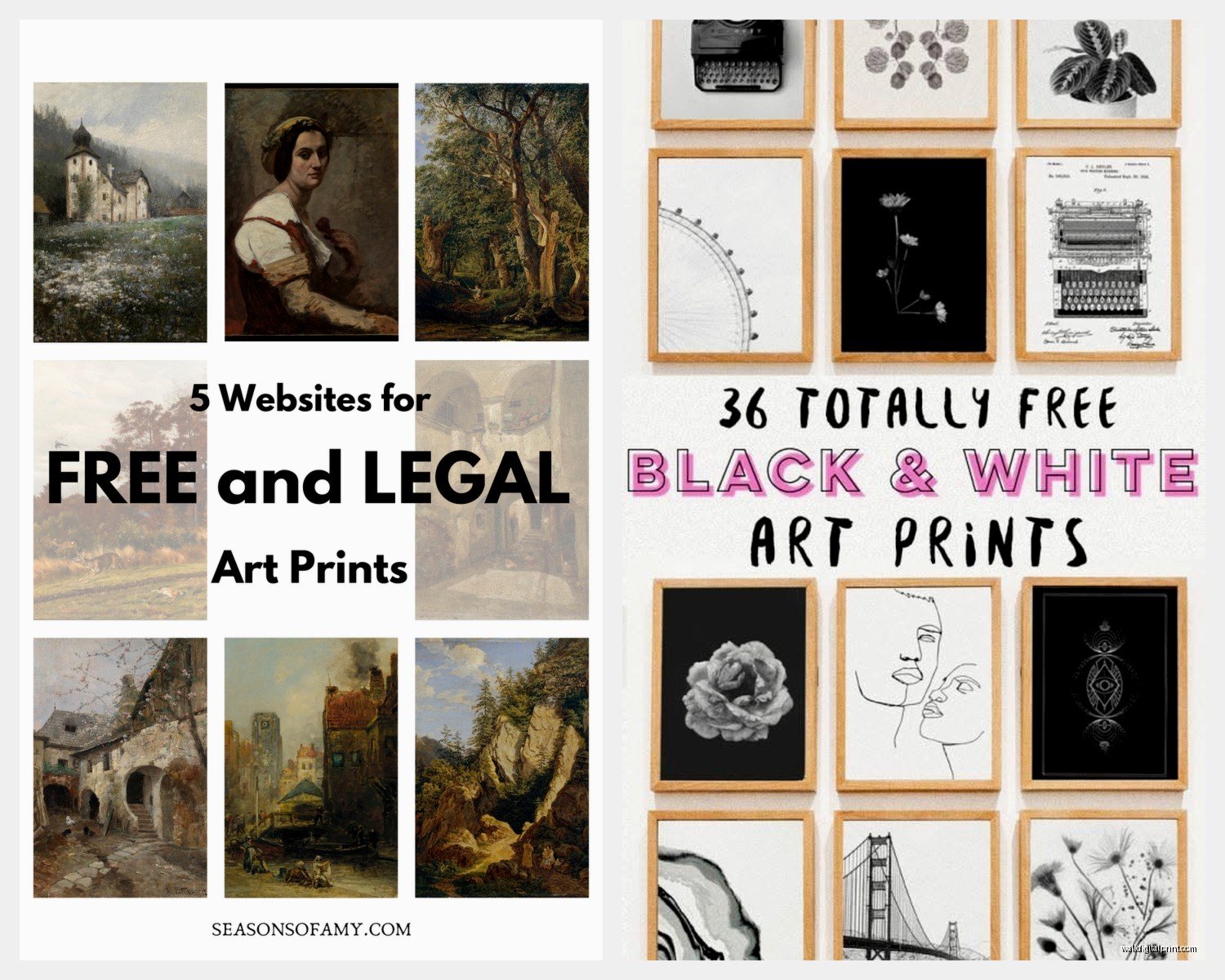
Okay so Unsplash is obvious but here’s what nobody tells you – their files are huge which is GOOD but you gotta check the actual pixel dimensions. I look for anything above 4000×6000 pixels minimum. The Met Museum’s collection is insane, they have like 400,000 images in public domain and I’ve pulled some incredible botanical prints from there. My living room has this 1880s magnolia print that people always think I paid hundreds for.
The Rijksmuseum in Amsterdam has their entire collection online too and the download quality is ridiculous. I printed a Vermeer detail at 24×36 and you can see the actual brush strokes texture when the light hits it right.
Oh and Rawpixel – they have a free section that’s actually curated unlike some sites where you’re scrolling through garbage for hours. I found this mid-century geometric series there that I printed for a client’s nursery and she literally cried when she saw them installed.
The Sites I Actually Use Weekly
- Unsplash – consistent quality, search actually works
- The Met Museum – public domain heaven, older art mostly
- Rijksmuseum – Dutch masters if that’s your vibe
- Rawpixel free section – modern stuff, good filters
- Library of Congress – vintage photography and maps
- Smithsonian Open Access – weird science illustrations I’m obsessed with
Print Quality Math That Actually Matters
This is gonna sound complicated but I promise it’s not. You need 300 DPI (dots per inch) for anything you’re viewing up close. Wall art you can sometimes get away with 150-200 DPI because you’re standing back from it.
Here’s how I calculate before downloading anything: If I want to print 16×20 inches, I need AT LEAST 4800×6000 pixels (16×300 and 20×300). I usually aim higher though because I like having flexibility to crop or zoom in on details.
My cat just knocked over my coffee while I’m writing this which is perfect timing because now I’m reminded – always save your original files before editing. I learned this when I color-corrected a print, didn’t save the original, and then realized I’d made the blues way too saturated. Had to re-download everything.
File Formats That Won’t Screw You Over
PNG and TIFF are your friends. JPG is fine but it’s compressed so you lose some quality. I always grab PNG when it’s available. TIFF files are massive – like we’re talking 200MB sometimes – but they’re uncompressed and give you the absolute best print quality.
Most museum sites let you download TIFF if you dig around in the download options. Don’t just click the first download button you see.
Editing Before You Print
Even “print-ready” files usually need tweaking. I use Photoshop but honestly Canva’s free version works fine for basic adjustments. Here’s what I always check:
- Brightness – monitors display brighter than prints come out, so I usually boost brightness by 10-15%
- Contrast – prints can look flat, I add a tiny bit of contrast
- Color mode – CMYK for printing not RGB (this is huge and most people miss it)
- Sharpness – I add a subtle sharpen filter because printing softens images slightly
Wait I forgot to mention – if you’re printing at home on a regular inkjet, do a test print at like 4×6 first. I wasted so much expensive photo paper in the beginning by printing full size immediately and discovering the colors were completely off.
Where to Actually Print These Things
Your home printer is fine for smaller prints (up to 8×10) if you invest in decent photo paper. I use Epson Premium Glossy and it’s like $15 for 20 sheets. The colors stay true and it doesn’t feel flimsy.
For anything bigger I use print shops because my printer maxes out at 8.5×11 and also I don’t hate myself enough to deal with that much ink cost.
Costco Photo Center is honestly incredible for the price. Their large format prints are like $7-12 depending on size and the quality is shockingly good. I’ve done 20×30 prints there that look professional. You upload online and pick up same day usually.
Fedex/Office Depot is more expensive but they have more paper options. I like their matte cardstock for modern minimalist prints. The glossy stuff can look cheap depending on the image.
Nations Photo Lab for when I need archival quality for clients. More expensive but the color accuracy is perfect and they last forever without fading. They have this metallic paper option that makes abstract art look insane – the colors shift as you walk past.
Paper Types Nobody Explains Properly
This confused me forever until I just ordered samples of everything. Here’s the actual difference:
Glossy – shiny, colors pop, shows fingerprints, looks cheap on the wrong images. Good for: photography, vibrant abstracts, anything with lots of color variation.
Matte – no glare, sophisticated look, colors appear slightly muted. Good for: line drawings, minimalist stuff, typography, black and white photography.
Luster/Semi-gloss – the middle ground and honestly my default choice. Slight sheen without being shiny, colors still vibrant, no fingerprints. Works for like 80% of prints.
Textured/Watercolor paper – expensive but makes modern art look gallery-quality. The texture adds dimension. I use this for abstract pieces or anything that should feel “artsy.”
Framing Without Spending Your Entire Paycheck
Ikea frames are actually good now? Their RIBBA and SILVERHÖJDEN lines are solid and cheap. I have like fifteen of them throughout my house. The mat boards are included which is huge because custom matting costs a fortune.
Michaels and Hobby Lobby with the 40-50% off coupons that are literally always available. Never pay full price there, it’s a scam. I stock up on frames when they’re running sales.
For larger prints (24×36 and up) I use poster frames without glass. The glass gets expensive and heavy at that size. I just mount the print to foam board which keeps it flat and protected.
DIY Mounting Trick
Okay so funny story – I discovered this by accident when I was too lazy to go buy mounting supplies. Double-sided tape works perfectly for temporarily mounting prints to test placement. Like the heavy-duty mounting squares from 3M. They hold prints flat against the wall without frames and you can remove them without damage if you’re renting.
I have a whole gallery wall in my office that’s just prints stuck directly to the wall with mounting squares. Looks intentional and editorial, costs basically nothing, and I can swap pieces whenever I want.
Color Matching Your Space
This is where most people mess up – they find a gorgeous print but don’t think about whether it actually works with their existing colors. I take photos of my walls and furniture and keep them on my phone so when I’m browsing printables I can visualize whether the colors will clash.
Neutral prints (black and white, beige, cream, grey) work everywhere obviously. But if you’re going for color, pull at least one shade from your existing decor. I have navy pillows in my bedroom so I specifically looked for prints with navy accents. Makes everything feel cohesive instead of random.
Sizing Guidelines That Actually Help
Too small looks awkward. Too big overwhelms. Here’s what I’ve figured out through trial and error:
Over a sofa – the art should be about 2/3 the width of the sofa. So if your sofa is 84 inches, aim for around 56 inches of art width. This can be one large piece or a gallery wall arrangement.
Over a bed – similar rule but you can go slightly smaller, like 1/2 to 2/3 the headboard width.
In an entryway – go bigger than you think. A tiny print in a large empty wall looks lost. I usually do 24×36 minimum for entryway statement pieces.
Gallery walls – mix sizes but keep spacing consistent. I use 2-3 inches between frames. The total arrangement should fill the wall space like it’s one cohesive piece.
Themes That Look Expensive But Are Free
I rotate through these depending on season and mood:
Vintage botanical illustrations from old science textbooks – The Smithsonian has thousands. They look expensive and collected. I print them in matching frames and group them together.
Abstract line art – super trendy right now and surprisingly easy to find free. Single continuous line drawings, minimalist faces, that whole vibe. Prints well in large format.
Architectural photography – black and white building details, geometric patterns. Very sophisticated and gender-neutral which clients always appreciate.
Vintage maps – especially for offices or studies. The Library of Congress has incredible old maps you can print huge.
Neutral color field paintings – just blocks of beige, cream, terracotta, sage. Sounds boring but looks so expensive when matted and framed properly.
Mistakes I Made So You Don’t Have To
Printed a 24×36 without checking my wall space – it didn’t fit between the window and corner. Measured after instead of before like an idiot.
Used regular printer paper for a test print and decided the colors were wrong – they weren’t, cheap paper just sucks. Always test on actual photo paper.
Didn’t convert to CMYK and my gorgeous blue print came out purple. Now I always convert color mode before sending to print.
Hung frames with regular nails that couldn’t support the weight – frames crashed in the middle of the night and my dog lost his mind. Use proper picture hanging hardware rated for the weight.
Oh and another thing – saved edited files as JPG at low quality to save storage space, then tried to reprint later and they looked terrible. Always save your edited versions as high-quality PNG or keep the original files.
My Current Favorite Free Sources for Specific Styles
If you want modern minimalist stuff, Unsplash has this photographer named Pawel Czerwinski who does incredible abstract work. All free to download and print.
For vintage vibes, The New York Public Library digital collections are insane. Old advertisements, fashion illustrations, city photography from the 1900s.
Nature photography – look I know it sounds basic but a really good high-res nature print in the right space is *chef’s kiss*. Unsplash and Pexels both have incredible landscape and botanical photography.
The Guggenheim has a small but quality selection of modern art in their open access collection. Some Kandinsky pieces that print beautifully.
Technical Stuff for Perfectionist Types
If you’re really particular about color accuracy, calibrate your monitor. I use a Spyder calibrator thing that cost like $100 and it made a huge difference in predicting how prints would actually look.
Check your printer’s color profile settings. Most home printers default to “vivid” or “enhanced” which oversaturates everything. Switch to “accurate” or “Adobe RGB” for truer colors.
Let prints dry completely before handling or framing – at least 30 minutes for inkjet prints. The ink needs to set or you’ll get smudges.
Store printed but unframed pieces flat between sheets of tissue paper if you’re not framing immediately. Don’t roll them, it creates crease lines that don’t fully flatten.
I could keep going but honestly you’ll figure out your own preferences once you start printing stuff. The main thing is just start with smaller prints to test your process before committing to expensive large format printing. And always always always check the pixel dimensions before downloading – that’s the thing that determines whether your print looks professional or pixelated.