Wall Art Guide, Wall Art Tutoriels
Home Interior Wall Art: Complete House Decorating Guide
Mar
So I’ve been meaning to tell you about this whole color thing with wall art because honestly, it’s where most people completely mess up their rooms and then wonder why everything feels “off.”
The Rule Nobody Tells You About Color Temperature
Okay so here’s what changed everything for me – warm versus cool isn’t just about the main color. Like, you can have a blue that’s warm (think navy with red undertones) and a yellow that’s cool (lemon-y). I learned this the hard way when I bought this “perfect” coral abstract piece for a client’s living room and it looked absolutely terrible because their walls had cool undertones and the art was screaming warm peach vibes.
What you gotta do first is figure out if your room leans warm or cool. Take a piece of white paper and hold it against your wall in natural light. If the wall looks slightly yellow or peachy next to it, you’ve got warm. If it looks a bit blue or gray, that’s cool. This sounds so basic but I promise half the expensive mistakes I see come from skipping this step.
Working With What You Already Have
Let me just say – you don’t need to match your art to your throw pillows exactly. That Instagram-perfect matchy-matchy look? It’s actually kinda boring in real life. What works better is pulling out accent colors.
Here’s my actual method: Look at your room and identify your three main colors. Usually it’s like… wall color, sofa color, and whatever your biggest accent is (rug, curtains, whatever). Your wall art should either:
- Feature one of these colors as a secondary shade in the artwork
- Introduce a complementary color that’s already hinted at somewhere tiny in the room
- Go completely neutral if everything else is already doing a lot
I had this situation last month where my client had a gray sofa, white walls, and these gorgeous emerald green velvet chairs. We could’ve gone with green art but instead found this amazing piece with rust orange and cream tones. The orange pulled out the warm undertones in her wood coffee table that nobody even noticed before, and suddenly the whole room made sense.
The 60-30-10 Thing Actually Works
You’ve probably heard this but like, applied to wall art it means: 60% of your room is the dominant color (usually walls), 30% is secondary (furniture), and 10% is accent. Your wall art should either support that 30% or BE part of that 10% accent.
If your art is gonna be the accent, go bold. Like really bold. A huge red abstract in an otherwise neutral room? Perfect. But if everything else is already colorful, your art needs to chill out a bit.
Specific Color Combinations That Just Work
Okay so I’m gonna give you my cheat sheet that I literally keep in my phone notes:
For rooms with gray walls: Blush pink + gold, navy + copper, sage green + cream, or honestly just black and white photography looks incredible. My own living room is gray and I have this oversized black and white landscape that people always ask about.
For beige/cream/warm neutrals: Terracotta + sage, mustard + charcoal, rust + navy. Avoid cool blues unless you’re specifically trying to create contrast, which can work but it’s tricky.
For white walls: Literally anything but you knew that. The trick with white is you can go either super colorful OR super minimal. The middle ground is where it gets boring. Either commit to a vibrant multi-color piece or do like a simple line drawing in black.
Blue walls (having a moment right now): Gold/brass tones, coral, cream, yellow. I recently did a powder room with dark blue walls and this vintage-style floral print with peach flowers and it was *chef’s kiss*.
The Undertone Thing That’ll Make You See Colors Differently
This is gonna sound weird but I started taking photos of art I liked next to my walls before buying. Like in the store or from online photos, I’d hold my phone up with the product image next to my wall and take a pic. You can see undertone clashes immediately this way.
Every color has an undertone. Grays can lean purple, blue, green, or brown. Whites can be cream, stark, blue-white, or gray-white. Your wall art needs to vibe with these undertones or intentionally contrast them in a way that feels purposeful.
I made this mistake with a “neutral” abstract piece that was supposed to be gray and cream. Brought it home and the gray had purple undertones that fought with my greenish-gray walls. Returned it, got one with warmer gray (brown undertones) and it was perfect.
Size and Color Intensity
Bigger pieces can handle more color complexity. Smaller pieces should be simpler color-wise or they just look busy and chaotic from across the room.
Like, a 48×36 canvas can totally rock a full rainbow situation if that’s your vibe. But a 16×20? Stick to maybe three colors max or it’ll just be visual noise.
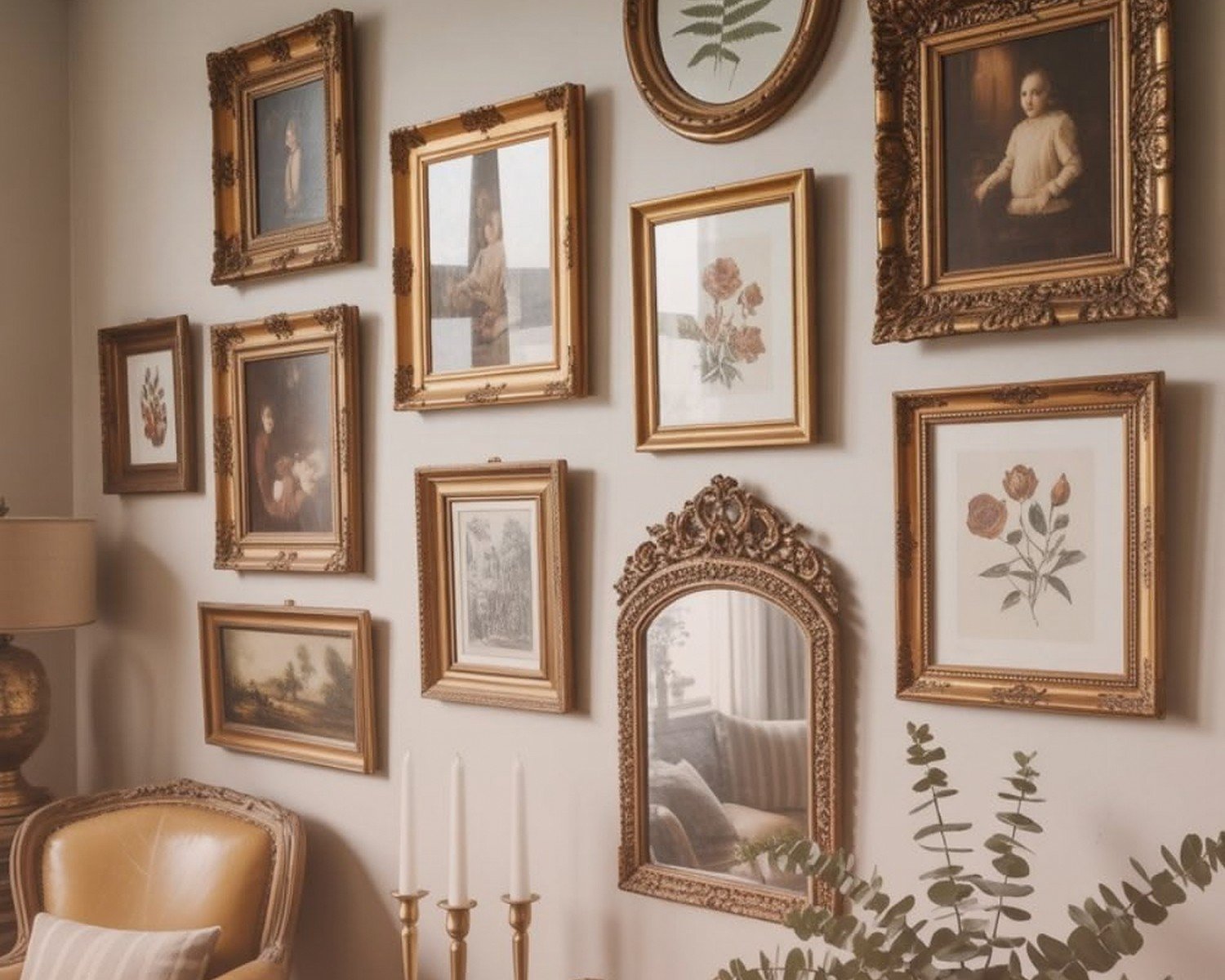
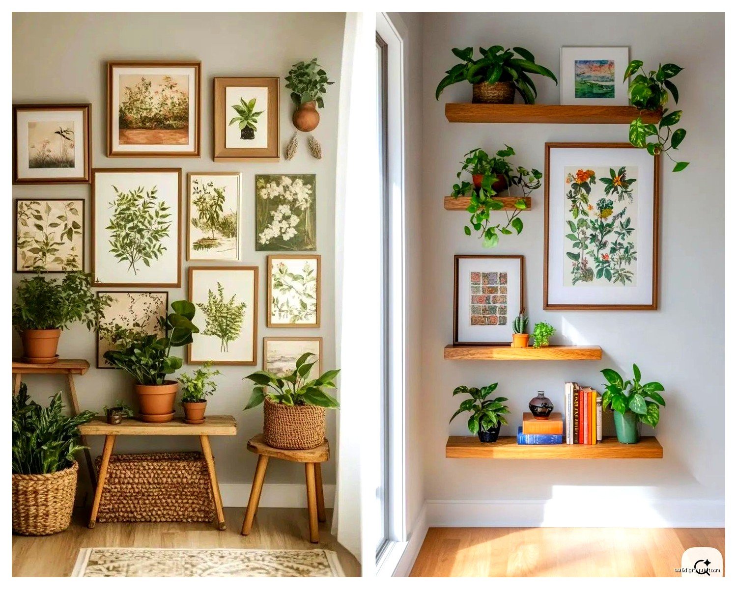
Gallery Walls Are Their Own Beast
Oh and another thing – gallery walls with multiple pieces need an anchor color. Pick ONE color that appears in at least half the pieces, even if it’s just a small amount. This ties everything together without being too matchy.
I did a gallery wall in my hallway (finally, after it being blank for like two years) with eight different pieces and the only common thread is that they all have at least a touch of black in them. Some are colorful, some are black and white, but that one connecting element makes it feel intentional instead of random.
Seasonal Flexibility – Yeah or Nah?
Some people swap art seasonally and some people think that’s extra. I’m somewhere in the middle? Like I have certain pieces I rotate but it’s not a whole production.
If you wanna do this, invest in a few key neutral pieces and then have some pops of color you can switch. Fall = warm oranges and browns, winter = cool blues and whites, spring = pastels, summer = brights. But honestly this only works if you actually enjoy changing things up. Otherwise it’s just another task you’ll feel guilty about not doing.
Testing Before Committing
Here’s something I do that clients think is genius but it’s really just common sense – I print out a scaled version of artwork before buying the real thing. Like you can get a poster-size print at FedEx for like $8. Tape it up, live with it for a few days, see how the colors feel in different lighting.
Because here’s the thing about color – it changes DRAMATICALLY depending on your light. That perfect blue in the store might look purple in your north-facing living room. The coral that looked amazing online might be straight-up orange under your warm LED bulbs.
Lighting Makes or Breaks Color Choices
Speaking of which – your light bulb color temperature matters SO much. If you have warm bulbs (2700K-3000K), cool-toned art can look muddy. If you have daylight bulbs (5000K+), warm art can look too intense.
I usually recommend people stick with 3000K-3500K bulbs because it’s neutral enough to not fight with art but still feels cosy. And if you’re serious about art, get picture lights. They’re not just for fancy houses – a simple LED picture light for like $40 can make a $30 print look expensive.
The Weird Psychology Colors Thing
Okay so funny story – I had a client who insisted on red art for their bedroom because they read somewhere it was passionate or whatever. Three weeks later they called me because they couldn’t sleep. Red is energizing! It raises your heart rate slightly!
For bedrooms: blues, greens, soft neutrals, maybe lavender
For living rooms: whatever makes you happy honestly, but warmer tones tend to feel more inviting
For dining rooms: reds and oranges actually do stimulate appetite (restaurants use this all the time)
For home offices: blues for focus, greens for calm, yellows for creativity
For bathrooms: whatever works with your tile because that’s the real limiting factor
Dealing With Existing Art You Can’t Change
Wait I forgot to mention – if you’re stuck with art you can’t get rid of (inherited stuff, partner’s choices, whatever), you can reframe it in a color that works better with your space. A different mat color or frame finish can completely change how a piece reads in a room.
I reframed my grandmother’s watercolor from this gold ornate frame to a simple white one and suddenly it worked in my modern space. The painting colors didn’t change but the context did.
My Actual Shopping Strategy
When I’m looking for art, I literally take paint swatches from my walls with me. You can get these free at any hardware store. Take your wall color, your main furniture color, and any accent colors.
Hold the swatches up to art you’re considering. Do the colors sing together or fight? Is there enough contrast or is everything too same-same?
For online shopping, most monitors display colors differently so I always check return policies. I probably return 30% of art I buy online because the colors aren’t right in person. That’s just part of it.
The Print vs Original Color Difference
One thing about prints versus original paintings – prints tend to have flatter color. Original paintings have texture that catches light differently, which can make colors appear more dynamic. Neither is better, but it’s something to consider when choosing colors.
A print with subtle color variations might look kinda bland, whereas those same subtle variations in an original with brush texture would look sophisticated. For prints, I usually go with either bold color or high contrast to compensate for the flatness.
Trends I’m Seeing That Actually Work
Right now everyone’s doing the whole “abstract colorful” thing and honestly? It works because it’s forgiving. A piece with multiple colors can pull from different elements in your room.
Also seeing a lot of monochromatic art – like all blues or all pinks in different shades. This is actually genius for indecisive people because you get visual interest without the color-matching stress.
And line drawings are having a moment – simple black line art on white. Super easy to work into any color scheme because it’s essentially neutral.
What Not to Do (Learn From My Mistakes)
Don’t buy art that’s the exact same color as your walls unless you want it to disappear. I did this once with a sage green painting on sage green walls and you literally couldn’t see it unless you were two feet away.
Don’t feel like you need to use every color in a multicolor piece of art somewhere in your room. That’s too literal. Pull out one or two colors and let the rest just exist in the artwork.
Don’t match your art to one throw pillow and call it decorated. Like yes, coordination is good, but it should feel natural not forced.
Quick Fixes When Colors Feel Wrong
If you already bought something and the colors aren’t working, try:
- Moving it to a different wall where the lighting is different
- Adding a mat in a different color before giving up on it
- Surrounding it with complementary pieces in a gallery wall situation
- Changing what’s around it – sometimes it’s not the art, it’s that one pillow that’s throwing everything off
My cat just knocked over my coffee which is perfect timing because I’m running out of things to tell you anyway.
The main thing is like, trust your gut but also give things a chance. Sometimes colors need to settle in your space for a week before you know if they work. And sometimes you just know immediately that something’s wrong and that’s okay too – that’s what return policies are for.