Wall Art Guide, Wall Art Tutoriels
Horizontal Wall Art: Wide Landscape Format Pieces
Mar
So I’ve been working with horizontal wall art for like six years now and honestly it’s one of those things that looks SO easy until you’re standing there with a hammer wondering why your beautiful landscape piece looks completely wrong on your wall.
Let me just jump into the sizing thing first because that’s where everyone messes up. The standard rule is your art should take up about 60-75% of your furniture width, but with horizontal pieces that gets weird fast. Like I had this client last month who bought this stunning 60-inch wide landscape photograph and it looked amazing in the gallery but then she put it above her 72-inch sofa and it just… disappeared? The proportions were technically correct but the visual weight was all wrong because horizontal pieces naturally feel lighter than vertical ones.
What actually works better is going slightly oversized with horizontal art. I’m talking 75-85% of your furniture width. The extra width compensates for the lack of height and keeps the piece from looking like a sad little window floating on your wall. My own living room has a 68-inch wide abstract landscape above a 76-inch credenza and it’s perfect even though technically it “breaks” the rule.
Understanding Horizontal Dimensions That Actually Matter
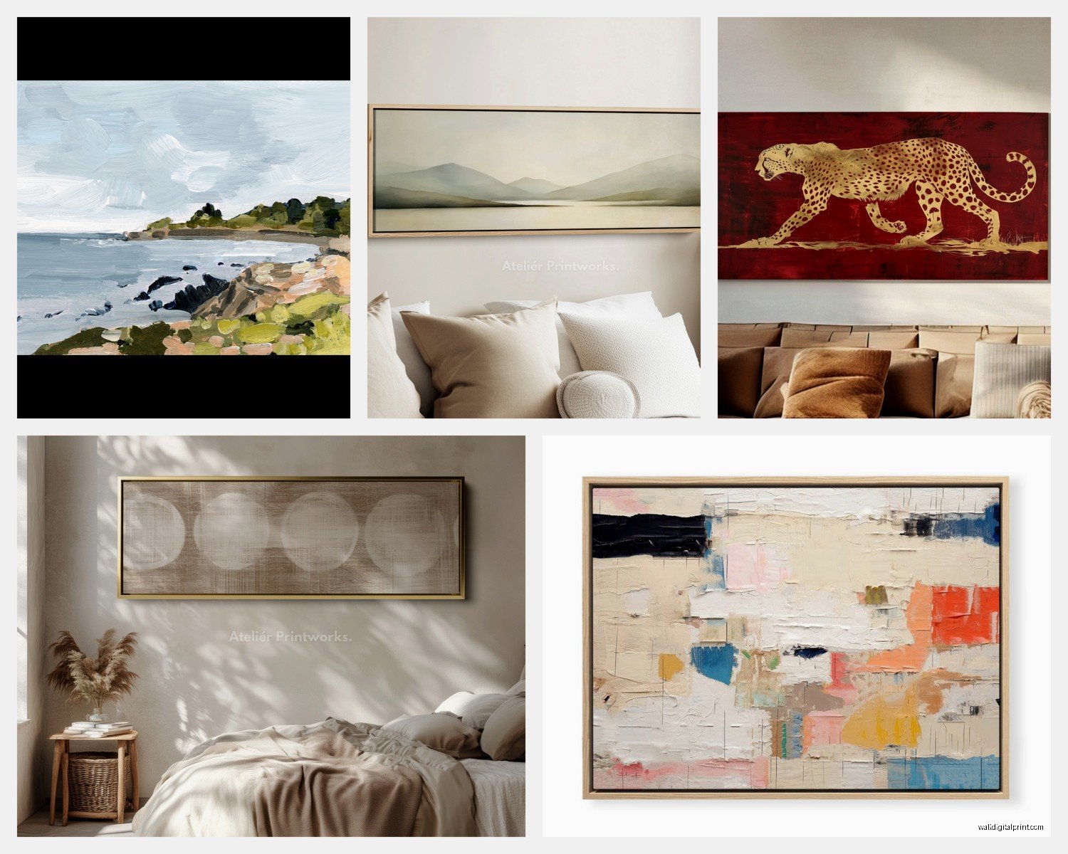
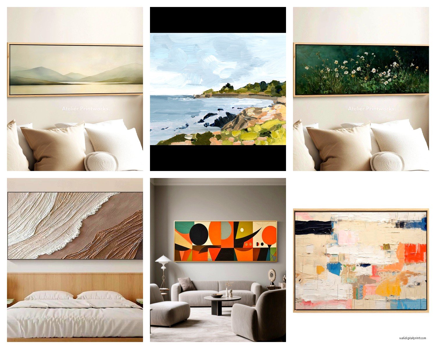
Okay so the most common horizontal ratios you’ll see are 2:1, 3:1, and sometimes even 4:1 for really dramatic panoramic pieces. A 2:1 ratio means if the piece is 40 inches wide it’s 20 inches tall. Pretty standard stuff. But here’s what nobody tells you the height matters WAY more than you think for how the room feels.
Pieces that are 16-20 inches tall work above most furniture. They’re substantial enough to register but won’t overwhelm a space. I use these constantly for clients who have normal ceiling heights like 8-9 feet.
When you get into 24-30 inch tall horizontal pieces you’re creating a statement and you need the wall space to support it. These work amazing in rooms with 10+ foot ceilings or on large empty walls where you want impact. I installed a 72×24 landscape piece in a modern farmhouse last fall and my dog literally barked at it for like ten minutes because it changed the whole room that dramatically.
The super wide skinny ones like 60×15 or 48×12 are tricky. They look incredible in photos but in real spaces they can read as decorative trim rather than actual art unless you really commit to the minimalist aesthetic.
Placement Height Because Everyone Gets This Wrong
The whole “57 inches to center” gallery rule? Kinda useless for horizontal pieces above furniture. What you actually wanna do is measure 6-8 inches above your furniture top and put the BOTTOM edge of your frame there. Not the center. The bottom.
For horizontal art on empty walls yeah okay use the 57-inch center line but honestly I usually go slightly lower like 54-55 inches to center because horizontal pieces benefit from feeling grounded. When they’re too high they float weirdly and your eye doesn’t know where to land.
Oh and another thing the couch placement matters so much. If your sofa is pulled away from the wall by more than 6 inches your horizontal art is gonna look disconnected. Either push the furniture closer or choose a different wall. I spent three hours last Tuesday trying to make a beautiful seascape work above a sofa that was 10 inches from the wall and finally just admitted defeat and moved it to the dining room.
What Actually Looks Good in Horizontal Format
Landscapes obviously but you knew that already. What works surprisingly well:
- Cityscapes and skylines they’re naturally horizontal subjects
- Abstract pieces with strong horizontal movement like brush strokes going side to side
- Beach scenes and seascapes because horizons are literally horizontal
- Panoramic photography especially mountains or fields
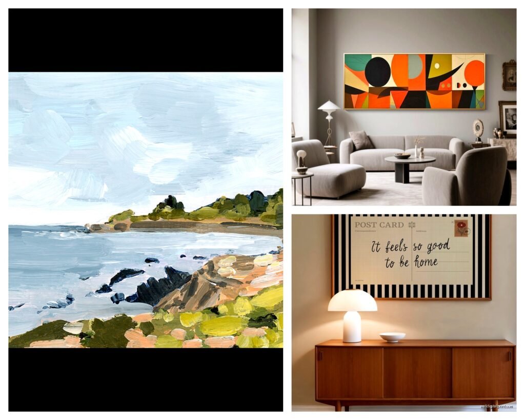
- Modern geometric art with horizontal color blocks
What doesn’t work as well in horizontal format even though people try it all the time:
- Portraits they just look squashed and weird
- Tall subjects like trees or buildings unless they’re part of a wider scene
- Anything with strong vertical elements fighting against the horizontal frame
- Dense detailed scenes that need height to breathe
I curated an exhibition last spring that was entirely horizontal pieces and we rejected like 40% of submissions because artists were trying to force vertical subjects into horizontal frames and it just looked wrong.
Framing Choices That Make or Break the Look
Thin frames work better for horizontal pieces than chunky ones. A 1-2 inch frame keeps the emphasis on the horizontal line while a 3-4 inch frame can make your piece look stubby. I usually go with simple wood frames in natural finishes or thin metal frames depending on the style.
Floating frames those ones where the canvas sits inside the frame with a gap are PERFECT for horizontal art because they emphasize the width. The shadow gap draws your eye along the entire length of the piece.
Gallery wrapped canvas with no frame can work but be careful because without a frame horizontal pieces lose definition and can blend into the wall. If you’re going frameless make sure there’s enough contrast between your art and wall color.
Multi-Panel Horizontal Arrangements
This is gonna sound weird but sometimes one horizontal piece isn’t enough and you need to think about diptychs or triptychs. Two or three horizontal panels arranged side by side can create this amazing visual flow across a really wide wall.
The key is keeping consistent spacing between panels. I use 2-3 inches between frames for a cohesive look. Any more than 4 inches and they start reading as separate pieces rather than one installation.
You can also stack horizontal pieces vertically which sounds counterintuitive but works great above sideboards or in narrow wall spaces. Two 40×16 horizontal pieces stacked with 3 inches between them gives you the impact of a larger piece while maintaining that horizontal emphasis.
Room-Specific Considerations
Living rooms are obviously the sweet spot for horizontal art. Above the sofa is classic for a reason it anchors your seating area and creates a focal point. Just make sure your piece is wide enough I see so many living rooms with tiny horizontal pieces that look like they’re drowning above a big sectional.
Bedrooms get tricky because horizontal art above the bed can make the ceiling feel lower. If you’ve got 8-foot ceilings I’d actually suggest going with a vertical piece or a more square format. But in bedrooms with higher ceilings a horizontal landscape can be really calming and serene.
Dining rooms are perfect for horizontal art especially above a buffet or sideboard. The horizontal line echoes the dining table and creates visual harmony. I installed a 72×20 abstract piece above a credenza in my friend’s dining room while we were supposed to be watching The White Lotus and it completely transformed the space.
Hallways can handle horizontal pieces but you gotta be careful about scale. A really wide piece in a narrow hallway can make the space feel even narrower. Sometimes multiple smaller horizontal pieces arranged in a row works better than one large one.
Lighting Your Horizontal Pieces
Picture lights those brass or chrome lights that mount above the frame work okay for horizontal art but they can create weird shadows on really wide pieces. You need a light that’s at least half the width of your art to get even illumination.
Track lighting or recessed spotlights are actually better for horizontal pieces because you can position them to wash light evenly across the width. Aim for lights positioned about 30 degrees from the wall and 3-4 feet in front of the art.
Natural light is amazing but watch out for glare on glass-covered horizontal pieces. The wide format catches light from windows at more angles than vertical art. I’ve had to relocate pieces because afternoon sun created this insane glare that made them basically invisible for half the day.
Common Mistakes I See Constantly
Hanging horizontal art too high is the number one issue. People default to that 57-inch rule without thinking about the format and then wonder why their room feels off.
Choosing pieces that are too narrow for the space. A 30-inch wide horizontal piece above a 60-inch console just looks sad and tentative. Go bigger or don’t bother.
Ignoring the wall color. Horizontal pieces need contrast to register properly. A light-colored landscape on a light wall disappears. A dark moody piece on a dark wall also disappears. You need enough contrast for the horizontal line to read clearly.
Mixing too many orientations in one space. If you’ve got a big horizontal piece as your focal point don’t surround it with a bunch of vertical pieces. Keep the visual language consistent.
Budget-Friendly Options That Don’t Look Cheap
Society6 and Minted both have gorgeous horizontal prints in tons of sizes. You can get a 40×20 print for under $100 which is insane. Just spend money on decent framing.
Etsy has independent artists selling horizontal digital downloads that you can print at your local print shop. I’ve found stunning abstract landscapes for like $15 and had them printed on nice paper for another $40.
Thrift stores and estate sales sometimes have horizontal art but you’re gonna need to hunt. I found an amazing vintage landscape at an estate sale for $30 last year and it’s now in my entryway.
IKEA actually has some nice affordable horizontal prints in their BJÖRKSTA line. They’re not gonna blow anyone’s mind but they’re well-made and inexpensive.
When to Use Canvas vs. Paper vs. Other Materials
Canvas works great for horizontal pieces especially in casual spaces. The texture adds interest and you don’t need glass which keeps costs down. Gallery-wrapped canvas is perfect for modern spaces.
Paper prints under glass look more formal and refined. Good for traditional spaces or when you want to emphasize the art as a serious piece. The glass does add glare issues though especially with horizontal formats.
Metal prints are having a moment and they work surprisingly well for horizontal photography. The material emphasizes modern subjects and the lack of frame really showcases the horizontal format.
Wood prints give this organic feel that’s perfect for nature photography and landscapes. The wood grain adds dimension and they’re lightweight which is nice for really wide pieces.
Installation Tips Because Hanging Wide Pieces Is Annoying
Use two hooks for anything over 36 inches wide. One hook creates a pivot point and your art will never hang straight. Two hooks distributed along the width keep everything stable.
Level is your best friend. I use a laser level for anything over 48 inches because trying to eyeball it never works. Mark your holes carefully before you drill.
Wall anchors are essential unless you’re hitting studs. Horizontal pieces are often heavier than they look and drywall alone won’t support them long-term. I use toggle bolts for anything over 20 pounds.
Get someone to help you with pieces over 48 inches wide. I’ve tried solo installing big horizontal art and it’s just frustrating. An extra set of hands makes everything easier.
Consider a French cleat system for really large horizontal pieces. It distributes weight evenly and makes it easy to adjust position if needed. Plus you can remove and rehang the art easily which is nice when you’re redecorating.
Wait I forgot to mention that you should always step back like 10 feet when you think you’ve got the placement right. What looks good from 2 feet away often looks wrong from actual viewing distance. I’ve repositioned so many pieces after doing the step-back test.
The thing about horizontal wall art is it’s all about creating visual balance and flow in your space. When you get it right it makes everything feel more intentional and pulled together. When you get it wrong your room feels off in this way you can’t quite pinpoint. Just take your time with measurements and don’t be afraid to try different positions before committing to drilling holes.