Wall Art Guide, Wall Art Tutoriels
Indigo Wall Art: Deep Blue Dye Color Designs
Mar
So I’ve been absolutely obsessed with indigo wall art lately and honestly it started because a client wanted to redo their living room but didn’t want the typical navy blue situation everyone’s doing. We went down this whole rabbit hole with natural indigo dye techniques and I gotta say, the depth you get with real indigo versus just… blue paint on canvas is completely different.
What Makes Indigo Different From Regular Blue Art
Okay so here’s the thing about indigo that nobody really explains well. It’s not just a color, it’s this whole fermentation process with actual indigo leaves or synthetic indigo powder these days. The dye oxidizes when it hits air which means you get these layers of blue that build up differently than if someone just painted something blue. I spent like three hours one Saturday comparing indigo-dyed fabric art pieces to acrylic paintings in similar shades and the indigo ones have this almost… iridescent quality? Not shiny, but dimensional.
The real stuff comes from the indigofera plant but most wall art you’re gonna find uses either Japanese indigo or synthetic indigo which honestly looks almost identical unless you’re getting really precious about it. My friend who’s a textile artist gets SO mad when I say that but like, for wall art purposes, you probably can’t tell the difference from six feet away.
Types of Indigo Wall Art You’ll Actually Find
There’s basically four categories I’ve worked with and each one has different vibes and price points:
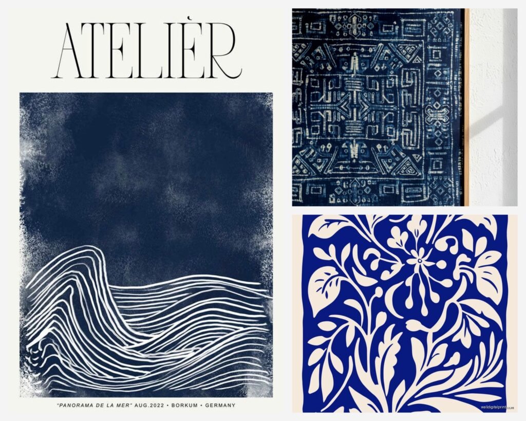
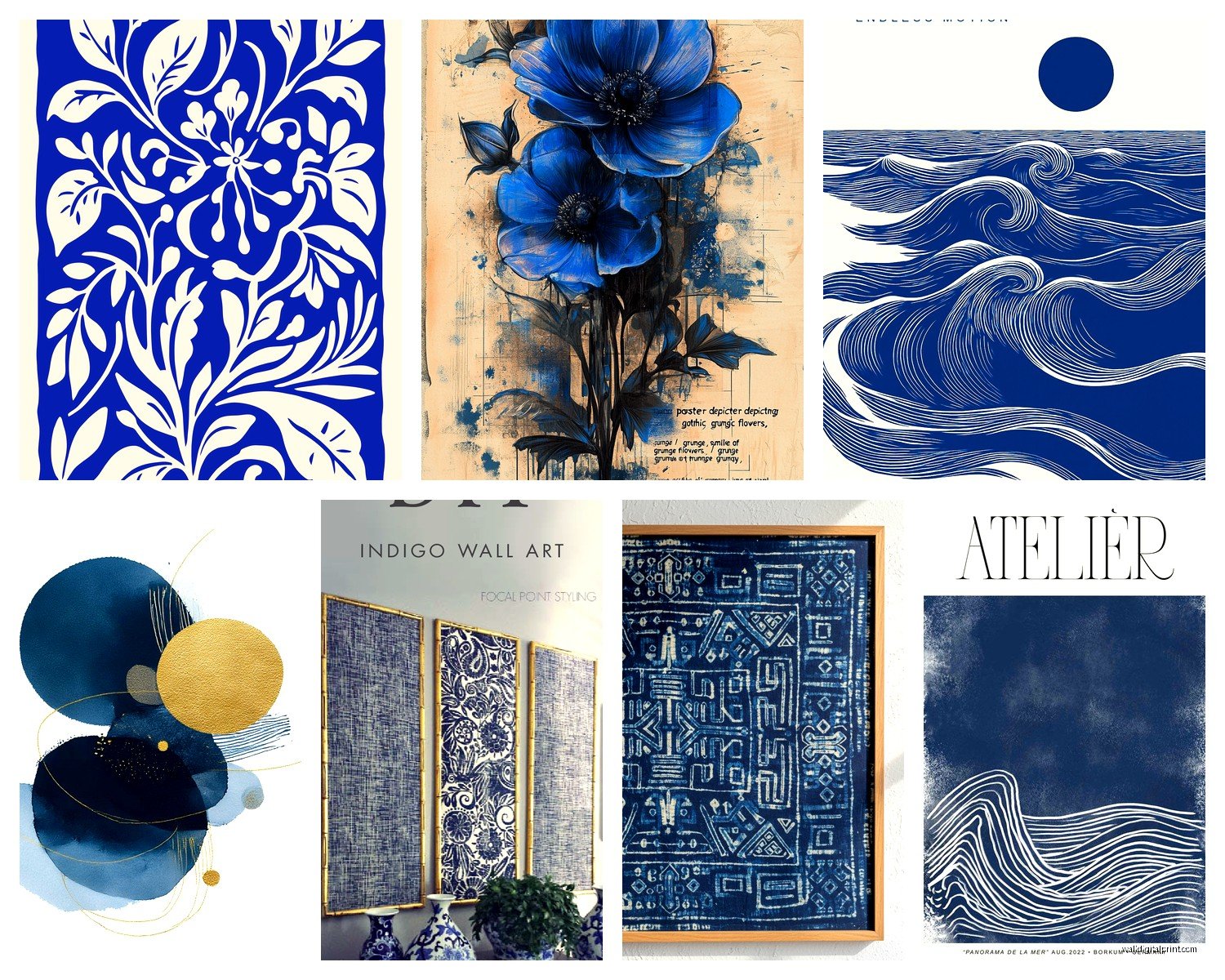
Shibori Fabric Panels
This is the Japanese tie-dye technique and it’s everywhere right now. You fold or bind fabric in specific patterns before dyeing it. The white parts where the dye couldn’t reach create these geometric or organic patterns. I’ve mounted probably fifteen of these for clients in the past year.
What you need to know is that the quality varies WILDLY. Some are hand-dyed on good linen or cotton, others are printed to look like shibori which… I mean it’s cheaper but you lose that texture thing that makes indigo special. Run your hand over it if you can – real shibori has slight stiffness where the dye concentrated and the white parts feel different.
oh and another thing, the mounting matters so much. I learned this the hard way when I just thumbtacked one to a client’s wall and it looked terrible. You want it either stretched on a frame like canvas or mounted on a backing board with a float frame. The float frame thing is gonna run you extra but it looks so much better because you can see the raw edges of the fabric.
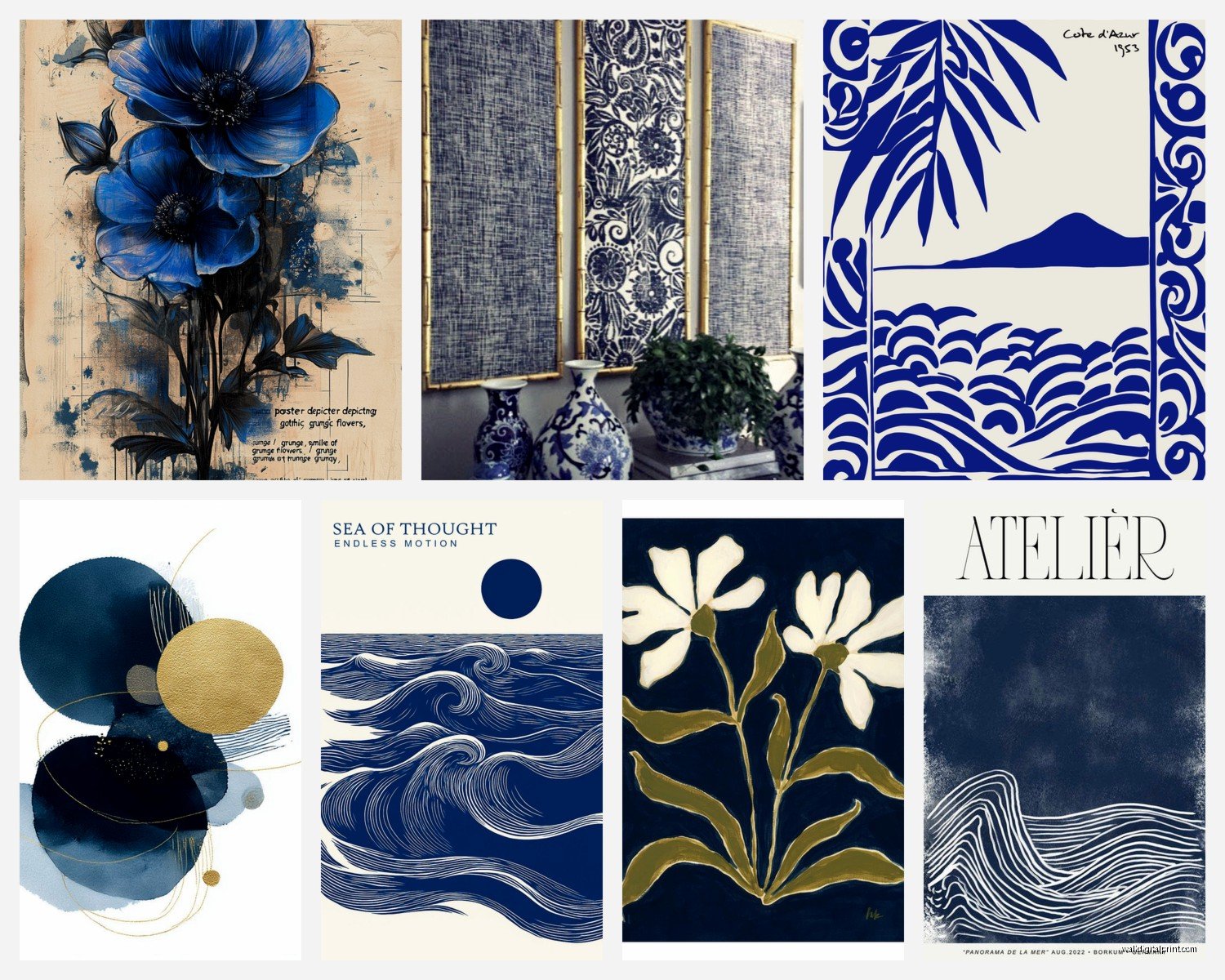
Indigo Prints and Paintings
These are more traditional art pieces where someone used indigo as a pigment. Could be botanical prints, abstract stuff, modern geometric designs. The artist Julia Canright does these amazing indigo botanical studies that I’m low-key obsessed with, though they’re pricey.
For prints, check if they’re using actual indigo ink or if it’s just blue ink. Sounds snobby but actual indigo ink has different aging properties – it can shift slightly over years which some people love and some people hate. I have one in my hallway that’s gotten slightly more purple-toned after two years near a window.
Indigo-Dyed Paper Art
This is gonna sound weird but some artists dye thick cotton paper or washi paper with indigo and then either leave it as minimalist color studies or cut it into shapes. Very sculptural, very expensive usually. I saw a set of three at an art fair last year for $800 and almost bought them but my partner was like “Sophia it’s just blue paper” and I’m still mad about not getting them.
If you go this route make sure it’s framed under glass because the paper can be delicate. Also UV-protective glass because indigo WILL fade in direct sunlight, learned that the hard way.
Mixed Media With Indigo Elements
This is where artists combine indigo-dyed materials with other stuff – maybe indigo fabric with embroidery, or indigo paper collaged with other elements. These are hit or miss for me. When they’re good they’re really interesting but sometimes it feels like throwing indigo in there just to charge more money.
How to Pick the Right Indigo Piece
So you’re looking at options and everything’s just… blue. Here’s what I actually look at when I’m selecting pieces for spaces:
Pattern complexity versus wall business. If your wall has a lot going on – busy shelving, lots of windows, whatever – you want simpler indigo patterns. Those really intricate shibori pieces with tons of detail? They need breathing room. I put one in a client’s bathroom that had patterned tile and it was just visual chaos.
The white-to-indigo ratio matters more than you’d think. Mostly white with indigo accents reads as light and airy. Mostly indigo with white accents is dramatic and moody. I’ve got this one piece in my office that’s probably 70% deep indigo and it makes the whole room feel cozier but definitely darker.
Scale is where people mess up constantly. That piece that looks perfect in the online photo is probably way smaller than you think. I ordered what I thought was a large shibori panel once and it arrived and was like 16×20 inches. Now I always check dimensions twice and hold up newspaper to the wall at that size to visualize it.
Mixing Indigo Art With Your Existing Stuff
Okay so funny story, I had a client who’d already bought three indigo pieces before calling me and she wanted to know how to make them work with her existing art. She had a lot of warm-toned abstract paintings and was worried the indigo would clash.
Here’s what actually works: indigo plays surprisingly well with warm woods, terracotta, rust colors, even blush pink. It does NOT work great with cool grays usually – makes everything feel kind of sterile unless that’s your vibe. With other blues you gotta be careful because indigo has those purple-green undertones that can make regular navy or royal blue look off.
I usually tell people to pick up the white in the indigo piece with your matting or frames. White frames on indigo art in a room with warm wood tones is *chef’s kiss*. Black frames can work but they make it more dramatic, more gallery-like.
wait I forgot to mention – indigo looks completely different in different lighting. Under warm incandescent light it leans more purple. Under cool daylight it’s bluer and crisper. Under those terrible fluorescent lights it can look almost gray-green. So if possible, test it in your actual space before committing. Most good galleries or online shops have decent return policies for this reason.
Where to Actually Buy This Stuff
Etsy is honestly great for indigo wall art because lots of textile artists sell there. Search “shibori wall hanging” or “indigo dyed linen art” and you’ll find tons. Quality varies so read reviews and look for shops that show detail shots.
West Elm and CB2 have gotten on the indigo train but their stuff tends to be printed rather than actually dyed. Not gonna lie, I’ve bought pieces from both for budget-conscious clients and they look fine, just don’t expect that depth of color you get from real dye.
For actual investment pieces, look at galleries specializing in textile art or contemporary craft. The Textile Arts Council has a directory. American Craft Council shows always have indigo artists. I found my favorite piece at a craft fair in Philadelphia like four years ago and still get compliments on it.
Smaller shops on Instagram are honestly where some of the best stuff is. Search hashtags like #indigoart #shiboridyed #indigotextiles. I found this artist in Portland through Instagram who does custom shibori panels and her work is incredible, way less than gallery prices.
DIY Indigo Wall Art If You’re Feeling Adventurous
Look, I’m not usually a DIY person because my time is worth money and I’m gonna be real, most DIY art looks DIY. But indigo dyeing is actually pretty forgiving and can look legitimately good even if it’s your first time.
You need indigo dye (Jacquard makes a synthetic version that’s easy to use), fabric or paper, rubber bands or string for shibori patterns, and patience. The dye has to be prepared in a vat and it smells weird – kind of earthy and chemical at once. My whole studio smelled like indigo for a week after I tested this.
Basic process: mix your dye vat according to package directions, fold or bind your fabric in whatever pattern, dip it in the vat, pull it out and watch it oxidize from green to blue which is honestly magical every single time. Repeat for deeper color. Rinse, unbind, rinse again, let it dry.
Pro tips from my experiments: use natural fiber fabric only, cotton and linen work best. The tighter you bind it the sharper your white areas will be. If you want soft blurry edges, bind it looser. Layer different shades by dyeing some areas more times than others.
For wall hanging, get fabric that’s substantial enough to hang nicely. I used a cotton duck cloth from the fabric store and it worked great. Thin cotton can look wrinkly and cheap even if the dye pattern is nice.
Mount it on a canvas stretcher frame (you can buy these at craft stores) using a staple gun, or get a curtain rod and make a sleeve at the top. The curtain rod method is super easy and looks more casual-bohemian. The stretched canvas method looks more finished and gallery-like.
Caring For Indigo Wall Art
So this is important because indigo is not colorfast the way modern dyes are. It WILL fade over time, especially in sunlight. Some people like this, the whole wabi-sabi aesthetic of things aging naturally. I have a client whose indigo pieces have faded to this really pretty soft blue-gray over like five years in a sunny room and she loves it.
If you want to preserve the deep blue, keep it out of direct sunlight. UV-protective glass helps if it’s framed. For fabric pieces that aren’t behind glass, you might need to occasionally gently brush off dust – don’t use cleaning chemicals on them.
Indigo can also crab a little onto walls if it’s touching them, especially when new. Use spacers or mount it so there’s a gap between the fabric and the wall. I learned this when a client texted me a photo of blue marks on her white wall and I had to repaint it. Oops.
Styling Indigo Art in Different Rooms
In bedrooms, indigo is amazing because blue is supposed to be calming or whatever but indigo specifically has this depth that doesn’t feel cold. I have a large shibori panel above my bed and it’s the first thing I see when I wake up. Pair it with white bedding and natural wood furniture.
Living rooms can handle bigger, more dramatic pieces. This is where those mostly-indigo compositions work well. I did a whole gallery wall for a client with different indigo pieces in different patterns – shibori, some botanical prints, one abstract painting – all in white frames and it looked cohesive because the indigo tied everything together.
Bathrooms are tricky because humidity but if you have good ventilation, indigo actually looks great in bathrooms. Something about the water-blue connection. Just make sure it’s properly sealed or framed if it’s near the shower.
Kitchens… honestly I don’t usually put art in kitchens because grease and cooking splatter but if you’re gonna do it, indigo works with white subway tile and brass fixtures really nicely. Keep it away from the stove though.
Home offices need something calming but not boring and indigo is perfect for that. I have three small indigo pieces arranged vertically near my desk and they’re visually interesting enough to look at during Zoom calls but not distracting.
What Not to Do
Don’t buy that mass-produced printed “indigo” art from TJ Maxx thinking it’s the same thing. I mean if you like it, fine, but it’s not gonna have that quality I’m talking about. It’s just blue ink on canvas.
Don’t hang valuable indigo pieces in direct afternoon sun unless you’re okay with them fading significantly. Morning light is generally safer.
Don’t go overboard with the indigo everywhere thing. I see this on Instagram sometimes where someone’s like “indigo bathroom, indigo bedroom, indigo living room” and it’s just too much of one thing. Indigo works best as an accent or focal point, not as your entire home’s color scheme.
Don’t ignore scale. Bigger walls need bigger pieces or multiple pieces arranged together. A tiny 12×12 indigo piece on a huge wall looks lost no matter how beautiful it is.
My cat knocked over my coffee onto some fabric samples I was testing last month which actually showed me that indigo doesn’t stain as badly as you’d think? The coffee came out with cold water pretty easily. Anyway, just saying it’s more durable than it looks.