Wall Art Guide, Wall Art Tutoriels
Inspirational Wall Art for Living Room: Motivational Quotes
Apr
So I’ve been down this whole inspirational quote wall art rabbit hole lately because honestly, my living room felt like it needed…something? And I figured motivational quotes might work but also didn’t want it to look like a corporate office waiting room, you know?
First thing – and this took me way too long to figure out – is that the material you choose literally changes the entire vibe. I started with those canvas prints from Amazon because they were cheap and I thought, whatever, it’s just words on a wall. Wrong. The texture matters SO much more than I expected.
Canvas vs Everything Else
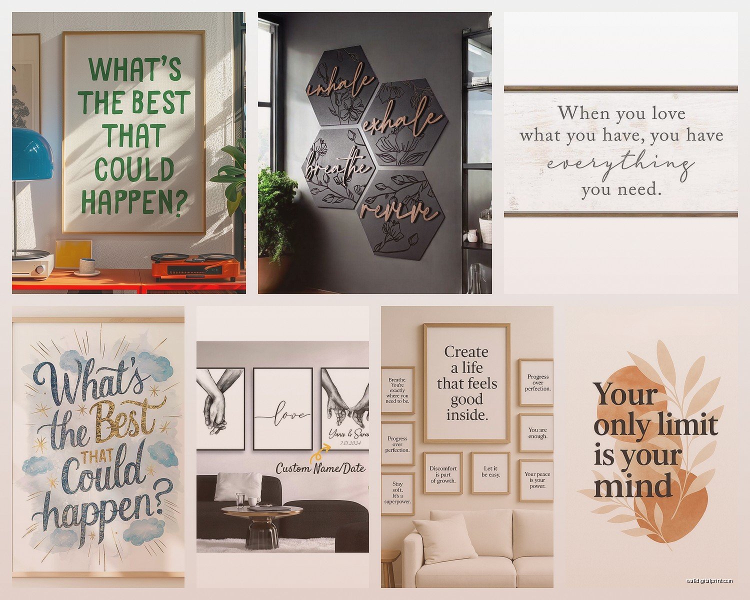
Canvas prints are like the default option everyone goes for. They’ve got that gallery-wrapped look where the image continues around the edges, so you don’t need a frame. I got one that said “Create Your Own Sunshine” (I know, I know, but hear me out) and the cotton-poly blend canvas actually gave it this soft, less aggressive look? Like the quote wasn’t screaming at me every time I walked in the room.
The thing with canvas though is you gotta check the GSM weight. Anything under 300gsm is gonna look flimsy and cheap. I learned this the hard way with a $15 print that literally showed the wooden frame through it when the light hit it weird. Spend the extra $20 and get something 380-400gsm. It just looks more intentional.
But then I discovered metal prints and honestly…game changer. They’re aluminum sheets with the image infused directly into the coating, and they have this depth that’s hard to explain. The quotes look sharper, more modern. I have one in my actual living room now that says “She Believed She Could So She Did” and before you judge, the metallic finish makes it look way less basic than it sounds. The reflective quality catches light differently throughout the day which is kinda cool when you’re sitting there with your coffee in the morning.
Metal prints are more expensive though – like $60-120 depending on size – but they’re waterproof and won’t fade. My friend has had hers for three years and it still looks brand new.
Acrylic and Glass Prints
Okay so funny story, I thought acrylic and glass were the same thing for like six months. They’re not. Acrylic is lighter and has this glossy, almost 3D effect because there’s usually a gap between the print and the acrylic panel. Makes the text pop forward. I saw one at a client’s house that said “Good Vibes Only” and normally I’d roll my eyes but the dimensional quality made it look expensive and artistic instead of Pinterest-basic.
Glass prints are heavier and more fragile but they have this crisp, ultra-modern look. The quote is printed on the back of the glass so you’re looking through it, which creates this interesting depth. They work better with minimalist quotes – like single words or super short phrases. I wouldn’t do a whole paragraph on glass because it can look cluttered.
The downside is both of these show fingerprints like crazy and my cat somehow always manages to brush against them, so if you have pets or kids, maybe skip these unless you enjoy cleaning.
Size Actually Matters More Than You Think
I made this mistake where I bought a 12×16 print with this long quote about dreams and ambition or whatever, and the text was SO SMALL you couldn’t even read it from the couch. Totally pointless.
For motivational quotes, you want the text to be actually readable from at least 6-8 feet away. That usually means:
- For quotes with 3-5 words: 16×20 minimum, 24×36 is better
- For longer quotes (2-3 lines): 20×30 or larger
- Single powerful words: you can go huge, like 30×40 or even bigger
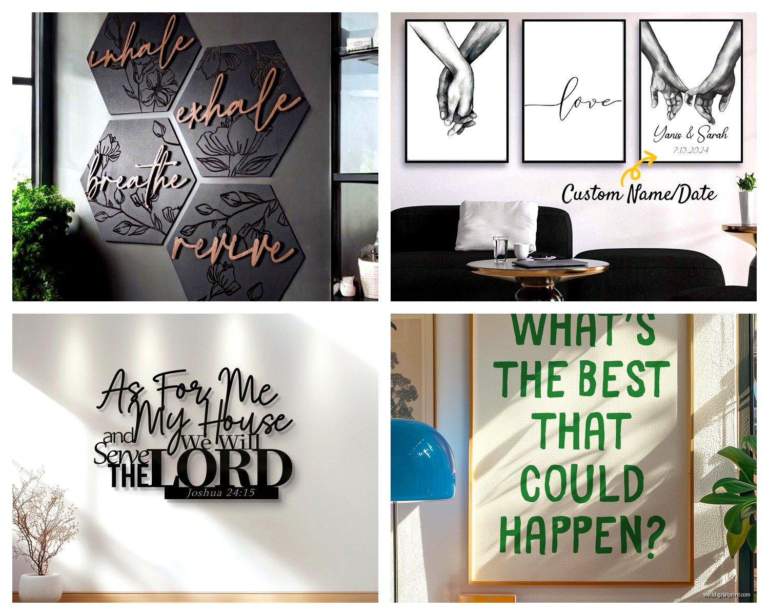
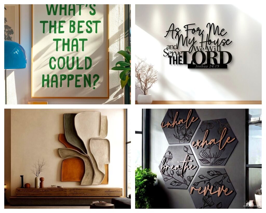
I have “Breathe” in giant letters above my couch – it’s 36×48 on canvas – and it’s probably my favorite piece because it’s simple enough that it doesn’t feel preachy but substantial enough that it anchors the whole wall.
Frame or No Frame Situation
This is where it gets tricky because frames can either elevate your quote or make it look like you bought it at HomeGoods (which, no shade, I shop there too but you know what I mean).
Floating frames – where there’s a gap between the art and the frame – work really well with motivational quotes because they add this gallery-quality look. I got black floating frames for two prints and they immediately looked more curated. The gap creates a shadow that gives dimension.
Traditional frames with matting can work too but you gotta be careful with the color. White matting with a thin black or gold frame is safe. I tried a chunky distressed wood frame once and it made my “Stay Positive” print look like farmhouse decor threw up on my wall. Not the vibe I was going for.
Oh and another thing – those magnetic wooden hanging systems? Where it’s just two pieces of wood with a magnet holding the print? Super trendy right now and they work great for paper prints with quotes. They look casual and modern at the same time. I have one with “Progress Over Perfection” in my workspace area and the way it hangs gives it this relaxed feel that matches the message.
Paper Quality If You’re Going the Print Route
If you’re buying unframed prints that you’ll frame yourself (which is usually cheaper), the paper quality matters. A lot.
Cardstock is the minimum – like 100lb cardstock at least. Anything thinner will curl over time or look cheap behind glass. I’ve had good luck with 130lb cardstock for quotes with simple designs.
Fine art paper is where it’s at though if you want something special. Matte fine art paper (like Hahnemühle or Moab) has this texture that makes even basic quotes look sophisticated. The tooth of the paper catches light subtly and gives the letters more presence. It’s more expensive – maybe $40-80 for a quality print – but if you’re gonna stare at it every day, might be worth it.
Glossy photo paper is hit or miss. It works if your quote has colorful backgrounds or graphics, but for text-only designs it can look too shiny and cheap. Unless you’re going for that modern pop art vibe, stick with matte.
What Actually Looks Good in Real Living Rooms
Here’s the thing nobody tells you – not all motivational quotes work in actual living spaces where you, like, live and watch TV and eat pizza on the couch.
Super long inspirational paragraphs? Too much. Your wall isn’t a self-help book. I tried one that was basically an entire poem and it stressed me out just looking at it. Too many words competing for attention.
What’s worked better for me:
- Single powerful words (Dream, Create, Breathe, Begin)
- Short phrases, 3-5 words max (Make It Happen, Stay Curious, Choose Joy)
- Questions that make you think without being corny (What If You Fly?)
The font matters too. Script fonts can look elegant but they’re hard to read from a distance. Sans serif fonts – clean, modern, simple – work better for actual daily viewing. I have one in a bold sans serif that says “Do More of What Makes You Happy” and even though that sounds cheesy written out, the typography makes it feel contemporary.
Color Schemes That Don’t Make You Cringe
Okay so this is gonna sound weird but the biggest mistake I see is people choosing motivational quotes in bright, cheerful colors because they think that matches the positive message. But then it looks like a kindergarten classroom.
Neutral palettes work better for longevity:
- Black text on white/cream background – classic, never looks dated
- White text on black/charcoal – dramatic, modern, works in contemporary spaces
- Navy or forest green text on light backgrounds – adds color without being childish
- Terracotta or rust text – trendy right now but still feels grown-up
I did try a mint green and coral combo because it matched my throw pillows and within three months I hated it. Stick with colors you won’t get sick of.
Metallic accents can be nice though – like black text with gold foil highlights on certain words. I have one that says “Make Today Amazing” and the word “Amazing” has this rose gold foil that catches light. It’s just enough visual interest without being overwhelming.
Where to Actually Buy This Stuff
I’ve ordered from like fifteen different places at this point so here’s the real talk:
Etsy is great for unique designs and you’re supporting small businesses, but quality varies wildly. Always check reviews with photos and read the description carefully about what material you’re actually getting. Some sellers are just dropshipping from print-on-demand services.
Minted has beautiful designs and good quality but pricey. Their paper is legit though – thick, nice finish, comes ready to frame. I got a “Be Fearless” print from there that’s held up perfectly.
Society6 and Redbubble are hit or miss. The designs are cool and artist-driven but since they use print-on-demand, you can’t always predict exact quality. I’ve gotten great stuff and mediocre stuff from both. Canvas quality from Society6 has been decent in my experience.
For metal prints specifically, I’ve used Displate and been happy with them. They have this magnetic mounting system that makes hanging super easy – no nails or anything.
Wait I forgot to mention – if you want something really custom with your own quote or specific font, Shutterfly and Snapfish let you design it yourself. The interface is kinda clunky but you have total control. I made one with a quote from my favorite book and chose the exact shade of blue I wanted.
Installation Without Destroying Your Walls
Command strips are your friend for lighter pieces – anything under 8 pounds. I use the large picture hanging strips and they’ve held canvas and framed prints for over a year with no issues. Just follow the instructions exactly, especially the part about waiting an hour before hanging.
For heavier stuff like big canvases or metal prints, you gotta use actual wall anchors. Drywall anchors or toggle bolts depending on the weight. My “Dream Big” canvas is probably 15 pounds and regular nails weren’t cutting it – it fell twice before I used proper anchors.
The magnetic mounting systems are genius though if you’re renting or don’t wanna deal with hardware. Some metal prints come with them built in.
Mixing Multiple Quotes Without Looking Chaotic
I have three motivational pieces in my living room and the key to making them look cohesive instead of like a Pinterest board exploded is keeping something consistent:
Either match the frames, or match the color palette, or match the font style. Pick one thing that ties them together. Mine all have black frames in different sizes but the frames being identical creates unity even though the quotes and styles vary.
Gallery wall layout helps too – I did the whole “lay them out on the floor first” thing which felt silly but actually worked. Keeping 2-3 inches between each piece and making sure the overall shape is balanced (like wider at bottom, narrower at top, or in a grid pattern).
Just don’t mix too many different materials. Like canvas + metal print works, but canvas + metal + acrylic + framed paper print all together looks like you couldn’t commit to a style.
My dog just knocked over my water bottle so I gotta wrap this up but last thing – don’t overthink the actual message. I spent weeks trying to find the perfect profound quote and honestly? The ones that resonate with you personally are gonna work better than whatever’s trending on Instagram. Even if it’s simple or you’ve seen it before, if it makes you feel good when you look at it, that’s what matters in your own living room.
The “Live Laugh Love” hate is real but you know what, if that phrase genuinely makes you happy, get it in a style that feels authentic to you and own it. Just maybe avoid the basic script font version.