Wall Art Guide, Wall Art Tutoriels
Long Landscape Wall Art: Panoramic Nature Photography

Mar
So I’ve been hanging panoramic landscape prints for like 6 years now and honestly the sizing thing trips up literally everyone who messages me. You’re probably looking at your wall thinking “how wide is too wide” and the answer is gonna sound weird but…it’s almost never too wide if you’re going for that dramatic panoramic look.
The Width-to-Height Ratio Thing Nobody Explains Right
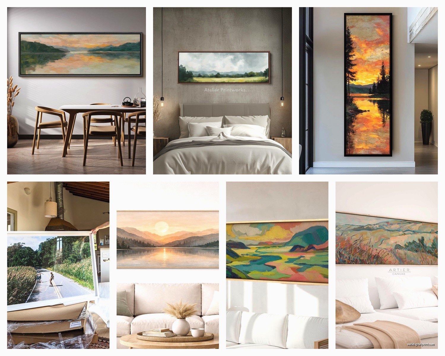
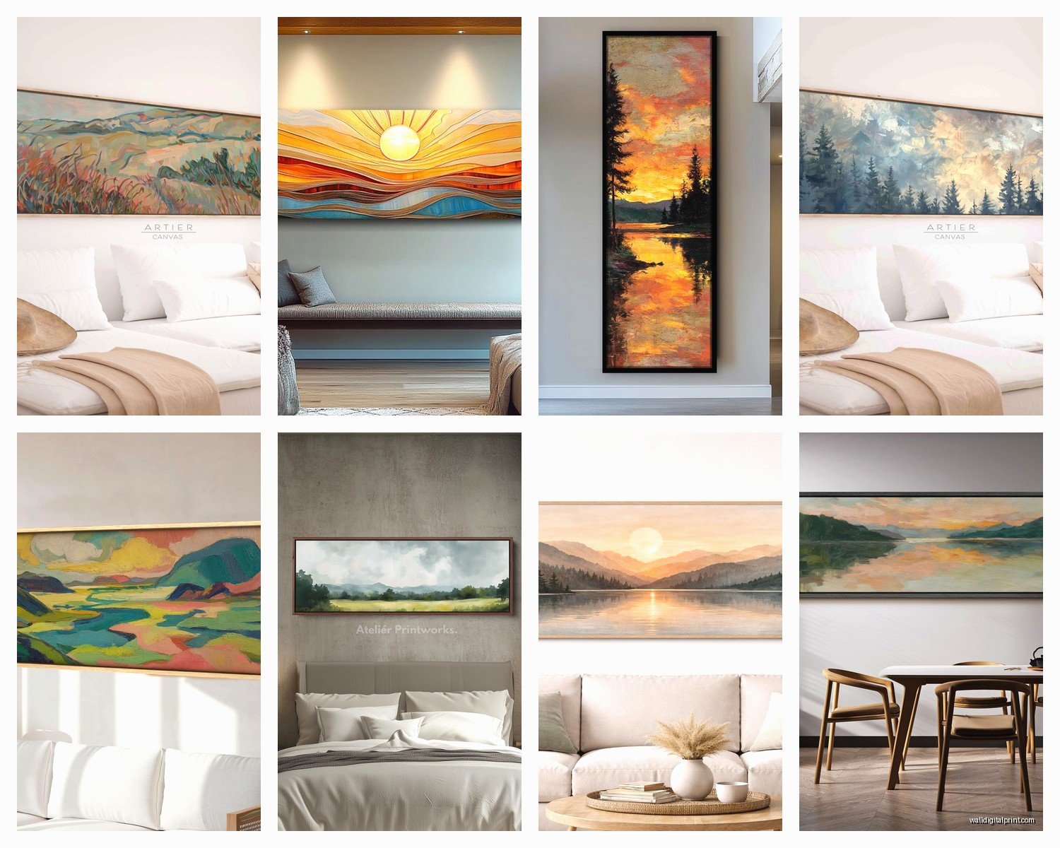
Okay so true panoramic prints are usually 2:1 or 3:1 ratio. That means if your print is 60 inches wide, it’s either 30 inches tall (2:1) or 20 inches tall (3:1). I learned this the hard way when I ordered what I thought was a panoramic of Yosemite and it showed up basically…square-ish? The seller had listed it as “landscape orientation” which technically just means horizontal but NOT panoramic.
Most nature photography panoramas look best at 2:1 because you get enough vertical space for mountains or forests without it feeling like a letterbox. The 3:1 ratio works amazing for coastal scenes or prairies where the horizon line is the whole point.
Actual Measurements That Work for Real Walls
Here’s what I tell clients based on wall size:
- Small wall (8-10 feet wide): Go for 40-48 inches wide print
- Medium wall (10-14 feet): 60-72 inches wide
- Large wall (14+ feet): 80-96 inches or bigger
The rule I use is the print should take up about 60-75% of your wall width. Less than that and it looks like it’s floating awkwardly. My cat knocked over my coffee while I was measuring a client’s wall last week and I realized I’d been doing the math wrong for their dining room…anyway, don’t go smaller than 60% coverage.
Print Material Actually Matters More Than You Think
I’ve tested basically every print substrate at this point because my art curator side gets obsessive about this stuff. For panoramic nature photography specifically:
Canvas – Everyone defaults to this but honestly? It mutes the details. If you’ve got a high-resolution panorama with intricate details like aspen leaves or rock textures, canvas softens everything. It works better for painterly landscapes or images with lots of negative space. The wrap-around edges look clean though, no frame needed.
Metal prints – This is what I use for dramatic landscapes with water or sky. The colors are SO vibrant it’s almost overwhelming at first. I hung a metal print of the Oregon coast in my own living room and visitors always think it’s backlit somehow. The glossy finish can create glare though, so don’t put it opposite a window. Also they’re heavy…you’re gonna need proper wall anchors.
Acrylic – If you want that high-end gallery look, this is it. The depth is insane, like the image is floating. I used acrylic for a client’s mountain panorama and it added this three-dimensional quality to the distant peaks. Expensive though, like significantly more than other options.
Fine art paper behind glass – Best for actual photography collectors who care about archival quality. You get the truest color representation but you’re dealing with glass reflection issues and it requires professional framing which adds cost.
Resolution Requirements Nobody Warns You About
Oh and another thing – panoramic prints need higher resolution than normal prints because of the size. For a 60-inch wide print at 2:1 ratio (so 60×30), you need AT MINIMUM:
60 inches × 150 DPI = 9000 pixels wide
That’s like…36 megapixels for just an acceptable print. For a really sharp print you want 300 DPI which means 18000 pixels wide. Most nature photographers shoot panoramas by stitching multiple images together, so ask the photographer or seller for the actual pixel dimensions before ordering.
I made this mistake with a gorgeous Iceland panorama I found on Etsy. Looked amazing on screen, showed up pixelated because the file was only 6000 pixels wide stretched to 72 inches. Had to reorder at a smaller size.
Where to Actually Source These Prints
Okay so funny story, I thought all panoramic nature photography was basically the same quality until I started comparing print sources for a hotel lobby project. The differences are wild.
Print-on-demand sites (Society6, Redbubble, etc.) – Convenient but you’re getting compressed files. The photographers upload images that get processed through their system and you lose detail. Fine for smaller prints, not ideal for large panoramas where you want sharpness.
Individual photographer websites – This is where the quality is. Photographers who specialize in landscape work usually offer downloads or direct printing through pro labs. More expensive but you’re getting full-resolution files. I work with a photographer who shoots the Pacific Northwest and his files are like 100+ megabytes each.
Gallery print services – Places like WhiteWall or Bay Photo. You upload the file yourself (or the photographer does) and they print it. This gives you control over the exact substrate and size. Takes longer but worth it for statement pieces.
Framing vs. Frameless for Long Formats
This is where people get stuck because panoramic prints in frames can look…off. The proportions are tricky.
Floating frames work best if you’re gonna frame it. They don’t overwhelm the image and the gap between print and frame actually emphasizes the panoramic format. I use walnut floating frames for warm-toned landscapes (desert, autumn forests) and black aluminum for cool-toned stuff (glaciers, seascapes).
Gallery wrap canvas is easier honestly. The image wraps around the edges so you just hang it directly. Make sure the wrap depth is at least 1.5 inches though or it looks cheap.
Standoff mounts for metal or acrylic – These are those hardware pieces that hold the print about an inch off the wall. Super modern look, works amazing in contemporary spaces. Installation is more complex, you need a level and patience.
The Lighting Setup Everyone Forgets
Wait I forgot to mention – panoramic prints need different lighting than regular wall art. Because they’re so wide, one picture light doesn’t cut it.
I usually do either:
- Track lighting with two adjustable heads positioned to eliminate shadows
- LED strip lighting mounted above the print (hidden behind a small valance)
- Two wall-mounted swing-arm lamps on either side if it’s above furniture
Natural light is tricky with panoramic prints because the angle changes across the width. You get glare on one side and shadows on the other. I learned this when I hung a 72-inch panorama of the Grand Tetons opposite a west-facing window…looked amazing at 9am, completely washed out by 5pm.
Hanging Height and Placement
The standard “center at 57 inches” rule doesn’t really apply to panoramic prints because they’re so horizontal. I go with:
Center the print at 60-62 inches from the floor if it’s on a blank wall. This is slightly higher than normal but accounts for the wide format pulling your eye horizontally.
Above furniture it’s different. Leave 6-8 inches between the furniture top and the bottom of the print. I’ve seen people leave like 2 inches and it looks like the print is sitting ON the couch which is weird.
For really wide panoramas (over 80 inches), sometimes I actually go lower, around 55-56 inches center height, because you want people to be able to take in the whole width without tilting their head up.
Subject Matter That Actually Works in Panoramic Format
Not every landscape photo works as a panorama even if it’s shot that way. Through trial and error (mostly error), here’s what actually looks good:
Mountain ranges – Obvious but true. The horizontal sweep of peaks just works. Look for images with foreground interest though, not just mountains in the distance.
Coastal scenes with a strong horizon line – Beach panoramas are my go-to for bedrooms. Something about that horizon line is calming without being boring.
Forest paths or tree lines – Creates depth and draws your eye through the image. I used a panorama of birch trees in a narrow hallway and it actually made the space feel wider.
Desert landscapes – The emptiness works in panoramic format. All that negative space emphasizes the scale.
What doesn’t work – Close-up nature stuff, waterfalls (too vertical), anything with a central focal point that gets lost in the width. I bought a panorama of a single tree once and it just looked…stretched and weird.
Color Palette Coordination
This is gonna sound obvious but the colors in your panoramic print need to actually work with your room or they’ll dominate everything. Because these prints are so large, they become the color anchor for the whole space.
I keep a folder on my phone with paint swatches and fabric samples from each room before I even start looking at prints. My dog chewed one of the sample cards last month which was fun to explain to the paint store…
- Cool-toned rooms (grays, blues, whites) – Go for coastal scenes, mountain lakes, winter forests
- Warm-toned rooms (beiges, tans, warm woods) – Desert landscapes, autumn forests, golden hour prairies
- Neutral rooms – You have freedom here but I usually pick prints with one dominant color that pulls from an accent in the room
The mistake people make is thinking black and white panoramas are “safe” but they can actually feel stark if your room has warm undertones. I use black and white landscapes mostly in modern spaces with cool grays and lots of natural light.
Installation Hardware for Heavy Panoramic Prints
Okay so this matters because panoramic prints are deceptively heavy, especially metal or acrylic. A 60×30 metal print can weigh 15-20 pounds.
For drywall: Use toggle bolts or snap toggles, not just drywall anchors. You want two hanging points minimum for anything over 48 inches wide. I space them about 16-24 inches apart so the weight distributes evenly.
For studs: Obviously ideal but panoramic prints are wide enough that you can usually hit at least one stud. Use a good stud finder (the magnetic ones are useless) and mark it clearly. I use blue painter’s tape to mark stud locations before I start drilling.
French cleats work amazing for really large panoramas. One piece mounts to the wall, one to the back of the print, and they interlock. You can slide the print left or right to adjust position which is clutch when you’re dealing with 80+ inch widths.
Maintenance and Longevity
Canvas needs to be dusted regularly with a soft brush because the texture traps dust. Don’t use cleaning products on it.
Metal and acrylic you can actually wipe down with microfiber and glass cleaner but avoid the edges where the print surface meets the substrate.
Paper behind glass is the most high-maintenance because you’re cleaning glass regularly and dealing with potential UV fading if it’s not museum glass.
I rotate prints in my own space every few years because I get bored but also because even with UV protection, prints near windows will fade eventually. Had a coastal panorama above my couch that faced an east window…after three years the blues had shifted noticeably lighter.
The thing about panoramic nature photography is it’s genuinely one of the most impactful design choices you can make because of the scale. It changes how a room feels in a way that smaller art just doesn’t. But you gotta get the sizing and placement right or it looks like you just stuck something random on the wall.