Wall Art Guide, Wall Art Tutoriels
Long Rectangle Wall Art: Wide Horizontal Narrow Format
Mar
So I’ve been working with these long horizontal pieces for like three years now and honestly they’re probably the most misunderstood format in wall art, people either go way too small or hang them in completely wrong spots and then wonder why their room feels off.
The thing with wide horizontal narrow art is that it’s basically designed for specific architectural situations. Like you can’t just throw it anywhere and expect it to work. I learned this the hard way when I bought this gorgeous 60×20 abstract piece for above my couch and it looked… fine? But not amazing. Turned out my couch was too deep and the proportions were fighting each other.
What Actually Counts as Long Rectangle Format
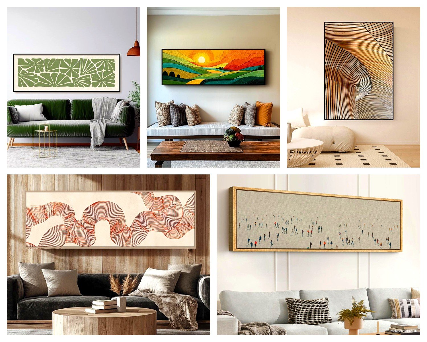
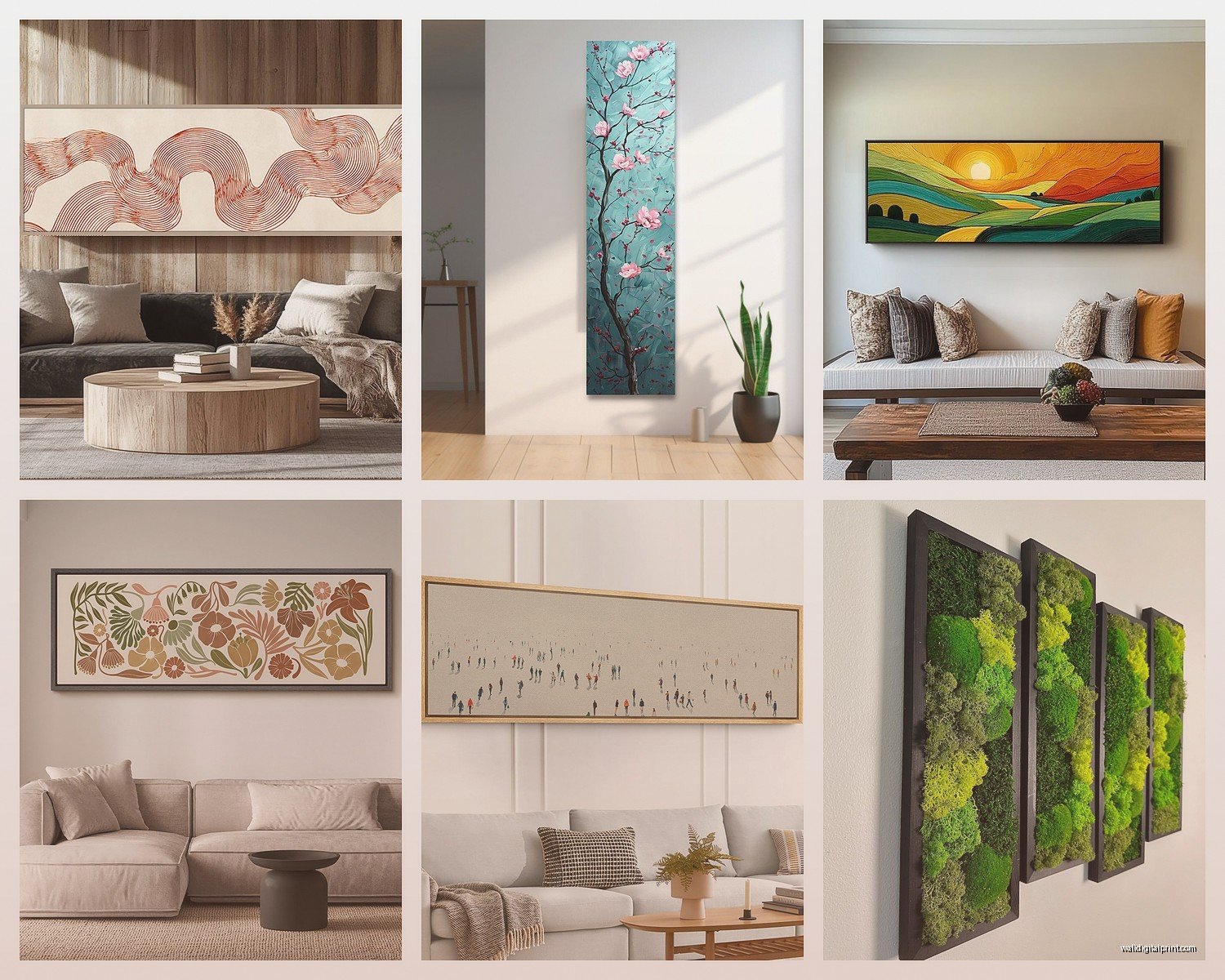
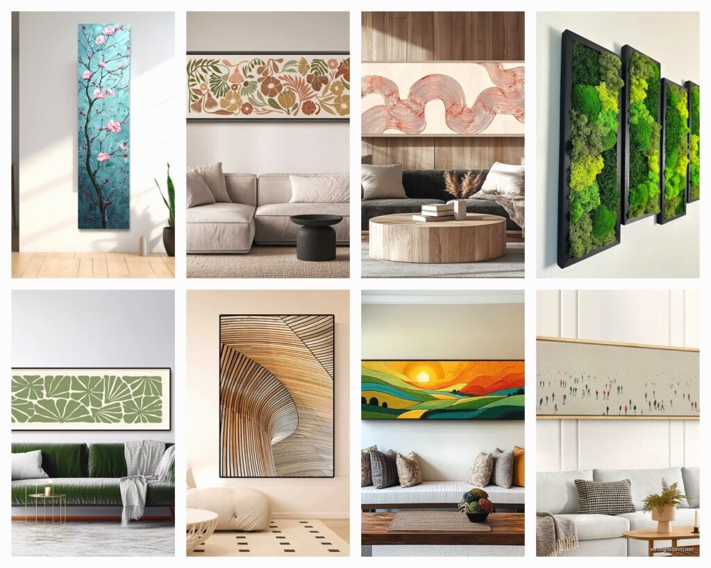
Okay so we’re talking about pieces where the width is at least 2.5 times the height. Usually you’ll see ratios like 3:1, 4:1, sometimes even 5:1 or 6:1 for really dramatic panoramic stuff. Common sizes are 60×20, 72×24, 48×16, 36×12. Anything in that realm where it’s distinctly W I D E and narrow top to bottom.
The narrow part is what makes it tricky because you don’t have much vertical real estate to work with, so the art needs to be either really strong compositionally or it just becomes a stripe on your wall that nobody notices.
Where These Actually Work Best
Above furniture is the obvious one but there’s nuance here. Your furniture should be:
- At least 50-75% of the art width (so if your art is 60 inches, furniture should be 30-45 inches minimum)
- Low profile works better than chunky pieces
- Centered under the art or slightly offset if you’re doing asymmetrical styling
I had this client who insisted on putting a 72-inch horizontal piece above a 36-inch console and it looked like the art was floating away. We ended up flanking the console with tall plants to visually widen the base and that actually saved it.
The Hallway Situation
Oh and hallways are like THE perfect spot for horizontal narrow art that nobody thinks about. Long hallways especially. You can do a gallery wall of multiple horizontal pieces stacked or one really long statement piece. I did my own hallway with three 48×12 pieces stacked vertically with like 4 inches between them and it completely transformed what was basically a boring tunnel.
The key with hallways is hanging height because you’re usually walking past them not sitting, so I go slightly higher than the standard 57-inch center rule. More like 60-62 inches to center.
Proportion Math That Actually Matters
Gonna be real with you, most proportion “rules” are whatever, but with horizontal narrow format there’s some actual guidelines that’ll save you from returns and regret purchases.
The two-thirds rule is your friend here. Your art should be roughly two-thirds the width of the furniture below it. Not exact, like 65-75% is the sweet spot. So:
- 60-inch sofa = 40-45 inch art
- 72-inch console = 48-54 inch art
- 48-inch bed headboard = 32-36 inch art
I broke this rule intentionally in my dining room by going BIGGER (art was like 85% of buffet width) and it worked because the room is small and needed the drama, but that’s an advanced move. Start with two-thirds.
Height Above Furniture
Standard is 6-8 inches between furniture top and art bottom. With horizontal pieces I actually go closer to 6 inches or even 5 if the piece is really narrow (under 12 inches tall) because you need to create visual connection. Too much space and they read as separate elements instead of a unified vignette.
Wait I forgot to mention, this changes completely if you have crown molding or chair rail or any architectural details. Then you’re balancing between the furniture AND the molding and honestly that’s when I just eyeball it until it feels right.
Frame Choices That Don’t Ruin Everything
Frames matter SO much with horizontal format because the frame becomes a significant portion of what you’re seeing, especially on the narrow ends.
Thin frames (under 1 inch) work best for:
- Modern and contemporary spaces
- When you want the art to feel light and floating
- Smaller pieces under 48 inches
- Photo-based or minimalist art
Thicker frames (2-3 inches) work for:
- Traditional spaces
- Creating more presence with smaller art
- Transitional styles where you need the frame to bridge modern art with traditional furniture
I made the mistake of putting a 3-inch ornate gold frame on a 60×15 modern abstract and it looked like the frame was eating the art. The proportions were just off. Switched to a simple 0.75-inch black float frame and suddenly the piece could breathe.
Float Frames Are Your Secret Weapon
Okay so funny story, I used to think float frames were overpriced and gimmicky until I used one on a horizontal canvas. The gap between the art and frame creates this shadow line that adds perceived depth, which is CRUCIAL when your art is only 12-16 inches tall. It tricks the eye into seeing more dimension.
They’re like $40-80 more than regular frames but for horizontal narrow format I think they’re worth it like 80% of the time.
Content and Composition Considerations
Not all art works in horizontal narrow format and this is where people mess up constantly on Etsy and those print-on-demand sites. They take a square image and just crop it horizontal and wonder why it looks weird.
Good horizontal narrow subjects:
- Landscapes (duh, but specifically panoramic views)
- Horizons, skylines, seascapes
- Abstract pieces with strong horizontal movement
- Typography or text-based art
- Botanical prints of branches or vines
- Architectural elements like bridges or buildings
Bad horizontal narrow subjects:
- Portraits (unless intentionally cropped for effect)
- Anything with a strong vertical element as the focal point
- Busy patterns that need vertical space to resolve
- Circular or radial compositions
I see so many people trying to force portrait subjects into horizontal format and it just doesn’t work compositionally. Like cropping a face so you only see eyes and forehead? That’s not artistic, that’s awkward.
Multi-Panel vs Single Panel
This is gonna sound weird but I actually prefer single panel for horizontal narrow format most of the time. Multi-panel (like triptych) can work but the breaks in a narrow format create these visual interruptions that fragment the flow.
That said, if you’re doing multi-panel:
- Keep spacing minimal, like 1-2 inches between panels
- Make sure the composition flows across all panels
- Consider going frameless/canvas wrap to reduce visual bulk
I did a 72-inch piece split into three 24-inch panels for above a king bed and the breaks actually helped because the bed was so wide it needed the segmentation. But for above a sofa or console? Usually single panel reads better.
The Canvas Wrap Debate
Canvas wrap (where the image continues around the sides) works great for horizontal format IF the sides are at least 1.5 inches deep. Anything less looks cheap and thin. I usually specify 2-inch depth for pieces over 48 inches wide.
Downside is canvas wrap limits your reframing options later, so if you’re the type who redecorates every few years maybe go with a framed print instead.
Lighting These Things Properly
Horizontal narrow art needs different lighting than standard proportions because the shape affects how light hits it. Regular picture lights don’t work as well because they’re designed for taller pieces.
Options that actually work:
Track Lighting: Adjustable heads let you angle light across the width. Position about 24-30 inches from the wall, angled down at 30 degrees.
Linear LED Strips: Mounted above the art (hidden or visible depending on your style). These are my favorite for really long pieces over 60 inches because they light the entire width evenly.
Wall Sconces: Flanking the art instead of lighting from above. Creates drama and works especially well in hallways or above beds where you can’t easily mount overhead lighting.
I installed LED strips above my 72-inch piece in the living room and my cat immediately decided the warm glow made it the perfect napping spot on the console below, so now the art is also a cat spotlight which wasn’t the intention but whatever.
Common Mistakes I See Constantly
Hanging too high is number one. People use the 57-inch rule without considering the narrow height means the center is already pretty low, so following standard rules makes these pieces float awkwardly.
Going too small for the space. Because the format is narrow, people underestimate how much width they need. A 36-inch horizontal piece above a 60-inch sofa looks dinky. You need at least 48 inches, probably more.
Ignoring the room’s other horizontal lines. If you have strong horizontal elements (like wood plank walls, shiplap, or prominent baseboards) your art needs to either align with those lines or deliberately contrast them. Misaligned horizontals create visual chaos.
The Sectional Problem
Sectionals are tricky with horizontal art because where do you even center it? Over the longest section? Over the corner? I usually center it over the main seating section (wherever people actually sit most) and let the sectional’s other parts do their own thing. Or I go really wide, like 80+ inches, so it spans multiple sections.
Alternatively just don’t put art above your sectional and do a large square or vertical piece on an adjacent wall. Not every sofa needs art above it and that’s fine.
Buying Considerations and Sources
Custom sizing is your friend with this format because standard sizes often don’t match your specific needs. I use a few print-on-demand services that let you specify exact dimensions:
- Printful for canvas wraps (decent quality, ships fast)
- Framebridge for custom framing of existing prints
- Local frame shops for unique sizes and mat combinations
Etsy is hit or miss. Filter for sellers who offer custom sizing and check reviews for print quality. I’ve gotten amazing stuff and complete garbage from Etsy, it’s really seller-dependent.
Original art in horizontal narrow format is harder to find because artists tend to work in standard proportions. But photography and digital art lends itself better to custom cropping, so that’s where I focus.
Price Reality Check
Expect to pay more per square inch for horizontal narrow format, especially custom sizes. A 60×20 canvas (1200 sq in) often costs as much as a 30×40 (1200 sq in) because the custom cutting and stretching is more complex. Frames are also pricier because custom widths.
Budget-wise I tell people to expect:
- $80-150 for decent quality print + basic frame in 48-60 inch range
- $200-400 for higher quality with float frame or premium materials
- $500+ for original art or limited editions
You can definitely find cheaper on Amazon or HomeGoods but quality is usually meh and the art itself is generic.
Styling the Space Around It
The art shouldn’t float alone. With horizontal narrow format especially, you need supporting elements or it looks like a random stripe.
Below the art, style with:
- Books or objects with varying heights (creates visual movement)
- Plants or greenery (softens the horizontal line)
- Symmetrical pairs of objects (lamps, vases, candlesticks)
- Lean smaller art pieces for layered look
Keep objects lower than halfway up the art height or they compete visually. So if your art is 20 inches tall, objects should be under 10 inches.
I learned this when I put tall candlesticks under a horizontal piece and it created this weird visual barrier where your eye couldn’t decide what to focus on. Swapped for low bowls and suddenly everything clicked.
The negative space between furniture and art matters too. That 6-8 inch gap should feel intentional, not accidental. Sometimes I paint the wall a different color in that zone or add subtle wallpaper to make it feel designed.
Anyway that’s most of what I’ve figured out through trial and error with these pieces. The format is really versatile once you understand the proportion rules and where it works best spatially. Start with measuring your furniture, figure out your width needs, then find art that fits those parameters rather than falling in love with art first and trying to make it fit.