Wall Art Guide, Wall Art Tutoriels
Matching Wall Art: Coordinated Sets & Collections
Apr
So I was reorganizing my living room last month and realized I had like seven random art pieces that absolutely did not work together, and it got me thinking about coordinated sets because honestly they’re kind of a game-changer when you don’t want your walls looking like a Pinterest board that had a nervous breakdown.
The Whole Matching vs Coordinated Thing
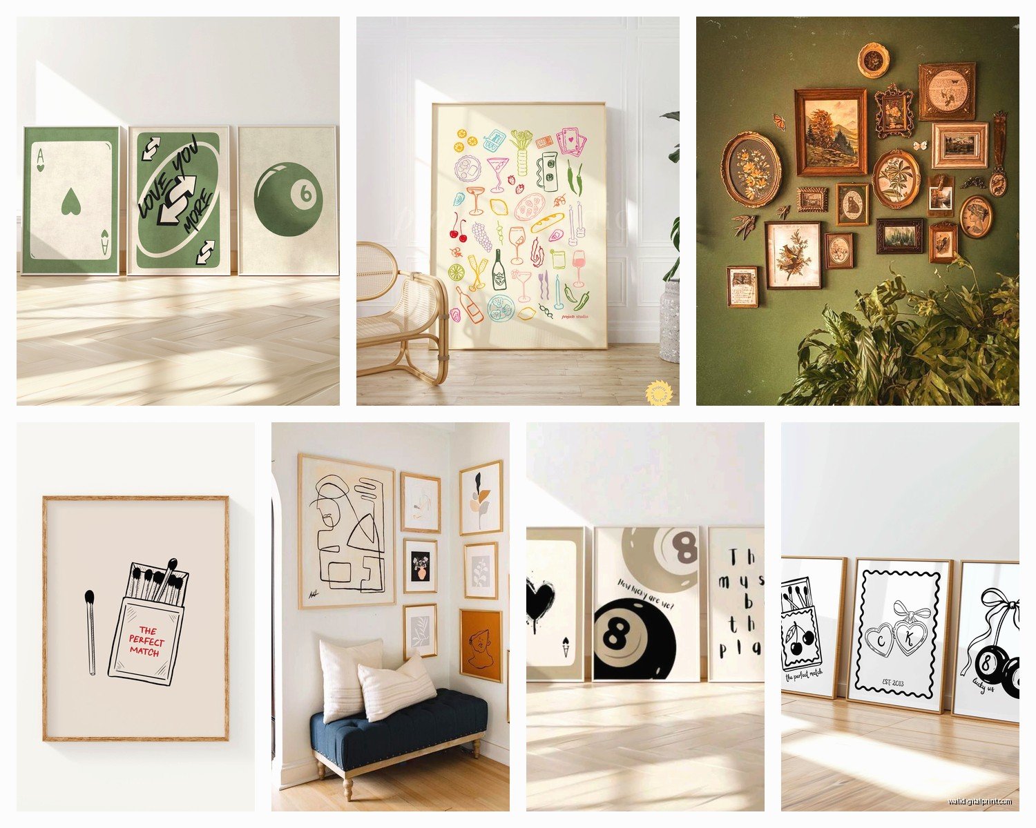
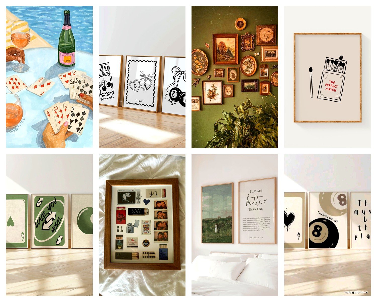
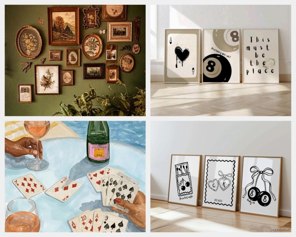
Okay first off, matching and coordinated aren’t the same thing and this matters more than you’d think. Matching is like those sets you see at HomeGoods where it’s literally the same image split into three panels (triptychs, if we’re being fancy). Coordinated is more like… they share a color palette or theme but aren’t identical. I’ve used both and honestly coordinated tends to look less catalog-y if that makes sense.
The triptych thing can work really well over a sofa though. I did this for a client’s media room with an abstract ocean piece split three ways and it looked expensive even though we got it on sale. The key is making sure they’re hung with like 2-3 inches between panels max, otherwise it just looks like you couldn’t commit to one piece.
Materials That Actually Matter
Canvas prints are probably what you’ll see most often in coordinated sets. They’re lightweight, you don’t need glass, and they have that gallery wrap thing going on where the image continues around the edges. I’ve got a set of three botanical prints in my hallway that are canvas and they’ve held up for like three years now without fading, but they’re not in direct sunlight which is key.
Framed prints are the other main option and here’s where it gets tricky. You want the frames to actually match if you’re doing a set—same color, same width, same finish. I learned this the hard way when I bought what I thought were matching black frames and one was matte and two were glossy and it drove me insane until I returned them. Also the matting needs to be consistent. White mats are safe but can look builder-grade depending on the art.
Metal prints are having a moment right now and they work really well for modern or industrial spaces. They’re literally printed on aluminum sheets and the colors pop like crazy. I used a set of three geometric designs in a client’s home office and they looked super high-end. They’re pricier though, gotta be honest about that.
Acrylic and Glass Options
Acrylic prints (also called plexiglass prints sometimes) give you this really glossy, almost 3D effect. They’re stunning for photography or artwork with a lot of depth. I have a coordinated set of cityscape photos in my bedroom that are acrylic-mounted and the reflection quality is chef’s kiss. But they show fingerprints and dust like nobody’s business. If you have kids or are generally not great at dusting (hi, me), maybe skip these for high-traffic areas.
Wood prints are another thing I’ve been seeing more of. The image is printed directly onto wood planks and you can see the grain through the image which gives this rustic-meets-modern vibe. Got a set for my sister’s farmhouse kitchen—three herb illustrations on cedar—and they smell amazing which is a weird bonus I wasn’t expecting.
How to Actually Choose a Coordinated Set
Okay so funny story, I spent like two hours last Tuesday comparing sets online because my cat knocked over a plant and water damaged this art I had and I needed to replace the whole arrangement. Here’s what I figured out.
Start with your room’s existing colors. Pull up a photo of your space on your phone and compare it while you’re shopping online. I know this sounds obvious but I’ve ordered things that looked perfect on the website and then got them home and they clashed horribly with my rug.
Color Coordination Approaches
Monochromatic sets are all variations of one color—like different shades of blue or grey. These are super safe and work in almost any room. I use a monochromatic grey set in my guest room because it’s calming and doesn’t compete with anything.
Analogous color sets use colors that are next to each other on the color wheel. Think blue-green-teal or yellow-orange-red. These have more energy but still feel cohesive. I did a blue-purple-teal set in a client’s bathroom and it made the whole space feel more expensive somehow.
Complementary sets use opposite colors—like navy and coral or green and pink. These are riskier but can look really dynamic if your room is otherwise pretty neutral.
The size thing is where people mess up constantly. You need to measure your wall space before you buy anything because a set that looks perfect online might be tiny in real life. I use painters tape to mark out dimensions on the wall before ordering—looks ridiculous but saves returns.
Layout Configurations That Don’t Suck
Three-piece sets are the most common and there are like a million ways to arrange them. The basic horizontal line is classic—just hang them in a row at the same height. Center the middle piece at eye level (about 57-60 inches from the floor) and work outward. This works great over sofas, beds, console tables, whatever.
Vertical stacking is good for narrow wall spaces like next to doorways or in hallways. I have a vertical three-piece set of abstract florals going up my stairwell wall and it draws your eye upward which makes the ceiling feel higher.
The offset grid is trendier and a bit more casual. You stagger the pieces at different heights but keep them relatively close together. This works better with smaller pieces—like 12×12 or 16×16. I did this in my home office with four square botanical prints and it feels less formal than a straight line.
Gallery Wall Integration
Wait I forgot to mention—you can totally use a coordinated set as the anchor for a larger gallery wall. I do this all the time actually. Use your three or four piece coordinated set as the focal point and then fill in around it with smaller, complementary pieces. The coordinated set keeps everything from looking too chaotic.
The trick is keeping your spacing consistent throughout the whole wall. I use 2-3 inches between all pieces regardless of size. Some people go tighter at like 1-2 inches which can look good but feels crowded to me.
Where to Actually Buy These
Online is obviously huge now. I probably get 60% of my art from online retailers these days. Etsy has a ton of downloadable print sets which are super affordable—you just download the files and get them printed at a local print shop or online printing service. Quality varies wildly though so read the reviews and check the resolution before buying.
Society6 and Redbubble let artists upload designs and you can buy them as various types of prints in different sizes. The selection is massive but it can feel overwhelming. I usually search by color or style to narrow it down.
Framebridge does custom framing for coordinated sets and while they’re not cheap, the quality is really good. You can send them prints you already have or order new ones through them. I used them for a client who had family photos she wanted turned into a coordinated set and they came out beautifully.
In-Person Shopping
HomeGoods and TJ Maxx have coordinated sets pretty regularly and they’re well-priced. The downside is you can’t return them if you change your mind, and the selection is totally random. I check every couple weeks when I’m near one because sometimes you find amazing stuff.
West Elm and Crate & Barrel have curated collections that are designed to work together. More expensive but the quality is consistent and they actually coordinate properly instead of just being random pieces grouped together.
Local art fairs and markets are underrated for finding coordinated sets. I got a gorgeous three-piece watercolor set at a farmers market last summer from a local artist and she even customized the colors slightly to match my space. Plus you’re supporting actual artists which feels good.
The Framing Situation
If you’re buying unframed prints (which are way cheaper), you gotta figure out framing. Standard sizes like 11×14, 16×20, or 24×36 are your friends because you can get inexpensive frames at Michael’s, IKEA, or Amazon. Custom sizes will cost you way more to frame.
IKEA frames are honestly pretty decent for the price. The RIBBA and FISKBO lines are my go-to for budget projects. They’re not heirloom quality but they look fine from a normal viewing distance. I’ve used probably 50 of them over the years.
For nicer framing, I use a local frame shop for special pieces but American Frame online is good too. They have tons of options and you can get exactly what you need. Takes longer to receive them obviously but the quality is solid.
DIY Framing Tips
Mat cutting is actually not that hard if you wanna save money. You need a mat cutter (about 30 bucks for a basic one) and some practice foam core. YouTube has a million tutorials and once you get the hang of it you can custom mat anything. I did this for like six months before I got lazy and went back to buying pre-cut mats.
Float mounting is this technique where the print appears to float inside the frame with space around all edges. It looks really modern and high-end. You can buy float frames or DIY it with spacers. I have a three-piece photography set in my dining room that’s float-mounted and people always ask where I got them framed.
Themes That Actually Work Together
Abstract coordinated sets are probably the easiest to work with because they’re not literal representations of anything. You can find sets with coordinating colors or shapes that tie together without being too matchy. I lean toward these for clients who are nervous about art choices because they’re hard to hate.
Botanical prints in coordinated sets are having a huge moment. Like those vintage-style plant illustrations or modern minimalist leaf prints. They work in literally every room—I’ve used them in kitchens, bathrooms, bedrooms, living rooms. Can’t go wrong honestly.
Typography and quote sets can be cool if they’re not too cheesy. I did a three-piece set in a client’s home gym with motivational words but we kept them minimal and graphic instead of the live-laugh-love vibe. Black and white, simple fonts, looked sharp.
Photography series work really well—like three shots from the same location or event, or a color story across multiple images. I have a set of three beach photos in slightly different lighting conditions in my bathroom and the progression is really soothing somehow.
The Installation Part Nobody Talks About
Okay so you’ve got your coordinated set and now you gotta hang it without destroying your walls or your sanity. Paper templates are your best friend here. Trace or measure each piece onto paper, tape the paper to the wall, and adjust until it looks right. Then you can mark your nail holes through the paper.
Laser levels make everything easier. I resisted buying one for years because it seemed unnecessary but oh my god it’s not. Twenty bucks on Amazon and suddenly everything is actually straight instead of “looks straight enough.”
For lightweight pieces (under 10 pounds), regular picture hanging nails work fine. For heavier stuff you need wall anchors or find studs. I use a stud finder app on my phone half the time because I keep forgetting where I put my actual stud finder and honestly the app works surprisingly well.
Command strips are great for renters or if you’re commitment-phobic about placement. They hold more weight than you’d think and don’t damage walls. I’ve used them for pieces up to about 15 pounds with no issues. Just make sure you follow the directions exactly—gotta press them firmly and wait the full hour before hanging.
Mixing Sets With Other Stuff
You don’t have to hang coordinated sets in isolation. I mix them with other art all the time. The key is having the set be the dominant element and other pieces play supporting roles. Like if you have a three-piece blue abstract set, you might add a smaller black and white photo nearby or a decorative mirror.
Scale matters when you’re mixing. If your coordinated set pieces are 16×20, don’t put a massive 30×40 piece right next to them or the set will look wimpy. Keep additional pieces smaller or at least not dramatically larger.
Layering is trendy right now—like putting art on shelves instead of hanging everything. You can do a coordinated set on a picture ledge and layer smaller pieces in front. This works great because you can rearrange stuff easily without putting new holes in the wall. I have floating shelves in my office with a coordinated set in back and smaller frames layered in front and I change it up seasonally when I’m bored.
When to Break the Rules
Sometimes intentionally mismatched frames can look cool with coordinated prints. Like if the prints themselves coordinate really well color-wise, mixing brass, black, and wood frames can add texture and interest. I did this in a client’s eclectic living room and it worked because the rest of the space had that collected-over-time vibe.
Mixing orientations—like two horizontal and one vertical piece from the same collection—can create visual interest too. You just gotta be more thoughtful about the layout. This works better with abstract or geometric prints than with photography usually.
Oh and another thing—you can split up a coordinated set across different rooms if they’re adjacent or visible from each other. I put two pieces from a four-piece set in my living room and two in the connected dining area and it creates this nice flow between spaces.
Look I’m gonna be honest, the best way to figure out what works is to just try stuff. Order a set, use that return policy if it doesn’t work, and don’t overthink it too much. I’ve been doing this professionally for years and I still sometimes hang things, live with them for a few days, and then move them around because they’re not quite right. That’s totally normal and actually part of the fun once you stop stressing about making everything perfect immediately.