Wall Art Guide, Wall Art Tutoriels
Mauve Wall Art: Dusty Purple Pink Soft Decor
Mar
So I’ve been totally obsessed with mauve wall art lately and honestly it started because a client asked for “something that’s not millennial pink but also not too purple” and I was like…okay that’s weirdly specific but here we are. Turns out mauve is having this massive moment and I get why because it’s somehow both warm and cool at the same time which sounds impossible but just trust me on this.
Why Mauve Actually Works Better Than You’d Think
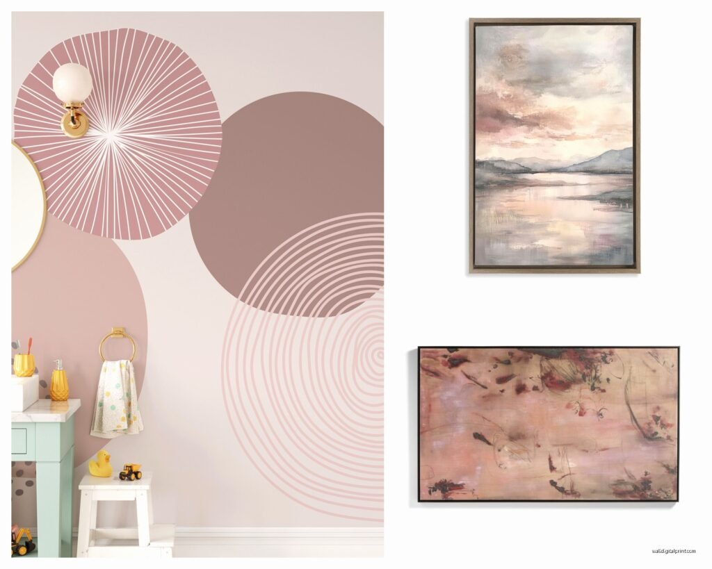
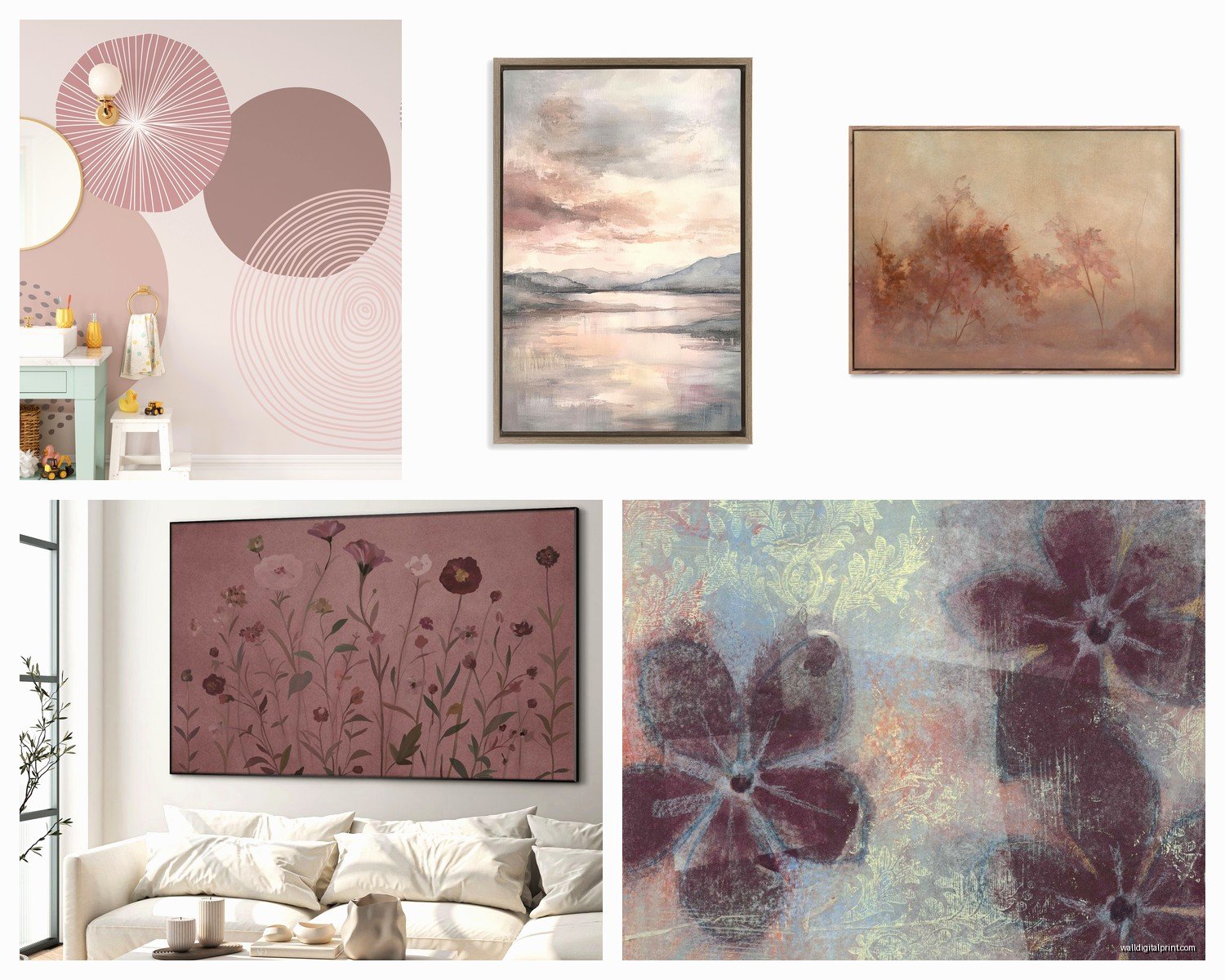
The thing about mauve wall art is it reads completely different depending on your lighting. Like I hung this dusty mauve abstract piece in my own hallway that gets northern light and it looks almost gray-lavender, but then I used something similar in a west-facing bedroom for a project and suddenly it’s got these peachy pink undertones coming through. You gotta test this stuff in your actual space because the photos online are basically lying to you half the time.
I usually tell people to order samples or at least be prepared to return stuff because what looks like a soft purple-pink on your phone screen might show up looking straight up lilac or even brown-toned depending on the print quality and your wall color. Speaking of which, mauve works insanely well on warm white walls but looks kinda dead on cool bright white. Just something to keep in mind.
What to Actually Look For When You’re Shopping
Okay so the finish matters way more than anyone tells you. I’ve tested matte, glossy, canvas, and those weird textured ones that are trying to look like original paintings.
- Matte prints in mauve tones feel more sophisticated and modern, less “I bought this at HomeGoods” vibes
- Canvas works if you’re going for that soft romantic look but can read too precious if your space is more minimal
- Glossy finishes make mauve look more vibrant and saturated which might be what you want or might be too much
- Framed vs unframed is gonna change the whole vibe – black frames make mauve pop more purple, natural wood pulls out the dusty pink, white frames keep it super soft
Size Really Does Matter Here
This is gonna sound weird but mauve art looks better larger than you think you need. Like I had this 16×20 mauve botanical print that just disappeared on the wall, swapped it for a 30×40 and suddenly the whole room felt intentional instead of like I forgot to finish decorating. The soft tones don’t have the same visual weight as bold colors so you gotta compensate with scale.
Oh and another thing – if you’re doing a gallery wall with mauve pieces, you need at least one darker anchor piece or it all just floats there looking washed out. I learned this the hard way when I spent like three hours arranging seven different mauve prints and my husband walked in and said “are those all the same picture” and I wanted to cry but also he had a point.
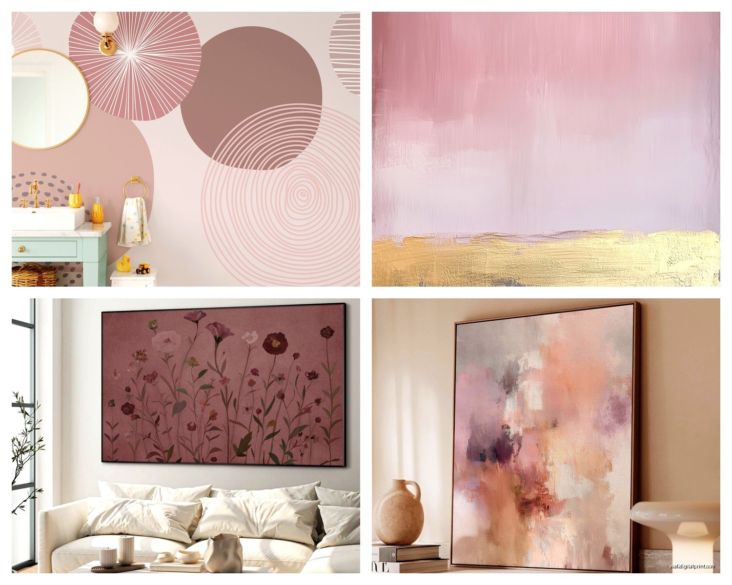
Mixing Mauve with Other Colors
So here’s where it gets fun because mauve plays well with almost everything which makes it super forgiving. I’ve mixed it successfully with:
- Sage green – this combo is everywhere right now and yeah it’s trendy but it genuinely looks good, very calming
- Terracotta and rust tones – brings out the warmer dusty pink side of mauve
- Navy or charcoal – makes the mauve feel more serious and less feminine if that’s a concern
- Cream and ivory – keeps everything soft and layered
- Gold accents – this elevates it immediately, very glam
What doesn’t work as well: bright white (makes mauve look dingy), true red (just looks confused), bright yellow (fights with the purple undertones). I tried mauve with a coral piece once and it was a disaster, looked like everything was just slightly the wrong color.
Abstract vs Figurative Mauve Art
Okay so I go back and forth on this. Abstract mauve art – like watercolor washes or geometric shapes – tends to read more modern and works in contemporary spaces. It’s also more forgiving because nobody’s gonna judge if the mauve is too purple or too pink, it just is what it is.
Figurative stuff like florals or landscapes in mauve tones can look really sophisticated but there’s a fine line before it starts feeling vintage in a bad way. I used a mauve peony print in a client’s dining room and it’s gorgeous, very elegant, but I also almost bought this mauve landscape that looked like a 1980s hotel painting so you gotta be careful.
Photography in mauve tones is having a moment too – like desert landscapes or architectural photos with that dusty pink-purple filter applied. These can be really striking and feel more collected and personal than obvious art prints.
Where to Actually Find Good Mauve Wall Art
I’ve wasted so much money figuring this out so learn from my mistakes. Etsy is great for unique stuff and you can usually message sellers about customizing colors, but quality is super inconsistent. I’ve gotten museum-quality prints and also things that looked like they were printed on regular printer paper, so check reviews obsessively.
Society6 and Minted have decent quality control and their mauve options are pretty extensive. The color reproduction is generally reliable which matters when you’re ordering online. Wait I forgot to mention – always check if they show the art in a room setting because that helps so much with scale and color accuracy.
For higher-end stuff, Artfully Walls and Framebridge do really beautiful work. The framing options are better quality and you can get actual art consultation which helps if you’re unsure. It’s pricier but worth it for main spaces like living rooms or primary bedrooms.
Target and West Elm both have mauve art options that are surprisingly decent for the price point. I bought a mauve abstract from Target for like $40 for a staging project and it looked way more expensive than it was. West Elm tends more towards the dusty pink side of mauve in my experience.
How to Hang Mauve Art Without It Looking Flat
This is where lighting becomes your best friend. If you can, add a picture light or use track lighting to highlight mauve pieces because the dimensional tones really come alive with direct light. Without good lighting, mauve art can just disappear into your wall.
Layer it with other textures and depths – like if you have a mauve print, put it near something with physical texture like a woven wall hanging or a shelf with objects. The flatness of mauve tones needs contrast or it all reads as one surface.
Height matters too. I hang mauve art slightly lower than I would with bolder colors because it’s softer and more intimate. The standard “57 inches to center” rule works but I usually go more like 54-55 inches for bedroom spaces with mauve art.
The Whole Undertone Situation
Okay this is complicated but important. Mauve has like five thousand different undertones and they all work differently. The more purple-leaning mauves (sometimes called lilac or lavender-adjacent) work better in cool-toned spaces with gray or blue elements. The dusty pink mauves work better in warm-toned spaces with wood and neutral beiges.
There’s also this brownish-mauve situation happening right now that’s very earthy and works beautifully with natural materials but can look muddy if your lighting isn’t right. I used a brown-mauve landscape in a client’s office with a lot of wood furniture and it was perfect, very grounded.
My dog knocked over a plant onto one of my sample mauve prints which actually showed me that the paper quality matters for longevity – the cheap one immediately water-damaged but the nicer one from Minted basically wiped clean. So there’s that.
Styling Around Mauve Wall Art
Don’t try to match your throw pillows exactly to your mauve art. I see this all the time and it looks too coordinated, like a hotel room. Pull one of the accent colors from your mauve piece instead – if there’s a hint of green or gold or cream, echo that in your textiles.
Wood tones matter here. Light oak and maple bring out the pink in mauve, walnut and darker woods bring out the purple. I did a whole bedroom around a large mauve abstract with mostly light wood furniture and white bedding and it felt very Scandinavian and calm.
Metallics are your friend – brass and gold warm up mauve beautifully, silver and chrome keep it cooler and more modern. I prefer brass with dusty pink-leaning mauve and black metal with purple-leaning mauve but that’s just personal preference.
Common Mistakes I See People Make
Using too much mauve. Like one or two pieces is sophisticated, five mauve prints makes it look like you’re trying to match a specific Pantone color for some reason. Spread it out or mix in other colors.
Hanging mauve art in rooms with bad lighting and then wondering why it looks gray and sad. It needs light, either natural or artificial.
Buying tiny mauve prints for big walls. The color is too subtle, you need scale.
Putting mauve art directly next to bright colors. It just makes the mauve look washed out and indecisive. Give it space or transition through neutrals.
Not considering the room’s purpose – mauve works great in bedrooms, living rooms, home offices, even dining rooms, but can feel a little flat in kitchens or bathrooms where you usually want more energy.
Seasonal Considerations That Actually Matter
This sounds ridiculous but mauve art reads differently in winter versus summer. In summer with bright natural light, it looks fresher and more pink-toned. In winter it can look more muted and purple-gray. I actually swapped out a mauve piece in my own bedroom for something warmer in December because it was making the room feel too cold.
If you live somewhere with dramatic seasonal light changes, consider choosing mauve art with some warmer accent colors mixed in so it doesn’t feel too stark in winter months. Or just commit to the seasonal swap thing, which is more work but keeps things interesting.
DIY Mauve Art If You’re Feeling Ambitious
Okay so I tried making my own mauve abstract art using watered-down acrylics and it was actually pretty easy and way cheaper than buying something. You need white or cream canvas, mauve acrylic paint, water, and maybe some complementary colors like sage or terracotta.
The key is layering super thin washes and letting them dry between layers. I was watching that show about the couple renovating the house in Scotland and just kept adding layers during commercial breaks. It took like three days total but most of that was drying time.
You can also print your own if you find copyright-free images or take your own photos and add mauve filters. Print quality matters though – I went to a local print shop instead of using my home printer and it made a huge difference. Cost like $25 for a 24×36 print which is way cheaper than buying art.
Oh and if you watercolor at all, mauve tones are super forgiving for beginners because they’re already soft and organic-looking so mistakes just look intentional.