Wall Art Guide, Wall Art Tutoriels
Metalplex Wall Art: Brand Metal Print Collection
Feb
Okay so I’ve been working with Metalplex prints for like six months now and honestly I was skeptical at first because metal prints can go either really high-end or really cheap-looking with zero in between. But a client wanted something for her downtown loft and I ordered three different sizes to test and here’s what actually matters.
The Material Thing Everyone Gets Wrong
So Metalplex uses aluminum panels that are way lighter than you’d think. I’m talking you can hold a 24×36 with one hand no problem. The printing process they use is dye sublimation which basically means the ink gets infused INTO the metal not just printed on top. This matters because I had one hanging in a bathroom with terrible ventilation for four months and zero fading. My cat knocked over a plant onto another one and the water just wiped right off.
The finish options are where people get confused though. They have glossy and matte and you gotta think about your lighting situation before you order. Glossy looks absolutely stunning with the color vibrancy but if you’re hanging it opposite a window or under track lighting you’re gonna get glare. Found this out the hard way in my own dining room and had to swap it to a matte finish.
Glossy vs Matte Real Talk
- Glossy works best in galleries, hallways, or walls perpendicular to windows
- Matte is your friend for offices, bedrooms, anywhere with lots of ambient light
- The color depth on glossy is like 30% more vibrant I’m not even exaggerating
- Matte hides fingerprints better if you have kids or you’re putting it in a high-traffic area
Size Selection Without Losing Your Mind
Oh and another thing about sizing that nobody tells you. Metal prints look smaller on the wall than canvas or framed prints of the same dimensions. Something about the sleek profile and no frame makes your eye read it differently. I always go one size up from what I’d choose for a traditional print.
For reference I did a 16×20 above a console table that’s 48 inches wide and it looked weirdly small even though technically the proportions were right. Swapped it for a 24×36 and suddenly the whole vignette worked. The sales rep at Metalplex told me later they recommend filling about 60-75% of your furniture width which is way more than the standard 50-60% rule for framed art.
Space-Specific Sizes That Actually Work
Living room main wall: you want 40×60 or bigger honestly. I did a 48×72 for a client last month and it’s the perfect statement piece without being overwhelming.
Bedroom above bed: 36×48 hits that sweet spot. Big enough to anchor the space but you‘re not gonna feel like it’s looming over you when you’re trying to sleep.
Bathroom or powder room: 11×14 or 16×20 max because these spaces are usually tight and you want it to feel curated not cramped.
Home office: multiple smaller pieces work better than one large. I’m obsessed with doing three 20×20 squares in a row right now.
The Mounting Situation
Wait I forgot to mention the mounting system is actually genius. Metalplex uses this float mount system on the back with these aluminum bars that sit about an inch off the wall. Creates this shadow effect that makes the print look like it’s floating which is very modern and clean.
You don’t need a frame obviously since it’s metal but that also means you gotta be more precise with placement because there’s no frame to hide wall imperfections. I learned this when I hung one in an old brownstone with walls that were definitely not straight and you could totally tell the print was slightly crooked even though it was level because the ceiling line was off.
Installation Tips From Someone Who’s Hung Like 50 of These
- Use a level obviously but also step back every few seconds because these catch light differently at different angles
- The float mounts are secure but for anything over 30 inches I always use two hanging points not one
- Drywall anchors are your friend unless you hit a stud which honestly never happens where you need it
- Leave about 8-12 inches from the ceiling so it doesn’t feel crammed up there
- Eye level is 57 inches from the floor to the center of the print this is the museum standard and it really does work in homes too
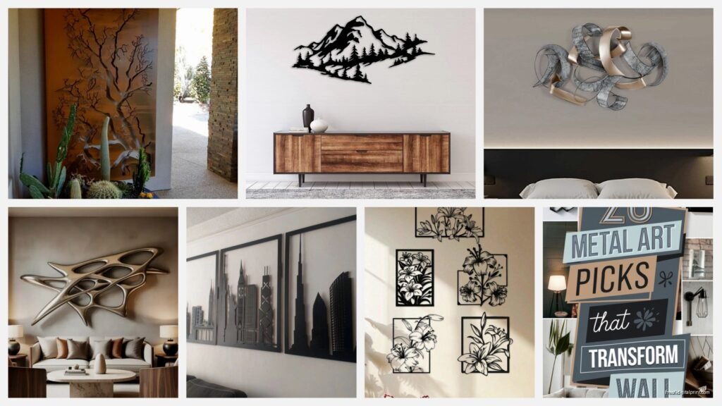
Image Selection Because This Makes or Breaks It
Okay so funny story I uploaded this gorgeous photo I took in Iceland and it looked absolutely terrible as a metal print. Turns out really soft, misty, atmospheric photos don’t translate well to metal. The medium wants bold colors, strong contrast, sharp details.
My dog was sleeping on the couch while I was editing photos for another Metalplex order and I realized that high-contrast images with defined subjects work way better than subtle gradient stuff. Abstract art with bold colors looks incredible. Landscape photography with punchy editing is chef’s kiss. Black and white can work but it needs strong contrast not that soft grayscale look.
What Looks Amazing on Metal
- Bold abstract art especially with geometric shapes
- High-contrast photography think bright blue skies against architecture
- Urban photography with lots of lines and detail
- Macro photography especially nature stuff with vibrant colors
- Graphic design pieces with solid color blocks
What Doesn’t Work Great
- Soft romantic landscapes with lots of fog or mist
- Vintage-style photos with intentional grain
- Subtle watercolor-style art
- Photos with lots of skin tones as the main subject because metal can make them look too cool-toned
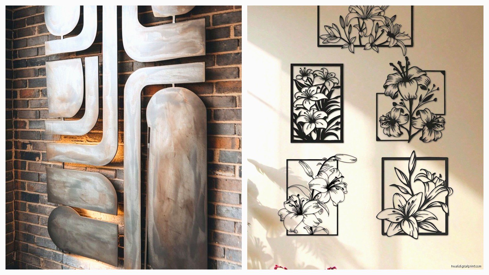
The Collection Approach vs Single Statement Piece
This is gonna sound weird but I’ve found Metalplex prints work better in odd numbers when you’re doing collections. Three, five, seven. Even numbers feel too formal for the modern vibe metal gives off.
I did a gallery wall last week with five different sizes all in the same color family and it’s probably my favorite install this year. Started with the largest piece slightly off-center then built around it asymmetrically. The beauty of metal is you can get closer to each other with the spacing because there’s no bulky frames competing for visual space.
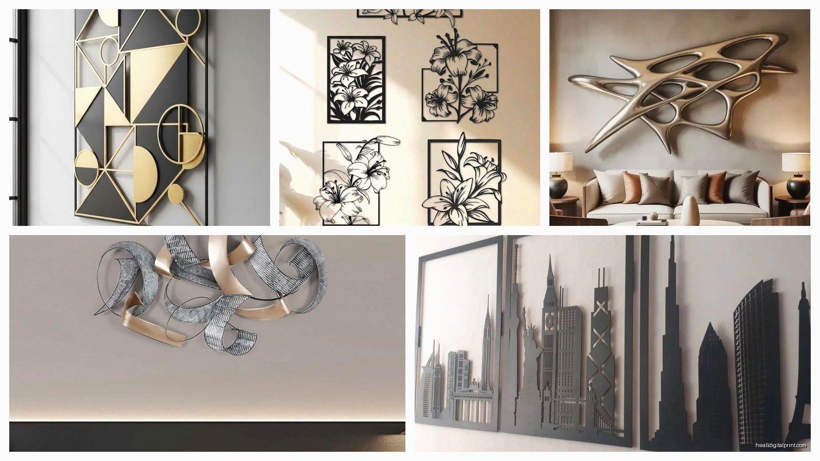
For spacing I do 2-3 inches between prints in a collection. Any closer feels crowded, any further and they read as separate pieces instead of a cohesive collection.
Cleaning and Maintenance Real Quick
These are ridiculously low maintenance which is why I love specifying them for clients. Microfiber cloth and water that’s literally it. I spilled red wine on one at a dinner party last year and it wiped right off no staining.
The surface is scratch-resistant but not scratch-proof so don’t like scrub it with anything abrasive. I keep a microfiber cloth in my cleaning caddy and just wipe them down when I notice dust which is maybe once a month? They don’t attract dust the way canvas does.
Price Point Reality Check
Not gonna lie these aren’t cheap but they’re also not as expensive as high-end framed prints when you factor in the framing cost. A 24×36 runs around $150-200 depending on if they’re running sales. But you’re getting a finished piece that’s ready to hang no frame needed.
I tell clients to think of it as an investment piece because the durability is insane. I have prints from Metalplex that are five years old and look identical to when I first hung them. Compare that to cheap canvas prints that start sagging or fading after a year.
Wait I should mention their customer service is actually responsive which is rare. I had an issue with a print arriving with a tiny dent in the corner and they replaced it within a week no hassle. The packaging is solid too lots of corner protection and bubble wrap.
Color Accuracy Thing You Should Know
The colors print slightly more saturated than they appear on your screen. This is usually a good thing because it makes the final piece more impactful but if you’re trying to match specific brand colors or you want a really subtle palette you might wanna request a proof first.
I always edit my images slightly less saturated than I want the final result knowing the metal process will pump them up a bit. Blues especially come out really vibrant almost electric if your original image is already punchy.
Editing Tips Before Upload
- Boost contrast by about 10-15% more than normal
- Sharpen a bit extra since metal holds detail so well
- Watch your highlights because blown-out areas look really blown out on glossy metal
- Cooler tones tend to work better than warm tones which can sometimes skew orange
Oh and always upload the highest resolution file you have. Metalplex can handle huge files and the detail reproduction is where these prints really shine. I uploaded a 100MB file once and the print quality was insane every tiny detail visible.
Trendy vs Timeless Considerations
Metal prints themselves are having a moment right now but the sleek modern look isn’t going anywhere. I was watching this design show the other night and realized metal art has been used in high-end commercial spaces for like 20 years it’s just now becoming accessible for residential.
That said choose your images thinking long-term. Super trendy subjects are gonna date your space fast. I steer clients toward abstract pieces, nature photography, or architectural shots that won’t feel tied to a specific year or aesthetic trend.
The actual metal medium reads as contemporary but not trendy if that makes sense. It’s like how stainless steel appliances became standard they’re modern but neutral enough to work with lots of styles.
Anyway those are the main things I’ve figured out through lots of trial and error with Metalplex. They’re legit quality definitely worth it if you want something that’ll last and look expensive without the expensive framing situation.