Wall Art Guide, Wall Art Tutoriels
Modern Prints Wall Art: Contemporary Photography & Graphics
Mar
So I’ve been meaning to text you back about this whole modern prints thing because I literally just finished hanging like fifteen pieces in a client’s loft and my hands still smell like wall putty which is… anyway.
Paper Quality Actually Matters Way More Than You’d Think
Okay so first thing – the paper itself is gonna make or break the whole look. I learned this the hard way when I ordered these gorgeous abstract prints for my own apartment and they showed up looking like they were printed at a Staples. The colors were flat, the blacks looked grayish, just terrible.
Here’s what you need to know about paper types:
- Giclée on cotton rag paper – this is the gold standard honestly. It’s archival which means it won’t yellow or fade, and the texture gives it that gallery feel. I use this for anything I’m charging clients actual money for
- Fine art paper (acid-free) – slightly less expensive but still really good quality. The main thing is making sure it says acid-free because otherwise you’ll have faded prints in like two years
- Photo paper (glossy or matte) – this is what most people default to and it’s… fine? But it photographs really badly if there’s any light in the room. That glare is brutal
- Canvas – I know everyone loves canvas but honestly for contemporary photography it can look kinda cheap unless you’re spending serious money. The texture interferes with sharp details
My cat just knocked over my coffee which is perfect timing because I need to rant about something real quick.
Where to Actually Source Modern Prints Without Going Broke
People always ask me where I get prints and I’m gonna be real with you – it’s a mix of high and low. You don’t need to spend $800 on every piece but you also can’t just print everything from your home printer and expect it to look good.
For contemporary photography: Honestly Minted has stepped up their game SO much in the last couple years. Their independent artist collection is really solid and the printing quality is consistent. I’ve ordered probably 30+ pieces from them and only had one issue where the colors were off, and they reprinted it no questions asked.
Artfully Walls is another one I use a lot – they’re more expensive but they work directly with photographers and the prints come ready to hang which saves you framing costs. Well, sort of. Their frames are hit or miss.
Oh and another thing – Etsy can be amazing if you know what to look for. Search for terms like “fine art print” or “archival print” and actually read the descriptions. A lot of photographers sell their work there at way better prices than galleries. I found this incredible architectural photography series from a guy in Copenhagen for like $40 per print and they’re stunning.
The Print-on-Demand Trap
Okay so funny story – I ordered from one of those print-on-demand sites (not gonna name names but it rhymes with Bociety Bix) and the quality was so inconsistent. Like I ordered three prints from the same “artist” and they clearly came from different printers because the color calibration was completely different on each one. That’s the risk with POD sites – there’s no quality control.
Size and Scale Is Where Everyone Messes Up
This is gonna sound weird but I literally have a measuring tape in my purse at all times now because I’ve made this mistake so many times. You see a print online, it looks perfect, you order it, and then it shows up and it’s either weirdly small or way too massive for the space.
Here’s my actual process: I cut out paper to the exact dimensions I’m thinking about and tape it to the wall. Lives there for like three days while I look at it from different angles, different times of day, whatever. My partner thinks I’m insane but it WORKS.
For modern prints specifically:
- Large-scale photography (40×60 inches or bigger) works best as a single statement piece. Don’t try to do a gallery wall with huge prints, it’s too much visual weight
- Medium prints (16×20 to 24×36) are the most versatile – you can do them solo or in groups
- Small prints under 11×14 need to be in a series or they just look like afterthoughts. Group them in odd numbers, clusters of 3 or 5 work best
Wait I forgot to mention – pay attention to orientation. Portrait orientation (vertical) makes ceilings feel higher, landscape (horizontal) makes rooms feel wider. I know that sounds basic but you’d be surprised how many people just… don’t think about it.
Framing Without Wanting to Die
Okay framing is honestly where I lose most of my time and patience. Custom framing is SO expensive – like $200-400 per piece sometimes – and the turnaround time can be weeks.
My workaround strategy: I buy standard-sized prints that fit into ready-made frames. Sounds limiting but honestly there are so many good options now. IKEA’s RIBBA frames are actually decent for the price, especially the larger sizes. The black frames look modern and clean, the white ones can look a bit cheap depending on the print.
For something nicer, I go to Frame Bridge or Frameology online. You upload a photo of your print, they send you a frame, you put it in, send it back, they finish it. Costs about half of custom framing and looks professional.
The Great Matting Debate
Do you need a mat? Honestly it depends on the print style. For contemporary photography with really bold colors or graphic elements, I usually skip the mat and go edge-to-edge. It feels more modern and immediate.
But for black and white photography or anything with delicate details, a white or off-white mat gives it breathing room. The standard is 2-3 inches on the sides and top, 3-4 inches on the bottom (it’s off-center on purpose, looks more balanced somehow).
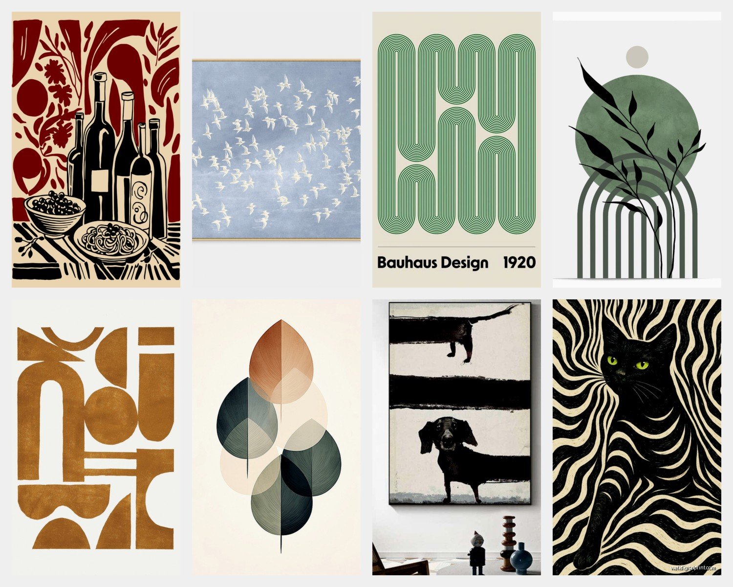
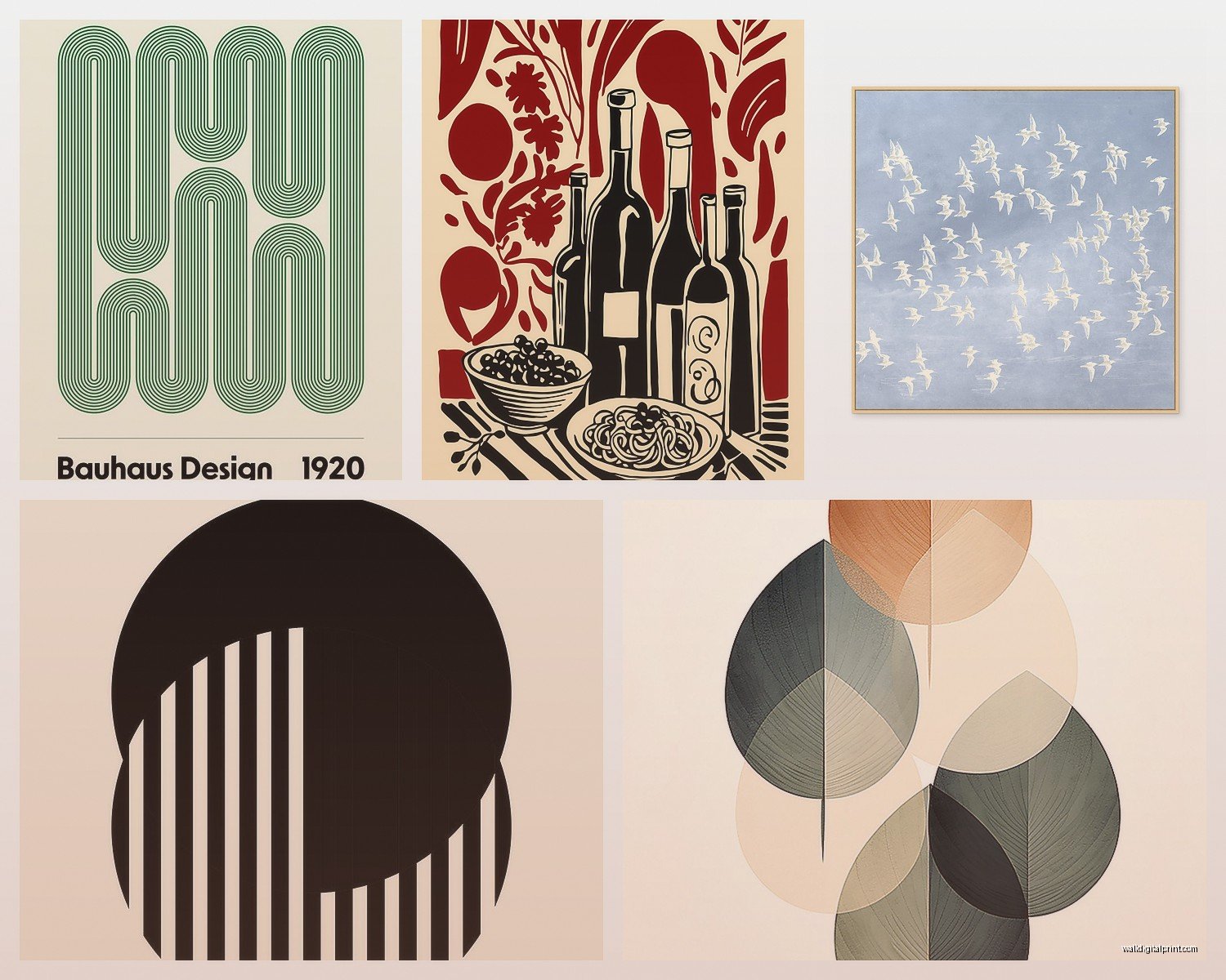
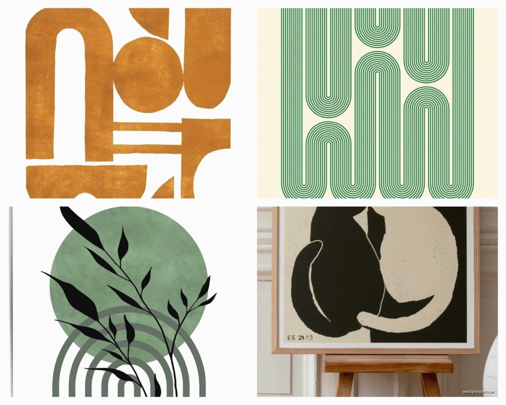
Subject Matter That Actually Works in Real Homes
Let me tell you what I see working over and over again versus what people THINK will work.
What actually works:
- Abstract photography with neutral colors – think architectural details, textures, minimalist compositions
- Black and white landscapes or cityscapes – timeless and they don’t compete with your furniture
- Botanical photography that’s NOT the trendy monstera leaf thing (that’s already dated sorry)
- Geometric graphics and line art – super versatile, easy to mix and match
- Aerial photography – beaches, farmland, urban patterns from above
What people think will work but usually doesn’t:
- Super colorful abstract art – it’s hard to pull off unless your whole room is neutral
- Typography prints with quotes – they feel very 2015 Pinterest
- Mixed media prints that try to do too much – photography with painted elements or whatever
- Anything too literal – like a giant photo of a camera if you’re into photography, it’s just… a lot
My client last week wanted to put up these huge colorful bird photographs in her bedroom and I had to gently steer her toward some black and white nature photography instead because her bedding was already this whole floral situation and it would’ve been visual chaos.
Color Calibration and Why Your Prints Might Look Wrong
This is technical but important – what you see on your screen is NOT what you’re gonna get printed. Monitors display in RGB (red, green, blue light) and prints are CMYK (cyan, magenta, yellow, black ink). Blues and greens especially can look really different.
If you’re ordering from a photographer’s site, they’ve usually already adjusted for this. But if you’re printing your own images or downloading free prints, you gotta be careful. I use a color calibration tool on my monitor (the Spyder5 thing, cost like $100) but that’s probably overkill for most people.
The hack: order one small test print before you commit to a large expensive one. Seriously. I do this with every new printer or paper type.
Hanging Methods That Don’t Destroy Your Walls
Okay so I’m gonna assume you’re renting or at least don’t want a million holes in your walls. Command strips are fine for lightweight frames (under 5 pounds) but anything bigger needs actual picture hooks.
My favorite thing right now is these French cleat systems for larger pieces. You screw one part into the wall (yeah I know, but it’s just two screws) and the other part goes on the back of your frame, and they hook together. Super secure and you can slide the print left or right to adjust without making new holes.
For gallery walls I always do the paper template thing first – trace all your frames on paper, cut them out, tape them to the wall in different arrangements until you find one that works. THEN you start making holes. The key is keeping consistent spacing between frames, usually 2-3 inches looks best.
Oh and another thing – hang art at eye level, which is basically 57-60 inches from the floor to the center of the artwork. This is a museum standard and it’s actually based on average human height so it just… looks right.
Mixing Photography with Graphics
This is where modern prints get really fun. You don’t have to pick just photography or just graphics – mixing them creates visual interest.
My formula: pick one dominant style (like 60-70% photography) and then add graphic prints as accents. Make sure they share a color palette or at least a tonal quality. Like if your photos are high contrast black and white, your graphics should also be bold and graphic, not soft and watercolor-y.
I just did this in a dining room where we used three large black and white architectural photos and then added two smaller geometric line art prints in the same frames. The repetition of the frames unified everything even though the styles were different.
Protecting Your Investment
UV-protective glass or acrylic is worth it if you’re putting prints anywhere with direct sunlight. Regular glass won’t stop fading, you need the UV coating. Museum glass is the best but it’s stupid expensive – like $100+ just for the glass on a medium-sized frame.
Acrylic (plexiglass) with UV protection is lighter and won’t shatter but it scratches easier. I use it for anything I’m shipping or anything going in a kid’s room.
For prints without glass – like canvas or mounted prints – you can spray them with a UV protective coating. Krylon has one that works pretty well, just test it on a corner first because some papers react weird to it.
The Stuff Nobody Tells You
Limited edition prints aren’t always worth the premium unless you’re actually collecting for investment purposes. For decorating your home, an open edition print that you love is better than a limited edition one you’re meh about.
Signed prints are nice but don’t overpay for them. A signature doesn’t make a print higher quality, it’s just a bonus.
Print numbers (like 15/100) don’t really mean much anymore since everything’s digital. The “edition” size is often arbitrary.
If you’re buying from independent photographers, always ask if they printed it themselves or used a lab. Lab-printed is usually more consistent quality.
And honestly the most important thing – buy what you actually like, not what you think you’re supposed to like. I’ve seen people fill their homes with trendy minimal line art when they actually prefer colorful photography, just because they thought it was more “sophisticated.” Your home should make you happy, not impress strangers on Instagram.
Okay I think that’s everything? Let me know if you have questions about specific prints or whatever. I’m gonna go wash this wall putty smell off my hands finally.