Wall Art Guide, Wall Art Tutoriels
Navy Blue Wall Art: Deep Blue Sophisticated Designs
Feb
So I’ve been obsessing over navy blue wall art lately and honestly it started because a client wanted to redo their living room but didn’t want to commit to painting an entire accent wall navy, which yeah I get it, that’s a BIG commitment. But navy art pieces? Total game changer and way less terrifying.
Why Navy Actually Works When Other Colors Don’t
Okay so here’s the thing about navy that took me forever to figure out. It’s technically a dark color but it doesn’t make rooms feel smaller the way black does. I tested this in my own dining room last year and my sister came over and said the room looked bigger somehow? Which sounds impossible but navy has this weird depth thing going on. It recedes visually while still making a statement.
The trick is understanding that navy reads differently depending on your lighting situation. North-facing rooms will make it look more true blue, almost royal. South-facing rooms with lots of light make it look softer, almost denim-like during the day. My studio faces east and I’ve got three navy pieces in here and they literally change personality throughout the day which sounds dramatic but it’s true.
Choosing the Right Navy Shade for Your Space
Not all navy is created equal and this is gonna sound weird but I have like a whole system now. There’s midnight navy which is almost black with blue undertones, classic navy which is your traditional nautical situation, and then there’s what I call dusty navy which has gray mixed in.
For modern spaces you want that crisp classic navy, super saturated. Traditional or farmhouse styles actually look better with dusty navy because it doesn’t fight with warm wood tones. I learned this the hard way when I put a bright navy abstract in a client’s craftsman home and it just… screamed at everything else in the room.
Testing Paint Swatches Against Art
Before you buy any navy art, go grab paint swatches in your existing wall color and hold them up to the art on your screen or in the store. I do this thing where I take photos of the art on my phone then go to the paint store and literally hold swatches up to my phone screen. The employees think I’m weird but whatever, it works.
Size and Scale Issues Nobody Talks About
So everyone says measure your wall space but that’s not actually the helpful part. What you need to know is that navy art needs to be bigger than you think. Like 20% bigger than your instinct tells you. I hung a 24×36 navy abstract above my couch thinking it would be perfect and it looked like a postage stamp.
For over a sofa you want at least 2/3 the width of the sofa. For above a bed, go even bigger because you’re viewing it from a distance. I’ve got a massive 48×60 navy and gold leaf piece above my bed and it STILL could go bigger honestly.
Wait I forgot to mention the weird exception to this rule. Gallery walls with navy pieces can use smaller sizes because the collective visual weight matters more than individual pieces. I did a gallery wall with like nine different navy prints ranging from 8×10 to 16×20 and the variety in sizes actually made it more interesting.
Abstract vs Representational Navy Art
Okay so abstract navy art is having a moment and I’m here for it but it’s also really easy to mess up. The thing with navy abstracts is they need some kind of contrast or they just look like blue blobs. Metallics work great, white definitely, even pops of coral or mustard.
I spilled coffee on this navy and white abstract print I was curating for a show which actually tested the paper quality accidentally and it wiped right off so that was good to know. But anyway, abstract navy pieces work best in contemporary or transitional spaces where you’ve got clean lines.
Representational stuff like navy florals or nautical scenes or geometric patterns work better in traditional spaces or coastal designs obviously. But here’s what’s interesting, modern botanical prints in navy are super versatile. I’ve used them in everything from mid-century modern to french country and they adapt.
The Nautical Trap
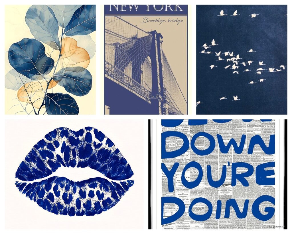
Everyone immediately thinks nautical when they see navy and like, you don’t have to go there. Navy is sophisticated enough to stand alone without anchors and rope and sailboats. Unless you’re doing a literal beach house, skip the obvious nautical imagery. There’s so much more you can do.
Framing and Presentation
This is where people waste so much money. Navy art in a cheap plastic frame looks terrible, sorry but it does. The darkness of navy needs substantial framing to hold its own on the wall. I usually go with either natural wood frames in light oak or maple for contrast, or black frames for a more dramatic gallery look.
White frames can work but they have to be thick, like 2-3 inches, otherwise the navy overpowers them. Gold frames are amazing with navy but they gotta be real gold leaf or powder-coated metal, not that shiny brass looking stuff from Target.
Oh and another thing, if you’re doing canvas prints in navy, make sure they’re gallery wrapped and at least 1.5 inches deep. Those thin canvases look cheap next to such a rich color. My cat knocked over one of my navy canvases last month and I realized how flimsy it was, ended up replacing it with a thicker one.
Mixing Navy with Other Art Colors
So I was watching this design show on Netflix while working on a mood board and they did this whole thing about monochromatic walls and it made me think about how navy plays with other colors. Navy and blush pink is probably the most popular combo right now and yeah it works but it’s kinda overdone.
What actually works better is navy with terracotta or burnt orange. The warmth balances navy’s coolness and it feels collected rather than matchy. Navy and emerald green is another combo I’ve been using a lot. Both are deep jewel tones so they have similar visual weight.
Navy with metallics is obviously a winner. Gold is classic, brass feels more contemporary, silver or chrome reads modern. I mixed navy with copper in a client’s office and it was perfection. The copper warmed up the navy without going full nautical.
Where to Actually Buy Good Navy Art
Etsy is honestly my go-to for navy prints because you can find independent artists doing really unique stuff. Search for “navy blue abstract art” or “indigo wall art” to get more results. A lot of sellers offer different size options which is clutch.
For original pieces I haunt local art fairs and galleries. Navy paintings have more depth than prints because you get texture and brushstrokes. They’re pricier obviously but one good original navy piece makes more impact than five prints.
Society6 and Minted have good options for more affordable prints and they do the framing which saves time. The quality is decent, not amazing but decent. I’ve ordered probably 15 pieces from them for various projects.
Custom Commission Route
If you’ve got a specific vision, commissioning a piece isn’t as expensive as you’d think. I worked with an artist on Instagram to create a 40×40 navy abstract with gold accents for like $400 which included shipping. That’s less than some mass-produced stuff at West Elm.
Just make sure you get the artist to send progress photos and be really specific about your navy shade. I learned this after getting a commissioned piece that was way more royal blue than navy and it didn’t work.
Styling Around Navy Art
Your navy art shouldn’t just float on the wall by itself. I usually add a small shelf below with objects that pull out accent colors from the piece. Like if there’s white in the navy art, add white ceramics or books with white spines.
Layering navy art with other pieces works if you’re doing a salon wall. Put the navy piece slightly off-center and surround it with smaller complementary pieces. The navy will anchor everything because of its visual weight.
Lighting is huge with navy art. It can look muddy without proper lighting. I always add a picture light or position a floor lamp to highlight navy pieces. Natural light is great during the day but you need artificial light for evening.
Common Mistakes I See All the Time
Putting navy art in a room with navy walls. It just disappears, there’s no contrast. You want your wall color to be at least three shades lighter or darker than your art.
Hanging navy art too high. The center of the piece should be at eye level which is usually 57-60 inches from the floor. People always hang art way too high and with navy’s darkness it looks like it’s floating away into the ceiling.
Not considering the undertones of your navy. Some navies lean purple, some lean teal, some are true blue. If your room has warm undertones everywhere else, a purple-navy will clash. Match your undertones.
Okay so funny story, I once bought this gorgeous navy geode art and didn’t realize until I got it home that it had tons of purple in it and my client’s space was all warm grays and beiges and it looked SO wrong. Had to return it and find a warmer navy with brown undertones instead.
Seasonal Rotation Strategy
This might sound extra but I rotate some of my navy pieces seasonally. Heavy navy abstracts with dark colors go up in fall and winter. Lighter navy pieces with white or tan go up in spring and summer. It keeps things feeling fresh without buying new art constantly.
Navy coastal pieces obviously work better in summer. Navy and burgundy or navy and forest green feel very autumnal. Navy with pastels is spring-coded. You can totally work navy year-round but switching up the accent colors makes a difference.
Budget-Friendly Navy Art Hacks
Frame navy fabric or wallpaper samples. Sounds cheap but if you use nice frames it looks intentional and collected. I did this in my guest room with six different navy fabric samples in matching white frames and everyone asks where I got the art.
Print your own navy art from free download sites then get it printed at a local print shop on good paper. Way cheaper than buying pre-made prints and you can customize the size exactly.
Thrift stores sometimes have art you can paint over with navy. I’ve grabbed old canvas paintings for like $5 and painted them entirely navy blue then added gold leaf accents. Instant custom art for under $20.
Oh wait, another hack – use navy scrapbook paper in frames for a super cheap gallery wall. The paper is thick enough that it looks substantial and comes in tons of patterns. Did this in my bathroom and it’s held up for two years.