Wall Art Guide, Wall Art Tutoriels
Navy Blue Wall Art for Living Room: Deep Blue Accent Pieces
Apr
So I’ve been totally obsessed with navy blue wall art lately and honestly it started because my client last month wanted to redo her living room but didn’t want to repaint the beige walls her landlord just did. Navy pieces were the answer and now I can’t stop recommending them to literally everyone.
Why Navy Actually Works Better Than Black
Okay so here’s the thing about navy that I didn’t fully get until I started playing with it in actual spaces. Black art can feel really harsh in living rooms, especially if your lighting isn’t perfect. Navy gives you that same dramatic contrast but it’s got this depth that changes throughout the day. Morning light hits it and you see the blue undertones, evening light makes it almost charcoal. It’s like getting three different pieces depending on when you look at it.
I tested this theory in my own apartment actually, hung a navy abstract piece next to a black and white photograph on the same wall for like two weeks. The black piece just sat there being black, but the navy one literally transformed. My sister came over and asked if I’d changed the artwork because it looked different from her last visit.
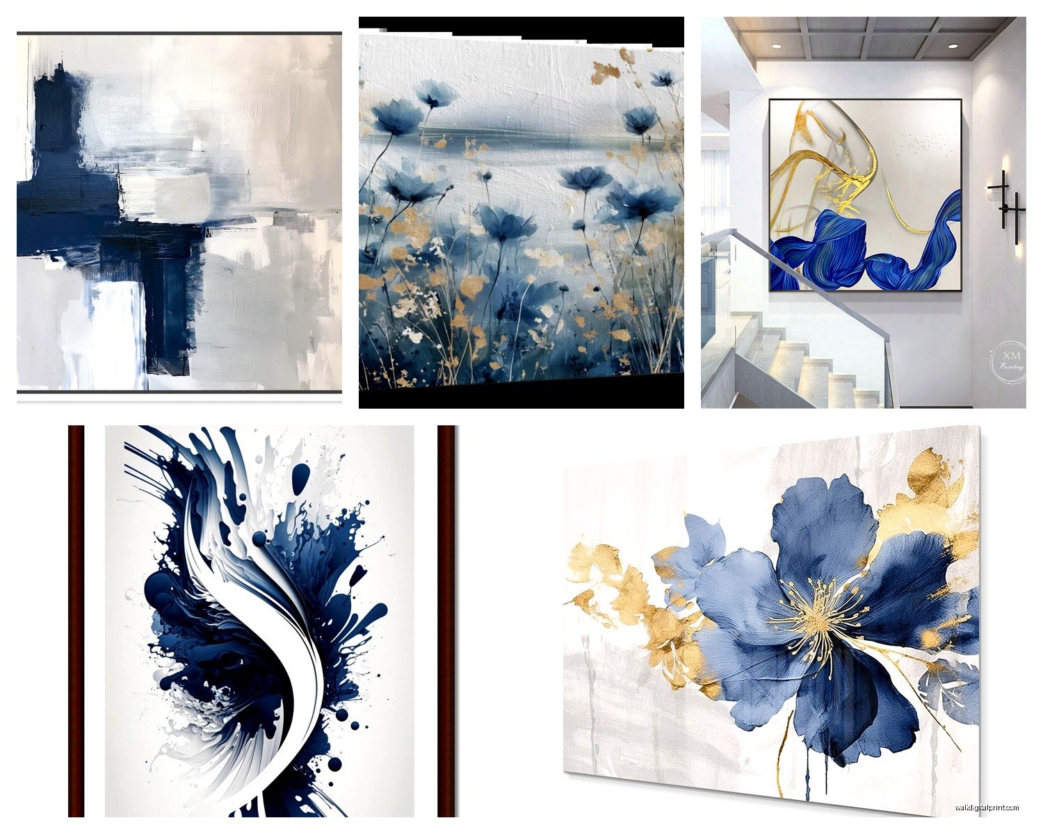
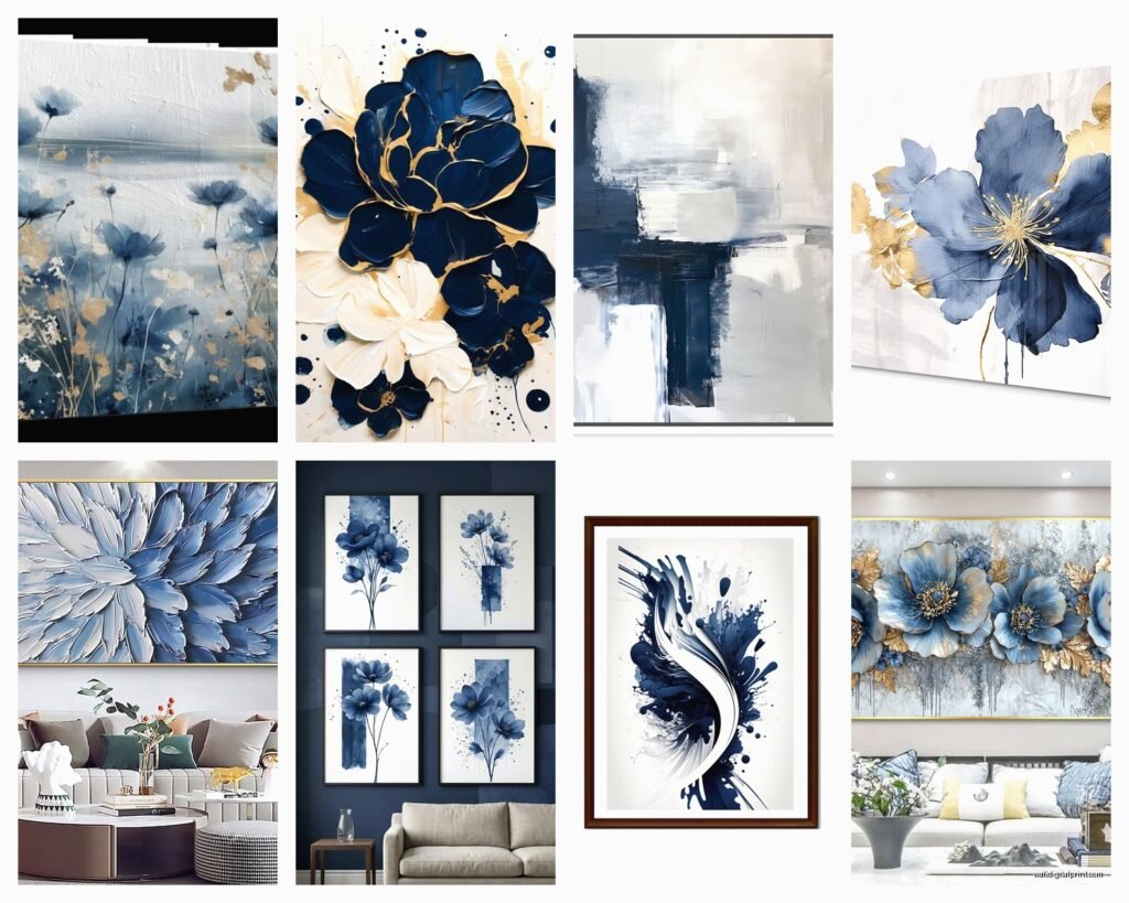
The Types You’ll Actually Find
Canvas Prints
These are gonna be your most affordable option and honestly for navy, they work great. I’ve bought from Etsy sellers, Amazon, even Target has some decent ones now. The key thing with canvas is checking if it’s gallery wrapped, which just means the image wraps around the edges so you don’t see white sides when you hang it.
I got this massive 40×60 inch navy and gold abstract from an Etsy shop called something like ModernWallPrints or maybe it was ContemporaryPrints, anyway it was like $120 and the quality was way better than I expected. The navy was actually navy, not purple-ish which can happen with cheap printing.
What to avoid: those super thin canvases that are basically poster board with fabric. You want at least 0.75 inch depth, preferably 1.5 inches. Makes it look more expensive and substantial on the wall.
Framed Art Prints
This is where you can get really specific with your style. Navy geometric prints, botanical prints with navy backgrounds, abstract watercolors. I’m currently obsessed with navy line drawings, they’re minimal but still make a statement.
For frames, white frames with navy art is *chef’s kiss* for coastal or modern spaces. Black frames make it more gallery-like and sophisticated. Natural wood frames if you’re going for that organic modern thing everyone’s doing right now.
Oh and another thing, don’t sleep on the mats. A white mat between navy art and a navy frame creates this really cool layered effect. My client in Brooklyn did this with three small navy botanical prints and it looked like she spent way more than the $45 per frame she actually paid.
Metal Wall Art
Okay this is gonna sound weird but metal navy wall art is having a moment. It’s usually abstract shapes or geometric designs cut from metal and painted navy. The dimensional aspect means it casts shadows and creates texture on your wall.
I found this circular navy metal piece at HomeGoods for $39.99 and it’s still one of my favorite living room additions ever. Works especially well if your living room has a lot of flat surfaces, the 3D element breaks things up.
Size Matters More Than You Think
This is where people mess up the most. They buy art that’s too small for their wall and then wonder why the room feels off.
For above a sofa, you want your art to be roughly 2/3 the width of the sofa. So if you’ve got a 90-inch sofa, you’re looking at around 60 inches of art width. This can be one large piece or a gallery wall arrangement.
I learned this the hard way when I hung a 24×36 inch piece above my friend’s sectional and we both stood back and were like yeah that looks ridiculous. Ended up doing a three-panel navy triptych instead, each panel 20×30, and suddenly the whole room came together.
Solo Statement Pieces
If you’re going with one large piece, I’d say minimum 30×40 inches for a standard living room. The navy abstracts in this size range usually run between $80-$300 depending on if it’s a print or original.
I’ve got a 48×36 navy and white abstract above my couch that I bought from an artist on Instagram during a sale, paid $175 and it’s worth every penny. The texture is actual paint strokes you can see and feel.
Gallery Walls
For gallery walls with navy as the dominant color, mix your sizes but keep them in the same family. Like all rectangular, or all square, or a planned mix. I use the paper template method where I cut out paper the size of each frame and tape them to the wall first. Saves so many nail holes.
My go-to gallery wall formula: one large navy piece (like 24×36), two medium pieces (16×20), three small pieces (8×10 or 11×14). Arrange them so the largest is slightly off-center, not right in the middle. Makes it feel more collected and less matchy-matchy.
Color Combinations That Actually Work
Navy and white is the classic, super clean and crisp. But here’s what else I’ve tested:
Navy and gold: Luxe without being too much. Even just gold accents in a navy abstract piece elevates the whole room. Works especially well if you’ve got gold or brass hardware anywhere else in the space.
Navy and blush pink: Unexpected but really beautiful. The navy keeps the pink from feeling too feminine or young. I did this in a client’s living room last year and her husband was skeptical until he saw it up, then he admitted it looked sophisticated.
Navy and terracotta: Very earthy and grounded. This combo got really popular with that desert modern trend but honestly it’s timeless.
Navy and emerald green: Bold. Not for everyone but if you want drama, this is it. Both colors are deep and rich so they play off each other nicely.
Navy and gray: Safe choice if you’re nervous about color. The gray tones down the navy’s intensity while still keeping visual interest.
Where to Actually Buy This Stuff
Okay so I’ve spent way too much time shopping for navy wall art and here’s where I’ve had the best luck:
Etsy: Best for unique pieces and supporting actual artists. Search “navy blue abstract art” or “navy geometric print” and filter by your size needs. Read the reviews about color accuracy because monitors can lie.
Society6: Good for trendy designs, lots of options. Quality is hit or miss though, I’ve gotten some prints where the navy looked faded. But their return policy is decent.
Amazon: Don’t judge me but Amazon actually has some solid options, especially for canvas sets. I bought a three-piece navy ocean wave set for my mom’s living room for $89 and she gets compliments constantly. Just stick with sellers that have lots of reviews with photos.
Target and HomeGoods: For affordable framed options. You gotta go in person though because their online selection is limited. My Target had this navy and gold leaf print last month that was *gorgeous* for $34.99.
West Elm and CB2: If you’ve got budget. Their navy pieces are legitimately beautiful but you’re paying $200-$800 per piece. I tell clients to wait for their 20% off sales.
Local art fairs and markets: Sometimes you find amazing navy pieces from local artists. I got a navy palette knife painting at a street fair for $125 that would easily be $400 in a gallery.
Styling Tips I’ve Learned From Trial and Error
Okay so just hanging navy art isn’t enough, you gotta style around it.
Repeat the navy elsewhere: Even just a navy throw pillow or navy vase pulls the whole look together. You want the art to feel intentional, not random. I usually do three navy touches in a living room—the art counts as one, then maybe pillows and a decorative object.
Layer textures: If your navy art is flat (like a print), add texture elsewhere. Chunky knit throw, velvet pillows, a jute rug. Keeps the room from feeling one-dimensional.
Consider your wall color: Navy pops amazingly on white or light gray walls. On beige walls it still works but needs more contrast elsewhere—think bright white trim or light colored furniture. On dark walls… honestly I’d skip navy art and go lighter.
Lighting is everything: Navy absorbs light so make sure you’ve got good lighting in the room. A picture light above the art is ideal but even just a well-placed floor lamp helps. My living room art looked muddy until I added a brass floor lamp nearby.
The Gallery Wall Layout Thing
Wait I forgot to mention this earlier but it’s important. When you’re doing a navy-focused gallery wall, don’t make everything navy. Break it up with neutrals or one accent color.
My formula: 60% navy pieces, 30% white or cream pieces, 10% accent color. This keeps it from being overwhelming. I did an all-navy gallery wall once in my apartment and my cat kept staring at it like it was a black hole, it was too much visual weight.
Common Mistakes I See All the Time
Buying navy art with a purple undertone: This happens a lot with cheap prints. True navy has either a gray or slightly green undertone, never purple. If it looks purple in the product photo, it’ll definitely look purple on your wall.
Hanging it too high: Center of the art should be at eye level, which is around 57-60 inches from the floor. I see people hang art way too high all the time and it makes the ceilings look lower somehow.
Not considering the room’s existing blues: If you’ve got a blue-gray sofa or blue-toned rug, make sure your navy art coordinates. I learned this when a client’s navy art clashed with her dusty blue curtains because the undertones were fighting each other.
Forgetting about scale in small rooms: Navy is a dark color so in a small living room, one large piece works better than multiple small pieces. The single piece creates a focal point without cluttering the space visually.
The Practical Stuff Nobody Talks About
Hanging heavy navy canvas: You need proper wall anchors. Those 3M strips work for lighter pieces but anything over 10 pounds needs actual picture hangers or wall anchors. I’ve had a canvas fall at 3am and it’s terrifying.
Cleaning: Navy shows dust like crazy. I use a microfiber cloth to dust my canvas pieces every couple weeks. For glass-covered prints, regular glass cleaner works fine.
Switching it out: This is probably just me but I get bored with art after a year or so. Navy pieces are easy to rotate seasonally—I store my navy abstracts in summer and bring out lighter, brighter stuff, then swap back in fall. Keeps the room feeling fresh without spending money.
Direct sunlight: Navy fades less than lighter colors but it still fades. If your living room gets harsh afternoon sun, maybe don’t put your expensive navy piece directly in the sun path. I learned this with a navy watercolor print that went kinda washed out after six months in my south-facing window area.
The thing about navy wall art is it’s one of those updates that makes a huge impact for relatively little money and effort. Like you can completely change the vibe of your living room in an afternoon with the right piece. Just gotta make sure you’re getting actual navy and not some weird blue-purple situation, size it properly, and style around it with intention rather than just slapping it on the wall and calling it done.