Wall Art Guide, Wall Art Tutoriels
Neon Sign Wall Art: Custom LED Light Typography
Mar
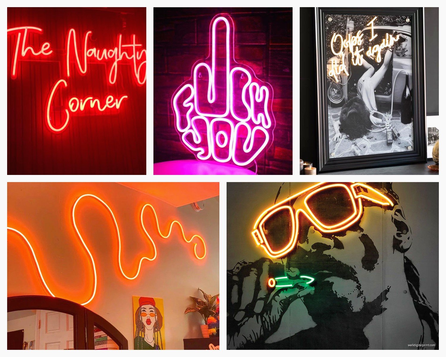
So I’ve been obsessing over neon signs lately and honestly it started because a client wanted one for their daughter’s room but then I ended up getting three for my own place, which is ridiculous but here we are.
First thing you gotta know is that actual glass neon signs are basically extinct for residential use. Like they exist but they’re insanely expensive and fragile and you need a professional installer. What everyone’s using now is LED neon flex – it’s silicone tubing with LED strips inside that mimics the look of glass neon but you can literally bend it with your hands and it runs cool to the touch. My cat knocked mine off the wall once and it was completely fine, which would never happen with real glass.
The Material Breakdown Nobody Tells You
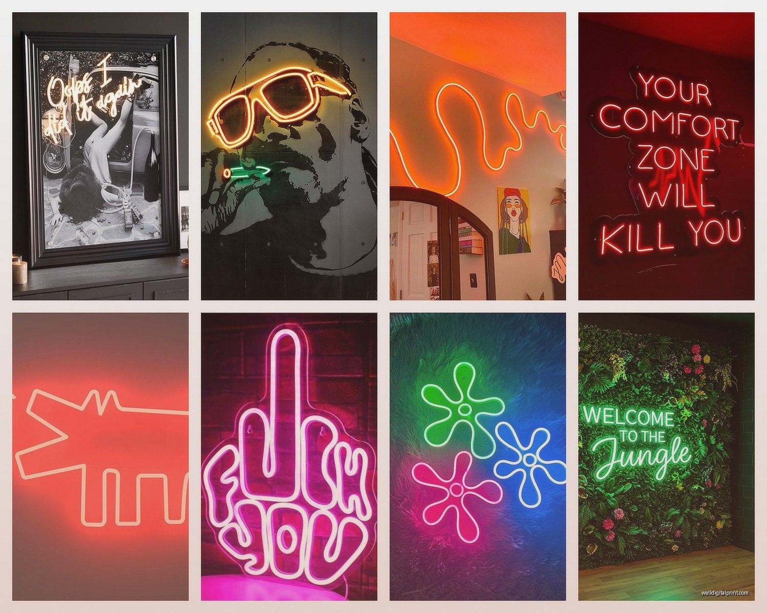
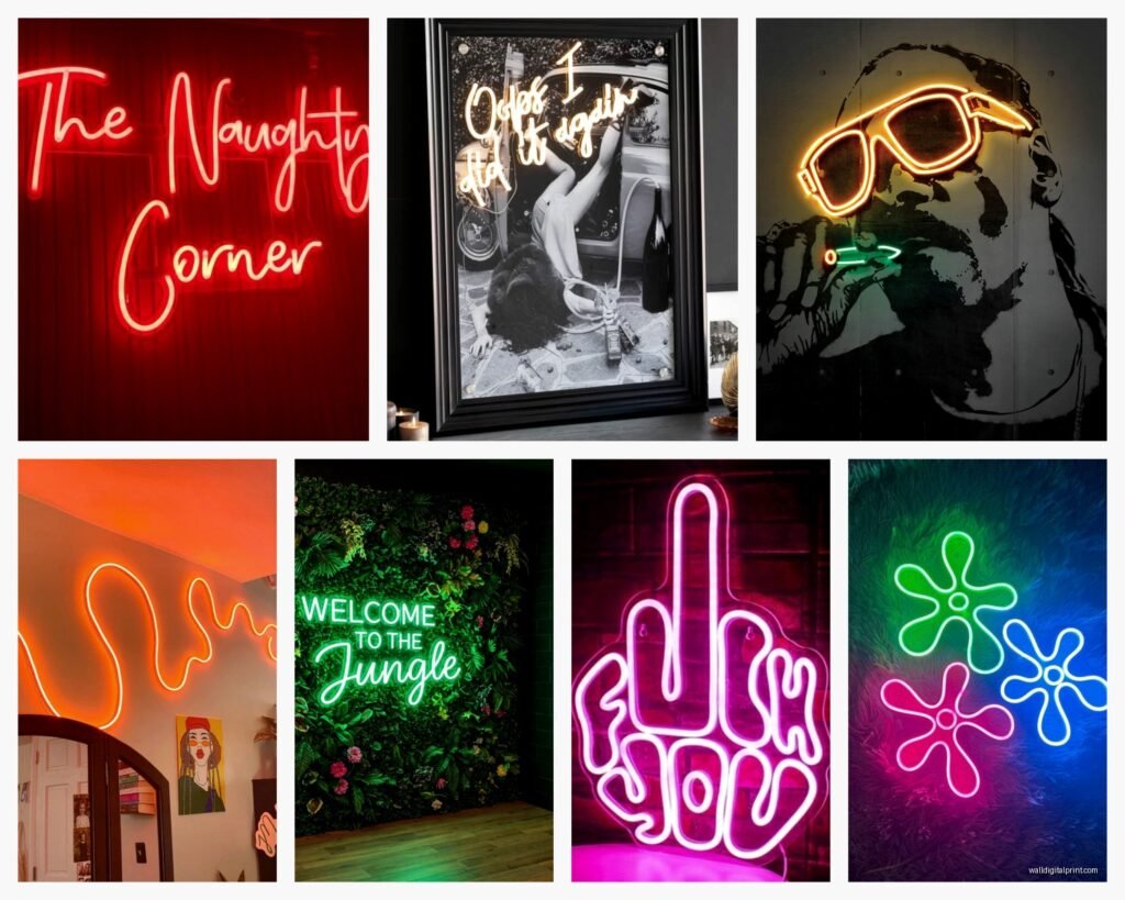
LED neon comes in two main types and this is where it gets confusing because sellers don’t always specify. There’s the cheaper PVC backing kind where the neon tubing is mounted on a clear acrylic board, and then there’s the premium version that’s just the tubing with a barely-visible backing. The PVC ones look more… commercial? Like a store sign. The tube-only versions have this floating effect that’s way better for home decor.
The silicone itself varies wildly in quality. Good silicone is super flexible and has even light distribution – you shouldn’t see individual LED dots when it’s on. Cheap stuff gets these dark spots between LEDs and the silicone can yellow over time, especially the white ones. I learned this the hard way with a “boss babe” sign I got from a random Amazon seller that looked amazing for like three months then started looking dingy.
Power and Installation Stuff
Most LED neon signs run on 12V which means they come with a transformer plug. The plug situation is actually annoying because they’re usually those chunky adapters that take up like two outlets. I’ve started using power strips mounted behind furniture so the cords don’t show. Some of the nicer custom shops are starting to offer USB-powered options which is genius for smaller signs.
Installation is usually mounting hardware on the back – either keyhole slots or those 3M command strips. The command strips work fine for signs under like 2 feet wide but anything bigger I’d use actual screws. I put a 4-foot “good vibes only” sign (don’t judge me, it was for a consultation project) in my office using command strips and it lasted about six weeks before crashing down at 3am and scaring me half to death.
Dimmer Switches Are Essential
Oh and another thing – get one with a dimmer or remote control. This is non-negotiable. Full brightness neon is way too intense for most rooms, especially bedrooms. I have this “sweet dreams” sign above my bed and at full brightness it’s like trying to sleep under stadium lighting. At 30% it’s perfect ambient light. Some signs come with remotes that do different modes – blinking, fading, whatever – but honestly I never use those. Just give me a dimmer.
Custom vs Pre-Made
Pre-made signs from places like Amazon or Urban Outfitters are cheaper obviously. You can get a decent small one for like $40-80. But the font options are limited and everyone has the same ones. I’ve been to four different apartments in the past year that all had that “good times” sign with the cocktail glass.
Custom is where it gets interesting but also expensive. You’re looking at $150-400+ depending on size and complexity. The pricing is usually per letter or per inch of tubing. Cursive fonts use more tubing because of all the connecting lines so they cost more than block letters.
I’ve used three different custom shops and they all have different strengths. Some are better at script fonts, some do better block lettering. The shop I use most now is actually based in Poland which sounds sketchy but their quality is insane and shipping only takes like 10 days. They have this configurator on their website where you can see exactly what your sign will look like in different colors.
Font Selection Is Harder Than You Think
This is gonna sound weird but choosing a font for a neon sign is completely different from choosing one for print. What looks elegant in a font book can look illegible in neon tubing. Super thin fonts don’t work because the tubing has a minimum thickness. Really ornate script can blur together.
I always tell people to stick with fonts that have clear letter separation. And test the sizing – small text in neon is hard to read from across a room. Anything under 8 inches tall is more decorative than readable. My living room sign is 16 inches and that’s the sweet spot for a focal point piece.
Color Psychology Matters More Than You’d Think
Okay so funny story, I did this whole nursery design with a soft pink neon sign that said the baby’s name, looked adorable in photos, but the pink light made everything in the room look weird. The white crib looked dingy, the gray walls looked mauve. Ended up switching to warm white and it solved everything.
Warm white is the most versatile by far. It goes with everything and doesn’t throw colored light onto your walls and furniture. Cool white is too clinical unless you’re going for that modern industrial vibe. Blue is calming but can make spaces feel cold. Red is dramatic but overwhelming in small rooms. Pink is Instagram gold but see above. Yellow and orange are underrated – they create this cozy sunset vibe.
You can also do multicolor signs where different words are different colors but I think those look tacky unless you really commit to a specific color scheme. Like if your whole room is black white and pink, then a multicolor sign could work. Otherwise it’s visual chaos.
The Backing Color Trick
Most custom shops offer different backing colors – clear, black, white, even mirror. Clear is standard but black backing makes the colors pop way more intensely. It’s especially good for bright colors like blue, green, purple. White backing diffuses the light more softly which is nice for warm tones. Mirror backing is cool but gimmicky – it creates this double reflection effect that’s more Vegas than home decor.
Sizing and Placement
People always size too small. A neon sign needs to be big enough to be a statement piece or small enough to be subtle accent lighting. That awkward middle size just looks like you couldn’t decide.
For bedroom headboards I do 24-36 inches wide. For living room walls as art pieces, 36-48 inches. For small accent areas like bookshelves or bars, 12-18 inches. Anything over 5 feet gets into commercial territory unless you have really high ceilings.
Height placement matters too. Too high and it looks like a store sign. Too low and it’s weird. I usually do about 6-7 feet to the center of the sign, which is slightly above eye level. Above a bed I go lower, maybe 4-5 feet above the mattress so you can see it when you’re lying down but it’s not directly in your face.
What Words Actually Work
Wait I forgot to mention – choosing what your sign actually says is harder than picking colors and fonts. Short phrases work best. One to five words max. Single words can feel too vague unless they’re really meaningful. Long quotes get expensive fast and are hard to read.
The ones that work best in my projects are:
- Names – especially for kids’ rooms or home offices
- Single meaningful words – “breathe” “create” “love” stuff like that
- Short phrases that mean something specific to the person
- Song lyrics if they’re short
- Inside jokes if you’re okay with guests not getting it
Generic Instagram phrases like “but first coffee” or “let’s stay home” are everywhere now so unless you genuinely love them I’d avoid. They were cool three years ago but now they’re the live laugh love of neon signs.
Maintenance and Longevity
LED neon signs are supposed to last 50,000+ hours which is like 6 years of constant use. I haven’t had one long enough to verify that but the oldest one I have is two years old and still looks new. The LEDs don’t burn out like traditional bulbs – they just gradually dim over time.
The silicone can collect dust which dulls the glow. I wipe mine down every few months with a slightly damp microfiber cloth. Don’t use cleaning products because they can damage the silicone coating. If you’re mounting it somewhere that gets cooking grease or smoke, you’ll need to clean more often.
The biggest wear point is actually the power cord where it connects to the sign. That junction can get loose over time especially if you’re unplugging and replugging a lot. Most better signs have a secure connector but cheaper ones just have the cord coming straight out which can pull loose.
Outdoor vs Indoor
You can get outdoor-rated LED neon but it costs more because the sealing is different. Regular indoor signs aren’t waterproof – they’re splash resistant at best. I tried putting one on a covered patio and it lasted through one rain before getting moisture inside and shorting out. Outdoor signs need to be IP65 rated minimum, IP68 if they’ll get direct rain.
The Custom Design Process
When you order custom, most shops have you fill out a form with your text, font preferences, size, and color. Better shops will send you a digital mockup before production. Always get the mockup. I’ve caught spelling errors, weird spacing, and font issues that would’ve been permanent mistakes.
Production time varies wildly – I’ve seen 3-5 days from some shops and 4-6 weeks from others. Chinese manufacturers are usually fastest but quality is hit or miss. European makers take longer but quality is more consistent. US-based custom shops are the most expensive but you get it faster and customer service is easier.
Shipping is where things get scary because these are fragile despite being more durable than glass. Good sellers pack them in custom foam cutouts inside sturdy boxes. Cheap sellers just wrap them in bubble wrap and pray. I’ve had two arrive broken from budget sellers and the refund process was a nightmare both times.
Budget Breakdown Reality Check
Here’s what you’ll actually spend:
Small pre-made sign (under 20 inches): $40-100
Medium pre-made (20-30 inches): $100-180
Large pre-made (30+ inches): $180-300
Custom small: $150-250
Custom medium: $250-400
Custom large: $400-700+
Installation hardware is usually included but not always. Dimmer remotes add $15-30 if not included. Outdoor housing adds $50-150.
The cheap Amazon signs under $40 are honestly not worth it unless you just want something for a one-time party. They look okay in photos but in person the light quality is bad and they feel plasticky.
My Current Favorites
In my own place I have “make it happen” in warm white above my desk, “hello gorgeous” in soft pink in my bathroom (small space so the pink works), and “stay wild” in blue in my bedroom. The bedroom one is probably my favorite because blue neon has this dreamy quality that’s perfect for a sleep space when dimmed way down.
For clients I’m doing a lot of custom names for nurseries and kids’ rooms, inspirational words for home offices, and food/drink related phrases for kitchens and dining areas. The kitchen ones are tricky because you need to consider the existing lighting – neon can look washed out under bright overhead lights.
Oh and if you’re renting, command strips do work but get the heavy duty ones and follow the instructions exactly. Wait 24 hours after applying before hanging the sign. And maybe don’t tell your landlord because technically it’s probably against your lease even though it doesn’t damage anything.
The whole neon sign thing isn’t going away anytime soon so if you’ve been thinking about it, now’s actually a good time because there are way more options than even two years ago. Just don’t cheap out too much because a bad neon sign is worse than no neon sign – it just looks like you tried too hard with the wrong thing.