Wall Art Guide, Wall Art Tutoriels
Neutral Wall Art: Earth Tone Beige Cream Subtle Designs
Mar
So I’ve been knee-deep in neutral wall art for the past three months because honestly, every single client right now is asking for “something beige but not boring” and I’m like…okay, let’s figure this out properly.
The thing about earth tone art is that beige isn’t just beige. I learned this the hard way when I ordered like fifteen different “cream” prints for a staging project and they arrived looking like completely different color families. Some pulled pink, some went straight yellow, one was basically gray pretending to be beige. My dog knocked over my coffee on two of them during this whole sorting process which actually helped me see the undertones better against the brown stains, so…silver lining?
Understanding Your Beige Baseline
Okay so here’s what nobody tells you – you gotta start with your wall color, not the art. I spent years doing this backwards. Your wall has an undertone even if it looks “neutral” and that undertone is gonna either fight with or complement your art.
Grab your phone and take a photo of your wall in natural light around 2pm. Then take another one with your lamps on at night. I promise they’ll look different. If your beige walls look pink-ish in natural light, you need art with warm undertones – think cream with yellow or peachy bases. If they’re reading gray-beige (greige, ugh I hate that word but it’s useful), you want cooler creams and taupes.
The Undertone Test I Actually Use
Hold up white printer paper next to your wall. Not cream, not ivory – pure white. The contrast will show you what undertone your wall actually has. This sounds stupid but it works better than those fancy color matching apps.
- Wall looks yellow next to white = warm undertones, go with cream and camel art
- Wall looks pink = warm but different, you want creams with beige-pink or greige
- Wall looks gray or blue = cool undertones, stick to taupe and cooler beiges
- Wall looks green = you probably have gray walls actually, or there’s a color reflecting from somewhere else in the room
Earth Tone Categories That Actually Matter
I’m gonna break this down by color family because that’s how I organize my vendor samples and it’s the only system that’s worked for me when I’m trying to pull a room together at like 9pm before an install.
Warm Creams and Ivory
These are your yellowy-peachy neutrals. They look amazing with natural wood, brass fixtures, and warm lighting. But here’s the catch – if you have cool-toned gray floors or silver fixtures, these are gonna look dingy. Not in a good way.
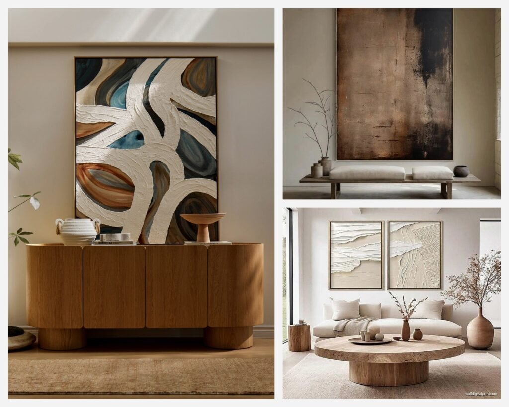
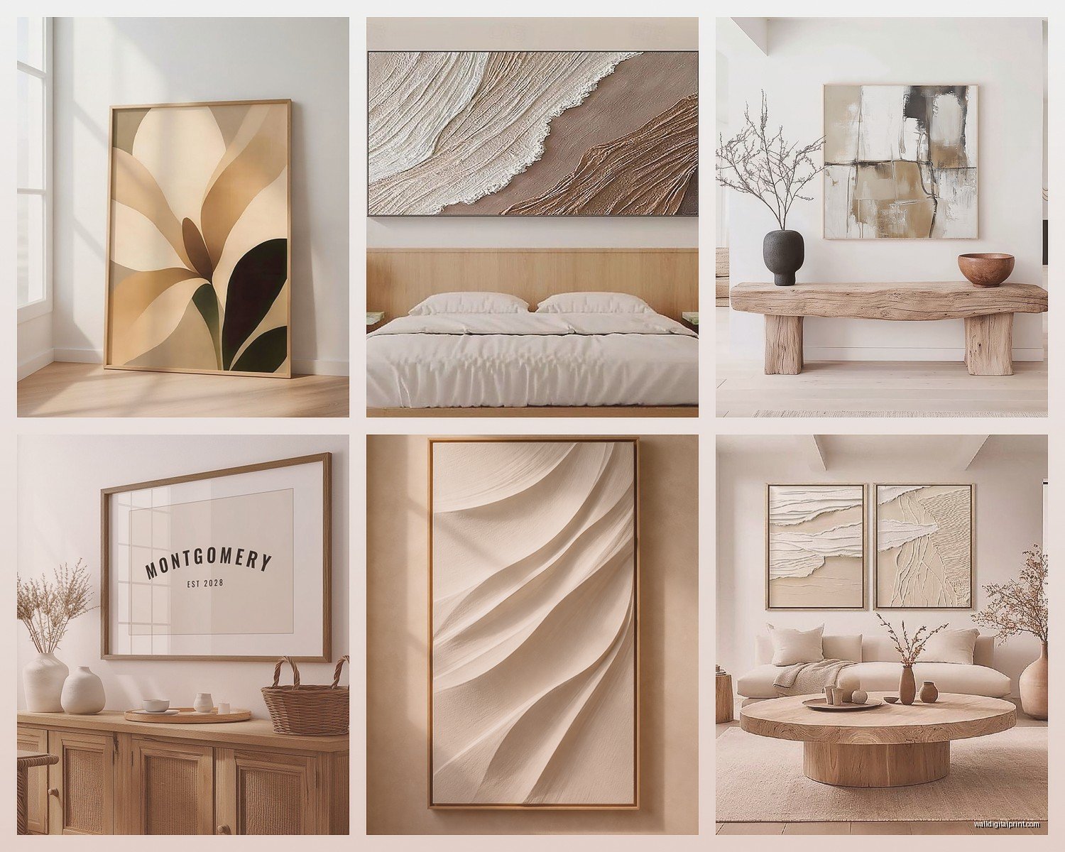
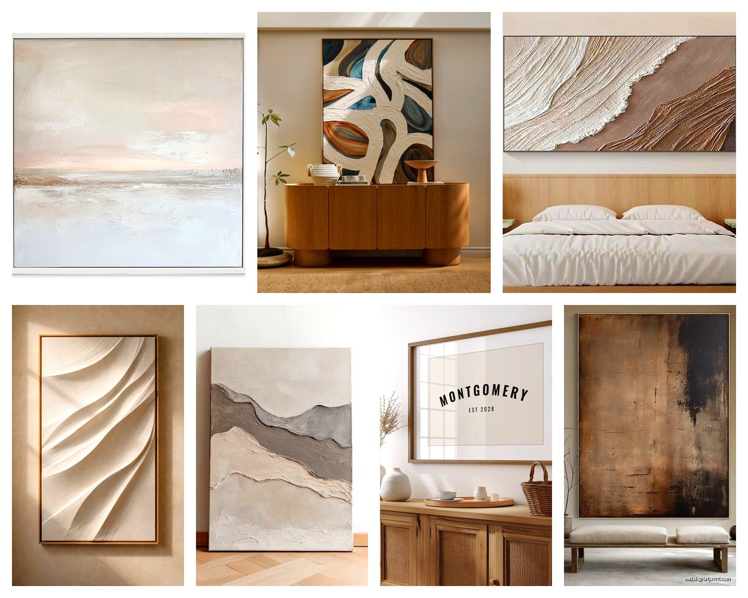
I use warm cream art in rooms with oak floors, rooms that get good southern light, and anywhere there’s already warm metals. A client last month had this gorgeous walnut credenza and we put three vertical cream abstract pieces above it with subtle sand and ochre details. It looked expensive even though the prints were like $40 each.
The designs that work best in warm cream: organic shapes, watercolor-style abstracts, line drawings, botanical prints without too much detail. When there’s too much detail in a cream-on-cream print, it just looks muddy from more than three feet away.
True Beige Territory
This is the middle ground and honestly the hardest to get right. True beige has balanced undertones – not too warm, not too cool. It’s the most versatile but also the easiest to make boring.
For true beige art to work, you need contrast within the piece itself. I’m talking about layered tones – light beige background with medium and dark beige elements. Or beige with slight texture that creates shadows. Flat single-tone beige art just disappears on most walls, I’ve made this mistake so many times.
What I’ve learned works: geometric designs in multiple beige tones, textured abstract pieces, photography of natural elements like sand dunes or desert landscapes. Oh and another thing – beige art with a thin dark frame (black or deep walnut) suddenly looks intentional instead of washed out.
Taupe and Greige
These are your cool-neutral options. They have gray undertones which makes them work in modern spaces, with cool metals, and in rooms with a lot of natural light that might make warmer neutrals look too yellow.
I just finished a condo with gray-beige walls throughout (builder standard, the client hated them but wasn’t repainting) and we used all taupe and greige art. Mixed in some pieces that had hints of sage and dusty blue. It pulled the whole thing away from looking like a boring gray box.
Taupe works really well in: abstract landscapes, minimalist line art, geometric prints, and those trendy arch designs everyone’s obsessed with. The cooler undertone reads as more modern somehow, where warm creams feel more organic and casual.
Sand and Desert Tones
Okay this is where it gets fun. Sand tones are beige-brown hybrids with yellow and sometimes orange undertones. Think actual beach sand or desert landscapes. These bring warmth without going full terracotta.
I use sandy neutrals when a room needs warmth but the client is scared of color. It’s neutral enough to feel safe but has more personality than straight beige. Pairs really well with natural textures – jute rugs, linen sofas, rattan furniture.
Design-wise, sandy tones work great for: abstract ocean-inspired art (subtle wave shapes, horizon lines), desert photography, geometric designs with curves instead of hard lines, and organic blob shapes that are everywhere right now.
Subtle Design Elements That Actually Add Interest
So here’s where most people mess up neutral art – they go SO neutral that there’s nothing to look at. Subtle doesn’t mean invisible. You need some kind of visual interest or it’s just…why bother having art at all?
Texture Techniques
Even in prints, you want the illusion of texture. Look for art that shows: brush strokes, paper grain, layered elements, slight imperfections. The “too perfect” digital prints feel flat and honestly kinda cheap even if they’re not.
I tested this theory last month – bought the same abstract design from two different sellers, one was a digital print on smooth paper, the other was a reproduction of an actual painting on textured paper. The textured one looked like a $300 piece. The smooth one looked like I printed it at home.
Subtle Color Accents
This is gonna sound weird but the best neutral art usually has tiny hints of non-neutral colors. We’re talking like 5% of the composition. A touch of rust orange, a whisper of sage green, the tiniest bit of dusty blue.
These micro-accents do two things: they keep the piece from looking flat, and they give you a color to pull into the room through pillows or accessories. I have a cream and beige abstract piece in my own living room that has these barely-there ochre details. I added one ochre velvet pillow and suddenly the whole room felt intentional instead of accidentally neutral.
Line Work and Shapes
When you’re working with subtle neutral colors, strong design elements become more important. Think about:
- Clean line drawings in beige on cream backgrounds
- Geometric shapes in tonal variations
- Organic curves and abstract forms
- Architectural elements like arches or columns
- Minimalist botanical illustrations
The shapes and lines create visual interest that color would normally provide. I’m working on a project right now where we’re using three prints – all in the same beige/cream/sand palette, but one’s geometric, one’s organic curves, and one’s linear. Together they create rhythm even though the colors are nearly identical.
Size and Scale Rules I Actually Follow
Okay so I’m gonna contradict myself here because I just said “rules” but honestly this is more like…guidelines I’ve developed after hanging way too much art in way too many spaces.
The Two-Thirds Thing
Your art (or art grouping) should take up roughly two-thirds the width of the furniture below it. Not exactly, roughly. I measure the sofa or console or bed, multiply by 0.66, and that’s my target width. This is especially important with subtle neutral art because it doesn’t grab attention the way colorful art does – if it’s too small, it just disappears.
Height Placement
Center of the art at 57-60 inches from the floor. This is the museum standard and it actually works in homes too. But – and this is important – that’s center of the art, not the hook. I still mess this up sometimes when I’m rushing.
Exception: above furniture, leave 6-8 inches between the furniture top and the bottom of the frame. More than that and the art floats weirdly. Less than that and it feels cramped.
Gallery Walls with Neutrals
Gallery walls in all neutrals can look amazing or really bland, there’s like no in-between. What makes the difference:
- Vary the frame colors even if the art is similar – mix black, natural wood, and white frames
- Include different paper textures and finishes
- Play with orientation – don’t make everything the same direction
- Use odd numbers – 3, 5, 7 pieces work better than even numbers
- Keep spacing consistent at 2-3 inches between frames
I did a gallery wall last week – nine pieces, all cream and beige abstracts, but mixed matte and slight sheen finishes, varied the frame materials, and included different design styles (some geometric, some organic). Client was worried it would be too monotonous but it turned out really sophisticated.
Pairing Neutrals with Different Room Styles
The same beige art is gonna feel completely different depending on what room style you put it in, which is actually kinda cool because it makes neutral art more versatile than people think.
Modern Minimalist Spaces
Go for clean geometric designs, simple line work, or single-tone abstracts. The art should feel intentional and edited. Large-scale pieces work better than collections of smaller prints. Frame in black, white, or natural wood with clean lines.
My go-to for modern spaces: oversized cream abstract with minimal design elements, thin black frame, lots of negative space in the composition. Or a diptych/triptych situation where one image spans multiple frames.
Organic Modern and Japandi
This is where earth tone neutrals really shine. Look for organic shapes, natural textures, imperfect elements. Wabi-sabi vibes where slight irregularities are features not flaws.
Designs that work: abstract landscapes, minimal botanical prints, watercolor-style pieces, anything inspired by natural elements like stones or wood grain. Frame in light wood or go frameless with a float mount.
I’m obsessed with this one vendor who does these cream and sand prints that look like aerial views of beaches – super abstract but you can kind of tell what they’re inspired by. They’re perfect for this style because they’re natural without being literal botanical prints.
Transitional Spaces
This is the hardest one honestly because transitional is like…not too modern, not too traditional, just right in the middle which can easily become bland. Your neutral art needs to work harder here.
Go for pieces with subtle traditional elements but modern execution. Maybe a botanical print but really abstracted, or a landscape that’s more about shape and tone than details. Mix frame styles – a gold-leafed frame with modern matting, or a traditional wooden frame with contemporary art.
Boho and Eclectic Rooms
Wait I almost forgot to mention – neutral art in boho spaces needs to be more textural and layered. You’re competing with patterns and colors elsewhere in the room, so flat neutral art will just disappear.
Look for prints with visible texture, layered designs, or organic irregular shapes. Mix your neutrals with pieces that have slight color – terracotta, rust, sage. Frame variety is your friend here – mix metals, woods, even some woven frames if you can find decent ones.
Shopping for Neutral Art Without Losing Your Mind
Okay so practical stuff because I’ve wasted so much money learning this.
Online vs In-Person
The problem with buying neutral art online is that every screen shows colors differently. That “cream” could arrive as yellow, pink, or gray depending on how it was photographed and what your screen does to it.
What I do: order samples if possible, or buy from places with really good return policies. Read reviews specifically mentioning color accuracy. And here’s a trick – if the seller shows the same print in multiple room settings, compare how it looks across those images. If it looks wildly different, the color in real life is probably somewhere in the middle.
Print Quality Markers
Not all prints are equal even at the same price point. Things to look for:
- Paper weight – anything under 200gsm feels flimsy
- Print method – giclée is best, but good digital prints on quality paper work fine for most spaces
- Paper finish – matte for bedrooms and cozy spaces, slight sheen for modern areas
- Color description – if they list “warm cream” vs just “cream” they probably know what they’re doing
Framing Options
You can totally change how neutral art reads by how you frame it. I’ve got this one cream abstract print that I’ve framed three different ways for different projects and it looked like different pieces of art.
Black frames: make the art feel more modern and add contrast,