Wall Art Guide, Wall Art Tutoriels
Off White Wall Art: Cream Ivory Neutral Warm Designs
Mar
So I’ve been working with off white wall art for like three years now and honestly it’s become this whole thing where clients keep asking me about cream versus ivory versus whatever-the-paint-store-is-calling-it-this-week, and I finally just started keeping notes because I kept forgetting which pieces worked where.
The Whole Cream Ivory Warm White Situation Nobody Explains Right
Okay so first thing – and I wish someone had told me this when I started – off white isn’t just one color. It’s like saying “blue” when you could mean navy or sky or teal. I made this mistake with a client’s living room in 2022 where I ordered what the website called “cream abstract art” and it showed up looking straight up beige next to her Sherwin Williams Alabaster walls. We had to return it which was a whole thing.
Here’s what I’ve figured out actually matters:
- Cream usually has yellow undertones – think vanilla ice cream
- Ivory leans slightly warmer but less yellow, more like old piano keys
- Warm white has just a hint of beige or brown in it
- Neutral white is the safe middle ground but can look flat depending on your lighting
The lighting thing is HUGE and I’m gonna come back to that because it’s honestly more important than the actual art color sometimes.
What Actually Works in Real Rooms
I spent like six months testing different pieces in my own apartment and in staging projects, and here’s the thing nobody tells you – the style of the art matters as much as the color. A geometric cream design reads completely different than a textured ivory piece even if they’re technically the same shade.
Textured Canvas Pieces
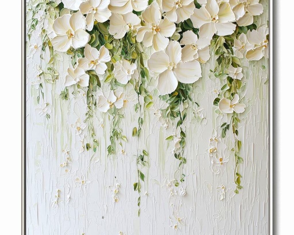
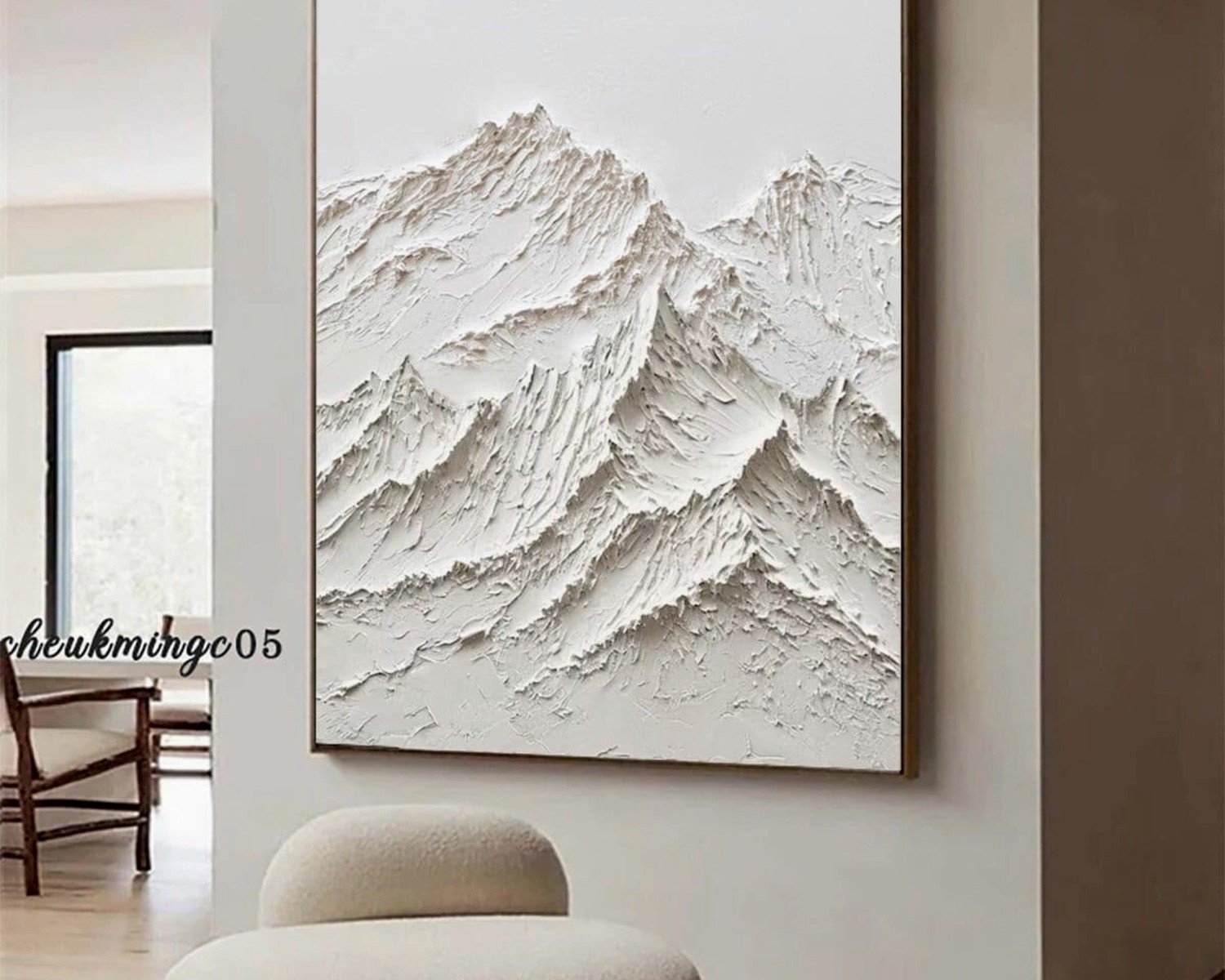
These are my go-to for like 60% of projects now. The texture catches light differently throughout the day so the color shifts slightly which sounds bad but is actually really nice? It keeps the wall from looking too flat. I’ve got this one textured piece in my bedroom that’s technically “warm cream” and in morning light it looks almost white but at night with the lamps on it’s definitely cream.
What to look for when you‘re buying:
- Actual thickness – if it’s under 1.5 inches it’s probably just printed texture not real
- Hand-painted details even if it’s mostly printed (check the product photos close up)
- Gallery wrapped edges so you don’t need a frame
- The weight – should feel substantial not like cardboard
Oh and another thing, some of these textured pieces shed a little at first? Like little fabric bits or dried paint flecks. It’s normal, just vacuum under it for the first week or so.
Line Art and Minimalist Drawings
This is where ivory really shines over cream I think. I don’t know why exactly but cream backgrounds can make black line drawings look slightly dirty, while ivory keeps everything crisp. I tested this side by side in a client’s office and we both immediately saw the difference.
My cat knocked over one of the framed samples during this test actually which is how I discovered that cheap frames are REALLY cheap – the glass shattered into like a million pieces. So if you’re going with framed line art, spend the extra $30 on actual quality framing. I usually tell people to buy the print separately and take it to a framer.
Abstract Warm Neutral Designs
These are trickier because abstract can mean literally anything. I’ve found the best ones for that off white vibe have:
- Multiple neutral shades layered – like cream with hints of taupe and warm gray
- Soft edges not hard geometric shapes (unless you’re going really modern)
- Some kind of movement or flow to the composition
- Enough visual interest that it doesn’t just disappear into the wall
Wait I forgot to mention – pay attention to whether it’s a print or a canvas or paper. This matters SO much for the final look. Prints on paper need glass which adds glare. Canvas can be hung as-is usually. And then there’s this newer stuff that’s like… printed on textured material that’s mounted on board? Those are actually pretty good for the price.
The Lighting Thing I Mentioned Earlier
Okay so this is gonna sound weird but I literally take paint swatches from clients’ walls before recommending art now because I learned this the hard way. The same cream-colored art piece looks completely different under warm LED versus cool daylight versus old incandescent bulbs.
Real example: I staged a condo last spring with these beautiful ivory abstract pieces, looked PERFECT during the day with all the natural light. The photographer came for evening shots and under the builder-grade LED fixtures everything looked gray and cold. We had to bring in warmer bulbs for the shoot.
How to Not Mess This Up
Before you buy anything expensive, try this: get paint samples in the off white shades you’re considering. Put them on your wall. Look at them at different times of day. Take photos with your phone because sometimes the camera sees colors differently than your eye does and that can actually be helpful weirdly.
If your room has:
- Warm lighting (yellowish) – go slightly cooler on the art so it doesn’t look too yellow
- Cool lighting (bluish) – warmer cream tones will balance it out
- Lots of natural light – you have more flexibility honestly
- North-facing windows – everything will look cooler so warm cream is your friend
- South-facing windows – you can handle cooler ivories without them looking stark
I was watching The Bear while figuring all this out one night and there’s that scene in the renovated restaurant where they’re obsessing over every detail? That’s kind of what this feels like sometimes but it does matter.
Size and Placement Because That Changes Everything Too
So you’ve picked your perfect shade of off white and the style you want… but then you gotta figure out how big and where to put it. I’ve messed this up more times than I want to admit.
The Couch Wall Situation
This is the most common spot people want art right? Above the sofa. Here’s what actually works after hanging probably a hundred pieces over couches:
The art should be about 2/3 the width of your sofa. Not the wall, the sofa. I see people buy these tiny pieces for big walls and it just looks lost. Or the opposite – cramming a huge piece over a loveseat.
For off white art specifically, you can go bigger than you think because it doesn’t visually dominate the space like bright colored art does. I usually push clients to size up one from what they’re considering.
Height-wise, center of the art should be about 8-10 inches above the back of your couch. Not from the floor – from the couch. Unless you have really high ceilings then you might go a bit higher but probably not more than 12 inches.
Gallery Wall Layouts with Neutral Pieces
Okay so funny story, my client canceled last minute one day so I spent like two hours in my studio just arranging and rearranging cream and ivory prints to figure out what actually looked good. Took photos of everything. Here’s what I learned:
Mixing different shades of off white in a gallery wall can look really sophisticated OR it can look like you couldn’t decide on a color. The difference is having some kind of unifying element:
- Same frame color on everything
- Similar style (all abstract, all line art, all botanical, etc.)
- Consistent matting if you’re using frames with mats
- A repeated accent color even if it’s subtle
I did one gallery wall with five pieces ranging from cream to warm white to ivory and tied them together with identical black frames and it looked intentional. Did basically the same thing with different frame styles and it looked messy.
Also layout matters – I use painter’s tape on the wall to map everything out before making holes. Or sometimes I trace the frames on kraft paper, tape those up, live with it for a day or two. Seems excessive but better than 47 nail holes you gotta patch.
Where to Actually Buy This Stuff
I’ve ordered from probably 30 different places at this point so here’s my honest take on where to look:
Etsy
Best for: Custom sizes, unique pieces, supporting actual artists
The quality varies like crazy though. I always check reviews with photos and message the seller with questions. Response time tells you a lot – if they answer quickly and thoroughly they usually care about their product. Some of my favorite cream abstract pieces came from Etsy but I’ve also received some absolute garbage.
Look for shops that offer different size options and show photos of the actual print, not just digital mockups. And check what they’re printing on – I prefer cotton canvas or archival paper.
Pottery Barn / West Elm / That Category
Consistent quality, easy returns, you know what you’re getting. But expensive for what it is honestly. I use these for clients who have the budget and want safe choices. Their ivory and cream pieces tend to be pretty true to the online photos which isn’t always the case elsewhere.
Wait during sales though – they have like 20% off constantly. Never pay full price there.
Amazon
This is gonna sound weird but I’ve actually found some decent off white wall art on Amazon? You gotta dig through a lot of crap and the photos are often misleading. But for budget projects or rental staging it can work.
The trick is reading the negative reviews – they’re more honest about color accuracy. If multiple people say “not as white as pictured” or “more beige than cream” that tells you something useful.
Local Art Fairs and Markets
If you want something truly unique in that perfect off white shade, this is it. I found this local artist who does these incredible textured neutral pieces and I’ve probably bought ten from her at this point. You can see exactly what you’re getting, colors are accurate, and usually you can request custom colors.
More expensive usually but worth it for key pieces.
Minted and Desenio
Good middle ground – better quality than Amazon, less expensive than Pottery Barn. Minted especially has nice neutral abstract stuff. Their framing options are decent too if you don’t wanna deal with getting things framed separately.
Desenio is more affordable but European based so shipping to the US takes a while. Their minimal line art in ivory backgrounds is really nice though.
The Frame Situation Nobody Thinks About Until It’s Too Late
I almost forgot to mention frames which is ridiculous because the frame can completely change how the off white color reads. This happens to me all the time – I get excited about the art and forget about the frame.
With cream and ivory art specifically:
Black frames – create the most contrast, make the off white look lighter, very modern and crisp. This is my default usually. Works in literally any room style.
Natural wood frames – warm it up even more, great for bohemian or organic modern spaces. But can look too matchy if your walls are also warm. I did this in a room with cream walls and natural wood frame and everything just kind of blended together in a bad way.
White frames – can work but tricky. The frame white needs to match your off white art pretty closely or it looks off. I usually avoid this unless the art has a white mat that creates separation.
Gold/brass frames – adds warmth and elegance, perfect for traditional or glam spaces. Can look too fancy for casual rooms though. I use these sparingly.
Oh and mat boards – if you’re framing a print, an off white or cream mat actually looks more sophisticated than pure white usually. Like 3-4 inches of matting makes everything look more expensive and polished.
Styling Around Off White Art
So you’ve got your art, it’s hung correctly, looks beautiful… now what goes around it? This is where I see people struggle because they think neutral art means neutral everything and then the room is just bland.
Layering Textures
Since you’re working with subtle colors, texture becomes really important. I learned this accidentally when I was staging a living room and ran out of time to find colorful accessories – just used different textures all in neutral tones and it actually looked better than my original plan.
Around cream or ivory art, try:
- Chunky knit throw blankets
- Linen or velvet pillows
- Natural wood furniture or decor
- Woven baskets or wall hangings
- Ceramic or stone objects
- Metal accents (brass, bronze, matte black)
The different textures catch light differently so even though everything is neutral-toned, it has depth and interest.
Adding Pops of Color (or Not)
Off white art is like the perfect neutral base – you can style it with bold colors OR keep everything tonal. Both work but they’re very different vibes.
I have one client with cream abstract art and she styled around it with deep emerald green and terracotta – looks amazing, the neutral art grounds all those rich colors. Another client has basically all neutrals with just slight variations and it’s this really sophisticated serene space.