Wall Art Guide, Wall Art Tutoriels
Personalized Metal Wall Art: Custom Name & Monogram Pieces
Mar
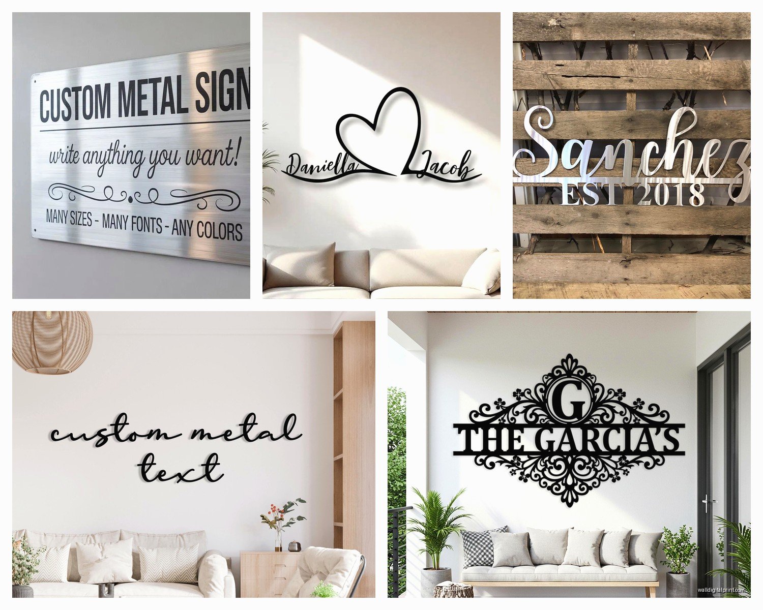
So I’ve been obsessing over personalized metal wall art lately and honestly it started because a client wanted something for her entryway and I went down this whole rabbit hole of materials and finishes and now I can’t stop recommending it to everyone.
The Materials Actually Matter More Than You Think
Okay first thing – not all metal is created equal and this is where people mess up. You’ve got your basic options: steel, aluminum, copper, and brass. Steel is what most people go with because it’s sturdy and takes powder coating really well. I did a custom monogram piece in steel for my sister’s new apartment and it’s been up for like two years with zero issues. The thing with steel though is you gotta make sure it’s treated or it’ll rust, especially if you’re putting it anywhere near humidity.
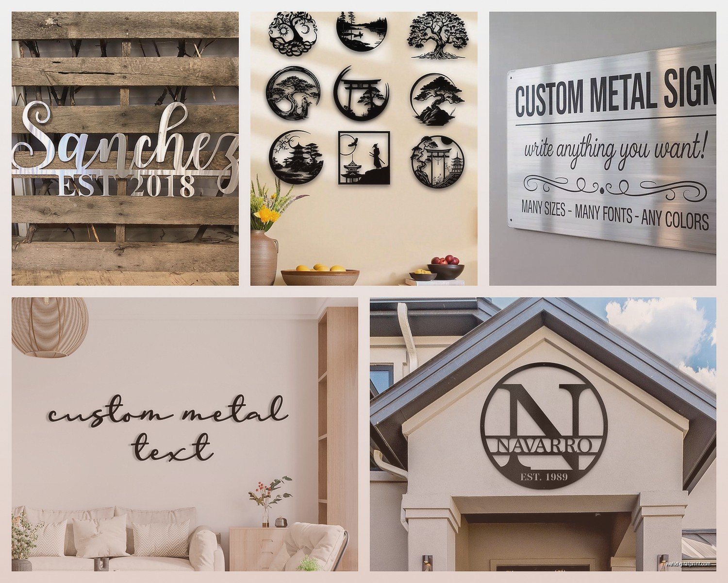
Aluminum is lighter which sounds great until you realize it can look kinda cheap if the design is too thin. But for larger pieces? Actually perfect. I hung this massive family name sign above my couch – aluminum, probably 4 feet wide – and my dog knocked into it once and it didn’t even budge because it’s secured properly but also didn’t put weird stress on the drywall.
Copper and brass are gorgeous but they patina over time which is either exactly what you want or absolutely not what you want. There’s no in between. I learned this the hard way with a copper monogram I put in a bathroom… the moisture made it develop this greenish tint way faster than I expected. Looked amazing actually but the client wasn’t thrilled initially.
Gauge Thickness Is Where People Get Confused
The gauge number is backwards from what you’d think – lower numbers mean thicker metal. Most wall art comes in 14 to 18 gauge. I usually tell people to go with 16 gauge for anything under 2 feet and 14 gauge for bigger pieces. The 18 gauge stuff feels flimsy when you’re holding it and it can warp slightly if the design has long thin elements.
Oh and another thing about thickness – it affects how detailed your design can be. Those intricate script monograms with lots of swoops and curls? They need thinner gauge or the cutting process gets wonky. But then you sacrifice some durability so it’s this whole balancing act.
Finishes and Coatings Change Everything
Raw metal finishes are having a moment but they’re high maintenance. Powder coating is gonna be your best friend for most applications. It’s basically a baked-on finish that’s super durable and comes in literally every color. I’ve got a matte black monogram in my studio and it still looks perfect after three years of me constantly rearranging things around it.
The metallic finishes – brushed steel, hammered copper, oil-rubbed bronze – those show fingerprints like crazy during installation but once they’re up you don’t really touch them so it’s fine. Just wear gloves when you’re hanging them or you’ll see every single smudge.
Wait I forgot to mention – there’s also this automotive-grade finish some companies offer and it costs more but it’s literally the same coating they use on cars. Totally worth it if you’re putting the piece outdoors or in a kitchen where there’s grease and moisture.
Custom vs Semi-Custom Options
This is gonna sound weird but sometimes the “semi-custom” options are actually better than going fully custom. Like, companies that specialize in metal wall art usually have templates for popular fonts and designs that they’ve perfected. I tried to get a fully custom piece made once with this very specific Art Deco font my client loved and the letterforms didn’t translate well to metal cutting. Too many thin sections that would’ve been structural nightmares.
The semi-custom route lets you pick from proven designs and just personalize the text or size. Places like Etsy have tons of shops doing this and the quality varies wildly but you can usually tell from reviews who knows what they’re doing.
Font Choices Are More Technical Than Aesthetic
Okay so script fonts look beautiful in theory but they can be a disaster in metal. All those connecting strokes mean the piece has to be cut as one continuous design which limits your size options and makes it more expensive. Block letters or fonts with separated characters give you more flexibility.
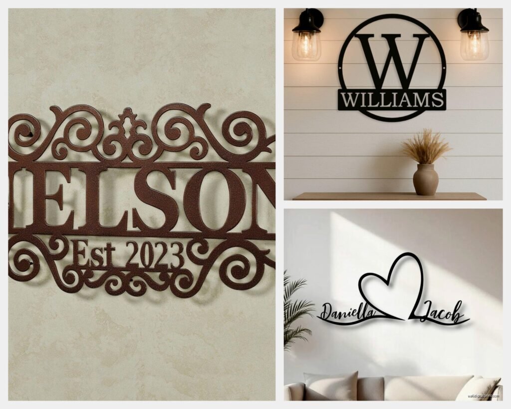
I learned this when I ordered a family name sign in this gorgeous flowing script and when it arrived the connecting pieces were so delicate I was terrified to hang it. It’s still up but I literally check it every few weeks to make sure nothing’s cracked.
Sans serif fonts are the most forgiving – clean cuts, strong structure, works in any size. If you want something fancier, look for serif fonts that have substantial letterforms. That thin elegant Didot-style stuff? Gorgeous on paper, sketchy in metal.
Monograms Have Their Own Rules
Three-letter monograms traditionally go First-LAST-Middle with the last name initial larger in the center. But honestly do whatever looks good to you because it’s your wall. I’ve done plenty where we made all three letters the same size or arranged them horizontally instead of the traditional layout.
Single letter monograms are actually harder to make look substantial. You need either a really decorative font or a large size or it just looks… sad? I did a 24-inch single initial in a ornate Victorian font for an entryway and it works but anything smaller would’ve gotten lost.
The circular monogram designs with the family name around the border and initials in the center – those are super popular right now and they photograph well but make sure you consider the reading distance. I put one in a dining room and from the table you couldn’t actually read the name part clearly.
Sizing Is Always Bigger Than You Think You Need
Everyone underestimates size and then regrets it. I literally have this conversation weekly. That 18-inch sign you’re looking at? It’s gonna look tiny on your wall. My general rule is measure the space and then add 6-8 inches to whatever size you initially thought would work.
For over a couch or bed you want the art to be at least 2/3 the width of the furniture. For entryway walls go bigger than feels comfortable – you want impact. I hung a 36-inch family name sign in my entryway and thought it would be too much but it’s actually perfect.
The weight issue is real though. Once you get above 30 inches in steel you’re looking at pieces that need serious anchoring. I always use wall anchors rated for way more than the piece actually weighs because better safe than having your metal art crash down at 3am and scaring everyone.
Hanging Hardware Varies Like Crazy
Some pieces come with keyhole slots on the back which are fine for lighter stuff but I don’t trust them for anything heavy. The bracket systems where the metal has tabs that hook over screws are way more secure.
Oh and there’s this mounting method where they weld studs to the back of the letters and you drill corresponding holes – gives you that floating off the wall look which is really cool but you gotta be precise with your measurements or it’ll be crooked and there’s no adjusting once those holes are drilled.
My cat knocked over a ladder into a metal piece I had leaning against the wall before installation and it didn’t even dent which was impressive. But that same durability means if you hang something crooked you can’t just bend it to adjust – you gotta rehang it properly.
Indoor vs Outdoor Considerations
Outdoor pieces need special treatment or they’ll deteriorate fast. Powder coating helps but you really want stainless steel or aluminum for exterior use. Regular steel will rust even with coating if there’s any chips or scratches that expose the base metal.
I did an outdoor family name sign for someone’s patio and we went with aluminum and automotive finish – it’s been through two winters and still looks new. But I’ve also seen steel pieces on covered porches that developed rust spots within months because the coating wasn’t applied properly.
UV resistance matters more than you’d think. Some painted finishes will fade in direct sunlight. If you’re putting something on a wall that gets afternoon sun, ask specifically about UV-stable coatings.
Price Ranges and What You Actually Get
Cheap options start around $30-50 for small basic designs but the metal is thin and the finish is usually just spray paint. Fine for a kids’ room or temporary decor but not heirloom quality.
Mid-range is like $80-200 and that’s where you get proper gauge metal with powder coating. This is the sweet spot for most people. The quality jump from cheap to mid-range is huge. The jump from mid-range to high-end is more about design complexity and premium finishes.
High-end custom pieces can run $300-1000+ and you’re paying for things like hand-finishing, premium metals, complex designs, or large sizes. I’ve spec’d pieces in this range for clients and they’re beautiful but you gotta really want that specific thing.
Where to Actually Buy These Things
Etsy is overwhelming but great if you filter by reviews and sales numbers. Look for shops that show actual customer photos not just mockups. I’ve found some amazing small makers there who do incredible work.
There are also these online customization tools on sites like Metal Unlimited or Say It With Steel where you pick your font and size and see a preview. Less personal but more predictable results.
Local metal fabricators are underrated – check welding shops or metal artists in your area. Sometimes they do wall art on the side and you can work directly with them on custom designs. Plus you can see samples in person which is huge.
Design Mistakes I See All The Time
Too many words. Someone tries to fit an entire quote or multiple names and it becomes cluttered. Keep it to one name or a short phrase – like 3-5 words max.
Wrong proportions for the space. That vertical “gather” sign that’s trendy? Needs a tall narrow wall space. Don’t try to make it work above a wide couch.
Ignoring the background wall color. Black metal on dark gray walls disappears. You need contrast or the whole point is lost. I did a consultation where someone had ordered bronze metal art for a brown wall and we had to repaint before it even made sense.
Mixing too many metal finishes in one room. One statement metal piece is great. Three different metal finishes competing for attention is chaos.
Installation Tips That’ll Save You Headaches
Use a level. Obvious but people eyeball it and then it’s crooked forever. I keep a small level in my bag specifically for art hanging.
Mark your holes with painter’s tape first. You can adjust the tape easily and once you’re sure it’s right, drill through it. The tape also helps prevent the drill bit from slipping on smooth walls.
For heavy pieces use two anchor points minimum even if the art only has one hanging slot. Better to over-engineer than have it fall.
Okay so funny story – I once hung a metal piece with regular nails thinking it was light enough and came back the next day to find it had slowly torn out of the drywall and was hanging at this sad angle. Had to patch holes and redo it properly with anchors. Learn from my mistakes.
The floating letter style where each letter is mounted separately looks amazing but takes forever to install because you’re essentially hanging multiple pieces and they all need to be perfectly aligned and level with each other. Budget like an hour minimum for installation.
Maintenance Is Actually Pretty Easy
Dust with a dry microfiber cloth every few months. That’s basically it for indoor pieces with proper finishes.
For raw metal finishes you might need to apply wax or sealant annually to maintain the look and prevent oxidation. It’s not hard just kinda tedious.
Outdoor pieces benefit from an occasional wipe-down with mild soap and water to remove grime buildup.
If you get a scratch in powder coating you can sometimes touch it up with matching spray paint but it’ll never be perfect. Better to just embrace the patina of use honestly.
The pieces I installed years ago still look great with minimal maintenance which is why I keep recommending metal over other materials for personalized wall art – it just lasts and doesn’t require constant fussing.