Wall Art Guide, Wall Art Tutoriels
Personalized Wall Art with Names: Custom Family Text
Apr
So I’ve been completely obsessed with personalized wall art lately and honestly it started because a client wanted something for their entryway that felt custom but wasn’t gonna cost like thousands of dollars. And now I have like three pieces in my own house because I went down this rabbit hole.
Materials That Actually Matter
Okay first thing – the material you pick makes a HUGE difference and nobody tells you this upfront. Canvas is what everyone defaults to but it’s not always the best choice. I learned this the hard way when I ordered this beautiful family name piece on canvas and it showed up looking kinda flat and lifeless. The texture of canvas can actually fight with text sometimes, especially if you’re doing script fonts.
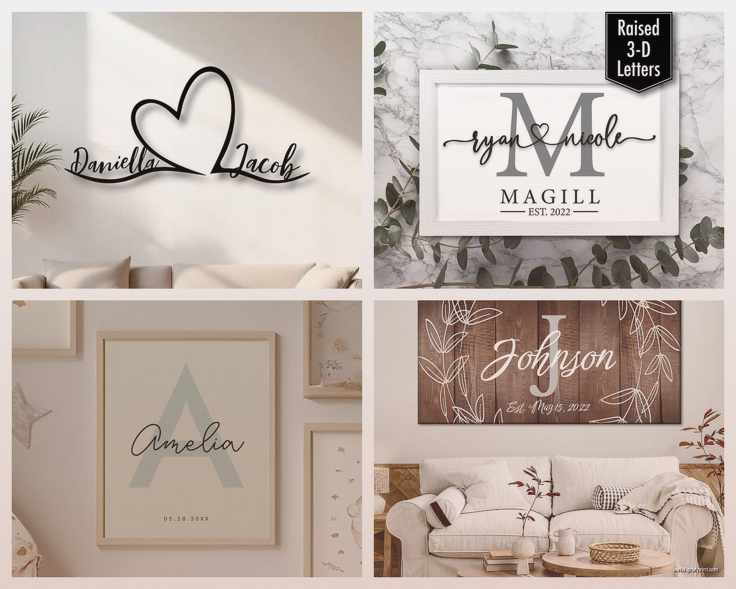
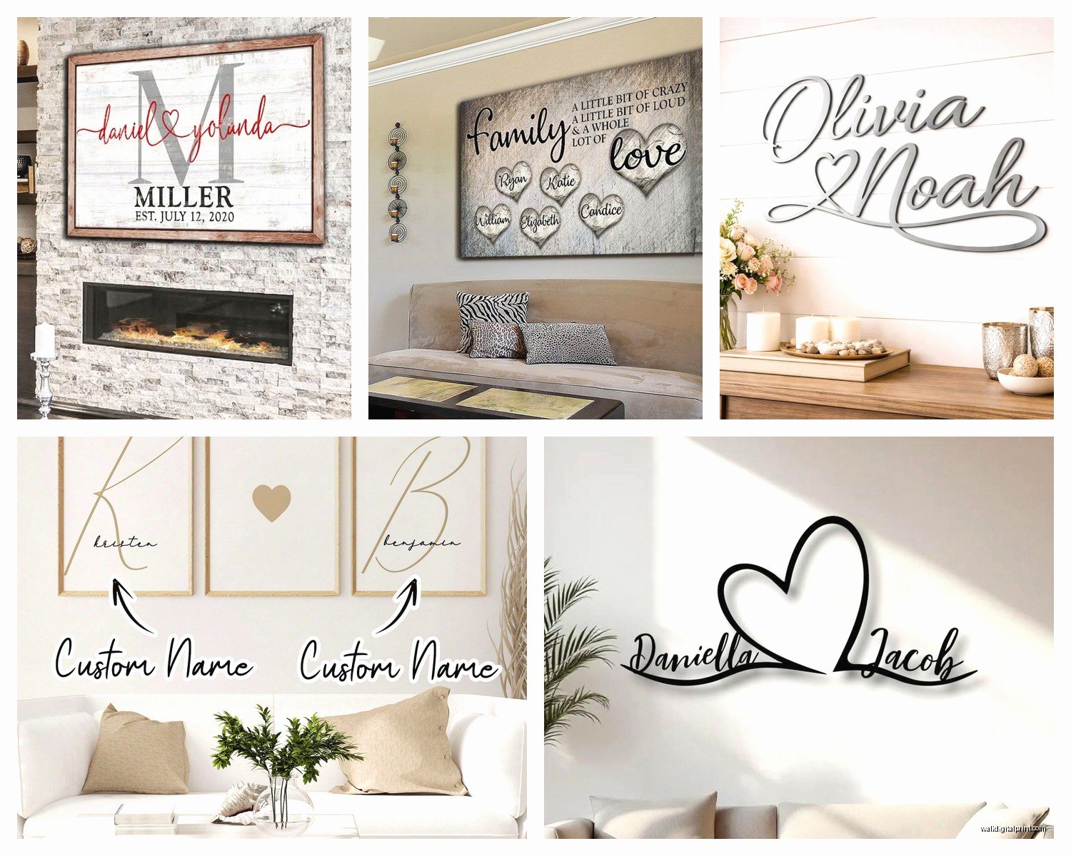
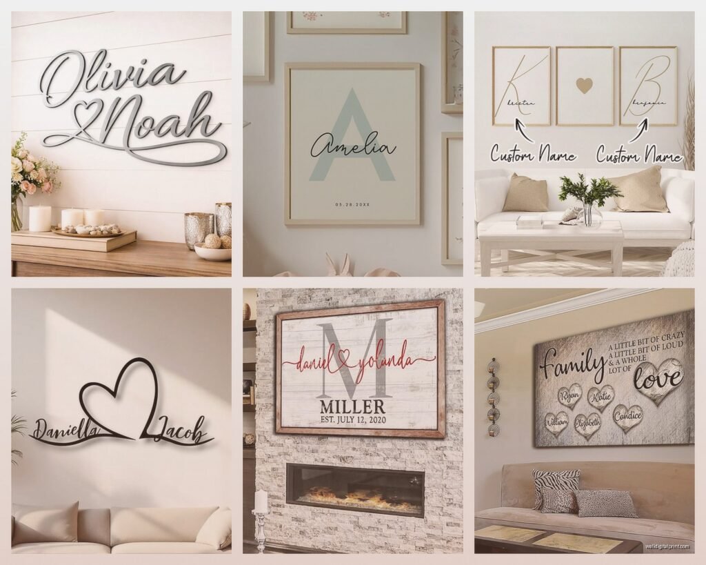
What actually worked better for me was wood. Like real wood prints or even MDF with a smooth finish. The contrast is just sharper and text looks more intentional. I got this piece from a small shop on Etsy – they print directly onto birch wood and the grain shows through slightly which sounds like it would be distracting but it actually adds this warmth that makes it feel less “I ordered this online” if that makes sense.
Acrylic is the other option I’ve tested a lot. It’s more modern obviously but for names and text it can look really sophisticated. The depth you get with acrylic is unreal – like the text appears to float slightly off the wall. But you’re paying for that effect. My sister got an acrylic piece for her last name and kids’ names and it was like $180 for a 16×20 which… yeah.
Metal prints are having a moment too. I curated a show last year where an artist used metal for typography work and it completely changed my perspective. For family names especially if you’ve got a more industrial or modern farmhouse vibe going on, aluminum prints with a brushed finish look expensive even when they’re not.
The Font Situation Nobody Warns You About
This is where people mess up constantly. You find a cute template online with like eight different fonts all mixed together and it looks chaotic in a bad way. I’ve gotten so many panicked texts from friends asking why their wall art looks “wrong” and it’s almost always a font issue.
Stick with two fonts maximum. Usually I do one script or decorative font for the main family name and then a simple sans serif for dates or smaller names. The contrast is what makes it readable from across the room.
Script fonts are tricky with certain letter combinations. Like if your last name has a lot of tall letters (h, l, k, f) some scripts make them loop weird and overlap. I ordered a piece with my client’s name “Halford” in this gorgeous calligraphy font and the H and f basically crashed into each other. We had to reorder with more letter spacing which most companies charge you for as a “custom adjustment.”
Oh and another thing – test how it looks in all caps versus title case. Family names in all caps can feel very formal and traditional (which might be what you want) but sometimes title case feels more personal and lived-in. I’ve been doing a lot of mixed case lately where the last name is caps and first names are lowercase and it has this modern vibe.
Color Choices That Don’t Look Basic
Everyone defaults to black text on white background and look, it’s classic for a reason. But you’re also gonna have the same thing as literally everyone else on Pinterest.
I’ve been experimenting with navy blue text on cream backgrounds and it’s so much softer while still being readable. Or charcoal gray on a pale blush pink if you want something that doesn’t scream “I have all boys” or whatever.
For more dramatic spaces dark backgrounds work really well. White or gold text on black or deep green looks expensive and moody. I did a piece for above a fireplace with cream text on forest green and my client literally cried when we hung it which was… a lot but also validating.
The metallics are where you gotta be careful. Gold foil or gold leaf text sounds amazing in theory but it can read as very 2015-wedding-decor if you’re not careful. Rose gold is even worse honestly. If you’re doing metallic go with actual brushed metal material rather than printed metallic colors. The texture makes all the difference.
Wait I forgot to mention – if you’re doing this for a kids’ room or nursery you can get away with more color obviously. But even then I’d keep the background neutral and just make the text colorful. I saw this piece recently with each kid’s name in a different pastel shade on white and it was actually really sweet without being too cutesy.
What Text to Actually Include
This is gonna sound weird but less is almost always more. I see people trying to cram their entire family tree onto one piece with names, birthdates, anniversary dates, family motto, zip code where they got married… and it just becomes visual noise.
The pieces that look best in actual homes usually have:
- Last name or “The [Name] Family”
- Maybe an established date
- First names if you really want them
- One short phrase if it means something specific to you
That’s it. I have a piece in my hallway that just says “Bennett” with “Est. 2012” underneath and everyone asks where I got it. It’s simple, it’s readable from the street through my front window, and it doesn’t require people to stand there reading for five minutes.
Some people do the whole “family name with first names branching off” design and those can work but they need a LOT of wall space. Like minimum 30×40 inches or it looks cramped. My friend tried to do this on a 16×20 with five kids’ names and you literally needed to walk up close to read anything.
Size and Placement Reality Check
Okay so funny story – I ordered what I thought was gonna be this statement piece for above my couch and it showed up and was like… the size of a dinner placemat. Always check actual dimensions not just the product photo.
For above a couch or bed you want something at least 30 inches wide minimum. Like that’s the smallest you should go. I usually aim for 36-48 inches for those spaces. The piece should be roughly two-thirds to three-quarters the width of your furniture.
Entryways can handle slightly smaller since you’re seeing them from closer up. A 20×24 or 24×30 works great there.
For a gallery wall situation you’ve got more flexibility but make sure the name piece is the largest or most central element. I see people make it the same size as their other art and then it gets lost.
Height matters too – center of the artwork should be at 57-60 inches from the floor which is standard gallery height. Everyone hangs stuff too high. Your personalized name art should be at eye level not floating near the ceiling.
Where to Actually Order From
I’ve tested like a ridiculous number of shops at this point. Etsy is obvious and there are some really talented sellers on there but quality varies wildly. Read reviews that include photos, not just five-star ratings with no context.
Some shops I’ve had good experiences with do the wood signs – they usually ship from North Carolina or somewhere with access to good wood suppliers. Turnaround is longer though, like 2-3 weeks sometimes.
For faster shipping the print-on-demand places work fine if you’re doing paper prints or canvas. You can frame them yourself which gives you more control over the final look anyway. I actually prefer buying the art unframed and then taking it to a framer or using a service like Framebridge because then you can match your existing frames or go with something more unique.
Minted has a personalization option that’s pretty user-friendly and their printing quality is consistently good. More expensive than Etsy but faster and you know what you’re getting.
There’s also been this trend of DIY with Cricut or vinyl lettering if you’re crafty. I’m not gonna lie I tried this and my cat jumped on the transfer tape and completely ruined it so… that was a whole thing. But if you’re patient and precise it can look really professional and you save money.
Finishing and Framing Considerations
If you’re getting canvas make sure it’s gallery wrapped which means the edges are finished and you can hang it without a frame. Some cheaper canvas prints have white edges that look unfinished.
For paper prints you absolutely need a frame with a mat. Just paper on wall looks temporary and college-dorm-ish. A simple black or wood frame with a white mat makes everything look more intentional.
Wood pieces usually come ready to hang which is nice but check what kind of hanging hardware they include. Some shops send them with sawtooth hangers which are fine for lightweight pieces but anything over like 3 pounds needs proper D-rings and wire.
Acrylic pieces often have standoffs (those little metal spacers) that make them float off the wall. Make sure you’re comfortable installing those because they need to be level and evenly spaced or it looks sloppy.
What Actually Works in Different Rooms
Living room – go bigger and bolder. This is where you can do the full family name with established date situation. Above the couch is classic but also consider above a console table or fireplace.
Bedroom – keep it more intimate. Just a last name or your couple name if you have one of those combined names. I did “The Bennetts” above our bed in a simple serif font on wood and it’s subtle but personal.
Kitchen or dining room – this is where you can get a little more playful with phrases. “Gather” or something about food if you’re into that. Though honestly I think the trend of word art in kitchens is kinda played out but you do you.
Kids’ rooms – their names obviously but consider how long the design will work. A piece with cartoon characters ages out fast but a simple name in a nice font grows with them. I always tell clients to think middle school – will your kid be embarrassed by this in seven years.
Entryway – family last name makes the most sense here. It’s literally the first thing people see and it sets the tone. Keep it elegant and not too cutesy.
Common Mistakes to Avoid
Okay rapid fire things I’ve seen go wrong:
- Ordering too small – already mentioned but worth repeating
- Picking fonts that are too thin – they disappear on the wall
- Forgetting to spell check before submitting – I’ve seen “Jonhson” and “Smtih” and it’s painful
- Not considering your wall color – light text on light walls doesn’t work
- Over-designing with too many decorative elements
- Choosing trendy styles that’ll look dated in two years
- Not measuring the space first
The biggest thing is just to keep it simple. The temptation is to add more and more elements but the pieces that actually look good five years later are the understated ones.
I’ve got a piece arriving next week actually that I’m testing for a client project – it’s last name in a really chunky serif font on natural wood and I’m hoping it has that expensive custom look. The mockup looked good but you never really know until it shows up.
Anyway that’s basically everything I’ve learned from ordering way too many of these. Start with your room’s style and work backward from there. Modern spaces need clean fonts and simple layouts, traditional spaces can handle more decorative scripts, farmhouse obviously wants wood or distressed finishes. And always always check the dimensions before ordering because that’s just gonna save you so much hassle.