Wall Art Guide, Wall Art Tutoriels
Petrol Vibes Wall Art: Blue-Green Urban Modern Designs
Mar
So I’ve been working with petrol-toned wall art for like three years now and honestly it’s the one color family that clients either immediately get or look at me like I’m speaking another language. That blue-green zone is tricky because lighting changes everything and I mean EVERYTHING.
What Petrol Actually Is (Because Everyone Asks)
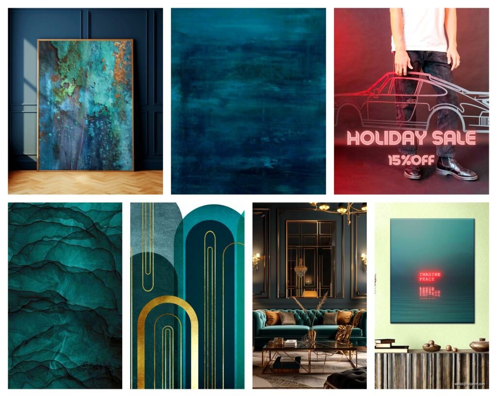
Okay so petrol sits in this weird spot between teal and navy. It’s got more gray than teal, more green than navy, and depending on your wall color it can read completely different. I had this whole situation last month where I hung a petrol abstract piece in a client’s living room and in morning light it looked almost forest green but by 4pm it was reading straight blue. We ended up keeping it because she loved both versions but like… you gotta test this stuff.
The hex codes you’re looking at usually range from like #005F6A to #1E5C5F to sometimes #2C5F63. But honestly those numbers don’t mean much when you’re standing in your actual room with your actual lighting situation.
Why Urban Modern Spaces Love This Color
Petrol works in modern spaces because it’s moody without being dark dark. It’s got enough presence to anchor a room but it doesn’t eat light like straight navy or charcoal would. I use it constantly in loft spaces, those converted industrial buildings where you’ve got concrete or exposed brick.
The blue-green thing plays really well with:
- Concrete and cement finishes
- Brass or copper fixtures (the warm metal contrast is *chefs kiss*)
- Light oak or ash wood
- White shiplap or painted brick
- Black steel frames and furniture
One thing I noticed after placing probably 40+ petrol pieces is that it makes white walls look crisper. Like it actually enhances the white instead of making it look dingy the way some blues can.
The Undertone Situation You Need to Understand
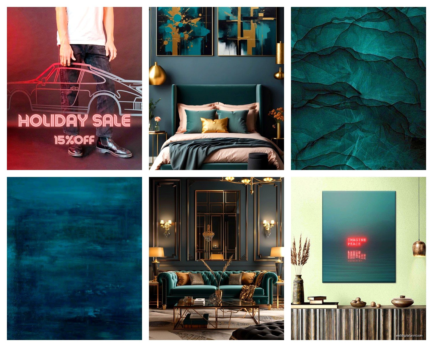
This is gonna sound weird but I keep paint swatches in my bag specifically for this. Petrol isn’t one color, it’s basically three different color families pretending to be one:
Green-leaning petrol: This has more of that emerald or forest base. In bright light it can almost read as a muted teal. I use this version in spaces that have warm wood tones or terracotta elements because it creates this earthy-but-modern vibe. Had a client with a bunch of vintage leather furniture and the green-petrol pieces I curated made everything feel collected instead of matchy.
Blue-leaning petrol: This tips more toward that classic navy territory but still has the green keeping it complex. Better for cooler spaces, works amazing with gray sofas and chrome fixtures. This is the one that photographs really well for some reason, probably because cameras pick up the blue more than the green.
Gray-leaning petrol: The most neutral of the bunch and honestly my go-to for commitment-phobes. It’s got enough color to be interesting but it acts almost like a neutral. This is what I recommend if you’re worried about the color being too much or if your space already has a lot going on.
Pairing Petrol Wall Art With Your Existing Stuff
Okay so you probably already have a room set up and you’re trying to figure out if petrol will work. Here’s what I’ve learned from trial and lots of error:
If Your Walls Are White or Off-White
You literally cannot go wrong. White walls are like the best canvas for petrol art. The contrast is strong enough to make the art pop but not so harsh that it feels jarring. I hung a massive petrol geometric piece in my own apartment last year (like 4 feet by 5 feet) and my landlord-white walls suddenly looked intentional.
Pro tip though – if your whites are warm (like cream or ivory), go for the green-leaning petrols. If your whites are cool (bright white or blue-white), the blue-leaning versions look cleaner.
If Your Walls Are Gray
This is where I’ve seen the most disasters honestly. Gray plus petrol can either look incredibly sophisticated or like you just grabbed random stuff from HomeGoods. The trick is temperature matching.
Warm grays (the ones with beige or brown undertones) need green-leaning petrol. Cool grays (the ones that almost look blue or purple in certain light) pair better with blue-leaning petrol. I spent an entire afternoon once moving pieces around a client’s bedroom because we had a blue-petrol piece against warm gray walls and it just looked… off. Swapped it for a green-petrol abstract and suddenly the whole room clicked.
Oh and another thing – if your grays are dark (like charcoal), petrol art can disappear. You’ll want pieces that have white or cream elements mixed in to create enough contrast.
If Your Walls Are Navy or Dark Blue
Surprisingly this works but you gotta go big or go home. Small petrol pieces on navy walls just look like slightly different navy. I did a study where I had navy accent walls and the only petrol art that worked was either oversized (like 3+ feet) or had significant white/cream elements creating pattern.
Actually the best petrol-on-navy situation I ever did was this textured piece that was mostly cream with petrol geometric shapes. The navy wall became the backdrop and the petrol shapes created this layered depth thing that was really cool.
If Your Walls Are Beige or Tan
Green-leaning petrol all the way. The warm walls plus cool color creates balance. Blue-leaning petrol against beige can look muddy or make the beige look dirty. I learned this the hard way in my first year when I put a blue-petrol landscape piece in a client’s tan dining room and she literally texted me “I think my walls look yellow now?”
Accent Colors That Make Petrol Pop
This is where it gets fun because petrol is surprisingly versatile with accent colors. Way more than I initially thought.
Mustard Yellow
Okay I know this sounds like a Pinterest cliche but it WORKS. The mustard warmth against petrol cool is just… it’s good. I use this combo constantly in living rooms and dining spaces. Usually I’ll do petrol as the main art piece and bring in mustard through pillows or a throw blanket.
The key is ratio – like 70% petrol, 20% neutral (white/cream/gray), 10% mustard. If you go 50/50 it starts looking too matchy and deliberate.
Blush or Dusty Pink
This combination is everywhere right now for a reason. The pink softens the petrol, makes it feel less masculine or industrial. I curated this wall for a client who wanted moody but not aggressive and we did a large petrol abstract with these subtle blush geometric pieces flanking it. Her husband was skeptical about pink but once it was up he got it.
Works especially well in bedrooms or spaces where you want that calm but interesting vibe.
Terracotta or Rust
If you’re going for that earthy modern look, petrol plus terracotta is your answer. The orange undertones in terracotta create this really grounded palette. I see this combo working best with green-leaning petrols because you’re building on that earth-tone foundation.
Had this client with a bunch of plants (like borderline jungle situation) and we did petrol art with terracotta pottery and it felt like a botanical garden but modern.
Brass and Gold Metallics
Not technically a color but I’m including it because the warm metallics transform petrol art. I always always always recommend brass or gold frames for petrol pieces instead of silver or black. The warmth just elevates everything.
Quick story – I was watching The Great British Baking Show while hanging pieces in my studio (I know, riveting life) and I spilled coffee on this petrol and gold leaf print I was about to ship to a client. Had a mild panic attack, but it actually barely showed because of the texture of the paper. Ended up ordering a backup anyway but that’s when I realized the thicker textured prints hold up way better than smooth finishes.
What Doesn’t Work (From Experience)
Bright red. Just don’t. It competes too much and everything looks loud. Same with bright orange – the neon-y kind, not the earthy terracotta kind.
Purple gets weird. Sometimes it works if it’s like a deep eggplant but usually petrol and purple together just look bruised.
Bright white as an accent (not as a wall color) can make petrol look dingy. Cream or off-white is better if you’re bringing in light neutral accents.
Types of Petrol Art Designs That Actually Work in Urban Spaces
I’ve placed everything from photography to abstract paintings to digital prints and some styles just perform better than others in modern urban settings.
Geometric Abstracts
These are like 60% of what I recommend for petrol. Clean lines, shapes, maybe some layering. They read as modern without being too cold or minimal. The geometric structure plays well with the architectural elements you typically have in urban spaces – the clean lines of modern furniture, the grid of windows, the angles of rooms.
Look for pieces that mix petrol with cream or white geometric shapes. The contrast creates visual interest without needing multiple colors. I have this one piece in my office that’s basically petrol rectangles on cream and I’ve stared at it for two years and I’m still not bored.
Line Art and Minimalist Drawings
Petrol line drawings on white or cream backgrounds are having a moment. They’re clean, they’re modern, they work in small spaces without overwhelming. I use these a lot in entryways or hallways where you want something interesting but you don’t have a huge wall to work with.
The thin lines in petrol against a light background create this airy sophisticated thing. Works great in clusters too – like three or four pieces in a grid.
Abstract Watercolors
When petrol is done in watercolor style with those soft bleeds and gradients, it softens the whole vibe. This is what I recommend for bedrooms or spaces where you want calmer energy. The fluid organic quality balances out the hard edges of modern furniture.
Best ones have movement – like the color flows across the canvas instead of sitting in solid blocks. Creates visual interest without being busy.
Textured or Layered Pieces
Anything with actual physical texture or the illusion of texture adds so much depth. Petrol can read flat if it’s just solid color, but texture changes everything. I’m talking about pieces with visible brushstrokes, or layered elements, or mixed media that has dimensional quality.
These work especially well in spaces with a lot of smooth surfaces – like if you have glossy kitchen cabinets or sleek furniture, the textured art creates necessary contrast.
Photography in Petrol Tones
Ocean photography, moody landscapes, urban architecture shots that have been color-graded to emphasize petrol tones. These bring in that representational element without being traditional or expected.
I hung this aerial ocean photo that was all petrol and navy in a client’s office and people always comment on it. There’s something about abstract-ish photography that feels sophisticated.
What to Avoid
Literal ocean or water themes can be too on-the-nose with petrol. Like yeah it’s blue-green but you don’t need a picture of actual water necessarily.
Super busy patterns. Petrol is already a complex color, if you add too much pattern complexity it gets overwhelming fast.
Anything too traditional or classical. Petrol reads modern so if you put it in a ornate gold frame with like, a classical landscape, it creates this confused vibe.
Size and Placement Strategy
Okay so you’ve figured out what style and which petrol undertone, now where does it actually go and how big should it be.
The Living Room
This is usually where people want to make a statement. For over the sofa, I typically recommend pieces that are 2/3 to 3/4 the width of the sofa. So if your sofa is 84 inches, you’re looking at like 56-63 inches of art width.
You can do one large piece or a diptych or triptych. I’ve been doing a lot of triptychs lately where the three pieces together create one large petrol abstract. Gives you flexibility – if you move, you can separate them.
Height-wise, the center of the art should be at eye level, which is usually around 57-60 inches from the floor. But honestly in modern spaces with high ceilings, I sometimes go higher to emphasize the vertical space.
If you’re not putting it over the sofa, a large petrol piece on the wall opposite your seating creates a focal point. This is what I did in my own place because my sofa backs up to a window.
The Bedroom
Over the bed is obvious but I actually prefer petrol art on the wall you see when you’re lying down. Like the wall opposite the bed or a side wall. When you’re trying to sleep, having a large piece directly above your head can feel heavy.
If you do go above the bed, make sure there’s at least 6-8 inches between the headboard and the bottom of the frame. And keep it to like 2/3 the width of the bed max – you don’t want it wider than the bed, looks unbalanced.
Bedroom petrol art should lean toward the calmer end –