Wall Art Guide, Wall Art Tutoriels
Pink and Blue Wall Art: Soft Pastel Gender Neutral
Mar
So I’ve been working with pink and blue wall art for literally three years now and honestly? It’s gotten so much easier to nail the gender-neutral vibe than it used to be. My neighbor just asked me about this yesterday because they’re doing a nursery but don’t wanna find out the gender, and I realized I have SO many thoughts.
The Shade Thing Everyone Gets Wrong
Okay so here’s what nobody tells you – not all pastels work together. I learned this the hard way when I ordered what I thought were “soft” pink and blue prints for a client’s home office and they arrived looking like a Easter basket exploded. The trick is staying in the same tonal family, which sounds fancy but really just means…
You want dusty rose with slate blue. Or blush pink with powder blue. The second both colors look like they’ve been “grayed out” a bit, you’re golden. I literally hold my phone up with a gray scale filter sometimes to check if they’re the same depth – if one looks way darker than the other in grayscale, they’re gonna clash.
The worst combo? Hot baby pink with navy-ish blue. Don’t do it. Just trust me on this one.
Where to Actually Start
Most people buy the art first and then realize it doesn’t work with their walls. Do it backwards. Look at your wall color first – is it warm white, cool white, greige, actual gray? Because a warm-toned soft pink is gonna look AMAZING on a greige wall but kinda weird on stark white.
My own living room is this Benjamin Moore Paper White situation, and I had to go with cooler-toned pastels or everything looked too yellow. My cat knocked over my coffee while I was figuring this out and the stain actually helped me see the undertones better, which is probably not the recommended method but whatever worked.
The Wall Color Cheat Sheet
- Warm whites and creams – go with peachy pinks and periwinkle blues
- Cool whites – dusty rose and slate blue are your friends
- Gray walls – almost anything works but cooler tones look more intentional
- Beige/greige – stick with warmer pastels or it’ll feel confused
Size and Layout Because This Matters More Than You Think
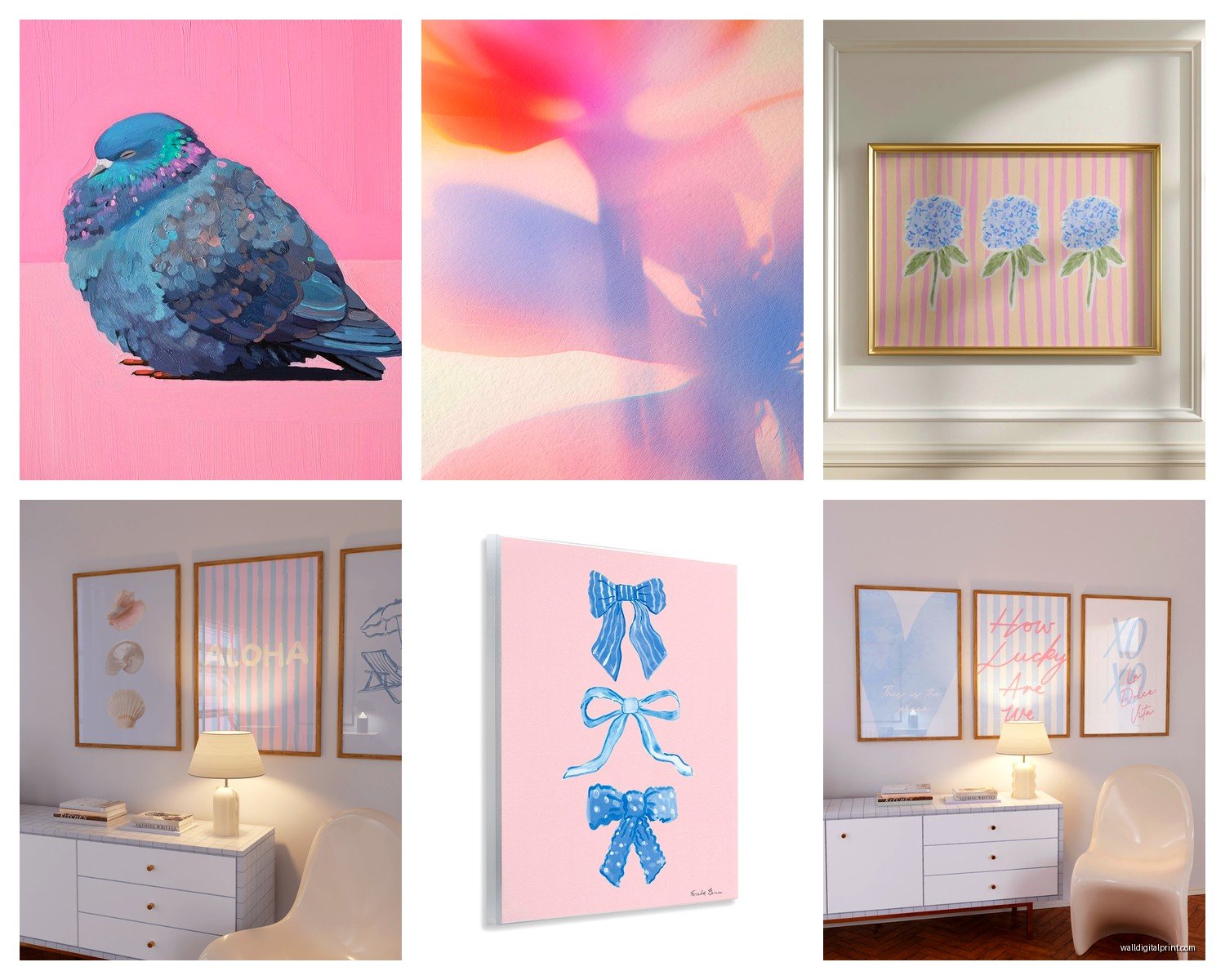
I see people buying these tiny 8×10 prints and wondering why their wall looks empty. For a gender-neutral pastel situation, you actually want to go bigger than you think. The soft colors kinda disappear if they’re too small, especially from across a room.
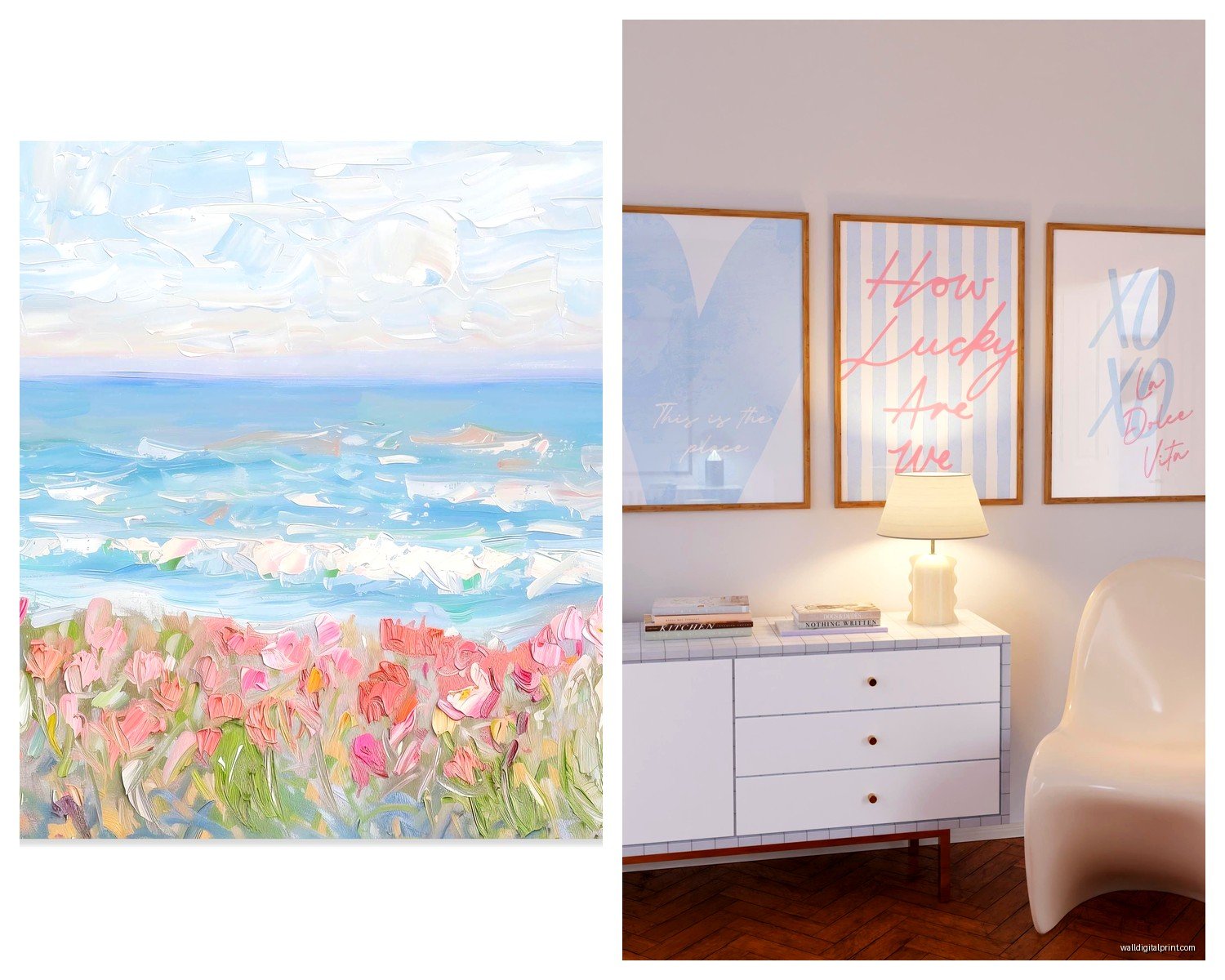
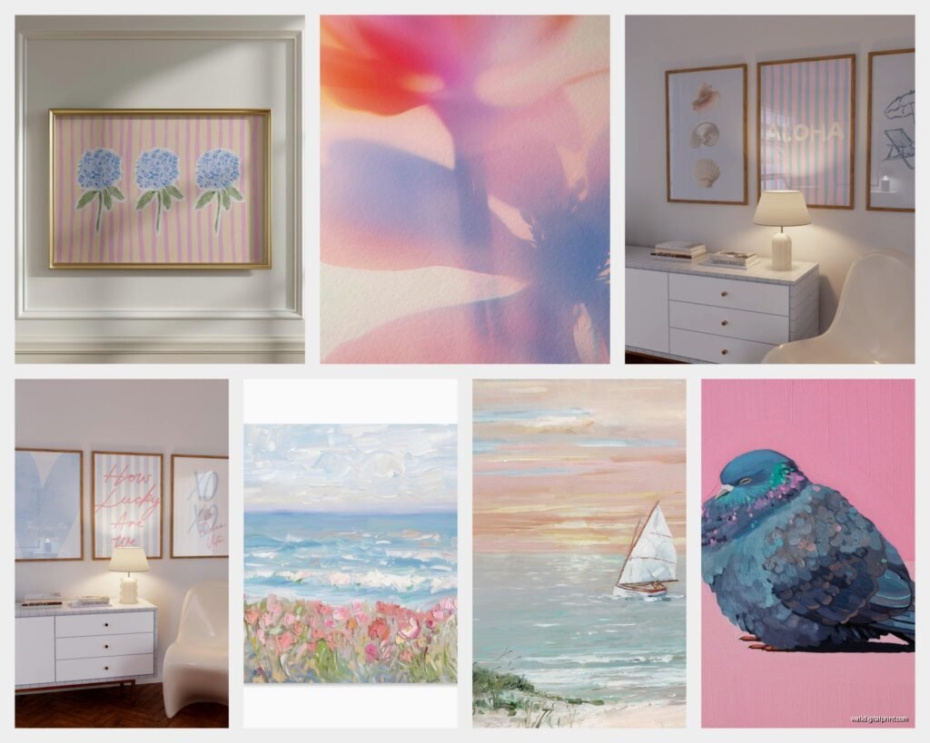
For over a crib or changing table, I usually do either one large piece (like 24×36 minimum) or a set of three 16x20s. Over a sofa or in a living room? Go even bigger. I did a client’s space last month with a 40×60 abstract pink and blue piece and it completely anchored the room without being overwhelming because the colors were so soft.
The Gallery Wall Approach
Okay so funny story – I used to think gallery walls with pastels would look too busy, but then I was watching The Great British Bake Off one night (don’t judge my choices) and noticed how they style the tent with tons of soft colors that somehow don’t compete. It clicked.
For a pink and blue gallery wall:
- Mix different sizes but keep frames consistent
- Use white or light wood frames – black is too harsh for pastels usually
- Throw in one or two neutral pieces (cream, taupe, soft gray) to break it up
- Don’t try to match the exact shades in every piece, just stay in the same temperature range
I usually do 5-7 pieces for a gallery wall. Less than that looks unfinished, more than that gets chaotic unless you really know what you’re doing.
Art Styles That Actually Work
Not every art style reads as gender-neutral even when you’re using the right colors. Like, a super detailed floral in pink and blue? Still gonna lean feminine for most people’s taste. Here’s what I’ve found actually works:
Abstract shapes and watercolor washes – This is probably the easiest route. Gentle color bleeds, organic shapes, nothing too literal. I source a lot of these from independent artists on Etsy and even Society6 sometimes.
Geometric patterns – Triangles, circles, gentle lines. Keeps it modern and the soft colors prevent it from feeling too stark. I just finished a playroom with geometric pastels and the parents were worried it would feel too “designed” but it’s actually really calming.
Minimalist line drawings – Think simple mountain ranges, abstract faces, botanical outlines. When they’re done in soft pink and blue, they feel contemporary and peaceful. Not like trying too hard.
Ombre or gradient pieces – Pink fading into blue or vice versa. Super cohesive obviously since the colors literally blend together. Just make sure the transition is smooth and not stripey.
What to Avoid
Things that immediately gender the space even with pastel colors:
- Obvious themed stuff – trucks, dolls, sports equipment, tutus, you get it
- Too much text with gendered words
- Hyper-realistic animals in pink and blue (somehow reads younger and more gendered?)
- Anything glittery or with that metallic sheen – goes feminine fast
Frame Colors Matter Way More Than You’d Think
I spent like two hours last Tuesday comparing frame options because my client canceled and I got obsessed. Here’s what I figured out:
White frames keep everything light and airy. They’re the safest choice and work in basically any room. But they can sometimes make the art feel a bit… I dunno, expected?
Light wood (like oak or maple) adds warmth without competing with the pastels. This is my go-to for nurseries and bedrooms because it feels more organic and less “matchy matchy.”
Natural wood with visible grain adds texture which is nice when your colors are super soft. Prevents the whole thing from feeling too flat.
Black frames – I know I said they’re usually too harsh, but occasionally if your space has other black elements (like window frames or furniture) and you want something more dramatic, it can work. Just test it first.
Mixing Patterns and Textures
Oh and another thing – you don’t want everything to be the same finish. All matte looks flat, all glossy looks cheap (sorry but it’s true). I like mixing:
- One or two pieces with texture – think canvas with visible brushstrokes
- Some smooth matte prints
- Maybe one with a subtle sheen if you’re doing a larger grouping
The variation keeps your eye moving around instead of just glazing over a wall of similar-looking art.
Actual Shopping Tips
Where I actually buy this stuff when clients are on different budgets:
Etsy – Best for finding unique pieces and supporting independent artists. You can usually message them about customizing colors too. Prices range wildly but I’ve gotten great stuff for $30-80 per print.
Minted – More curated, higher quality usually. Their pastels tend to be really well done. Pricier though, like $150+ for framed pieces.
Society6 – Hit or miss on quality but good for trying out a look without committing serious money. Their smaller prints are pretty affordable.
Local art fairs and markets – I’ve found some of my favorite pieces this way. You can see the actual colors in person which is huge with pastels since they photograph differently.
The Printing Quality Question
If you’re getting prints made from digital files, pay attention to the paper. Matte fine art paper makes pastels look softer and more expensive. Glossy photo paper can make them look washed out or too bright. I learned this after ordering a whole set that looked completely wrong because of the finish.
Lighting Is Gonna Change Everything
This is gonna sound weird but the lighting in your room will literally change how your pink and blue art looks. Warm bulbs (the yellowish ones) make pinks look more peachy and blues look slightly green sometimes. Cool bulbs (the blue-white ones) keep the colors truer but can feel harsh.
I usually recommend soft white LEDs (around 3000K if you wanna get technical) for rooms with pastel art. It’s that middle ground where colors look accurate but the room still feels cozy.
And natural light? If your art is in direct sunlight, you gotta make sure it’s fade-resistant or it’ll turn into completely different colors within a year. UV-protective glass is worth it if you’re investing in nicer pieces.
Making It Work in Different Rooms
Nursery/Kids Room: Obviously the most common spot. I usually go with more playful compositions here – maybe abstract animals or soft geometric patterns. Keep the frames light wood or white, and don’t be afraid to go bigger than you think you need.
Living Room: This is where you want more sophisticated abstracts or minimal line art. Larger scale pieces work better. I just did a living room with a huge pink and blue abstract over the sofa and it’s elegant, not juvenile.
Bedroom: Soft and calming is the goal. Watercolor washes, gentle gradients, abstract landscapes in pastel tones. I like pairing pink and blue art with white or cream bedding here.
Home Office: Geometric patterns and modern abstracts keep it professional but still interesting. Just avoid anything too busy that’ll be distracting during video calls.
The Styling Around It
Your art doesn’t exist in a vacuum (I mean obviously). What else is in the room matters:
If you’ve got pink and blue art, pull one of those colors into your textiles – throw pillows, a blanket, maybe a rug. But don’t try to match them exactly or it looks too coordinated. Just echo the general tone.
Add in neutrals to balance. Lots of white, cream, natural wood, maybe some soft gray. The pastels should be accents, not the entire color story.
Greenery helps. Real or fake plants add life and keep the pink and blue from feeling too color-scheme-y. I always add at least one plant near pastel art installations.
Budget Breakdown
Since everyone always asks about cost:
Low budget (under $100 total):
Get 2-3 prints from Etsy or Society6, print them yourself at a local print shop on good paper, use simple white frames from Amazon or Target. Totally doable and can look great.
Mid budget ($200-400):
Buy ready-to-hang pieces from Minted or similar, or get custom prints from Etsy artists and have them professionally framed locally. This is where most of my clients land.
Higher budget ($500+):
Commission custom pieces from artists, get museum-quality framing, or invest in original artwork. The colors will be exactly what you want and it’ll last forever.
Testing Before Committing
Here’s something I always tell people – tape up paint swatches or print out low-res versions of the art you’re considering before buying. Live with it for a few days. Look at it in morning light, afternoon light, evening with lamps on.
I’ve saved so many clients from expensive mistakes this way. What looks perfect on your phone at midnight might look completely different on your actual wall at 2pm.
Okay I think that’s everything I’ve learned from doing this approximately a million times. The main thing is just keeping the tones soft and consistent, going bigger than feels comfortable, and not overthinking it too much. Pastels are forgiving – they’re literally designed to be gentle and easy on the eyes.