Wall Art Guide, Wall Art Tutoriels
Pink and Green Wall Art: Preppy Fresh Spring Combo
Mar
So I’ve been completely obsessed with this pink and green combo lately and honestly it started because I needed to redesign this client’s sunroom but then I ended up redoing half my own living room at 2am which… probably says something about my priorities but whatever.
The thing about pink and green wall art is that it can go preppy SO fast, and sometimes that’s exactly what you want, but sometimes you accidentally end up with a Lilly Pulitzer store explosion and that’s not for everyone. I’ve tested like fifteen different shade combinations at this point because my dog knocked over my coffee onto a mood board and I had to start over anyway, so might as well experiment right?
Getting the Shade Balance Right
Okay so here’s what actually matters. You need to pick your dominant color first and this is where everyone messes up. Most people think pink should be the star because it’s bolder or whatever, but green should honestly be your anchor like 60-70% of the time.
The greens that work best are sage, eucalyptus, and this specific mossy green that’s hard to describe but you know it when you see it. Hunter green can work but it gets really traditional really fast. I learned this the hard way when I bought three prints with hunter green and they looked like they belonged in a country club from 1987.
For pink, you want either a dusty rose (super safe, works with everything) or a coral-leaning pink if your room gets good natural light. Hot pink is tricky because it needs to be like an accent in the art, not the main event. Maybe 10-15% max of the composition.
What Doesn’t Work
Baby pink with kelly green. Just don’t. It reads more Easter basket than preppy fresh and I spent $180 learning this lesson so you don’t have to.
Neon anything with this combo unless you’re specifically going for that 80s vibe which is fine but that’s a different aesthetic entirely.
Art Styles That Actually Look Good
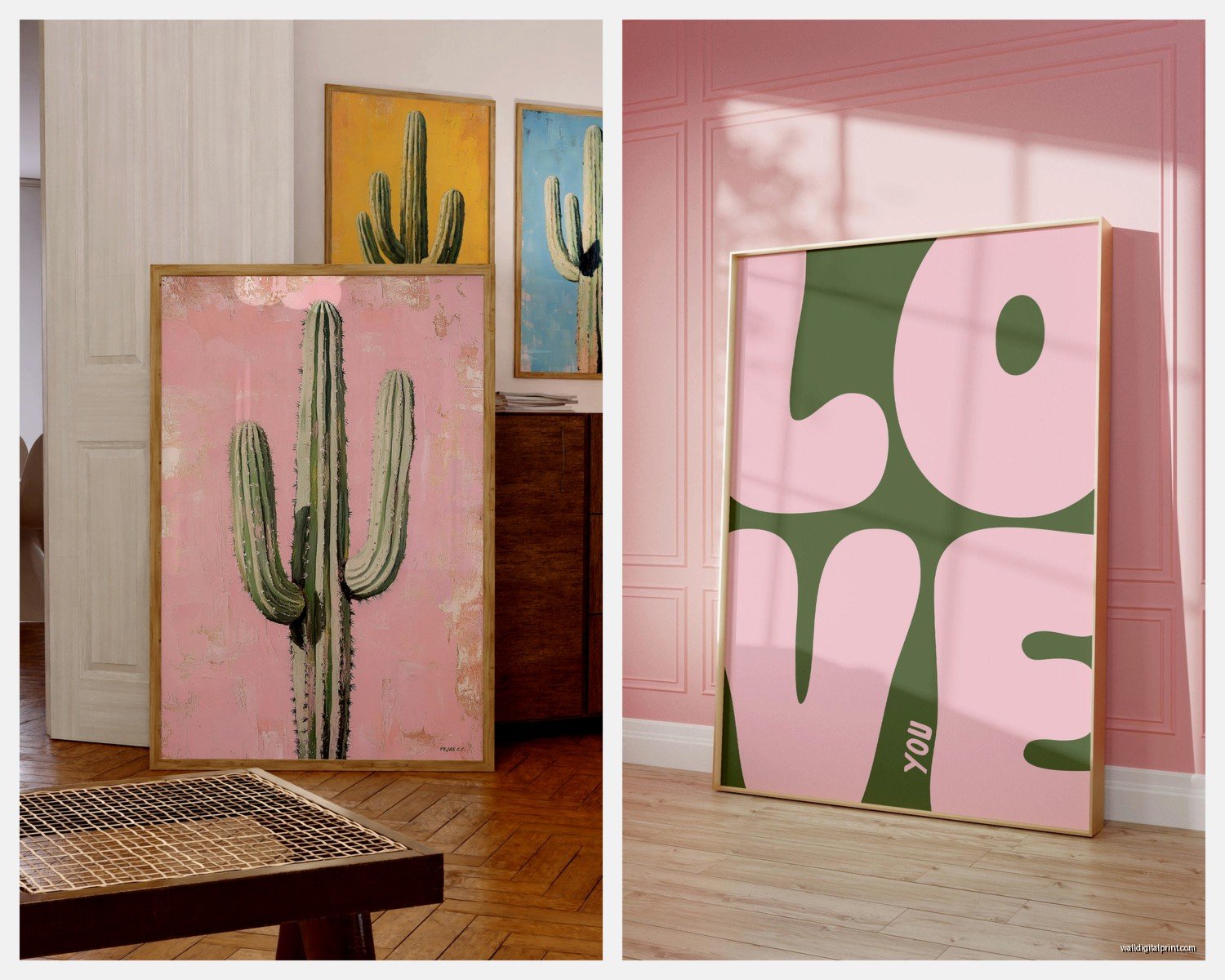
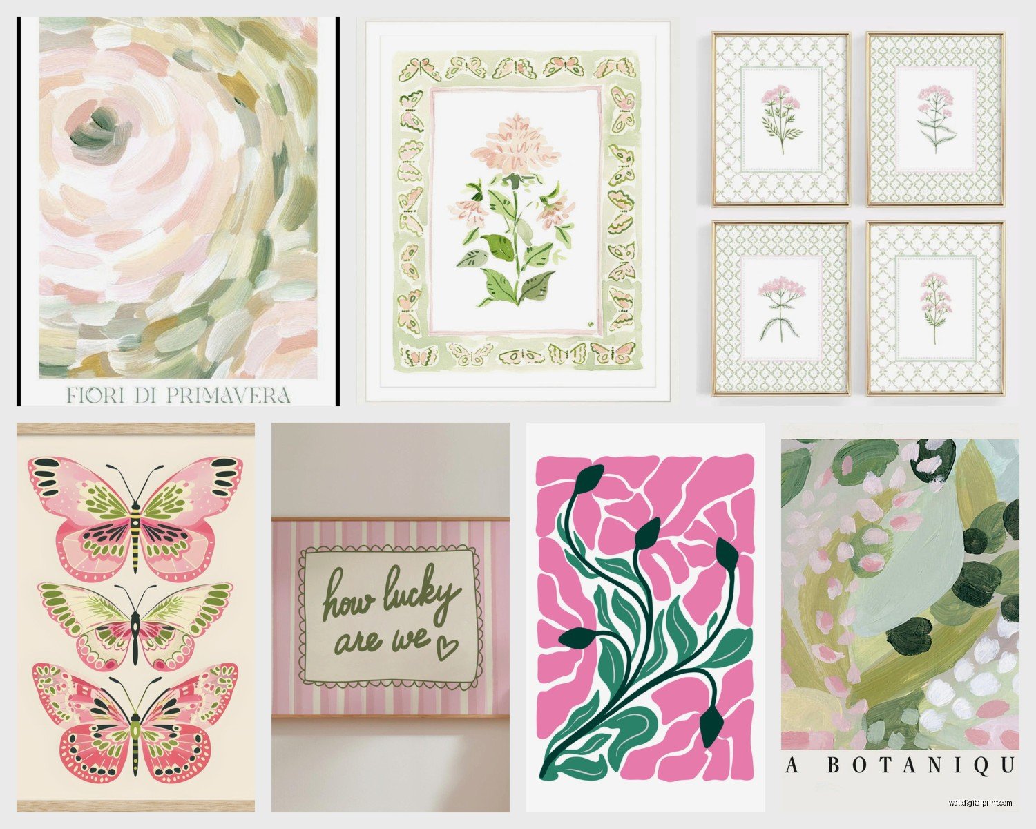
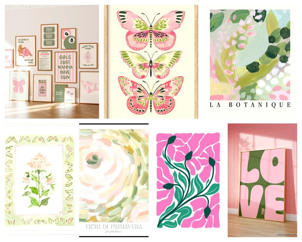
Abstract botanical prints are your best friend here. I’m talking those loose watercolor palm fronds or monstera leaves in green with pink backgrounds, or the reverse. There’s this one artist on Etsy who does these and I’ve probably bought six from her at this point… my credit card statement is embarrassing.
Line drawings work really well too. Simple continuous line art of faces or bodies with just touches of pink and green. Very modern, very clean, doesn’t feel too preppy if you’re worried about that.
Oh and another thing – vintage botanical prints. Like those old school scientific illustration style drawings of flowers and plants. You can find affordable prints of these everywhere and they give you the color combo but with this sophisticated edge that keeps it from feeling too sorority house.
Gallery Wall Strategy
If you’re doing a gallery wall (which honestly is the best way to use this color combo), you need at least one piece that’s almost entirely green. This grounds everything. Then you can go wild with the pink-heavy pieces around it.
I usually do a 5 or 7 piece gallery wall with this combo. Odd numbers always look better, that’s just a fact. The layout I use most is:
- One large green-dominant piece in the center or slightly off-center
- Two medium pieces with equal pink and green
- Two smaller pink-heavy accent pieces
- Two tiny pieces or objects (could be a small mirror, a brass object, whatever)
Wait I forgot to mention – you gotta throw in some neutrals. All pink and green will give you a headache after like three days. Add in cream, white, or even black line drawings. This is gonna sound weird but I always include at least one piece that’s just black line art on white background in these gallery walls. It gives your eye a place to rest.
Frame Choices That Don’t Ruin Everything
Natural wood frames. Light oak or maple. This is non-negotiable if you want the preppy fresh thing.
White frames can work but they need to be the right white – warm white, not stark white. Stark white makes the whole thing look too clinical.
Gold frames… okay so gold CAN work but only thin gold, and only if you’re mixing it with the wood frames. All gold is too much. I tried it in my bedroom and my partner said it looked like a fancy hotel bathroom so that was the end of that experiment.
Black frames are too harsh for this specific vibe. Save those for a different color scheme.
Where to Actually Buy This Stuff
Etsy is honestly your best bet for affordable prints. Search for “abstract pink green art” or “botanical pink green print” and you’ll find tons. Most are digital downloads so you can print them yourself at like Staples or FedEx for way cheaper than buying framed.
Society6 has good options too and they do the framing for you which is convenient if you don’t wanna deal with it. A bit pricier though.
Minted for when you want something really high quality. Their paper quality is noticeably better and their frames are actually good, not flimsy.
Target and H&M Home randomly have great pieces sometimes. I found this perfect pink and green palm print at Target for $25 last spring and it’s still one of my favorites.
The DIY Route
If you’re crafty at all – and I mean even a little bit – you can make your own. I did this when my client canceled last minute and I had a free afternoon. Got some watercolor paper, pink and green watercolors, and just made loose abstract shapes. Scanned them, printed them at FedEx in different sizes, and honestly they look professional enough.
The trick is to keep it simple. Don’t try to paint anything realistic. Just organic shapes, color blocks, maybe some gold leaf if you’re feeling fancy.
Styling the Rest of the Room
Your wall art is gonna dictate everything else so don’t fight it. Pick up the pink in your throw pillows or a blanket. The green should show up in plants (real or fake, no judgment), maybe a lamp base or vase.
I always do white or cream walls with this color scheme. Colored walls compete too much with the art. The one exception is if you do a soft sage green wall, then you can do pink-heavy art, but that’s advanced level stuff.
Furniture should be neutral. Beige, cream, natural wood, maybe some rattan or cane details. This is where you get that fresh spring feeling – lots of texture in neutral tones with the pink and green as pops of color.
Lighting Matters More Than You Think
This color combo looks completely different in warm vs cool light. Trust me on this. I hung a whole gallery wall and then turned on the lights at night and it looked totally wrong because I had cool-toned bulbs.
You want warm white bulbs, around 2700-3000K. This makes the pink look cozy instead of fluorescent and keeps the green from looking too yellow.
If possible, put your art on a wall that gets indirect natural light. Direct sun will fade the prints over time and also the colors will look washed out during the day.
Common Mistakes I See All the Time
Using too many patterns. If you’re doing pink and green, and multiple pieces of art, keep most of them fairly simple. Maybe one patterned piece (like a palm print or floral) and the rest should be abstracts or solids.
Hanging everything too high. The center of your art should be at eye level, which is usually around 57-60 inches from the floor. I see people hang stuff way too high all the time and it looks awkward.
Not considering your existing furniture. If you have a lot of cool-toned grays and silvers in your room, this warm preppy pink and green thing might clash. You gotta work with what you have or be willing to swap some stuff out.
Going too matchy-matchy. Your pieces don’t all need to be the exact same shade of pink and green. In fact, it looks better if they’re not. Vary the tones a bit.
Making It Work in Different Rooms
Living room – go bigger and bolder. This is where you can do a large statement piece or a big gallery wall. Mix in some brass accessories and lots of plants.
Bedroom – keep it softer here. More dusty rose than coral pink, more sage than bright green. You want it to feel calming, not energizing.
Bathroom – actually works great if you have the wall space. Smaller prints, maybe 8×10 or smaller. The humidity won’t hurt them if they’re behind glass.
Kitchen – I did this in my breakfast nook and it’s super cute. Just keep the art away from the stove area because grease and art don’t mix.
Home office – this is where the preppy vibe really shines. Feels professional but personality-filled. I’d do a more structured gallery wall here, very symmetrical.
Seasonal Flexibility
The cool thing about pink and green is it works year-round but feels especially right in spring and summer. If you get sick of it in fall, just swap in some orange or rust-colored pillows and suddenly it feels autumnal. Winter, add some white and silver accessories.
Or just leave it because honestly who has time to redecorate seasonally. I say this as someone who theoretically has time but usually ends up watching Netflix instead.
Budget Breakdown
You can totally do this on a budget. Here’s what I’d suggest:
Under $100 total:
- 5 digital prints from Etsy: $25-40
- Print them at FedEx or Staples: $30-40
- Frames from IKEA: $30-40
Medium budget around $300:
- 3-4 framed prints from Society6: $200
- 1-2 pieces from Target or H&M: $50
- Accessories and styling items: $50
Splurge version $500+:
- 2 large pieces from Minted with custom framing: $300-400
- 3 smaller complementary pieces: $100-150
- Professional gallery wall planning or installation: $100
The middle option is usually the sweet spot. Good enough quality that it’ll last but not so expensive you’re afraid to actually hang it.
Anyway, that’s basically everything I’ve figured out through way too much trial and error. The pink and green thing really does create this fresh, happy vibe that’s hard to beat, especially if you’re sick of gray and white everything. Just start with one piece you really love and build from there instead of trying to plan the whole thing perfectly upfront because that never works anyway.